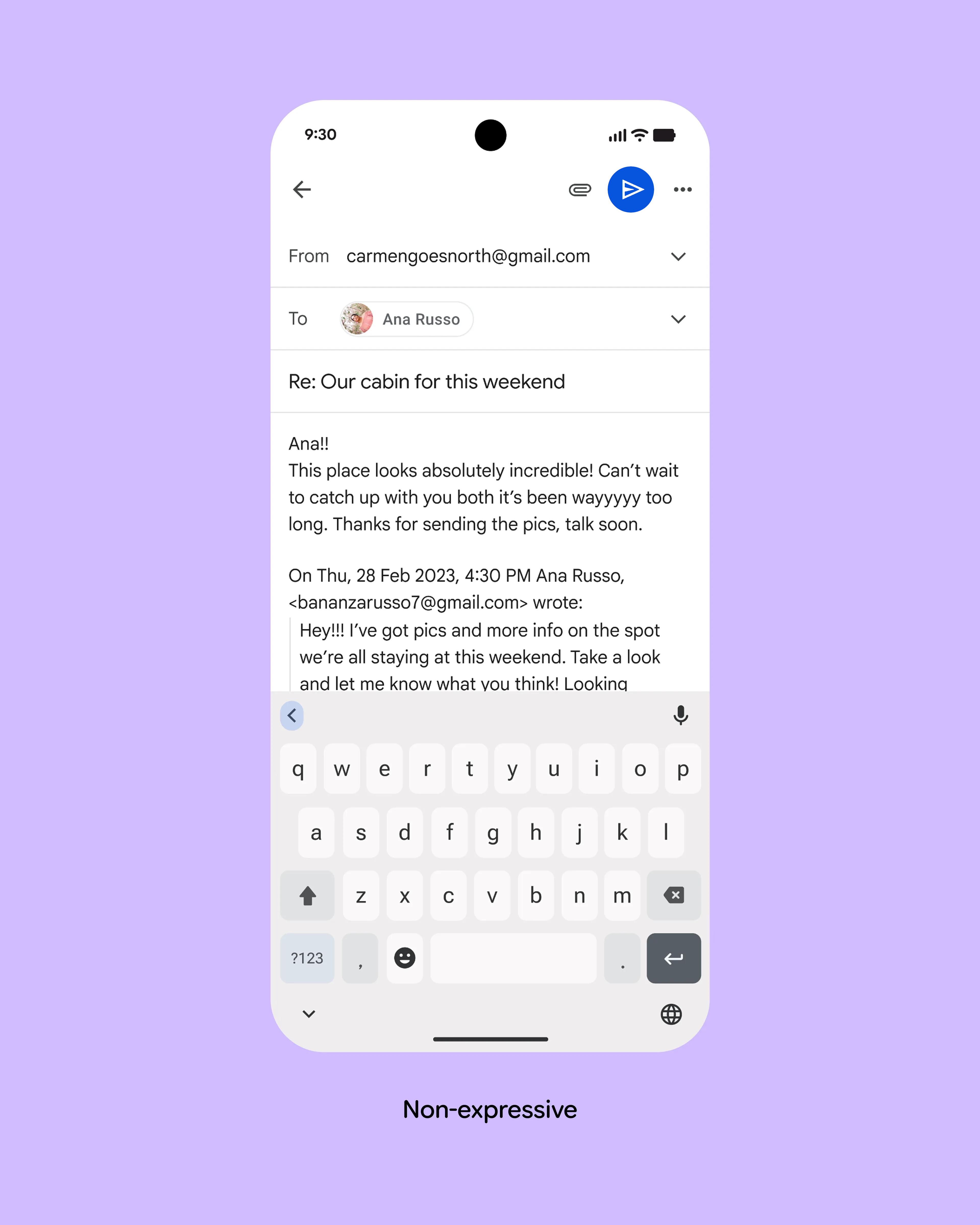
The reason the send button on the old design is hard to see seems to me to be that it doesn't stand out in any way. The only difference to everything else on the screen is that it's blue instead of black, but the contrast isn't big and it's between two less important icons.
Here's a 30-second edit of the first picture that undoubtedly breaks material design guidelines, but also solves the problem without introducing any new problems: https://kappa.lol/7Zuuc8.png
The problem with a text button in a case like this is that the translation of "Send" is longer in most languages and even much longer some languages.
Maybe just use the word "send" in a blue bubble? Forcing us to discover and translate hieroglyphics is just lazy UI design because you do not want to worry about localization.
On my Android gmail app, when I reply to an email, there's very little on the screen at the start of the process. The pink-ish send button really stands out since everything else is grey text (I'm using dark mode). They show an image after the user has composed their message and also expanded the quoted previous email text, which is not really what the user's experience is like, so it's misleading IMO.
my thoughts on the email design:
- Comparison is strange. One email has an image, the other text. Not the same email.
- Hiding the previous parts of the thread seem good by default, but how do you easily get them back?
- Where is "from" in new design?
- Where is "to" in new design?
- I do like expanding attachment a bit so you don't have to click twice to attach a photo (for example), but I'm not sure how often some of those options are used, may be too much. I could see a photo icon and general attach icon both showing.
- Back arrow looks broken in new design.
On the subscription side, I think it's an issue as it moves the control away from the consumer when doing those upgrades. With the older, one-time purchase upgrade model, which has since fallen out of favour; I could evaluate once a year whether the updated product was worth the additional cost. With a subscription model, there's a chance I could end up funding the development of features that I neither want nor need.
The old model was tightly coupled to the CD as distribution vector—you got what came on the disk, nothing more. It was easy to understand for everyone involved, and the path of least resistance for the developers
The internet changed that, because people began to expect you to fix bugs in a released product indefinitely. Declaring that you are all done fixing bugs is now not just an obvious necessity given the infeasibility of distributing small updates on CDs, it's now a conscious decision that has to be explained to the customer in sufficiently clear terms that they don't come complaining to you later. Failing that, you just have to plan on supporting a purchase indefinitely, and the easiest way to organize that is as a subscription for a single main release channel.
JetBrains has what could be a good model for products that lend themselves to a regular release cadence—it's a subscription, but you keep the license for the version that was current on the day of your last payment. But not every product lends itself to that kind of regular, predictable release cadence.
You could also just cancel when you realize it's not worth it instead of sinking a large upfront on it only to find it didn't fit into your workflow. I find that a benefit as even very loved and low priced software often just doesn't fit my personal desired ways of working.
I'll try it because of hype/marketing/good Show HN/etc, and then never really adopt it. So my thought is it's better to just make it easy to cancel the subscription otherwise I'd probably never even try it.
My own personal 'hack' has been focusing around a core and doing things fast. I've done a range of things but they've always been roughly relevant to the same field, so I can apply what I've learnt previously onto new things. This has also resulted in being able to make things faster due to familiarity and having dealt with the friction points before. I put 'hack' in quotes because it was about a decade(and a lot of money in domain renewals) until things started coming together regularly for me.
Not to defend anyone; but being around a lot of these people, there's a lot of cognitive dissonance when it comes to nutrition whilst on steroids. People often attempt to switch up their diet when starting and give it outsized attribution to their success. It isn't helped by people with poor diets not getting the same results, but in my experience it often has more to do with a person that can consistently eat chicken and broccoli will be more consistent with pinning, etc. than a person that can't stick to a diet.
I do it, as I like the idea that if one other person finds it useful then it's worth it. I don't put my github on my resume, but my username is my name so it's easy to find and definitely has come up (sometimes indirectly) in interviews. For me, the best interviews have had good discussions about the good, the bad, and the why. From the perspective of trying maximise my desirability to all employers, it has definitely "hurt".
I think you touch on why a singular difficulty level can be good when you mention meeting where your capabilities lie instead of forcing you to guess. When I encounter something difficult in a game, I'm always tempted to turn the difficulty down and often do. With Souls games I explicitly know if something is too hard and take it as a sign I need to do something different; whether that's my mechanical technique or the need to explore more. An increasing buff or other difficulty helpers would mean I could eventually brute force my way through without considering other options. Maybe I would prefer that, but it would just be a guess unless I did it the other way.
I had a similar experience, and I had a passport to prove my UK citizenship. It's a giant knot where everything relies on something else and you need to keep at it until one thing let's you in. It felt impossible and I feel like I had the best case scenario; I can't imagine how people without a support network can do it.
It's strange to think I was working on AngularJS and Flash apps at the same time. Flash feels like it was a millennia ago, whilst AngularJS feels very recent. Maybe because AngularJS's successor keeps it's name fresh in my mind?
I agree; I'll buy all 60 plots if it's real! I feel people are so overly keen on dunking on crypto at the moment, that they are blinded to agreeable satire. The proof that people claim makes it sincere isn't compelling.
I use a random group of words as variable, etc. names when I can't think of them fast enough to stay in the flow. I find it easy to remember what each one does, and can go back and rename them to more reasonable things before doing a commit. It only takes missing one inexplicably named 'deodorant' variable, for me to want to sink into the depths of the Earth at the thought of people thinking I'm one of these eccentrics.
- I do have trouble spotting the send button on the old design
- Maybe just moving it to a similar position as the new design would help
- I don't actually want it near the keyboard because I might accidentally tap it
- There's plenty of space, why can't they just have a button that actually says 'send'?