Flash is just “We don’t like to pay developers. We prefer you to pay more for memory. And your processor. And by the why, we don’t care about your security.”
Ironically memory prices are skyrocketing right now. Even the best known Electron application (Signal) is eating memory like it is free. Similiar native applications integrate much better and use a fraction of memory (e.g. Fractal).
PS: If autonomous locally usage doesn’t make sense a mere web-app is good way. At least it is then a single tab in the web-browser and most platforms are covered (if you don’t target Chrome exclusively…). In this case possible step? At least not 500 MB wasted.
I think the common opinion is that unless you are really careful, it becomes quite a big executable eating a huge amount of ram even for low functionality and often slow.
There are very good electron apps, but the engineering to make them small and fast is quite important.
I use Flightaware for detailed information about specific flights. They have tons of information about the history of the flight, past delays, etc. I use it to track specific incoming flights when I have to pick up someone from the airport. I keep an eye on it when I'm waiting to fly, and I also use it to see progress of the flight while I'm in the air if the airline doesn't provide that in a seat-back screen.
While your site is pretty cool, it's more of a neat thing to look at than it is a useful tool like Flightaware. That said, I bookmarked it and will visit it often (probably) as I live near an airport and can see planes in the distance. Also, I second the request for higher-resolution map tiles.
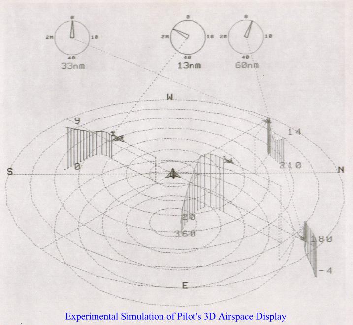
I was asked to come up with a 3D display of the airspace around an aircraft for the pilot to use and which could replace the 2D displays used then. People were impressed, but decided it was impractical for a variety of reasons. You can't really tell where the aircraft are relative to each other and the ground without rotating the display (which means the pilot loses their orientation), and there are no altitude indicators and it's difficult to tell where each aircraft is relative to the others. (Which is why I added the vertical lines and ground tracks.) Also things get visually messy when several aircraft are close together, even if you use different colors (which doesn't work for the colorblind). For example, could you use this display to tell if a collision is imminent near ground level in proximity to an airport? The display does give you a high level sense of what is going on in the airspace; it may not have enough details to be of practical use to pilots and air traffic controllers. I'd suggest consulting with them to get feedback. Maybe this would be practical as a VR display? How did they solve this in the F-35 helmet display?
You might find interesting how space games have tackled this issue. Most share the same design for a radar display that shows targets around you in all dimensions using vertical lines to offset the markers above or below. Check out a video of Elite Dangerous combat to see it in action. It seems conceptually very similar to what you came up with.
You faced all of the same usability problems. Until there is a true 3D display I don’t think this will be super useful for true traffic awareness. The cockpit is just too chaotic.
It’s very interesting to see your graphic. Was this supposed to be displayed on a cockpit TV?
Yes, it was supposed to be an alternative graphic for a cockpit radar display in a jet fighter. The goal for any such display is to convey maximum information at a glance. I got feedback from a fighter pilot who said he wouldn't use it. Most people don't think in 3D, they think in 2D. Pilots have to think in 3D to some extent, but in a battle a fighter pilot wants to know what they immediately need to pay attention to, which is usually something heading directly at them (another jet or missile) and they mostly want to know the direction it is coming from, not so much what its altitude is. I made the path histories fade out so they didn't get too long and clutter the screen. The vertical bars were calibrated to indicate a specific distance so they also gave an idea of velocity. It would be possible to add/remove things from the display based on some automatic assessments of priority (i.e., remove everything not headed at the pilot, though having things appear and disappear can be confusing also). The aircraft icons were actual wireframe models representing the type of the aircraft, but had to be oversize to see them, which added some confusion also. The pilot found a fixed size icon with a few numbers next to it and highlighting for approaching/receding much more useful. Took me a long time to digitize them with just a ruler. While such a display may not have a technical use, it might be useful in advertising, showing travelers at an airport what is going on around the airport at the moment for example.
Not everyone sees color exactly the same way, for example some people can see a little into the IR and UV. While the pilots may not be colorblind, the people who repair the displays might be. Situations can also make pilots colorblind, like strong glare coming through a window. It's better to have an unambiguous display that is easy to interpret rather than to rely on something that can be subjective like color. People can only reliably identify a few distinct colors, so if you have 300 kinds of planes and missiles to identify using shades of red and purple doesn't work so well. An ID number next to an icon can handle thousands of kinds of entities. People can tell color #F0479E is different then #F04750 when comparing them side by side, but they probably can't tell you what the exact name of each shade is, and at a glance they might think they are both the same color. So it's not so much colorblindness as it is the limits of human perception. What I call Hunter Green and English Racing Green might look like the same color to you.
I noticed one minor area for potential improvement: when I look at the ATL area right now, it looks like aircraft are clipping through the ground at takeoff and landing.
I'm guessing this is because you're taking the pressure altitude which is derived from aircraft transponder data, and incorrectly interpreting it as altitude above sea level, without correcting for local air pressure variations. Right now, local barometric pressure in Atlanta is about 1028 mbar, which means pressure altitude is about 450 feet lower than true MSL altitude.
(Pilots need to know their altitude relative to sea level and the ground, so they have to manually adjust their altimeters to correct for pressure variations, based on the latest local weather conditions. For ATC, it's more critical to know aircraft's altitudes relative to each other. So transponders report the pressure altitude without correction, to guarantee that inconsistent pressure corrections can't cause errors.)
No this is a known issue, there is some mitigation for it right now, but I haven’t chased down all of the edge cases.
There are some places on the map where the terrain texture isn’t great, or is below the elevation of the centered airport, and the planes will breach the mesh. There’s a setting in there where you can manually tweak the ‘ground elevation’ if it gets annoying to you.
I am not a developer at all (electrician, retired, live in a flightpath), but I'm pretty sure you can build a healthy retirement with your absolutely breathtaking solo project.
At the same time, I'm not sure how you monetize such an easily "stealable" idea. My hunch is that you'll see other flight trackers debut your perspective as one of many layers within their own trackers (this is where you come in, as consultant?).
At a minimum: If your resumé previously lacked page 2, it no longer does.
I'd recon your page 3 has already begun, too... as you digest all these intentional comments, over the next few months: don't ever lose your glee of hackiness.
Luck, given — but you've already done all the work!
Another bug: when you adjust altitude scale, it doesn't rescale the existing trails, it simply moves the planes up and down leaving stairsteps in their paths.
Suggestion - make it default to an airport that is currently in daytime. Clicked on it this morning EU time and Boston was obviously dead to the point of the site seeming empty/broken
had it bookmarked since the last share, but had noted the world-tiles would regularly not load, seems okay (and with colors?) now,
but maybe that could need some low-detail fallback when arcgisonline servers are busting? - some 16k image to fill all the black void?
also "copy this view" does nothing (neither location nor any settings, gives just the bare link)
without an airport near "my current location" is my goto.
is there a direct link for this? (otherwise i may hack together some userscript that clicks that button for me...)
"my assumption" would have been some x/y/angle/zoom params on the url, maybe even with some of the settings encoded in... (autorotate, render-radius or terrain height would be first to come to mind)
my "not getting any tiles" must have been 2 or 3 days ago - and from the last time i had to mess with tiles i do remember that to be fairly ugly in regards to performance/scaling so i feel you ;)
also addon after trying the "direct link to an airport":
- this still loads at the random-US-airport first. with some tweaking there is likely an entire tilefetch you can save^