The whole Metro/Modern UI is in like 90% cases much much uglier than whatever was before, and even after years of using them, I just can't get used to them. Every time I see a dropdown, text box or check box of new Modern UI, I think there's some CSS missing or page didn't render correctly. Looks cheap and ugly.
Then google comes and do some version of Modern UI on web and Android, which looks and feel miles better than MSFT!
The input/select boxes are certainly a step backwards visually.
The double border (thick black + thin white) is good for usability/accessibility but it's just ugly and also draws a ton of attention to itself on whatever page it's on.
Yeah, I agree funny how much better Visual Basic and Windows 95 contorls were even in this regards. I believe pretty much any UI experience was better as the "modern" one. I shouldn't have to wonder what control I can interact with and which one saves state immediately versus needing an explicit "apply" or save action. It's pretty messy and confusing.
I agree with your assessment for most of "flat". Apple does it OK but there are still dialogs and such that look entirely lacking design, in the worst way.
On the plus side the typical case of design along these trends looks indistinguishable from the sort of thing that used to make people shake their head and go "I see the developer made this UI, we'll send it over to design to make it look nice, typical developer, doesn't get design" which means you can match average modern design quality without... knowing anything. So that's nice. Just claim something design-related in your title or how you introduce yourself or something and people will accept it—they'll still say it's bad if your title and reputation is just as a developer.
[EDIT] for example—look at the "upcoming" for the Button element on the linked site. Yeesh.
Most of them look better than they did. The combobox is still a mess though. It's always been one of my least favorite controls, mostly because of the UI. Now, the flyout menu is detached from the base control, making it worse.
It would be good for the design team here to take a look at how popular web frameworks have implemented dropdowns/combos, and take some inspiration. Things like the button morphing into the overall list, and losing the dividing line between the bottom of the entry field and the list of options.
The focus highlighting is excessive in my opinion and will lead more designers to disable it - not a great step for accessibility. Maybe put the high contrast version behind a browser option/high contrast mode for the system, so it's a little quieter.
In any case, happy to see progress on modernizing native form elements. But I hope these don't make it upstream without some significant UI polish.
I really don’t understand what designers are thinking these days. Do they actually use the stuff they are designing? I spend a lot of time randomly swiping and clinking on my iPad in the hope of finding something I am looking for.
I know this might come off as trivializing hard work, but I think many feel that their work must be _different_ to a high degree or they haven't put enough of themselves in the work.
Inconsistency seems to be the name of the game here: depending on which webserver the loadbalancer sends me to (I can only speculate that this is the case?), I get a different favicon for this webpage! [0]
I have a habit of opening the same link multiple times, since it's sometimes easier to click the link in the thread than to Ctrl+PageDown to switch tabs.
In this case, I had it open, came back to the HN thread to leave a comment, opened the site again to look some more (twice?), came back to the thread and read someone else's comment about consistency, went back to look at what they were saying, and that's when I noticed the icon was different compared to the other three tabs of it I already had open.
Yeah, it's pretty bizarre. I'm currently able to reproduce both icons being served (in Firefox on Windows) by doing a hard refresh (control+shift+R) twice in a row, then doing a normal refresh (control+R) twice in a row, repeating the sequence a few times. I'll consistently see different icons throughout this process.
The date picker is worse as well.
Harder to determine day line from list of data. Whole thing looks like raw data before a format/style is applied, minimalism at its worst.
Harder to determine last/next months dates from picker
Why up/down for past/future instead of left/right, maybe its a cultural thing of writing from left to right but I always imagine time as moving into the future from left to right.
Today button is an improvement over the dot.
I am tired of giving MS feedback. Either you get no answer or some standard text snippet from a bot and nothing ever happens anyway. It’s a waste of time in my view.
Sure there is. Uninstalling Edge and Chromium are the easiest ways to provide feedback. You can bet your bottom dollar that there's telemetry tied to uninstallations.
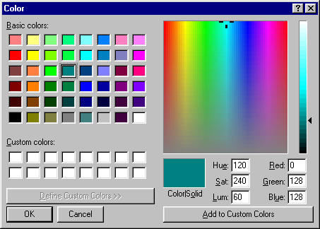
The color picker in particular is a massive step backwards. I've always thought the normal Windows color picker could stand some improvement and additional features. But this is moving in the wrong direction by taking away features.
Also, note that the images on this web page are being scaled to fit the blog's width. Not all images are shown at 1:1 zoom, so some will be stretched. I noticed the horizontal lines in the standard text box were fuzzy and realized it was being scaled by my browser.
Imagine listing out the months of the year in one column on a blackboard. Obviously January would be at the top and December at the bottom. If you had to list the hours of the day, 00:00 would be at the top and 23:00 at the bottom. I assume this is the logic they're using. (This is also how time is referred to in Mandarin -- the past is above and the future is below; last week is literally "the week above".)
I don't agree that January would obviously be on the top. Consider that almost everything on the internet nowadays has the most recent piece of data on top: Twitter, Facebook, Email threads (anti-top-posting battle was lost years ago).
As for Mandarin, yeah, that is true, but that is just one language among many. Some languages refer to past as "front" and future as "behind", should we make a 3d picker too?
One reason they went with up/down may be to shelve the problem with right-to-left languages. But in that case they should use something more obvious. Note that a three letter abbreviation of a month is also not that much larger than an arrow...
The colour swatch honestly seems much more functional in the old version, with the ability to store custom colours, specify hue, saturation and luminosity etc. The new swatch is frankly neutered down. Apart from that the other changes seem okay.
Fun fact: the old colour picker is literally unchanged since Windows 95 (https://guidebookgallery.org/pics/gui/interface/dialogs/colo...), complete with the really awkward use of a pipe character as separator between "color" and "solid" (which was used for the closest non-dithered colour match back when we had 4- and 8-bit displays)
And to this day, 24 years later, adding custom colours is bugged. It does not "add" colours, it overwrites the first colour in the list.
EDIT: to clarify, the above is only true if you exit the dialog and then return to it. It has no concept of previously defined custom colors, it just overwrites whatever you had before, instead of appending to the list.
All that having been said, yes, it does appear to be better and more functional than the new proposal.
> It does not "add" colours, it overwrites the first colour in the list.
It's not bugged. It's just non-obvious. Select the empty custom colour first, then select from the colour box the colour you want to add, then select 'add to custom colours'.
It's actually somewhat more complicated than that even: clicking an "empty" custom colour (I put "empty" in quotes because it actually has no concept of empty, they're just white -- it keeps track of how many colours you've added since opening the dialog but it does not know if the colors you're overwriting are "empty" or not) selects the starting point where you want to start overwriting the list. So clicking multiple times will keep overwriting your colors, you just get to choose your starting point. So there is kind of a way to use it but it is non-intuitive and backwards as all heck.
What the "add" button does, then:
1. overwrite colors step by step in the list (with no undo),
2. in order from top to bottom and then left to right,
3. starting at the most recently clicked custom color,
4. or at the first color in the list if no custom color has been clicked since opening the dialog
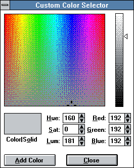
This screenshot shows only the right part of the color selector dialog, which is otherwise exactly same as the W95+ version. CHOOSECOLOR.Flags has few bits that determine which variant is shown, and this particular variant is not documented in current winapi docs. I believe that this version is only used by Windows 3.x Color control panel applet.
[Edit: and as this dialog is present in Windows 3.0 it almost certainly isn't implemented by same code as Color Dialog from Common Dialog library, because Common Dialogs were introduced in Windows 3.1]
[Edit2: when I think about it probably the only common dialog that actually changed since W3.1 is Print Dialog. Other changes to the library were implemented as adding new dialog types. Notably the ComCtl/COM based W95 file/folder dialogs, which actually aren’t API compatible with previous versions, because they deal in shell objects (ie. ItemIDLists) and not in filenames. (This is also probably the reason why various parts of Windows Setup use really weird looking directory selection dialog)]
I agree — I prefer the old colour picker, too. Not only is it more functional, but it's the standard colour picker! If you've used any other Windows program that uses it, even if it was Paint in Windows 95, you already know how it works.
I don't mind people trying to re-invent the wheel, but I'm getting tired of having to use a dozen different interfaces for the same task.
I generally agree. I think the only thing I do like is that the new picker appears to be locally attached instead of a separate dialog that is called out and not closed once a selection is made (at least that's the behaviour on mac. I'm not sure if that's been the same recently on Windows)
Can someone explain to me why they would spend effort on this kind of thing? Other than minimalist websites like HN, I can't remember the last time I saw completely unstyled form inputs in the wild.
If every web developer is going to immediately reach for CSS/JS to style these things, who cares what the default style is?
If I could use unstyled controls and know that most browsers would have reasonable defaults, I would. I think a lot of line-of-business developers would agree. I see an opportunity to eliminate one thing that adds bloat to web applications.
I often do use the unstyled input for say range sliders and color pickers. Most component libraries don't include them but they are complicated enough to make you not want to reimplement them. Even if you choose another external library it will be thematically incompatible anyway so you might as well go barebones and accept the OS style.
In general, it's definitely possible to go too far with styling. Sometimes the look and feel of your app does add value but for the vast majority of apps, how your scrollbars and file pickers look doesn't ever matter.
I guess one area where I see custom styling as important is visual consistency between browsers. These updates only apply to Chromium browsers, so a sufficiently visually complicated UI might look good in Chrome, but bad in Firefox for instance.
I don't feel super strongly either way, but I think it is important to call out
A lot of native HTML controls cannot be styled, instead they are re-created in JS.
This causes problems with accessibility, and burdens the browser with unneeded JS.
On a very related note, Safari not supporting date and time inputs on MacOS, and not having full support on iPhone, is super irritating. Having to add a bunch of barely accessibility JS controls to my site because Apple refuses to implement a spec after a bug was filed 6 years ago (https://bugs.webkit.org/show_bug.cgi?id=119175) was rather annoying.
I'd argue that the correct solution then is to have better support to style native components if designers are going to do it anyway.
Additionally, it is not terribly difficult to make a custom checkbox , for instance, accessible. It may require JS and ugly DOM, but I wouldn't say it's difficult.
Date and time pickers are harder. All the platforms have a native control, and all major browsers except Safari on MacOS expose it.
That one omission means the control is basically unusable without some sort of polyfill, at which point you might as well just use the same JS implementation everywhere because why not. :/
The the drop down on select not being customizable is also famously irritating.
Nearly all browsers have a native date/time control, true. Also true - many browsers do it quite badly. So eventually I always end up using the JS solution...
e.g. There's no way (by design!) to override in CSS the browsers' date format detection - and the method differs by browser/OS combination. Some customers can't manage to configure it, so end up with the american format when they want the european format. Also more than a few native browser date controls are very underfeatured (e.g. current Edge).
I am thankful for momentjs literally every day I do web development. I know it gets a lot of flack for it's bundle size, but it makes so many things easy.
Heck the native JS Date object can't even give an ISO time string in the same time zone the date object was created in. Not to mention a dozen other deficiencies.
Dealing with time had always and probably will always be painful.
And then there is China, where they use YYYY-MM-DD, but 12 hr time with an AM/PM equivalent. So close to doing it the correct way!
The article makes several points that a lot of this effort came out of Accessibility requirements. Microsoft is very serious about Accessibility. They can't stop a web developer from breaking Accessibility, but they certainly care if the defaults are Accessible.
Microsoft seriously needs to hire designers. Say what you will about Apple, but that’s something they understand. Windows has gotten a little better but everything look developer designed.
Calling these changes "improvements" is a stretch. Still flat, still dreary. They should have at least gone for a "Flat 2.0" look [1]. Flat 2.0 is is mostly flat, but it makes use of subtle shadows, highlights, and layers to create some depth in the UI. This is definitely not Flat 2.0. Look at that button. Looks almost like a disabled text input. Dreadful.
That's how they present all these meaningless UI changes - as an "improvement". But guess powerusers and professionals aren't the groups they're aiming at anymore - which I'd say is clearly shown in iOS Skype changes log [1].
"Since we began work on the next version of Microsoft Edge based on Chromium, we’ve been investigating ways to leave Chromium as it is, as much as possible, without re-implementing its features to resemble IE/Edge as it was."
I don't think the poor HTML rendering and extra Microsoft code was what laurensr meant when they mentioned the lost features in the new Chromium-based edge; rather, it's the loss of Edge-only program features like pen/ink markup on pages. https://support.microsoft.com/en-us/help/4027048/microsoft-e...
They're not interested in bringing the inking features over? Did they fire the team or something? Is there something about their code which makes it not worth porting on to Chromium or something?
All the inking stuff (and also the PDF/EPUB stuff that old Edge was really good at) is in UWP (WinRT/XAML) controls. At the moment it looks like the Edgmium team is entirely avoiding UWP controls. It seems like they are avoiding them for maximum cross-platform ease, but it's still not hard to wonder why they don't just use XAML Islands for nice stuff like Inking on Windows 10+ at least.
I wish the calendar widget would be improved in standard Chrome too. Looks like though they are not making the slashes optional, it's not usable for Europeans as we tend to use dots.
Part of the problem is that it assumes browser wide setting of language, where as it is very common here to install browser and OS with US locals, but still want to have European inputs.
I wish it would be based on the site's html lang attribute instead of an OS/browser locale. Also the user can't even just type something like "20190504" to get 2019-05-04, because for some reason it accepts six characters for the year part and it becomes 201905-04-
There could be some east west divide. But is seems to be widely used, for instance Germany seems to prefer dots. Someone has compiled a table here https://gist.github.com/mlconnor/1887156 not sure about it's accuracy.
Imho, everyone should use ISO8601[1] as standard. Then there'd be none of this 'it's an american who wrote it so it's the month first for some reason' rubbish.
I'm an American that prefers YYYYMMDD and has used it exclusively in my career. As a developer with a lengthy deployment background and it's simply the superior way to go for dates for readability and sorting. Many like myself have 2 modes of operation, the 2nd being what business owners and executives are expecting. We couldn't force it on them if we wanted to. This often extends into English vs metric as well. I default on metric for everything I can. It may not be the American developer to blame but the average person around him. It's very surprising to me that after the American Revolution, we weren't eager and early adopters of the Metric system considering animosity towards the British was still lingering for some time.
Indeed, it seems like they have no idea what conventions are, and just wanted to change everything for whatever reason. The default low contrast gray "button" is garbage.
Also, I get switching to a black outline on the focused text element, but now you have two colours signifying that something is focused.
>Just click the smiley face in the top-right to Send Feedback, and let us know what you think!
It's telling that when I wanted to provide feedback I did a ctrl-f to find some sort of feedback link and it took me a while to figure out they meant to download the actual build and then submit feedback... that feels as wonky as some of the choices.
I know we're getting dangerously close to "Ceci n'est pas une pipe" post-modernism art theory land here, but a screenshot of a widget isn't the widget, and how they look in a screenshot is still bereft of other context. It's not unreasonable to ask that even "purely visual/aesthetic" feedback deal with the widgets in the direct context of running in a browser, and used inside web forms.
I think that's actually supposed to be the :hover and/or :focused state (as most of the screenshots of the other controls intentionally are), which is why that specific one especially seems to tell me it needs more context.
Because you just spent time creating a blog post explaining the changes, presumably to an audience who might not be using your application but you want to entice.
I really don't get the time picker design that basically works as two long comboboxes side by side. Especially the minute picker requires far too much scrolling/swiping for what it's worth.
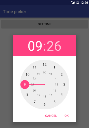
I much prefer the Android dialog, with a clock face that allows me to select the right time with two clicks [1]. Am I alone in this, and is it hated by all and thus ignored in other OSes? Is it patented and thus unavailable for anyone but Google? I don't get it.
It doesn't have two rings anymore, you choose the hours and then it changes the ring to minutes for you to choose that. Functionally the same I would say, for all but the most pedantic person.
And I believe it has been that way for several years...I don't recall ever seeing hours and minutes rings visible at the same time.
Well, no, that is still the current time picker. I find it the fastest and easiest way if picking a time on a touchscreen. Not sure if it would work as well with a mouse, though. And it takes a lot of space.
I just wish MS would release Edgium already... we can drop so many hacks and finally stop supporting IE11 once Edgium is released because we can just tell customers on IE11 to use Edge.
How well does that work in corporate environments (which I'd guess would be the last vestiges of IE 11 use)? If you can't tell them to use a different browser now, why would it be different after Edge is Chromium-based?
I guess the theory is that Windows 7 can run Edgmium, but not Edge Classic, so at least Windows 7 users could upgrade from IE11 to Edgmium. But the problem with that theory is that Windows 7 expires from security support in April and if those users aren't already contemplating their next Windows upgrade then yes, why would they bother upgrading IE11 to Edgmium? Especially because wouldn't they already just be using Chrome in that case?
Yes, I know that Edgmium will also have the ~crutch~ ability to run IE11 in specific tabs on Windows 7 (and 10) so corporations stuck in IE11 for "reasons" can have their cake and eat it too, but that's still doesn't mean corporate developers can stop supporting IE11, that means corporate developers will be asked to continue to support IE11 because GPO-ing the entire LAN to use IE11 "compatibility tabs" is easier than picking and choosing individual intranet sites that require IE11 because of bad vendors. (If your corporation or client is stuck with supporting IE11, it is likely stuck forever. IE11 will never die, because corporations won't let it.)
People said the same thing about IE6, then IE7, then IE8, then IE9, then IE10. At some point you have to pull the plug on your customers or they will bleed you to death with technical debt and wasted productivity.
Then google comes and do some version of Modern UI on web and Android, which looks and feel miles better than MSFT!