If I could give one piece of advice for technical developers it’s that design isn’t all about the way it looks, it’s about the way it works.
To expand on that, it’s how the pieces fit together within your set of constraints. There’s a LOT in common with what makes code beautiful or not. You get to the essential; nothing more, nothing less. This doesn’t mean “minimalist” , per se — just be wary of ornamentation that doesn’t add value.
A design can be award-winning without much “flash”. A readable font. A thoughtful, consistent, grid, that gives the content some air. Color choices based on accessibility, constrained to a palette that has some meaning for the project, etc.
Don’t be afraid to learn about design! Look to resources like IDEO, who take a principled approach to design that’s not superficial. Think about the field of Architecture, where engineering and aesthetics have been combined for centuries — and where the same concerns of “essential” vs “ornamental” remain an active area of debate to this day.
lots of whitespace and "air" has become especially fashionable in the past many years. it makes design easier in some ways without necessarily pushing it forward. yes, it forces more conscientiousness of essentiality and contribution of each element (a good thing), but it's also used as an ipso facto justification to resist change and meeting needs (a bad thing).
i love seeing designs that are intricate yet coherent. that seems to push boundaries more than "air". that approach seems more challenging than "cut as many elements as necessary to achieve a desired white space ratio".
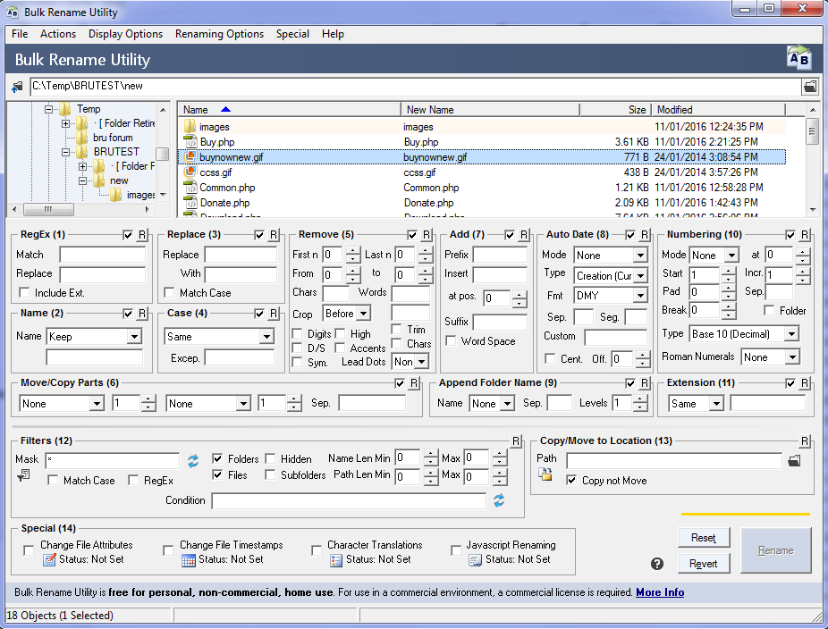
Design is more complicated than just 'give content some air'. Here[0] doing that would be a recipe to disaster. I'm a user of this tool and it really works like it is. I doubt that making it look more trandy would make it more functional.
Just because you got used to this tool, does not mean it is good UX. To me this looks really cluttered, and I would be overwhelmed, if I looked at all those options for the first time.
And I don't even see a reason that all these different modes need to be visible at the same time. It also takes up alot of space.
There are probably many ways to make this more user friendly, but if it works for you, thats great
Airplane cockpit design is also "cluttered", but the people who will be using the cockpit interface (trained pilots) want that. The cockpit is designed for the pilot, and in every case design should be catered to the needs of the user. I work in UX specifically and try to oppose designing same-y interfaces at every turn. Different apps have different users with different needs. Unfortunately, this is an uphill battle as we've established some mystical need for "branded" interfaces that all look and act the same, regardless of the function or user need.
That's not really true. Every custom built tool receives some form of training. Easily accessible designs lend themselves more for getting right into and learning by doing as a lot is self-explanatory and the user isn't overwhelmed. On the other hand, nice designs with lots of space, often also end up with slow response times and lots of scrolling of clicking, making certain work quite tedious.
As the parent comment said, software should really be built for the user and not just so everyone and their children can use it (unless that's your target group).
Financial terminals don't have the super nice designs to it, but they are highly functional, customizable and fast. A lot of cashier terminals are still running on old hardware with bad designs, yet they are highly functional.
I think there's always room for improvement and with every change you'll see a certain amount of push back, but I think it's important to consider the user and not write "simplified" software, when you have power users in front of you.
I agree with you. The UX/UI patterns should be functional first with a focus on primary userbase.
In many startup scenarios, however, the users are not identified yet, so this UX pattern works only when you are well aware of the business case and user capabilities.
> Just because you got used to this tool, does not mean it is good UX. To me this looks really cluttered, and I would be overwhelmed, if I looked at all those options for the first time.
It is also true that looking cluttered at first sight does not mean it's not good UX.
Just sticking to some proven standards, even from a 20 year old software book, can really enhance an interface. Right off the bat I can spot a half dozen instances where a text input could easily span to align with an element above it, but it falls a few pixels short.
Yes, great point! Even the best design principles can fall into 'trend' territory if they're not applied intentionally, to solve an actual problem. Exceptions definitely make the rule, and a site might find that extreme information density is what's called for. It really comes down to being intentional, being wary of trends for trends sake, and hammering on the constraints, and the problem one is trying to solve for the user.
I don't see how it's a justification to resist change any more than any other recommendation is inherently a justification to resist change that violates the recommendation.
it's a consequence of how people handle complexity
here we call it the deer - headlight problem. why doesn't the deer dodge? because it's a novel situation, he's under pressure to understand and there's no frame of reference for instincts to take over
same with non driven users (users that aren't doing a specific job) having a novel interface, they don't know which operations and options are irreversibile and so get frozen trying to understand everything the computers tells them at once and once they're overwhelmed they just get stuck
giving UX air is a good catchall that both forces you to parcel only what's important for your user and help user not getting overwhelmed by options
a more detailed advice would be to present branching decisions in order of commitment and only showing the relevant options at each step, but more whitespace is a good rule of thumb because it forces you into wizards without becoming a mouthful like this one, and gives you enough agency to come up with alternatives design to wizards of you can get by with other representations of the data to be manipulated
> design isn’t all about the way it looks, it’s about the way it works.
That's a dangerous thing to say, I think. Because the way it looks is the way it works.
A huge part of design is managing the prominence (and presence/absence) of various elements, so people understand what something does, and find it as effortless as possible to find and take the actions they want.
Prominence is managed by relative size, weight, hue, brightness, saturation, shadow, whitespace, opacity, ornamentation, vertical ordering, horizontal ordering, and so on.
All of those things are how it "looks".
Presence/absence is managed by hierarchy, expand, hover, etc.
All of those are also how it looks, by what's removed or shown.
I think I agree with where you're coming from, especially in your last paragraph. I'm just worried that your first sentence is easily misinterpretable as "as long as all the information is on the webpage, fonts/colors/spacing are mostly irrelevant".
We're mostly talking about the same thing. Simply put, I'm primarily talking about the distinction between choosing something because it looks cool – and sometimes what looks cool is a very important constraint – vs having intention in one's design choices. Like you point out, things like prominence, progressive disclosure, etc. Those aren't superficial choices; they actually serve a purpose, and are a way to fit within a set of constraints.
For most, yes, it will end up represented in 'how it looks', but I'm underlining the importance of 'how it got there'.
(Aside: worth just highlighting for everyone that not everyone is sighted, that accessibility matters, and that not every design choice is visual.)
I think the problem is also with non-technical people who focus on aesthetics and push technical folks to make the product bloated. Design education would help project managers, and non-tech customers who are requesting that product or feature.
This is such a common problem that there is a meme about it "Can you make it pop a little more?".
Providing advice to technical folks is just a small part of this problem.
When I was first starting out it was, "can we make it edgier?"
The IDEO philosophy – which has really influenced a lot of Silicon Valley's best teams – is all about what you're saying. Design Thinking is really about making everyone on the team a designer. Everyone has their speciality, but the Designer's role is to bring everyone together with a process that involves everyone.
This was the approach used by Apple when they first launched their Apple Stores, twenty years ago. Rather than impose a design created in a vacuum, they brought together a diverse team that included someone representing the retail employee perspective.
I mostly agree with your parent post and your response. I think when technical people who have excellent understanding of user needs usually produce better product/service than designers getting together in a room with post-it notes - this may be an unpopular opinion but I've seen it time and again - "Design Thinking" is largely a buzz word in all places I've worked.
Also, just to nitpick - Apple has produced some of the worst products with no understanding of what the user wants - for e.g. Apple Music App. Also, Google, a recent one - Google Meet hides its mute/unmute button and in a completely undiscoverable way. Imagine driving a car where the brake pedal disappears only to appear when you hover your arm in a particular position left of the steering wheel. Now you can apply brakes. That's what they're doing with Google Meet, when I want to unmute to say something, I have to hover my mouse on the bottom of the screen and the unmute button pops up. Why isn't it always visible!? If I were leading that project, I would ask the team to scratch the entire UI and rebuild it and make sure these things don't happen again.
I agree with the overall point that design is about more than looks, but my impression is that design as practiced by the IDEO / Stanford d.school / design thinking crowd is a quite different beast from what’s being taught inside most architecture schools.
The former tries to distill design into a largely linear, repeatable process (that can be peddled by consultants, if I’m being a bit cynical), the latter would characterize such approaches as reductionist and limiting.
Consultant here! Design is taught as a holistic process. I have not seen "largely linear" in a decade. It is complex, iterative and grounded in research. At least that is my experience and how I have seen it taught. YMMV.
Dangerous to separate these. Poorly looking sites have poor experiences. Of course, aesthetics are subjective, so I'm speaking generally here.
My philosophy for design is to always, without exception, strive for a good looking and functioning site. You can't have a site that works well that looks like shit. Conversely you can often find sites that look great but are absolutely unusable.
Our points are not at odds. Something 'brutalist' might be very fitting in certain contexts. In most scenarios, creating something that's 'easy on the eyes' is a very important constraint of the design. My main point is that beauty in design emerges from a graceful balancing act between all of the conflicting constraints on a project. It rarely emerges by enforcing a facade on top of something.
The best Visual Designers have superb pattern-recognition skills for applying principles they've become familiar with in their education and professional work. They can quickly recognize a certain type of problem, and call on their depth of experience to apply a solution. But even the best can slip into habit of using well-worn tricks in situations where perhaps a different approach would be more fitting.
What makes craigslist look like shit? It's boring sure, but it doesn't look like shit. Many designer portfolios I see with hideous colors and abstract out of proportion illustrations are much worse looking than craigslist.
I agree that it's trainable, but to create a good icon a first timer can spend several hours. Several hours in which they could be doing work that they have trained for.
If one intents to be a sole developer then yes, they have to improve in all fields, but when one is in a team one has to let some things go, and let people better than them on that field do them.
Design isn't about drawing pictograms, so nice strawman. The type of design thinking implied in the comment is more about knowing –or at least have the faintest idea about what a visually cohesive system is and could look like. There's no such thing as a "sole developer" in software development because your code is inherently tied to function and that function tied to its design. The more you value that concept the more you "train" your understanding of modern graphic design.
What I particularly like about IDEO is that they hire non designers. It's very possible to have a biologist, historian,and and a designer sitting at one table trying to come up with new concepts.
What I'm saying is that beauty in design doesn't come from slapping a facade onto something. It comes from a harmonious relationship between all the elements, adding up to something that solves the particular 'problem' of that site.
UI is a specialization within UX, the way databases are a specialization within Computer Science. CS deals more broadly in the constraints of memory, time, resources, etc. Databases deal with the same things, but through a specific lens.
UX deals with a set of constraints as well. The business needs, the user needs, etc. UI deals with a narrower subset of those constraints.
The fonts you choose, the colors you choose, the information density – if these are intentional choices based on your particular set of constraints, you'll end up with something elegant. That elegance is what makes something feel right.
They sell a (rather expensive) book on web/mobile app design that explains how to build your design system and use it to create great looking apps. They cover all the bases you would expect like fonts, line-heights, colors, shadows, borders, sizing, working with images, visual hierarchy, using white space, etc. etc.
I'm a developer by trade and I work primarily with one other developer, so we end up doing all of our design work. This book really helped us step up our game and gave us some very simple tactics to use to improve our designs. Imho, it was well worth the price.
1+ for the book. It gives enough inspiration for a clean look. The guy also worked together with Adam on Tailwindcss which is a nice class-based css framework which makes designing website a lot of fun. Especially because it gives some “constraints” i.e. only a handful of size options. Makes the whole design more consistent in my opinion.
I used to do a lot of web design back in ~2004-2008 before i became a developer, and while i like that the web nowadays is more accessible the design of today lacks individuality.The brand design is more shaped by the choice of colors and fonts imho.
Another +1 recommendation for the book and related videos. While it has not been a silver bullet (nothing is), it has given me a lot of helpful tools to improve my designs. The book does a good job of filling the "design for engineers" gap that I have observed while trying to find good resources on web design.
I feel like you could ask similar "why" questions about everything design-related. "Why is no one asking why good-looking, modern designs are necessary?"
Many people interpret quality of design as an indicator of content or product quality.
To address your particular question, depth creates a more realistic and visually interesting representation of information on a screen. It can also serve to indicate the priority of information on a page. If depth draws your eye to or away from a particular element, it can help to achieve the designer's goals.
I can’t speak to this suggestion but I purchased the book and watched the videos and all of the guidance and material I remember is very sound and, in my experience, very enlightening for me as an engineer who’s worked in SaaS with very talented UX people but still struggle with coming up with clean UX on my own.
Over many years, I've come to know that "Design" is a very subjective field. There are efforts to make meaningful measurements, A/B testing, etc but the domain space of possibilities is so large that it is impossible to test all configurations - layout alone has endless possibilities and which layout is better? My guess is as good as the designer's. I need to be able to see either one of the following to consume the advice - 1) Deep logic that describes the fundamental problem, an unchained reasoning leading to the solution with little ambiguity or "gray areas". or 2) Concrete experimental or empirical data that a particular solution works while making sure things like accessibility are accounted for. Otherwise, how do I know that some authority in "Design" is correct and I should follow their advice?
I am just speaking my mind, what kind of things prevent me from trusting others despite of their benevolent intentions. Time and again, I've been bitten by bad subjective advice - there is a lot of bullshit out there. Tread carefully, adopt what makes sense to you and ignore others unless evidence shows otherwise. That said, there are a lot of gems out there as well.
If the thing I am making is art and is subjective, then why can't I just be original? If a particular activity is totally arbitrary, then all bets are off.
Blindly following advice is why we as a society get stuck in a local optimum and don't try other things. Domain exploration and experimention, originality and authenticity are paramount to getting out of the local optima. Every once in a while someone does and they revolutionize the world.
Alternatively, just work with a designer. There are thousands of them out there who want to build tech stuff but don't have the skills. They want developers to collaborate with. Reach out to some on social media and you might be surprised how receptive they are.
You don't have to do everything on your own, and you definitely shouldn't compromise on design if you want your project to succeed.
- you may not have the budget for that (small company, student, open source project, side project...)
- you may not be able to find the talent where you are (good designers are not uniformly distributed, and remote may not be possible for you. Source: lived in Africa)
- you may want/need to know the basics to evaluate the work of a designer, hire one or just communicate efficiently with one
- you may just be curious, and want to learn that for you. Or transition to be, you know, a designer :)
Unless it is an open source project I feel it would be rude to ask someone to work for free on it.
I said work with a designer, as in a collaboration. As in bring them onboard as a co-founder, give them equity, have an agreement to share profits. Pay them if you can. Share skills by getting them to do design work on your side project in return for coding their side project. There are lots of ways to work with people.
I am absolutely not suggesting anyone asks someone to work for free. That's exploiting people. Don't do that.
I think probably how it sounded to me was "Need a designer, get a designer as a co-founder." and I was thinking of random designer drone and not sure how that plays out as a skillet works out as a founder (I consider myself a programmer drone equally likely or not likely to be qualified to be a founder).
Not all of them have the same product sense of a good product manager[1]. However, as far as I can tell, the lines do get pretty blurry the more senior you become as a designer. You shift from tactical work to strategic work which can have a huge influence on the product.
[1] Conversely, a lot of product managers do not have the same UX sense of a good designer. My favorite PMs are ones that have a solid UX background.
Yeah, true. Lucky for everyone both UX skills and product skills can be taught. Otherwise we'd have no hope and a sea of disjointed unusable products.
Product management and UX get pretty blurry (positively) when product management wants to generate value to customers by listening to them/distilling what users want into a good strategy that meshes with the business.
Project and program management are detached from the skill set of both product manager and UX experts. One can have the skills, but it is not because they know product or UX.
They said product management, IMHO an important distinction. Project management is managing the work, product management is shaping the product - again, IMHO.
Airbnb is also a great example of gdub’s comment that “design isn’t all about the way it looks, it’s about the way it works”. [1] This applies not just to the website or the app, but to the entire user experience.
Asking a designer to work on your open source project for free is like asking the local pizza parlor to feed your open source project for free. Unless your open source project is something that benefits designers it doesn't...well it doesn't benefit designers. The open source model is mostly developers building things that serve their own interests and the interests of other developers. On top of that developers tend to be paid better than designers and designers get lots of offers to work for free.
If you build a tool for coders, you will most likely find coders who are willing to help. And if you build an (open source) tool for graphics, you will have no problem finding designers who are willing to help for free (speaking from experience).
Sorry for not being clear. I don’t disagree. An open source tool for designers would probably attract designers’ contributions. Very few open source projects are tools for designers. Most projects looking for free design contributions are not for designers. The ideas of giving back or what comes around goes around don’t apply because the the interests of most projects do not include benefits for designers.
Check out the designer's portfolio first. If you like what you see, hire them to work with you on a small piece of the project (if possible) and negotiate how you want to handle any modifications to their designs. If it doesn't work out, you can stop working with them.
> There are thousands of them out there who want to build tech stuff but don't have the skills.
This sounds like a pretty cynical take. I know plenty of designers who want to design for tech, not because they "don't have the skills" to "build tech stuff" but because they have different skills, aka design skills (user research methods, applying UX best practices, visual design, the list goes on). Although many design departments may have originally started under engineering, I like to think that designers have much more to contribute than being developer-wannabes that your comment might imply.
That said, I agree with the rest of what you said! There are lots of designers out there who want a chance to practice their skills, and I encourage everyone to at least get your project design critiqued!
I think most of these resources are for devs who just need something to look good enough. if I'm building a UI for a small project, or even something for my own use, I'm not going to spend money on a designer. I just want a website to tell me two fonts that look nice together.
As in Dribbble or Behance for example, or Twitter (et al). Or look for large designer communities on Slack or Discord etc (or FB)
fiverr (or Upwork etc) are just meat markets and a race to the bottom, being hit or miss should be expected from those platforms: if you try to buy things on the [extreme end of] cheap, then often the end product is not going to be particularly good.
> My experience with fiverr is very much "hit or miss" and getting designers interested for a startup in very early phase is hard in my experience.
How are you paying them? Fiverr is a low-price marketplace and not where I'd try to find the best talent. Getting good Fiverr designs requires a lot of work and some understanding of design. The latter seems to run counter to this thread. Ultimately, you won't get great design on the cheap.
My personal experience is the lowest cost option for really great design is having a couple of thousand dollars on retainer with a contract designer, or small design agency. Go through your working prototype and see how they can uplift the existing design within your budget. If you can come inside budget then get the same designers back later for more bits and pieces. This is how you build up a relationship and they might cut you some slack, such as doing an updated email template, or some other one-offs.
Using bootstrap, or another standard framework is a potential win. They may be able to provide customizations for you directly. If you have a completely custom frontend, or something that's highly engineered, then it's harder and more expensive for developers to work with you.
It goes without saying that you need to own the copyrights on the assets they create for you. The other part is that you need things in the right formats. If they created illustrations, then get the original AI files, not only the exported image files. If you have the source files, then you can make your own tweaks later. So many people forget to think about this. I've had to make tweaks 100% of the time. Copyright issues will come up much later and hinder you when you are successful, but it's easy to deal with those initially.
If you don't have a couple of thousand to budget toward design then you should stick to generic templates because designers don't work for free. They generally don't win from startup success because of the bias towards engineers, so don't expect them to keen to work based on some promise of success and payment later.
I am well aware of fiverr being the low-end of the spectrum, which is why I used that as example. As opposed to "finding a designer", which is costly.
I was not trying to argue that I want to hire a designer for a fiverr-price. Slavery has been abolished in Europe and I would not like to bring it back, thank you very much.
The advise to move forward with commonly known frameworks such as Bootstrap is a good one. As it allows to bring in (and properly pay!) designers when you can afford it.
Hi, I agree with you.. but I think there needs to be something to get you started...watching other websites can intimidating sometimes especially when your just working on a side project....
I'm dying to do a side project, but I'm a code guy. I have zero talent for business, design or product. Wish I could easily find a partner that is the opposite of me.
Hi guys,
Nodesign.dev is a collection of tools and resources for developers who want to make their site look "respectable" without using any design tools...It includes everything from favicon generator , illustrations to CSS frameworks.
Thanks for creating this site. If you'd like to include it, I built MVP.css (https://andybrewer.github.io/mvp/) for this demographic of folks that want a good looking design but don't have design skills themselves.
I think this is because the page loads a mix of HTTP and HTTPS content. Did a quick check and all of the HTTP URLs are images, and nearly all of them already support HTTPS. Should be easy to fix.
As a heads up, the site loads with a horrible amount of pop-in. I suggest loading the items in the order you want to display them, so that after the first 6 load, the pop-in is finished, so that the screen will stop flashing.
How will these tools in fact enable a developer to ship a better design? As a developer with limited design skills, I find that the problem is not finding tools, but rather knowing how to use them, eg what font to choose, what color palette to pick etc.
> My strategy: use a known CSS framework like Bootstrap,
Any suggestions for using Bootstrap or another CSS framework without using JavaScript? I'd like a pure CSS framework. Bootstrap looks good, but doesn't document what if any limitations will apply if not using their JS.
+1 for Bulma. I usually do custom design for anything customer facing. But I've been very happy with Bulma for a couple of internal dashboards where design wasn't important.
That looks promising! The minified version looks a little larger than Bootstrap (200k vs 160k), but it looks impressive, and I'm much happier going with something that uses Flexbox.
I just started digging into Bulma, and ran into https://github.com/jgthms/bulma/issues/1836 . It turns out you shouldn't use Bulma if you actually want h1, h2, and similar semantic elements to do anything. The default Bulma styles make h1, h2, and various other elements all look identical to normal body text, unless they have Bulma CSS classes applied to them.
The kind of CSS framework I expected was one that provides semantic classes for things like tab bars and similar, and then themes can decide things like "my tab bars should have borders around their tab labels". (And, as a side effect, the CSS would also be smaller, since it only needs a style for "tab bar", and not "tab bar without is-boxed" and "tab bar with is-boxed".)
I think the point is that it makes design more accessible. This is a great resource of tools for developers that want to at least attempt to make their creations look modern and professional. I've already found 2 sites in here that I plan to use.
If you struggle with knowing where to even start, then working with a designer is probably your best bet.
Design is a "talent" the same way software development is a "talent". Some people may have natural abilities, but overall it is something to be practiced and studied if you want to get better at it.
CSS is just a programming language.
I am as talentless a designer as any of you but I stopped reaching to libraries and frameworks to solve my design issues, and started learning modern CSS and some basic design skills.
Lots of good books and web sites, and my personal preference is video courses through Lynda.com, which I get for free through my public library.
On the same topic as "you don't need frameworks to get jobs done", the next one I'm going to take is learning ES6, because modern browser-supported javascript isn't completely terrible anymore.
I went from software engineer to founder. As part of that journey I had to learn something about design since my co-founder didn't have that skill or interest.
My advice for founders: copy.
Find a design you like, brand colors you like, and just copy it exactly. Colors, shadows, spacing, layout. As long as it is an established brand/company, the UX will be good enough that it won't harm your startup. And that's all you are going for initially: a design that doesn't turn customers away.
When you can afford it, I would hire a UX designer with a strong portfolio of usable/accessible design projects that knows how to interpret behavioral analytics into improving the UX over time as the company adds new features.
If you can spend money on marketing, you cannot afford to not spend money on ensuring the UX is working for your users and to get insight into if poor design is the reason behind not performing as expected for your bottom line.
Pro-tip: UX is NOT UI (there are a lot of off the shelf design systems that make designing UI trivial e.g. Salesforce lightning design system, material design, etc. - hire someone who is a UX design generalist until you can afford specialists - UX designers/researchers).
Most of my side projects just lay somewhere because I think a good design can make a difference. So this is really great resources.
Does anybody have experience with https://tailwindui.com/. As dev I like the tailwindcss and the founder released this some time ago and I am wondering if it's worth the price.
I'm just in the process from migrating from UIKit to tailwind. So take this with a grain of salt:
Before you get into tailwind-ui, I would start out with the basics of tailwind, which can already take you quite far. I would even say, that using simply tailwind will make your design unique in a way that tailwind-ui won't. That way, while you are in the process of designing your website, you always have the option, to extract your own components and don't fall back to templates which restrict your design.
One video, which was eye opening for me, was watching Adam Wathan rebuild Netlifly from scratch [1]. My takeaway: You don't need fancy ui-components to build something great.
This is awesome. I have been using unDraw and unsplash as well as some other things for my startup (shameless plug: https://makely.me)
Some feedback for the site: make the titles of each product a little more clear. For instance, "Free Stock Photos: High-Res Images for Websites & Commercial Use" doesn't tell me what the website is until I hover over it.
EDIT: Another thing, I was expecting the filters to be additive (i.e.: if I select "Art" and "Fonts", I would expect to see results from each category, instead I get nothing)
Hi, it's great you like your site...Thank you...I had perviously made the filters to be additive but later chose against it....as the the user needed to find the specific thing he is looking for like Favicon && Generators....
Craig Newmark proved that the graphic part of design isn't strictly necessary. But I wonder if that's as true now as it was when he began craigslist in 1995.
One of the most useful design-related tools I've found is this color picker which generates complimentary colors for you based on model of your choice (triadic, analogous, etc.):
I always struggled with picking complimentary colors and found this worked a lot better than most of the pre-defined color palette suggestions out there.
I see plenty of websites claiming to redistribute CC0 images. That can be a legal liability.
I mean there's nothing to stop someone from downloading photos from Flickr and uploading them in their own name to one of those CC0 websites, especially because the latter will usually do no contributor verification at all. But no matter what the website says, you - the person using the image - will be held legally responsible in case it was wrongly promoted as CC0.
FWIW, and since it's a design-oriented site (but maybe it's a pun on the site's name?), the masonry/grid flashes badly on first load on a desktop. I guess it's because of frequent CSS re-layouting as the individual grid cell's content graphics get loaded.
This is fantastic, thank you. I bookmarked it to use when I start my next side project. At work we have a graphic design team to develop assets, but on my own I have no such resource. And I'm beyond terrible at it.
Of course some of the choices are personal opinion as to how good they are - especially items like UI Designers, but still good to have the choices in the first place.
it would also be nice to just be able to click the tile for the listing and being taken to the site rather than having to click the title which is not apparent at first.
To expand on that, it’s how the pieces fit together within your set of constraints. There’s a LOT in common with what makes code beautiful or not. You get to the essential; nothing more, nothing less. This doesn’t mean “minimalist” , per se — just be wary of ornamentation that doesn’t add value.
A design can be award-winning without much “flash”. A readable font. A thoughtful, consistent, grid, that gives the content some air. Color choices based on accessibility, constrained to a palette that has some meaning for the project, etc.
Don’t be afraid to learn about design! Look to resources like IDEO, who take a principled approach to design that’s not superficial. Think about the field of Architecture, where engineering and aesthetics have been combined for centuries — and where the same concerns of “essential” vs “ornamental” remain an active area of debate to this day.