This article does not capture what is actually wrong with the regression.
First, it's not necessarily wrong to fit a linear regression to data that might not be from a linear model, or that you know to be nonlinear. The data could be linear enough in the region of interest for the line to nonetheless be useful, for example. Sure, you need an underlying linear process if you want certain theorems and guarantees to apply. But with any data set, linear or not, regression still gives the best linear approximation to the conditional expectation function.
Second, the following paragraph seems to imply that small correlations are the same as no correlation, and the reason the regression is problematic is that the correlation is small:
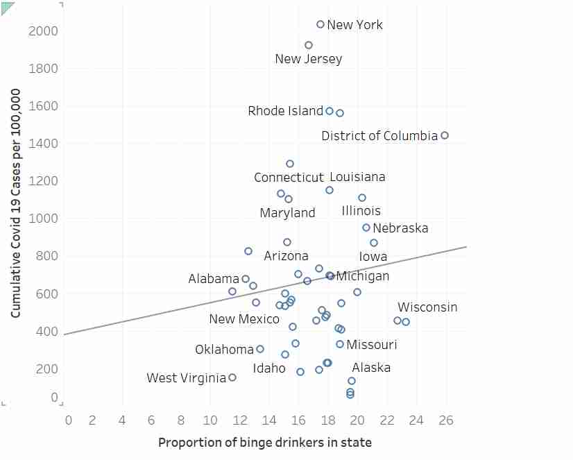
> How does that fit look to you? I don’t have access to the original dataset, so I can’t check it, but I’m guessing that the correlation there is somewhere around 0.1 or 0.2 – also known as “no correlation”.
But small correlations, if they actually exist, can sometimes be of great practical relevance. So that's not it either.
The actual problem is that the correlation isn't statistically significant – there isn't enough evidence to conclude that the observed (small) correlation actually exists, as opposed to being the result of random noise in the data. And indeed, as some other comments here point out, you can get similar graphs by fitting lines to randomly simulated fake data.
(If you prefer a Bayesian gloss: the data isn't informative enough to move you off any reasonable prior with most of its mass around zero. Same principle.)
Agreed. I was curious enough to run the model myself so I used a tool to extract the data. The slope estimate (b=17.24) is not significantly different from zero, p=.437.
In case anyone is interested, below is R code to read these data and compute the regression. The summary() reveals the p value for the slope to be 0.437, and that for the intercept to be 0.32.
    d <- read.table("https://pastebin.com/raw/HhWTKZRb", header=TRUE)
    m <- lm(cumulative_covid19_per100000~proportion_binge_drinkers, data=d)
    summary(m)
The problem is that the author is essentially claiming that running the regression for data not passing his eyeball test is, in itself, a misuse of regression...which is nonsense.
I'm not sure I understand your point. Did you actually look at the regression line through the data? It looks crazy off. I'm not a statistician but that line looks like it doesn't represent that data very well at all. People area also saying nuanced comments above but the underlying fact seems to be that this is not a good use of linear regression, and there is no strong correlation between the two axes.
Without access to the residuals, I'd still venture to guess that the assumptions of the regression are not severely violated in this data set.
When this regression is conducted, the null hypothesis is not rejected (regression slope not significantly different than zero). If someone is somehow arguing this regression rejects the null hypothesis, then they would be incorrect. But there is nothing wrong with using regression here. Its kind of the whole point. This is basic regression statistics 101.
Error bands on the regression slope would help people understand the uncertainty of the apparent slope.
Eyeball tests are often misleading, or fail to detect weak correlations (or deviations from model assumptions such as heteroskedasticity). That's why we check with more formal methods.
What are some examples of data sets with high(ish) r with high p (low confidence), and low p (high confidence) with low r?
I guess it would be a very tall, "sharp cornered" parallelogram of data points (clear slope at the average, but high error variation), vs a very short, wide rectangle?
> First, it's not necessarily wrong to fit a linear regression to data that might not be from a linear model, or that you know to be nonlinear. The data could be linear enough in the region of interest for the line to nonetheless be useful, for example.
Yes, very good point! Likewise regression is not robust to log transformations, but we still use log transformations (depending on the data) because we may be able to tolerate some loss of information. If the nonlinear correlation is bounded below some tolerable amount it's okay to use the linear relationship on its own.
What do you mean it’s not robust to log transformations? A log transformation changes the inference to be about the conditional geometric mean, certainly (the log of an average of x is not equal to the average of a log(x)), but this is often quite sensible.
The way I'd say it is that the uncertainty of the value is large compared to the value itself. Just thinking about the causal mechanisms, drinking (binge or not) with other people could put you at risk if any of the other drunks are infected. But drinking alone might help protect you from covid, since it is a way to avoid other people.
Overfitting is insidious. These graphics would convince a lot of people who'd otherwise catch the error in the article without needing it to be explained to them. At that point it's not enough to eyeball the line of best fit, you have to sanity check the explanatory power and do cross validation...
Yes, this article should parade the p-value to make its point and for some reason it doesn't.
On p-values and linear regression in general, though: when you're new to inferential statistics applied to really complex data, such as anything that relates to human behavior, you go through this "clearly that's not a linear relationship" phase. But that's not really the point. You can choose any sort of function you want to maximize r, the options are endless [0]. But linear regression has a distinct advantage in that you can interpret the model coefficients as meaningful numbers. You can say things like "for every 5% increase in the proportion of binge drinkers in your state you can expect an X% increase in the proportion of the population that will get Covid" ...if the model satisfies some significance parameter threshold, like p<0.05, and, you know, correlation equals causation. Everyone knows that. Anyway, with your great 4th order polynomial, all you can say is "see, it fits!"
About significance thresholds. Yes, they are totally arbitrary, another realization in one's journey with frequentist statistics that is quite deflating. Still, we need a rule of thumb so we use things like p<0.05 and have a bunch of fancy ways to account for things like multiple comparisons, which increase the likelihood that some spurious correlation would have appeared to be significant without such adjustments.
This stuff is all super-useful when used appropriately. That's why, when you need to create a model (outside the Bayesian/ML anything goes world) and you need to get it right, the first thing you do is reach out to your trusty PhD statistician friend. At least, that's what I do. They spend countless hours to get to a place where they can say "in this situation, I would suggest..." I'm glad some people are into it that much.
> I said that if you had reason to believe in a linear relationship, then you could try to find it. That’s the huge catch to linear regression: no matter what data you put in, you’ll always get a “best match” line out.
This challenge generalizes to all model fitting. Incorrectly assuming a distribution is Gaussian is a big one.
When I applied to my MSDA program, I had to interview with the lady who would become my first year mentor. "Now, do it over again... on paper." That's what she'd say to anyone too confident in their outputs. She has a reputation for weeding out people who can pass the entrance testing and qualifications, but can't adapt. And what we do requires thick skin. You're wrong until you just happen to be right.
This is what stresses me out about people doing "bootcamp" data science courses and then getting jobs where they're given the responsibility of making decisions based on analysis of data.
Statistics is more involved than it appears, there are so many ways something can subtly violate underlying assumptions, or appear to be fine on the surface while being actually meaningless. It's really easy to fit a model, it's more involved and difficult to actually understand the complexities.
The variable of interest may not have a Gaussian distribution, but its expected value and variance generally are. Sure, there's some pathological cases, but the Cauchy distribution doesn't show up that often.
(Read: If X and Y are normally distributed random variables with mean 0 and standard deviation 1, then X/Y is equivalent to a Cauchy(0,1) distributed RV. This is a useful equivalence to know if working with standard normal RVs, which is often. E[X/Y] does not exist!)
If X ~ Cauchy(0,1), then X ~ normalized student-t distribution.
(student-t puts the “t” in t-SNE, where it acts as a weighting function on the Euclidean distance between points. UMAP uses a parameterized version of this weight function that is essentially a generalization of the Cauchy distribution: https://jlmelville.github.io/smallvis/umap.html)
This person has no idea what they're writing about.
Edited because my post was flagged (I'm not sure why). The definition of correlation coefficient is incorrect, which could have been attributed to a typo, except the author goes on to say "The bottom is, essentially, just stripping the signs away.", suggesting the square root of a sum of squared differences would be the same as the sum of differences, were it not for the signs. That's not how norms work.
The whole paragraph on interpreting a correlation coefficient is particularly painful to read: "... if the correlation is perfect – that is, if the dependent variable increases linearly with the independent, then the correlation will be 1. If the dependency variable decreases linearly in opposition to the dependent, then the correlation will be -1. If there’s no relationship, then the correlation will be 0."
For all its good intentions, I feel like this post hurts more than it helps.
Could someone link to original article? Didn’t see in post. Notice that they don’t cite what the authors’ computed R^2 was but conjectured it was low (and I agree that it is likely low). Thus, doesn’t appear to be a case of blind p-hacking off the bat.
Could just be really bad. However could be that:
- The conclusion of the paper was that no relationship exists.
- Later specifications include covariates. For example, including travel flows here could help to disentangle cultural mores regarding drinking and probability that ANY virus was transmitted to place.
- some sort of weighting was done. Although in that case I would expect to see a steeper slope to account for New York. Usual practice here would be to display the univariate relationship with circles that are sized to match weights.
- Graphs like this can play tricks on your eyes. There might be a lot of dots clustered along the fit line that are overlapping etc.
Ultimately, the author rejected the use of regression by using an eyeball test.
Eyeball tests are not rigorous, and can be misleading. Further, the purpose of regression is not just to obtain the slope via least squares in the case of obvious relationships, but to provide a test of the null hypothesis (slope = 0) of weaker, but theoretically interesting relationships.
This type of amateur (and wrong) statistics article shouldn't be making it to the top of HN.
I will remember this. Not the exact article, but the general spirit of knowing how to incorporate those endless statistics books/ articles/ resources into a tool I can use to detect errors. Maybe I'll even graduate to judging them.
Yes. If you have enough radiation dose you'd need more than 100% chance of failure.
A much better model is that the number of spots where the chip was destroyed by radiation is a Poisson distribution with lambda linear in the size of the radiation dose. For low probabilities of failure, the probability of failure is approximately lambda, which is linear. For large lambda, the probability of at least one failure approaches one.
However this more accurate model, in the case of interest (low probability of failure), linear is the appropriate approximation. And a small child should get the simpler version and not the complexities of Poisson.
First, it's not necessarily wrong to fit a linear regression to data that might not be from a linear model, or that you know to be nonlinear. The data could be linear enough in the region of interest for the line to nonetheless be useful, for example. Sure, you need an underlying linear process if you want certain theorems and guarantees to apply. But with any data set, linear or not, regression still gives the best linear approximation to the conditional expectation function.
Second, the following paragraph seems to imply that small correlations are the same as no correlation, and the reason the regression is problematic is that the correlation is small:
> How does that fit look to you? I don’t have access to the original dataset, so I can’t check it, but I’m guessing that the correlation there is somewhere around 0.1 or 0.2 – also known as “no correlation”.
But small correlations, if they actually exist, can sometimes be of great practical relevance. So that's not it either.
The actual problem is that the correlation isn't statistically significant – there isn't enough evidence to conclude that the observed (small) correlation actually exists, as opposed to being the result of random noise in the data. And indeed, as some other comments here point out, you can get similar graphs by fitting lines to randomly simulated fake data.
(If you prefer a Bayesian gloss: the data isn't informative enough to move you off any reasonable prior with most of its mass around zero. Same principle.)