The amount of scrutiny UI changes would need to go into production should exponentially increase with how long the existing UI has been in production.
We really need to stop changing UI for the sake of changing it. Nothing in the laws of nature, nothing of any fundamental significance, nothing in any rule book or of any engineering consideration says that UI belongs to a particular era or it’s “outdated”. More often than not, it’s purely some designer’s personal taste.
Even if the current UI sucks, changing it should require serious justification and weighed against retraining millions of people.
We need to treat GUI as a specification and a contract to the users. With APIs, we version them, we're incredible careful to not break the client's code. If there is a new change, we'd create `v2/foo` to access resource foo while still maintaining v1.
I think graphical interfaces are exactly the same. Instead of `GET` request, it's our eye balls consuming data from a 2D space of a computer monitor. Whenever GUIs break, we suffer from the disparity between expectation and what we're seeing. Breaking GUIs should be treated with the same level of rigor and respect as REST APIs (and other specifications/contracts).
My team does this. We don't really track the layout of a GUI (read: web, desktop, or CLI) but we do track inputs, output, and behavior. That said, it is very expensive to do this in terms of time and the amount of overhead it will add to each iteration of the SDLC so I can see why teams would rather not.
I think an interface that could be defined and iterated on is what Mozilla used to have with their chrome UI specification layer, and I think they mothballed that a few years ago? At least I think it was called chrome, it's not exactly easily searchable anymore.
Edit: Actually, I think I'm thinking of XUL? I'm not sure how much it's still the standard for Mozilla UI specification or not.
Scratch all that, let's just change it anyway and optimise for the following metric: looking good in screenshots (notice how trends like ungodly amounts of whitespace, flat widgets, flashy animations, are all explainable by optimising for subjective style over usability). For fuck's sake.
If every "modern UI" designer was required to go through a single hour of senior citizen IT support, most would realize they need to confess their sins and beg for forgiveness.
It's incredible how much modern UI design principles just... blatantly conflict with reality.
History is full of failures where they did almost exactly that, just without the "re" in front of "training". The creation of that weird MS Office toolbar thing for example must have consumed a large fraction of the last remaining blank slate non-users in the experiments that led to it's design.
For me the ribbon is completely stupid as you have to constantly click 2 times for the features you want to go from one toolbar to another.
And worse, you often have to click through multiple of them just to find the function that you are looking for. It is even more difficult as each one will have its buttons of random size, aspect and randomly placed.
Funnily enough, I just installed windows 10 on a old computer for somebody, and the new office online that's installed defaults to "ribbon simplified" view which looks like the old office before ribbon
Similar, nothing in the laws of nature, nothing of any fundamental significance, nothing in any rule book or of any engineering consideration says that UI should never ever change.
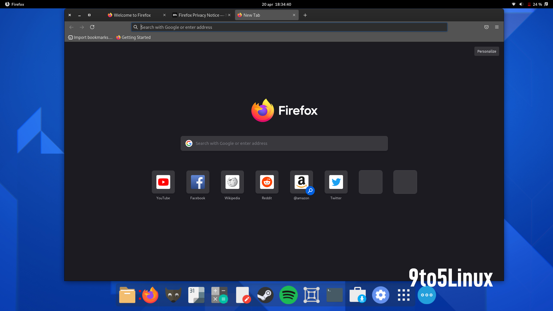
It doesn't seem like this new UI does much in terms of changing UX though? Besides compact mode being hidden this looks like more of a new "skin", so there's nothing new to be learned to use it.
I think it's more about, what will they be able to claim as an achievement on their resume. None of them want to say "kept the site majestically usable in the same way so that ever larger ecosystems started depending on it", even though that's what we want.
Design and implement the UX and UI for actual distinguishing features. Or improving the settings menus, the "customize" view, adding more tab management features (adjustable minimum tab width?), et alia.
I can clearly feel a mild dopamine rush every time the UI of an app/service changes - independent of whether that being an actual improvement. I suspect this effect to be even stronger for a majority of users. From that pov changing the UI is a marketing instrument.
I really wish this went into more detail, or linked to a technical change log. What does this even mean:
> Fewer interruptions: We’ve removed unnecessary alerts and messages.
What messages were removed? What if they were useful to me?
Also, it appears that they're sticking with their decision to remove a useful menu setting (compact mode) and hide it in about:config[0]. I guess I should count my blessings that they aren't removing it entirely. If anything, they should remove the standard size mode - I want to see less of my browser's chrome when using the web, not more.
> compact mode) and hide it in about:config[0]. I guess I should count my blessings that they aren't removing it entirely
I see this is your first rodeo. Probably within 2 years the story will change to "removed rarely used setting to minimize maintenance burden". Make no mistake removing it from the UI means the feature is already dead
Yeah, making the browser's chrome _bigger_ is a really weird choice. A whole lot of work has gone into making the browser chrome as small as possible. By default now, the bookmarks bar is gone, the menu bar is gone, toolbars are gone, the title bar is gone, some browsers even remove the tab bar when there's just one tab. Using _more_ vertical space for the chrome, without even providing new or improved functionality, seems like the exact opposite direction of both what users want and the industry trend.
I really like the current Firefox design, and it doesn't get in the way. I hope I'll learn to like this new design too once I get to use it for myself.
I feel like this is an extension of the "make everything tablet-friendly" design trend that seems to have taken over GNOME development (who in turn clearly got it from Apple).
In fact, the new UI reminds me quite a bit of the GNOME Epiphany browser.
It's not bad... I guess? I don't like it, personally.
I also don't understand why they're spending any amount of time on this.
With touchscreen laptops I don't mind a more touch friendly mode. Though ideally it would only take extra space when touch input is available on the device.
Thank you for pointing out the about:config setting. Looks like the new compact mode is roughly the same density as the old normal mode. Definitely a loss.
When will they finally incorporate the tree style tabs into the browser? I don't need a new look, give me better, more productive UI changes... I get there are extensions already (1) but having this functionality be incorporated into the native browser will make it faster and possibly even more usable (like allowing us to select and bookmark all the tabs in a tree view as well).
Aside from the necessity of ad-blocking, this is my favourite add-on for usability, although you can overuse it. Sometimes I have 5 browser windows open with tree tabs everywhere.
Yet another form of externalised memory. Just need to remember backups/bookmarks.
in this context I meant the bookmarked tab data itself was saved in a tree data structure so one could visualize the data later in a tree fashion as well. Currently when you save all the tabs, they lose their child-parent relationship
Oh god, please stop with the UI/UX churn. If I knew nothing about Firefox outside of browser updates I would think the parent company was overflowing with money and devs/designers were hunting around for makework projects. It would certainly explain why they keep "improving" the UI every year by changing, breaking, moving, adding, removing, redesigning, and redesigning again all of the basic functionality.
It's all a massive waste of time for what users they have left. Most people just want their browser to be a reliable tool that lets them get to the content they're interested in. Facilitating that appears to be towards the bottom of Mozilla's priority list, below random hobby projects, talking about social justice, UI redesigns, and increasing executive compensation.
- icons are thinner than before, making them harder to see (hmm, they're actually inconsistent, some are thick - search icon, and some thin - navigation icons)
- lack of countours makes toolbar input fileds harder to discern (I can still have separate search field, so at least that's good)
- new colors are meh, looks like random variants of grey + tinted background for the toolbar, which looks very out of place. just keep it grey, it would look less out of place
my pet peeve about popups is that some of them can't be distinguished from popups created by the website.
for example when firefox asks me if i want to allow notifications, i can't tell if the website is trying to trick me in clicking on something malicious.
browser UI elements should be clearly distinguishable from website elements. hopefully those updated prompts will fix that.
I've just been upgraded to v89 and have this new theme. There are no borders around my tabs now, which make it stupidly hard to differentiate between them (as someone who keeps a lot of tabs open).
One exciting thing in Fx89B -- and which you can see right here on HN! -- is that unstyled form fields have had a bit of a facelift. The text area I'm typing in right now, for example, looks much cleaner with clearer focus styles and slightly-rounded corners. It's not a huge deal, but it does mean that standard form controls are on their way to being consistent in Fx across platforms, and thus more acceptable to just plonk in and use.
It reminds me a lot of Big Sur, even on Windows. It looks okay, but the tab bar now takes up more vertical space for no apparent reason -- other than looks -- which I'm really not a fan of. It's just wasteful. But that seems to be par for the course in user interfaces these days.
It's weird they took out the icons in the hamburger menu, they are useful visual cues especially for non power users who are not familiar with whith shortcuts.
Otherwise I like the look of it but it seems like totally unnecessary. I don't understand why they invest so in new ui changes.
MIDI is not very fringe, and far more people have MIDI controllers than VR headsets, yet Mozilla puts resources into that. My roommates aren't too technical, but all of them have MIDI controllers, and one has made an entire EP on the browser (in Edge!).
It's true if you consider UI to be more about empowering users, making easy things easy and more difficult things possible, rather than just good looks. I think a valid argument can be made that repeated firefox ui changes have had to do with good looks and not much else.
I guess I’ve been using this through Nightly, and I’ve gotta say it’s a significant improvement all around. Thinks feel lighter, without having made any fundamental changes.
I'm on the beta channel and the only regression for me is the fact that the url bar is hard to see – it's a shade of gray similar to its surroundings. It feels like it costs me more attention to click on it, which is bad, since it's the most used UI element.
Oh, wait, I'm also missing the separators between the tabs, and the tabs, once you have many of them, seem smaller than before and show only four letters of the page title..
The year is 2070. Advances in ultra-high density displays have finally realised modern designers' wet dreams of having fonts whose lines are only 1 micrometre thin.
I can't think what's more idiotic in those screenshots. The ungodly amount of whitespace, or the checkboxes-turned-slideswitches (despite the fact that the "slide" metaphor doesn't even make sense outside of touch interfaces), the gray-on-gray colour scheme ("accessibility, what's that?"), the neon-blue accents marketed as a "calming, fresh new design"...
The text in the menus / tooltips depends on your system. That part is not specific to FF. It does match the rest of the gnome environment. (used for screenshots) I'm not sure the thin font complaint really belongs here.
> the gray-on-gray colour scheme ("accessibility, what's that?")
As long as the contrast is large enough, it doesn't seem like an accessibility issue. (Accessibility has to account for people who don't see colour) For accessibility you don't want black-on-white either, so you do need some level of grey. It would be interesting to see what does the high-contrast system setting do to the display, but otherwise... are you actually commenting about low contrast?
On the active window the lowest contrast I can find is 4.64:1 (for placeholder text in the address bar) which passes WCAG AA for normal text (AAA for large).
Your third link shows that they're adding sponsors to the top sites list. As far as I know that's kind of flying under the radar, previously the only ads on the new tab page were article recommendations from Pocket.
Thanks. Was this added in the last few versions? I'm usually on top of these things but I hadn't noticed that setting in the home page section of preferences until now. (For me, toggling it didn't add or remove any sites from my list, so it had no noticeable effect.)
Pocket seems to be the only menu item visible by default, and they've adopted the idea of searching on Google from the URL bar. Is Mozilla short on cash again?
My pet peeve is with the still half finished look, it jumps out as really garish now to when you open the dev tools and see the clashing styles or the bookmarks/history dialog that hasn't been updated in ages.
Not to mention the white title bar in some dialogs even with dark mode enabled.
if they had spent half of the time and ressources they wasted to constantly uselessly redesign things, to simply fix bugs and improve efficiency; then the user experience would be hundred miles better than today!
But sadly it looks like that they are only interested in eye candy tasks...
Or at the very least, the UX wouldn't be worse than it was a year ago! Just as an example: version 68 on Android (which I'm still using) had the ability to save a page as a PDF, and this is still missing from the redesigned Firefox for Android. Most extensions still don't work with the new FFA either.
I wonder if normal Firefox will ever let users permanently load their own extensions without having to have Mozilla 'sign' them first. I also wonder if they will ever let users permanently disable Firefox from checking for updates.
While annoying I see the benefit as a user and addon developer. It protects less sophisticated users from abuse. Though I do prefer Chrome's opt in to a dev mode without a whole separate binary.
there are examples of firefox protecting 'less sophisticated' users from abuse while still allowing them to go through with it if they really want to. such as, opening up the inspect element area and receiving a warning + having to type 'allow paste' to be able to paste javascript into the console. there's ulterior motives for requiring mozilla to sign extensions, and it isn't about protecting users.
Yeah, I was fully prepared to hate it, but it's actually
quite nice. Even switching from compact to normal mode
didn't take that much space. Them moving and renaming
some menus is a rather meh decision, but I guess it's more
of a matter of habit.
I have been using Firefox for 15 years and will never switch. For me it's the idea of supporting the underdog along with the security. Plus at this point I really know how to use it well!
> Colors in Firefox on macOS will no longer be saturated on wide gamut displays, untagged images are properly treated as sRGB, and colors in images tagged as sRGB will now match CSS colors.
This has always been just a about:config setting away, I wonder why they're changing this now, and why only on macOS. I've been using this setting on Linux for nearly half a decade now. (You just change gfx.color_management.mode from 2 to 1.)
Last I checked, canvas elements and av1 images weren't color managed. I wonder if they've fixed either of those with this change.
gfx.color_management.mode = 1 only worked vaguely correctly if all of your monitors share the same color space (or you only have a single monitor). Videos also weren't color managed, and there still existed some situations where colors would still be incorrect. (see: https://cameratico.com/tools/web-browser-color-management-te...)
This change effectively sidesteps the issue by making everything render to sRGB, and telling macOS that Firefox's windows are sRGB only.
> effectively sidesteps the issue by making everything render to sRGB
Wow, that seems ... really unfortunate? So on macOS, if I open a nice photo from a friend that's tagged with AdobeRGB, Firefox will downconvert that to sRGB? I hope they don't bring that change to any other OSes!
You're right that mode 1 is flaky and could use some improvements (video, canvas elements, av1 which is treated as video by the decoder...) but converting wider gamut graphics down to sRGB seems like a clear step in the wrong direction.
By the way, Firefox passes all the tests in the article you linked to for me.
Honestly, I'd rather have consistent and accurate colors across multiple monitors even though it would be limited to sRGB. Most content on the Web is for sRGB anyways, so it's not like much was lost.
It's still much better than Windows though... I clamp my wide gamut monitor to sRGB because Windows is so infuriatingly inconsistent.
Are you using the beta? If not, that's expected unless you have the mode=1 setting I mentioned in my top level comment. I have that set on Linux and everything works as expected. (I haven't tested this on macOS at all so it's possible the setting isn't even functional in Firefox 88 for Mac.)
In general I like the redesign, however, my one major quibble with it as a user of Container Tabs is it is now a little more difficult to see the Container Tab color.
The update to this version, with Firefox Developer Edition, breaks the browser under macOS. If the app is in the dock, you need to option-click the icon, then click the button in the window that appears that starts with 'Refresh' to un-break it.
Firefox still has a few UI elements that look like they haven't changed in 2 decades. Probably still using XUL. Wonder how all these UI changes pile up onto a very old codebase.
In Firefox, I would like to see the workspace feature which is already exist in Opera. It allows to you separate tabs as groups like Work, Project, Music etc..
After they f*cked up mobile version I stopped caring. This should die already or it should be taken over by someone who actually cares eg. Open Office ---> Libre Office
The new tabs seem to large and waste a lot of space. It also isn't intuitive what Tab I am on because I would expect the one I am on to be in the front, instead it always feels like it is set back for some reason.
I enjoy Firefox browser, and think it is important, I try and evangelize it as much as I can, I especially loved the container features. So if anyone from Mozilla is seeing this, please consider focusing your browser use case on power users, and instead of spending time and money on UI changes that don't do anything but create churn, focus on personalization, customization, and core usage.
Also please don't ever support FLoC the day that happens is the day I leave FF for good.
We really need to stop changing UI for the sake of changing it. Nothing in the laws of nature, nothing of any fundamental significance, nothing in any rule book or of any engineering consideration says that UI belongs to a particular era or it’s “outdated”. More often than not, it’s purely some designer’s personal taste.
Even if the current UI sucks, changing it should require serious justification and weighed against retraining millions of people.