For the OPs website, the top left (on mobile) uses the Ansible A, mirrored. Not a big deal just trying to make sure they’re aware that it’s trademarked
I honestly don't think there's enough similarity there to be considered any sort of trademark infringement. I think if Ansible tried to test that in court they'd likely get shut down pretty quickly. Just for starters, even if you mirror the A like you say, they're not the same font when overlaid for direct comparison. There's also the difference between an A in a black circle and four letters (APSE) side by side in a black rectangle. No judge in their right mind would see any sort of trademark infringement between those two logos.
Trademark law is less about these sorts of technicalities and more about the general impression in the mind of the consumer. Would someone confuse the two logos?
When seeing just the "A" as used in Apse.io's favicon, I wouldnt be able to tell if it was Ansible or Apse without double checking which way round each was, and which font each was.
Most of the "Kelvin Clein" fakes that you see are not actually skirting around the trademark, and rely on never actually being tested in court. At most it pushes enforcement from the front lines of "this is a fake" to the courts with "prove this is a fake".
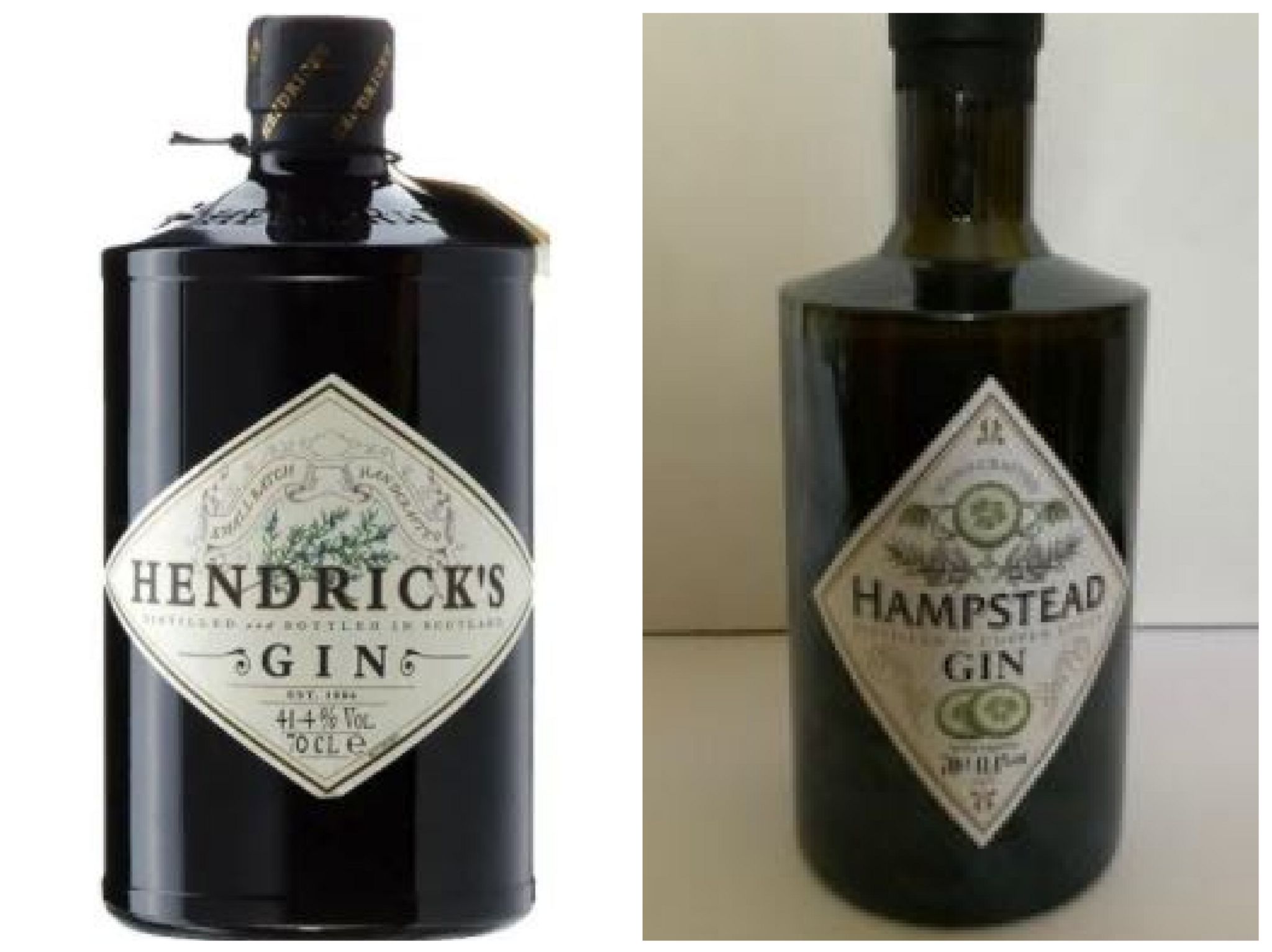
For instance, in the UK, an off brand clone of Hendricks Gin has been sued for trademark infringement and this article gives a good breakdown of the legal issues[0]. Examples of the different designs here[1].
Its not a given that Apse is infringing, or that Red Hat would sue over it. But given how much easier it is to change these things when the project is young, I'd suggest the author change the logo. Apart from anything else, the similarity to Ansible works against Apse's own notability.
Ironically not used a single time on the front page of ansible.com as far as I can see on my iPhone XR.
(I also couldn't find a single case of A in shaded circle on the APSE page but I admit I could be missing something.)