I was really pleased when Stack Overflow switched to system fonts [0] and hoped this would be a trend. With system fonts there is less cognitive load going from app to app. The font stays out of your way and serves its purpose best: presenting textual information.
Here we have the opposite: Twitter decided that tweet bodies should perform a marketing function. They sacrificed utility for brand cohesiveness. I understand the motivation, but there's a middle ground that serves both purposes: use your own custom font for the UI and use a system font for user-generated content. Gmail does this: the UI is Roboto, while the default font is "Arial, Helvetica".
The 'brand' needs to differentiate, though. And if Facebook's empire does it, so must Twitter.
It seems like when you're VC-backed and get to a certain size, one of the items on the checklist is "design custom font that looks like every other VC-backed platform's custom font, but is slightly different."
You are correct. They did make their own font. Which seemed like a very strange expense to me. Even though I use Dropbox heavily, I'll almost never see their font. Dropbox is used mostly through the OS's file manager.
Middle management becomes a bit of a circle jerk in large companies. They have to find reasons to justify their existence so you get branding initiatives like this to pump up the annual reviews.
I will plug my Firefox addon here which builds on this Firefox’s feature. Basically the add-on remembers the websites for which the user wants to enforce/unenforce browser fonts.
What does that do for fontawesome-style fonts (icons in the private area) that websites love to use instead of SVGs and text labels?
I personally block fonts via uBlock Origin, which lets me allow them for the subset of websites I visit regularly enough that I'm okay with allowing fontawesome-style fonts.
Firefox is smart enough to not block fonts that are used to render PUA characters.
It doesn't help with icon fonts based on ligatures instead of PUA characters (Google's Material Design framework seems to do this) but we can't have everything.
blocking remote fonts in uBlock Origin has zero effect on Twitter, just tried, unless you mean something else, in that case please enlighten me how to have back left column with same font as before
The first image shows https://twitter.com/newsycombinator with devtools on the right showing that the computed `font-family` for that one span has "TwitterChirp", and the uBO logger at the bottom showing that chirp-*.woff fonts were blocked by my uBO rules.
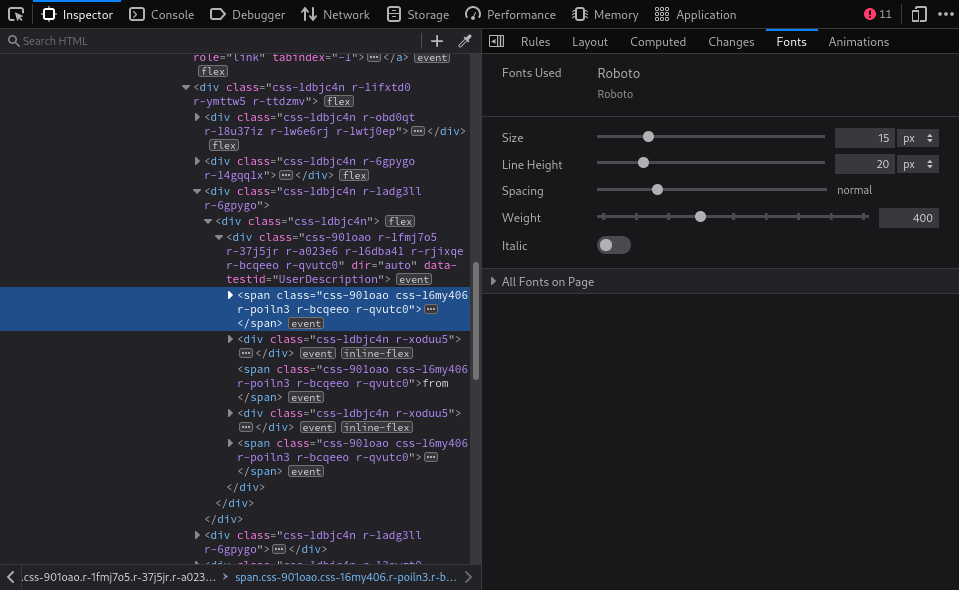
The second image is the Fonts tab of the dev tools showing that the font that the browser is using is Roboto, which I have available locally.
As for how I do it, see https://news.ycombinator.com/item?id=26284124 . If you don't want to go that far, you can still create a rule just for twitter.com that blocks just the chirp*.woff URLs.
When it comes down to it I find it rare that a custom font sparks any joy in me. I love typography and I started my career in design, so I don’t think I’m some old man yelling at clouds here.
They often seem to be the result of inexperienced design or design by committee. An unnecessary and distracting effort at differentiation or branding. In the worst cases you might even see a FOUT or have to endure downloading 5mb of zillions of characters of some fonts your browser will never draw.
I know there are cases where it’s tasteful and well executed. I love that. It just isn’t common in my experience.
On my team at work we created a sort of pros and cons list and for our use case (instantdomainsearch.com) it made virtually no sense to incorporate a custom font into our design. When it was all laid out and considered it really drove home for me how unnecessary it is.
The designs looked really nice and it seemed compelling, but in real life on the internet I just want things to 1) load very quickly 2) draw and become interactive very quickly 3) look and feel familiar in the right ways such that I can I intuitively use the software. Custom fonts put a stick in the spokes of each of those points.
For me, it was the opposite with Stack Overflow. I use the Consolas font literally everywhere throughout my Windows machine. It's the default and most common monospace font on Windows, and I'm used to reading code like that. Yet Stack Overflow started using Cascadia Code instead, which I'm not used to, and it feels like all the code there is bold, and some letters have strange proportions.
Maybe website owners could just use "monospace" in CSS and let users configure the browsers as they wish. But I guess it's too late for that now as users aren't used to do this.
Interestingly that means Twitter text is no longer fully portable. If you copy some text from Twitter, you specifically need Chirp to render it properly or else characters like their special logo character will be broken for all other fonts
Because they're using the "Private Use Area" of the font improperly...
Maybe I'm paranoid but I'm feeling like this is an intentional decision in order to push other fonts/foundries to start adding the Twitter logo as a standard Unicode character. Basically bypassing the need for consensus by just forcing the matter and cementing their logo in typography standards.
This seems a little paranoid, yes. :) What text do you envision copying from Twitter that's going to specifically include their special logo character? It's not going to be in anybody's tweet text.
> Because they're using the "Private Use Area" of the font improperly...
Uh, isn't putting your own characters in Unicode's private use area specifically what that area is for? Isn't that where fonts that have dingbats unique to them, for instance, would put them?
Not likely perhaps, but could this be one way to retain more copyright over tweets in the future?
Most companies based on user generated content try to claim ownership over it by way of agreements. That has always been murky legal territory and it's not easy to know what value they have.
If the proper rendering of content was made dependent on proprietary fonts, that could be one way to exercise control over where that content can be used.
It's not impossible that making users pick proprietary emoticons could have economic value. Remember where you heard it first...
I don't think this will push fonts/foundaries to add the twitter logo any more than I feel pushed to use the twitter logo in handwriting. Fonts are very nice in that the user still enjoys a high level of choice in the matter. Heck, even the twitter nonsense could be fixed with a stylus/tampermoney script of one or two lines.
To complement srfvtgb's point, even official unicode characters are not guaranteed to be included in all fonts. Having the glyph disappear on other platforms will probably be accepted as a fact of life, especially as it's a corporate logo.
Not a lawyer, but if the Unicode Consortium even tried to add their logo to the specification, wouldn't Twitter have to actively sue to stop them or risk having their trademark genericized?
Gut check: are there currently any trademarked symbols in Unicode? I can't think of any offhand, and it I find it difficult to imagine it happening for precisely that reason.
The well-known laundry symbols are trademarked apparently, and while there is a proposal to include them into Unicode, this might in fact be blocking it…
These are trademarked for other reasons than a company logo though, and I don't really see the point in including company logos (which might change or disappear tomorrow if they go bankrupt or are taken over by another company—and then what with the company logo in Unicode?).
It looks like they've put a picture of an apple in the Private Use Area as well at U+F8FF. Weird; there's no need for the PUA there; just pick (heh) U+1F34E (red apple) or U+1F34F (green apple).
That’s a holdover from MacRoman.[1] If you’re on a Macintosh, Option Shift K at least on the standard US layout. Still comes up in Apple docs and user forums.
Yes, welcome to Corporate Typograhism™ where big corp takes an already existing (copyrighted) font -- change it a little -- then release it as their own.
The implication that this is a practice being used to skirt copyright is wrong. In almost all cases the font foundry is commissioned by a company to produce a distinct (or not so distinct as the case may be) variant of a typeface/family, licensed to them for their use - as an alternative to having the foundry create an entirely new typeface from scratch.
Ironically making it not even that unique amongst "social networks", since Depop adopted GT America as their brand typeface back in 2017. Whilst Depop is technically a shopping app, it's one with a heavy skew towards social networking functionality.
Though to be fair, Depop uses GT America Extended and Expanded, rather than Standard.
This looks very much as if the font renderer is aggressively hinting to the pixel grid vertically, but not horizontally. That’s a known trick for getting a decent compromise between crisp text (along the baselines and tops of letters) with subpixel horizontal kerning.
I doubt the Android renderer is really broken and no-one has noticed until now, so I’d guess the font either has bad hinting, or more likely it’s just being displayed at an awkward size and vertical positions are being rounded in an awkward way. You can see the slight deviations from the baseline in the iOS screenshots, it’s just much more subtle as it isn’t being hinted.
> I doubt the Android renderer is really broken and no-one has noticed until now, so I’d guess the font either has bad hinting, or more likely it’s just being displayed at an awkward size and vertical positions are being rounded in an awkward way. You can see the slight deviations from the baseline in the iOS screenshots, it’s just much more subtle as it isn’t being hinted.
Having developed for Android off and on over the years, I would absolutely not rule out the possibility that there's been a really basic problem with font rendering, reported in 2008 and repeatedly closed as stale on each version release then re-opened, with the most recent "any progress?" post dated 3 weeks ago, that everyone's just been quietly working around.
https://mobile.twitter.com/mcclure111/status/142554526675777... is the tweet with a screen grab of the very fucked-up way it renders on Android, in case Twitter decides to hide that part of the thread for you like it does for me. It’s really astoundingly nasty-looking.
Probably a case of a monoculture of designers and/or developers on Retina Displays and Apple's renderer getting the benefit of extra pixels per inch of the usual font sizes?
This seems really common with tech companies that the fonts they like for "crisp" and "light" look great on Retina Displays and no one thinks to check any other display or OS font renderer. I feel it's also why the designers at so many companies right now often accidentally favor (display) fonts with hints and weight tuned for headlines, high DPI printing, and/or large uses (banners) for places where body fonts with thicker weights and better hints for smaller font sizes on less pixel dense displays would be much better for everyone involved.
(Though some of that belief that it is such a widespread problem comes from my bias from ugly personal experience of getting designs handed to me from the only macOS users in an entire enterprise and having to point out their font choices were entirely inappropriate on anyone else's displays in the company, and being the only one to point it out and easily ignored because I wasn't a designer and what did I know.)
It may indeed be a problem with hinting. Certainly two o's render very differently on my screen. I first tried to show what I saw by doing a screen grab, but then realized that the image apparently looks different on my screen vs others.
Now I realize that for others to see it, a good zoomed photo with my phone will go a long way:
I just realized that this must not be the chirp font at all, based on looking at the g. This must be some fall-back font. oops. Still it looks terrible.
Apparently some font renderers are bugging out on this new font making some letters render in a way that looks misaligned, which is very taxing on the eyes.
The screenshots are horrible quality, it's effectively a meaningless comparison. (And even if they weren't, comparing two fonts using Windows' font rendering is an exercise in pointlessness since the heavy hinting destroys small differences anyway.)
I forget when this has been discussed before but a lot of major digital companies (Apple, Microsoft, Adobe, etc.) end up creating their own fonts for legitimate business reasons that are totally unrelated to design/usability. I can't seem to find the reference, but I think it had to do with licensing/commercial reasons.
A lot of font foundries switched from one-time lump-sum payments to pay-per-use, thinking they’d make a whole bunch of money from the scale of big digital companies, and not realizing this would just cause these companies to design their own fonts instead. Really short-sighted IMO.
From your description it looks to me like the foundry industry moved from one-time lump-sum for everyone, to one-time lump-sum (font designing cost) for some rich companies, and pay-per-use for everyone else.
Primarily, any license fees your don't have to pay for billions of per-use occurrences is money saved. In Twitter's case: that's a lot of money.
But there's of course also the whole "Your honor, as the evidence makes plain, this content/communication is claimed to have originated on Twitter, but does not use our official typeface. We move to dismiss this case/be awarded damages based on the fact that we were not part of this particular incident", paired with "Your honor, as the evidence makes plain, this content uses our proprietary font, but did not originate at twitter. We move to dismiss this case because we were not involved/be awarded damages on the basis us defamation and will be filing a counter-suit for impersonation".
There was that incident a while back where a bunch of government leaks were outed as fake because they were printed with a (default MS Word) font that was not available or in use when the document was purportedly created
Then Pakistani Prime Minister Nawaz Sharif tried to cover up a scandal that was revealed in the Panama papers back in 2014. He forged a document purportedly from 2006 using Microsoft's not-yet-released font Calibri as an attempted cover story.
I'm sure you know this, but for others: This is a cost-saving move.
It's always more economical for a company of Twitter's size to develop their own font because 1) Then they don't have to pay per-use licensing fees, which are huge at the billion user scale, and 2) a peculiarity of copyright law means that the actual shapes of the letters aren't actually protectable by copyright -- you can copy an existing font virtually 100%, tweak a thing or two, and legally call it your own.
That's obviously true for system-provided fonts but fonts like Helvetica Neue aren't typically available on any platform by default and has to be loaded in...
> a peculiarity of copyright law means that the actual shapes of the letters aren't actually protectable by copyright -- you can copy an existing font virtually 100%, tweak a thing or two, and legally call it your own.
IANAL but this is only true in some jurisdictions, primarily the US and Japan.
Also, I don’t think it’s quite that simple either. The actual type face may not be eligible for copyright, but the computer code describing the particular curves and hinting rules and etc. is. So I think you can’t just trivially copy a font and modify it and call it your own.
> a peculiarity of copyright law means that the actual shapes of the letters aren't actually protectable by copyright
Warning: offer not applicable in UK and most countries in EEA. They have the concept of protecting designs there. Japan excludes most designs of fonts because of its utilitarian use BUT if the font (technically typeface) is distinctive and used in a way that can be defended as an artistic choice, it's protected under copyright.
Why not try, though? First and foremost, I think it's a good thing that designers are getting work. I also think huge "for fun" webapps are in a particularly advantageous place when it comes to pushing the boundaries of design, mostly because they have people on hand who can do it and who probably want to do it. Next, it's really a low risk preposition.
Maybe Office 365 needs to be conservative with fonts. Twitter can push boundaries, though. I wish they'd push boundaries more, ala Bertone or Memphis Group, but I guess the risks are larger the more you push the boundaries.
> "Maybe Office 365 needs to be conservative with fonts. Twitter can push boundaries, though."
What's the difference between Office and Twitter here? Both are apps that should just get out of the way of the content.
Most software should just have native UI that follows the platform guidelines. Unfortunately software companies hire graphic designers who know nothing about interaction design, and generalist programmers who want to do one-size-fits-all UIs. And that's how you get unreadable fonts in slow Electron apps.
Why not try? Because the cognitive dissonance when people's eyes and brains run into a large variety web-based and app-based screen fonts. Web based font performance is still terrible. So.. because: the brain doesn't like it.
Different presentation fonts in web pages, desktops, etc. can start to have the experiential impact of (gui) skins, or non-standard dotfiles.
Please note the things I'm leaving out of this... print, books, static things, etc.
Yes but we want a comparison. I check Twitter election to election. There is no way for me remember the old font. Let alone compare it to this new one.
Look at the source code of Twitter or Facebook. It's intentionally obfuscated and mangled, probably in part to fuck with ad blockers.
I have a few user stylesheets (even a little custom Firefox extension to block one user's comments on a site I frequent), but the sites I'd really like to use them on largely don't make it possible to do so.
Look at a Facebook ad in your browser's web inspector, for example. The "Sponsored" tag is made up of 31 different randomly named span tags. https://imgur.com/a/AHZL8ko
> Look at a Facebook ad in your browser's web inspector, for example. The "Sponsored" tag is made up of 31 different randomly named span tags. https://imgur.com/a/AHZL8ko
Tangential, but I love the image of a frustrated PM at Facebook hearing the news that "hey, you still have to make this label readable to screenreaders," necessitating an `aria-label` with the plain-text content "Sponsored", which makes all their span-chopping junk completely irrelevant to adblocker rules that can now just look for that string as an anchor :)
It took a while to setup, but fixing the problem in the font rendering layer has worked really well. Several years ago - after being annoyed by blurry/bad fonts, extremely bad hinting, and other font problems - I spent a few weeks investigating the way fonts are rendered and a few more weeks comparing many different fonts and various permutations of rendering/hinting methods. The result of all that work included a set of fontconfig files with long lists like this;
    <fontconfig>
      <alias>
        <family>Arial</family>
        <prefer><family>Ubuntu</family></prefer>
      </alias>
      <alias>
        <family>Helvetica</family>
        <prefer><family>Ubuntu</family></prefer>
      </alias>
      <!-- Many more aliases that -->
      <!-- force fonts to Ubuntu. -->
      <alias>
        <family>sans-serif</family>
        <prefer><family>Ubuntu</family></prefer>
      </alias>
    </fontconfig>
This way, my font overrides happen in any software that uses fontconfig (i.e. most X11 software that uses TrueType fonts).
I assume any problem or slowness I have with a website on Safari in MacOS or iOS using a content blocker is due to the website wanting to track me or otherwise for advertisement purposes.
You don't need to use website font's. You can configure the browser to use your chosen fonts. It's a normal accessibility option on the browser config page.
The only problem is devs who use fonts for icons, which is as stupid as it sounds.
(It would be nice to also have minimum font weight setting, not just minimum size, because some designers just can't be helped and use <=200. Then most of the issues with typography on the web would be solved.)
The business model where you need to stop your users from hiding ads was not compatible with things like user stylesheets. If CSS compilation didn't obfuscate class names and such, it'd be quite compatible.
Not only that, but when they inevitably change the font again, it would be nice to be able to read a then-old article to see what the font looked like when it was announced.
To anyone saying "Users will complain about anything", I'm on a Windows desktop and this is honestly the most unpleasant reading experience I've had on any big website in recent memory.
There seems to be an issue with the OS antialiasing that is rendering characters slightly blurry to feel it's not focused, further straining my eyes.
Seems to have only been tested on Bay Area Apple devices.
Funny, all the e's look about the same to me. Do you just not like the style? That's not my complaint about the o's. I'm complaining that some are square and some are round. Specifically the o In "Notice" looks roundish and the O in "Today" is squared off.
Look very closely at the o in "Notice" and the o in "Today"... I see that if I zoom in to the image it looks better than when I zoom out, so there is clearly some interaction going on with the video driver on my screen at 100% zoom that makes it more obvious for me. But the two o's are not the same, the o in Today is narrower, and ends up looking squared off on my screen, and the o in "Notice" looks rounder and more open.
Now I realize that for you to see it, a good zoomed photo with my phone will go a long way:
I think this is just horizontal antialiasing kicking in.
The o in “Notice” happens to start slightly to the left of a pixel boundary, so it has a narrow strip of very light pixels on its left side (pixels with maybe 10-20% coverage). That makes the boundary look fuzzier and rounder.
The o in “Today” is probably more or less flush with the pixel boundary, so its left side has dark-coloured pixels (80-90% coverage).
It’s likely also the case that it isn’t scaling the luminance to account for sRGB properly. If a pixel is say 20% covered by black-on-white text, you multiply 255 by 20% to give a linear brightness of 51; but for onscreen display this should be converted to sRGB, which is around 124 (gamma ~2.2). If you don’t correct the gamma, the left edge of that o is much darker than it should be, so it looks square rather than rounded off.
Opinions differ as to whether text should be gamma-corrected! If you don’t correct the gamma, it looks darker and sharper, which many people prefer. But it’s actually sharper because it’s more aliased, which exacerbates the kind of moire glitches you’re seeing.
I personally prefer text with no hinting and correct gamma, as I think macOS and iOS do it, but it does look much fuzzier on low-res screens that way so some people dislike it.
The way marketing teams talk about asinine changes like this as if they are making deep, meaningful improvements to everyone's lives is just nauseating. It's a fucking font and no one was asking for it.
There are a million ways twitter UX could improve and this is almost the stupidest one I can think of.
Helvetica definitely was not designed with screens in mind—Apple replaced it with San Francisco for both a legibility and a brand cohesiveness purpose.
That said, this feels like a weird argument given that Twitter didn’t use Helvetica on any modern platform when it used system fonts. SF Pro, Segoe UI, and Roboto are all designed for screens unlike Helvetica.
Personally, I find Helvetica to be extremely sufficient for reading text on screen. Maybe it isn’t the best possible font, but I think their statement is kind of non-sensical, it makes it sound like it would’ve been a problem to use Helvetica… I doubt it.
It was Helvetica Neue, not regular Helvetica, in MacOS 10.10 Yosemite. In theory that variant had adjustments to make it more suitable for on screen use and I don’t recall it being particularly bad.
Yeah, that tweet was a definite WTF moment for me. Having to explain what cargo culting is to tech folks, is becoming more rare for me. Yet we continue to try to summon those gods.
I'm usually terrible at noticing typefaces (especially when developing to a design). But now this has been pointed out to me, I can't not see it. It's tricky to focus on and I can see why people are finding it troublesome...
Every UI change forces a cost on your users. It forces them to relearn the language of what your buttons mean (the Follow button semantics here are atrocious now, and give almost no affordances to users about what is going on).
Changes to UI reduce familiarity, and if they are fond of your product, that is usually a really bad thing. Having a good friend change personality is disturbing and unpleasant!
What is gained from these changes from Twitter, other than some employees are able to say they influenced the product? They may have tested with some users, but was the testing representative of reality? What risk was taken here for what amount of potential gain?
I wish this post was carved in stone in every consumer tech office. It is crazy to me how often companies produce negative value by redesigning their UI just for the sake of it. It's one thing if functionality has changed and you need to make a UI change to accomodate it, but reworking the UI for the exact same functionality is the equivalent of saying, "Our previous design was so bad we needed to burn a bunch of our and our customer's resources to recreate it. But trust us, this time we've got a good feeling about it".
I feel like Basecamp is the only company that gets this right. Want to radically redo your UI? Ship a new version and let your existing users continue to use the old version.
I routinely override web fonts in Firefox by deselecting "Allow pages to choose their own fonts, instead of your selections above". This would solve the desktop web interface. I use Verdana a lot for this purpose. Chromium browsers don't seem to have this override font option. Now you have found a new reason to love Firefox, you're welcome!
For mobile devices, you will have to use a third party app.
Sometimes, the corporately-chosen font is just empirically bad.
I stared it for a good minute thinking maybe I wasn't being served the new font, but no, it's just so similar to Helvetica (Roman) that I have to deliberately look for the differences to tell. I compared Chirp and Helvetica side by side and the only significant differences in the characters themselves are in the upper case J, Q, and R, then lower case g and the numeral 2.
Am I missing something or is it just that I go to twitter so seldom that I assumed it was always Helvetica?
Edit: it seems it's not the font itself, but rather something going on with the rendering making it blurrier for some people than the previous typeface.
There's something really strange that happened to me for over a year, and it's stopped. I can't remember what it was or why. I think using https://twitter.com (without the www), forcing https, and using Safari. Some combo of those things made the site almost never load properly. Try adding in a WWW or a different browser if you're interested.
is it actually objective qualities of the font that are giving people headaches, or is it just because it looks different from what the user expects, and twitter users are used to looking at twitter many times a day, so it throws their brain for a loop?
While it's hard to prove that this (or anything) directly causes headaches, Chirp has an unusually small x-height (stem width to x-height ratios would normally be around 1:6 for a legible font – Chirp's ratio is 1:4, very small) and an extreme x-height to body height ratio (the capitals are MUCH taller than the non-capitals).
The net effect is that even at the same "font size" you have to squint more to read anything, because non-capital text is very very small and tight relative to the rather large capitals.
I find handles and other bolded text are objectively difficult to read. Take a look at a bolded 'e' for a prime example; there is not enough whitespace, and the horizontal line is too thin, making it all but disappear in the middle of the bold curve.
> is it actually objective qualities of the font that are giving people headaches
The typeface pulls your left and right eyes toward each other, making you look at it cross eyed. It's incredibly nauseating, like the feeling you have right after stepping off a poorly-designed amusement park ride.
I don't use twitter that much. I find the font uncomfortable to look at on my windows desktop but not my macbook. Especially the left hand navigation bar. so, for me, it's not about the change but about the font in specific rendering environments.
Windows' font rendering just plain sucks compared to macOS, to a point I'm actually getting headaches. I know, subjective anecdata and all of that, but I haven't been able to pinpoint why exactly...
That's insane. I had crazy headaches yesterday (very unusual for me) and this could very well be the reason. I guess this is a good motivation to cut down on Twitter (now I just need HN to switch to this font as well).
just tried in My filters, left column looks still same (much thinner font than before), what am I doing wrong? W10 Pro (customs caling size 110) + Edge (Chromium)
Since most of the comments are negative, I will say I noticed the new font yesterday and loved it on my Windows computer in Chrome.
I switch between Mac for work and Windows for pleasure and Windows font rendering can be hit and miss.
I notice fonts on websites a lot and get frustrated when they're bad but this was one of the most pleasant ones I've experienced, to the point I went and looked it up. I didn't realize it was a modified Grilli Type, I've always enjoyed their fonts so not much surprise I liked it.
Maybe I'm being a curmudgeon, but I miss bitmapped fonts.
I use terminus wherever I can. It's exactly 12 pixels high (there are larger sizes, but they're not really useful). It's crisp, and clear, and easy to read, and looks excellent in Emacs.
There's no fancy font hinting or subpixel rendering. The font specifies exactly the pixels that it occupies, and that's it. If Emacs tries to render it at 11 or 13 pixels high, it doesn't -- it renders at exactly 12.
Some years back, firefox removed support for bitmapped fonts. So I had to set it to use terminus-ttf instead. This works fine in many places; the comments here in hacker news are being rendered at 12px so it looks pretty similar to the bitmapped font except with the addition of some subpixel rendering. It makes the edges of the letters soft and fuzzy but I would really prefer nice crisp, clean pixels. It's not too bad, though.
But in this comment box, firefox wants to render the text at 13.33px high, so it tries to upscale it a little bit and it looks muddy and terrible.
I guess things are different on a high-DPI display, but if you want to optimize the legibility of characters while minimizing their size, you really can't beat a bitmapped font where someone actually went and manually placed each and every pixel by hand.
I was about to dismiss these as complete fabrication and go on with my life. However, after looking at the font screenshot, I instantly felt a small pinch behind my eyes and at the back of my head. Coincidence ? Maybe, but it happened also with my SO and some members of the family (without warning them first).
So there might be a problem with this font indeed!
Same. I genuinely have no idea how something as big as twitter could botch this so bad. Is buying one of every majorly used device and handing them to a bunch of testers really not worth the effort?
Noticed it yesterday and thought the stylesheet had glitched on my browser as the font was soo bad but then later on it was trending so realised Twitter had just been stupid.
Was getting a headache from it.
This change can be undone for now using this JS: document.cookie="ab_decider=responsive_web_chirp_font_enabled=false&responsive_web_nav_visual_refresh_enabled=false"
If you don't like the new font or Follow/Following buttons, my browser extension/user script for Twitter can now get rid of them, screenshots in the release notes here (the latest Chrome version is still pending review at the time of typing):
I tried turning Chirp back on after a full day of coding at work and it's even worse when your eyes are starting to get tired, genuinely unpleasant to look at (on Windows, at least).
Yeah the follow buttons confused me for quite a while. I thought I was following a bunch of folks at first glance. Then I realized they've flipped the sense of outlined/solid buttons!
I’m a visually impaired individual with moderate disability — I can use tools like custom typefaces and zooming to manage most of my needs but I rarely use screen readers as well.
Personally, the main difficulty I have with the typeface is the kerning — the minimum space between two letters. I don’t know how these things are measured, if it really is as tight as it looks, but subjectively it feels like surprisingly little space. It’s much harder for me to read than Neue Helvetica.
I don't know about Twitter, but HN font (or colours, or spacing, I don't know) has always given me headaches. And I almost never have headaches otherwise.
I personally can’t stand reading Twitter, but I do like posting jokes and comments for my small group of friends. I built this to delegate posting to Twitter via GitHub actions from markdown files in the repo.
https://github.com/reidjs/markdown-tweet-scheduler
Huh. I looked at a side by side comparison and I could barely tell the difference. And everything on twitter.com seems legible. I guess I'm not typeface sophisticated enough!
Now the PayPal and Dropbox fonts... those I noticed. And those I loathe entirely.
This change appears to only affect posts in western languages, and users with multilingual content end up with a mix of fonts in their timeline, which doesn't look all that great.
But at least Twitter did not mix fonts within the same post, I guess.
You never know when something is going to crop up that causes you a headache. Personally, I can't use a phone with curved screen edges or a curved monitor without incurring a piercing headache after fifteen minutes or so.
Wow I thought something felt weird when I looked at the screen then looked away. I'm not dyslexic or anything but looking at Twitter with that font almost makes my head hurt, not kidding.
I don't know about headaches, but I do find this font decidedly less readable. The letters are too spaced. It does something to my brain that makes me have to slow down while reading.
My guess is the headaches either only happen if you use Twitter while drinking the new Coke Zero, or they only happen if you use Twitter while not drinking the new Coke Zero.
New font looks fine to me. But might be because I don't read Twitter every day. Didn't even know if the new font was active until I checked the Chrome inspector.
The font rendering feels broken on my Windows machine to me. Like the designer only tested it on a Mac and didn't account for how Windows renders fonts differently.
This is one of the reasons I always disable web fonts, in preference to the system fonts, so my browser interface is consistent with my desktop interface.
The difference is quite obvious, at least on Windows. Roboto is narrower, better hinted, has fewer embellishments, got a better consistency ("rhythm") and as a result it's much easier on the eyes. Here, side by side - https://i.imgur.com/tXokROR.png - Roboto at the top, Chirp at the bottom.
It also seems that chirp has unusually short ascenders and larger lobes/bowls. For example the 'h' character looks like a child drew it and much closer to an 'n' than one would expect.
Note: simple does not imply useful. Plenty of great content out there that strongly benefits from telling the browser not to use the extremely limited "web safe" fonts, or incredibly ugly OS defaults for non-latin content. Let along fonts for typesetting maths, or diagrams, or even smart things like "temporarily showing scribbles instead of real text, until everyone's clicked the "ready to share!" button on their shared page experience".
This is the nuclear option: it's simple, and also ensures a terrible experience of a web with content based on the fact that webfonts are going to work.
I can't stand this "twitter hates x" trend where articles use a handful of embedded tweets to make their case, but then you look at the engagement on those tweets and they have like 2 likes. Good job, you found a couple of random people on twitter talking to themselves. You can do that for any opinion under the sun.
Maybe people really do hate the font, but use some real numbers to make your case, not this anecdotal vox pop fluff.
Same here. It's like all those sensationalist political / culture war articles that frame some out-there fringe idea as a mainstream agenda (e.g. "Curry considered racist"). Then you actually read past the headline, and it turns out some unknown blogger or tweeter was just looking for attention.
Anyone going purely off of headlines, and taking them at face value, would have an absolutely bizarre worldview by now.
I can offer this; 99.99% of the time I hate font changes, especially from companies that I am used to looking at.
I'm not one of those hate any changes guys. I will admit if it works, don't touch it though. A lot of websites don't just work. HN just works. No need to change anything. It font change that irritates me.
Viacom/Comcast recently changed their font on their lousy viewing guide, and it's irritating.
Why? I think it a combination of, "you shouid get working on your lousy app, and not the font?"
Changing font is easy. Changing an api is better especially when it's needed, along with lowering price from customers who hate your company?
The new Twitter font looks so weird, and at the same time, it looks quite strong on the eyes. They should revert it to the classic one and bring back the fleets.
The new font is also destroying Arabic and Farsi text. Does Twitter not have a single Farsi or Arabic speaking employee?
This is an indication that they really don't value diverse employees there. Can't believe no one was like "hey this is destroying readability of these two major languages."
Here we have the opposite: Twitter decided that tweet bodies should perform a marketing function. They sacrificed utility for brand cohesiveness. I understand the motivation, but there's a middle ground that serves both purposes: use your own custom font for the UI and use a system font for user-generated content. Gmail does this: the UI is Roboto, while the default font is "Arial, Helvetica".
I'm sure I'll get used to it, but eh.
[0] https://news.ycombinator.com/item?id=27063991