Using a rainbow spectrum for heatmaps is bad design. Blocks of color become visual categories rather than quantities.
The only good use for them I can think of is if the graph is on a log-scale and the changes in color represent orders of magnitude difference. For a simple heatmap though it'd be much better to just have a smooth gradient between two colors.
Sorry to nit, the article was interesting. That's just a peeve of mine.
GazeHawk intern here. These are really good points. We're aware that heatmaps can be problematic and we think about tweaking the way we build them quite a bit. Maybe in a few blog posts time you'll notice that we're using a different-looking visualization. I've put that IBM study into our "food for thought" reading list.
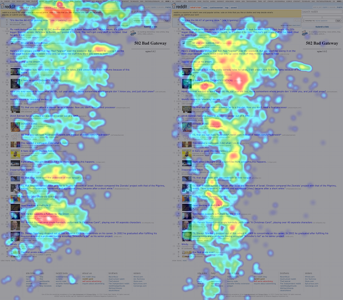
...The two red hot-spots to the right and further down the page.
Is it an emergent distortion because of the heat map? Is it an aggregate spot between the link above and the link below that ends up being significant? Do experienced redditors rest their eyes on blank patches of the page??
Additionally, the veteran users scope out the source domain of each link as a quick indicator of the type of content, whereas the other users rely more heavily on the headline.
The data in the article does seem to bear this out. The source domain is displayed at the end of each headline, which probably accounts for the shadowy spots on the right side of the veteran redditor heat map. You really only need to glance at the end of the title to see if it's an imgur link or not.
"...we can easily demonstrate that reading reddit is a skill that develops and changes over time..."
Actually, you've failed to demonstrate that. A better test would be to record first time visitors and then come back after they've become long time users and record again. That way, you could rule out the mitigating factor that you mentioned earlier in the article:
"...indicating that either only certain types of people become redditors, or that the veterans’ reading patterns had changed..."
As a veteran redditor (6 years now), I wouldn't even be looking at that frontpage without logging into my account where I'm unsubscribed from all the default subreddits.
From other things deriving I would guess, that veteran users become more efficient, looking for what they really care about instead of letting their eyes and brain parse every letter. It's the same for me here on HN. I don't care about 90% of the content, even from the front page. So I don't even read it just scroll until my eyes find words they consider interesting. But I spend more time researching other sources to an interesting topic and actually spent some meaningful time writing meaningful comments (or at least try to).
edit I even end up more often these days using the browser search function to not need to read every entry.
The problem with heatmaps like this is that they don't actually give any information to what is the cause of the changed attention. Has the attention span become shorter, has the knowledge of where the better posts are and how to identify them become internal or is regular visitor to reddit simply not interested in too many stories because they know they come back in a few minutes?
Only with some causal correlation between user behaviour and your site you can change your site to adapt to your users. I really would like to see more research on this.
Wouldn't veteran users, in many cases, have already looked at the front page? They check the top 2-3 articles to see if anything is new and then can skim/see the thumbnail for any link below the top few. I feel like this would make a big impact as the first time I look at the frontpage in the morning I read it differently than later in the day.
I wonder why the concentration right at the bottom-right of the page (which contains site links and FAQ) is present for experienced users but absent for others.
Agreed... the RES 'loading next page' cog icon is directly above the 'reddit tools' footer in my setup, and I'm guessing it's above the 'help' for people with smaller monitors, and above the 'about us' for those with larger monitors.
Old timers tend to know it better than the new folks, mainly since it's hardly ever referenced anymore, but it's the guidelines for how to interact on the site.
GazeHawk is a YC startup that does eye tracking using webcams. More about it here: http://www.gazehawk.com/
Presumably they got a bunch of people who were willing to participate in the study, then showed them the same screenshot of Reddit and tracked their eyes using their technology.
The only good use for them I can think of is if the graph is on a log-scale and the changes in color represent orders of magnitude difference. For a simple heatmap though it'd be much better to just have a smooth gradient between two colors.
Sorry to nit, the article was interesting. That's just a peeve of mine.