This site is an extraordinary labor of expository love! I've encountered it a couple times over the last 8 years or so. Page after page of detailed summaries, explanations, arguments, graphs, pictures, diagrams. It just keeps going. It is at least a booksworth of material, and with book-style glosses and marginalia. I wonder why it's not already published as one.
I'm looking forward to it, it's likely to be one of the definitive resources on color. I believe it's important to pay attention to the artistic perspective; I think the belief that there is a "scientifically correct" approach to color problems is often a damaging form of scientism.
I teach in an art/design school. The standard reference book for all (so called) theory courses is Itten’s color contrasts. Itten’s ghastly tome is full of mistakes, vagaries and mumbo jumbo.
In contrast, Bruce MacEvoy’s Handprint is my first point of reference for anything color related. It is also tragically under-recognized by designers. As a measure of the guy, he made his own watercolor color wheel, painstaking mixing each pigment by hand (around 60 pigments in all) and locating each one on the wheel.
I disagree with the reasoning that purple looks closer to red than green because of the "left hump" in the red cone sensitivity curve. That IS why we see a purplish color in the rainbow (as opposed to it stopping at blue).
But purple is close to red because of the circular nature of color because of the 3 types of cone cells. Even in the simplified model used by digital cameras, where it truly is red, green and blue, red is close to purple. This would be true even if (as is true on many camera sensors) the red sensitivity curve had no "left hump".
The red sensitivity curve for eyes (properly the cones are called Long, Medium and Short rather than Red, Green and Blue) also doesn't have a left hump. This is a misunderstanding originating from the fact that the X in CIE XYZ does have a left hump. But the XYZ functions are not intended to correspond to cone sensitivities.
So this is not a misunderstanding, but the real reason why magenta (red+blue) is perceived similar to violet (shorter wavelength than blue) by human eye.
What you’re finding is the CIE “color matching functions”, which is closely related but not the same thing as the raw physical response of the cones. Here is a paper describing the difference, and more current research than what you found: https://hal.archives-ouvertes.fr/hal-01565649/document
Look specifically at page 2, and the linear relationship between the color matching functions (where red has a left-bump), and the “fundamental sensitivity” plot, which is attempting to find raw physiological cone response to different wavelengths, rather than what the observer perceives.
So what you mean is that any color that is a mixture of two wavelength that trigger two different cones is “close” in some sense to the perceived color of either one of those wavelengths?
This doesn’t mean color is “circular” per se, right? I suppose color perception with 3 cones has a sort of circularity when we plot the color space in 2d, but I’m not sure that sufficiently explains our experience of color.
Anyway, what you’re saying is that mixtures of two things can be perceived as close to one of the two inputs. The argument holds for any number of cones - if we had 10 cones, we could still trigger the two with the furthest apart wavelength response using a mixture of two separate wavelengths, and the result would be “close” to one of the two. But this also holds for any pair - the mixture of imagined cone #3 and imagined cone #6 would also yield a color that is “close” to #3, and also “close” to #6.
Has anyone asked a tetrachromat this question? What would it mean if they disagree that red is close to purple? What would it mean if they agree?
Yeah, red being closer to purple than red to green is about as strange as red being closer to orange than to green. The absolute difference between (1, 0, 1) and (1, 0, 0) is smaller than between (0, 1, 0) and (1, 0, 0).
Not sure I follow your arguments. Red sensitivity curves on the page you linked do have "left hump" (and 2 of answers there directly attribute closeness of red and purple to them).
Could you please explain how 3 types of cones can cause "circular nature of color" without existence of that "left hump"?
A color is the combination of cells that gets activated. Without the left hump purple would still be purple even if that spectrum would no longer be perceived as purple. Red and purple are similar since they have many of the same cells getting activated.
> Without the left hump purple would still be purple even if that spectrum would no longer be perceived as purple.
Do not quite understand what you're trying to say (sorry, English is not my native language), here is my understanding - without the left hump purple would be still called "purple" but perceived as kind of deep blue (separate from regular blue, but not closer to red as it is perceived now). Is it what you were saying?
> Red and purple are similar since they have many of the same cells getting activated.
And this is the part I do not understand - without the left hump, purple (defined as spectral color with shortest wavelength) would NOT activate many red-sensitive (L) cone cells. Why it would have more similarities in cell activation to magenta (defined as red + blue) then? What specifically would cause L-cones input ignored in this case?
" without the left hump purple would be still called "purple" but perceived as kind of deep blue (separate from regular blue, but not closer to red as it is perceived now). "
That's not correct. Without the left hump, almost everything would appear the same, with a few minor exceptions.
You see purple and magenta when both the "red cones" and "blue cones" are activated, but not the "green cones".
This can happen two different ways. One is very short wavelengths of light, which appear violet. The red cones are stimulated because of that left hump. This is where violet on the rainbow/spectrum comes from, and why a "black light" looks purplish rather than simply blue.
But another way is to have some long wavelengths (which alone would appear red) and some short wavelengths (which alone would appear blue), mixed together. Note that to see a hot pink/magenta/fuchsia, this is the only way it will happen.
I suggest reading the two links to my posts on Quora, where I go into a good bit of detail about it.
But no, the red hump is not why red is close to purple. The red hump is simply why, in some circumstances, you can see purple (technically violet... which is a blueish purple) with only short wavelengths, rather than by mixing long wavelength and short wavelength light.
In most cases, when you see something that appears purple, it is because you are seeing a mixture of red (long wavelength) and blue (short wavelength) light. In that case, the left hump is insignificant.
Note that in all cases, when you see purple, your "red" cone cells (as well as your "blue" cone cells) are being stimulated. THAT is why red is close to purple.
Ok, think I got it, the confusion is how we define "purple".
Yes, if we define it as "magenta" = mixture of red and blue, then it is pretty obvious that it would be closer to red than green and, of course, the left hump is insignificant.
However, in the TFA, it is defined as "purple is at the opposite end of the spectrum from red" (which is technically "violet" indeed), and in that case purple being close to red (by being perceived same as magenta) can only be explained by "red hump" = red-sensitive (L) cones being also sensitive to blue. Does not look you disagree with that.
I was confused and can see why GP was too, this seems to be splitting a very fine hair. But I am trying to read and understand your argument carefully. You reject the left hump theory, but responded by saying purple is triggered by red cone response - which is what the left hump does, assuming the hump exists and is significant.
I feel like this argument may be playing loose with terms, and deserves more clarification before announcing disagreement. What does “close” mean when you say red is close to purple, what exactly is “purple”? Violet (pure blue) is a type of purple, as you said, and red-blue mix is also a type of purple, but they aren’t the same. With the right mix, they might be metamers, so the effect of the hump can’t be ignored in the fact that some pure blues might be indistinguishable from some red-blue mixtures.
It’s true and I agree with you that seeing most “purple” colors involves seeing some red. But that doesn’t necessarily justify rejecting the left hump theory. You are seeing some red with a 50/50 mix of 400nm and 700nm light. If there’s a left hump, you are also seeing some red with a pure 420nm source. Our perception of blue, and what defines the words “purple” and “violet” to the average human observer includes the experience of seeing purple colors on the blue end of a rainbow, colors that feel similar to the colors on the red end of the rainbow. This fact seems to be at odds with your claim that the left hump of red has nothing at all to do with it, doesn’t it?
OTOH, maybe the hump doesn’t exist, and only your explanation is left. What is the source of the cone response function image you posted to Quora? The one on Wikipedia’s entry on cones doesn’t have a left hump. https://en.wikipedia.org/wiki/Cone_cell
Perhaps red being “close” to purple has to do with both of them being at the ends of the perceivable spectrum - both get dark further from green/center. Perhaps it has to do with all color space diagrams of saturated colors always showing blended mixture gradients between the primaries, and not limiting the visualization to mono-wavelength sources - maybe like the number zero and the idea of capitalism - you can’t ever unsee it once you’ve seen it. Perhaps red is not “closer” to purple in any more meaningful sense than any other color mixture of primaries is close to a primary - maybe this whole discussion is only surprise stemming from the discrepancy of graphing colors in two different ways - one is 1-dimensional and the other is 2-dimensional.
Look at it this way. Imagine you are using a paint program, and want a purple, magenta, or violet. Maybe you are drawing a rainbow, and want that violet that you see when you see a rainbow in real life.
How does the monitor represent that? By somehow generating a very short wavelength of light, that appears purplish?
No of course not... it does it by lighting up both the blue subpixels, and the red subpixels. There are no violet subpixels.... that would be a waste of money to make a monitor that actually emits that wavelength as a separate subpixel. Your eyes don't care... they see it as purple.
Another thing that could help you understand this is by looking at how yellow works. Yellow can be formed by a single wavelength of "yellow light", such as a yellow laser. But it can also be formed by mixing pure red and pure green light. Again, your eyes don't care, it is yellow either way. (in most real world situations, such as a typical yellow reflective object, it is formed by a whole range of wavelengths ranging from red to green).
You are making this more complicated than it needs to be. Basic color theory, including the cyclic nature and the way purple is between red and blue, does not need the "left hump" for it to work. You should try to understand how RGB works first, then later learn how the quirks of the human visual system affect it. Another interesting thing is that the peak sensitivity of the "red cones" is actually in the yellowish green area of the spectrum, but our brain does some post processing, so to speak, to make it so we can perceive actual red.
I don't know where I got the image of the chart, you can reverse image search it. Not sure why the left hump is not shown on the one on wikipedia.
I guess I didn’t communicate my points clearly either. I don’t fully buy the hypothesis of the statement that purple is “close” to red. You’re explaining the answer to a question that I’m not convinced is even valid. The first question to answer is: “Is purple close to red?” What does that mean, exactly? Why is this question being asked, what is surprising about purple being close to red? Why aren’t people asking why yellow is close to red?
The other point I’m making is that while you’re correct that the left hump is not required logically to explain that a mix of red and blue is close to red, that doesn’t mean you can dismiss it. The human perception of red and blue have a more cyclic connection than between green and blue, precisely because our red response has a bump that overlaps the blue range, and green doesn’t.
Physical color does not have a cyclic nature. Short wavelengths do not turn into long wavelengths. Human color perception is perhaps cyclic in a way, but you haven’t defined clearly what you mean by “cyclic”. That’s really my main nit pick with what you’re saying.
I agree that most purples are a physical mixture of red and blue wavelengths, or a mixture of red and blue responses. The interesting purple in this discussion is the one that’s not a mixture of wavelengths, but a violet (pure blue) that elicits a mixture of red & blue cone response. That one is due to the red cone’s left hump. Said another way, any so-called “cyclic” connection between red and blue absolutely is increased by the presence of the left hump.
Or said a third way, the only reason that the violet in a rainbow is perceived as a mix that is partly red - the only reason your explanation applies here in the first place - is because the left hump exists. If the left hump didn’t exist, then we wouldn’t be perceiving a mix of red and blue, we would be perceiving only blue… and then violet would feel further away from red than it does now.
Talking about how monitors display purple does not do a good job of clarifying the questions about purple, that isn’t a good example or analogy, IMO, because monitors cannot represent pure single-wavelength colors, they are three-primary emitters. It’s well known that there are visible colors, shades of violets, blues and reds that RGB monitors cannot display - which I think is very relevant to the question of the perception of purple. The spectra (& luminance) range of monitors is not limited because they cover all perceivable possibilities, they’re limited for more practical reasons of cost and for covering most (but not all) use cases for most (but not all) people.
"I guess I didn’t communicate my points clearly either. I don’t fully buy the hypothesis of the statement that purple is “close” to red. You’re explaining the answer to a question that I’m not convinced is even valid."
Ok, well if you are just rejecting the premise of the article, as well as my premise, I don't know what to tell you.
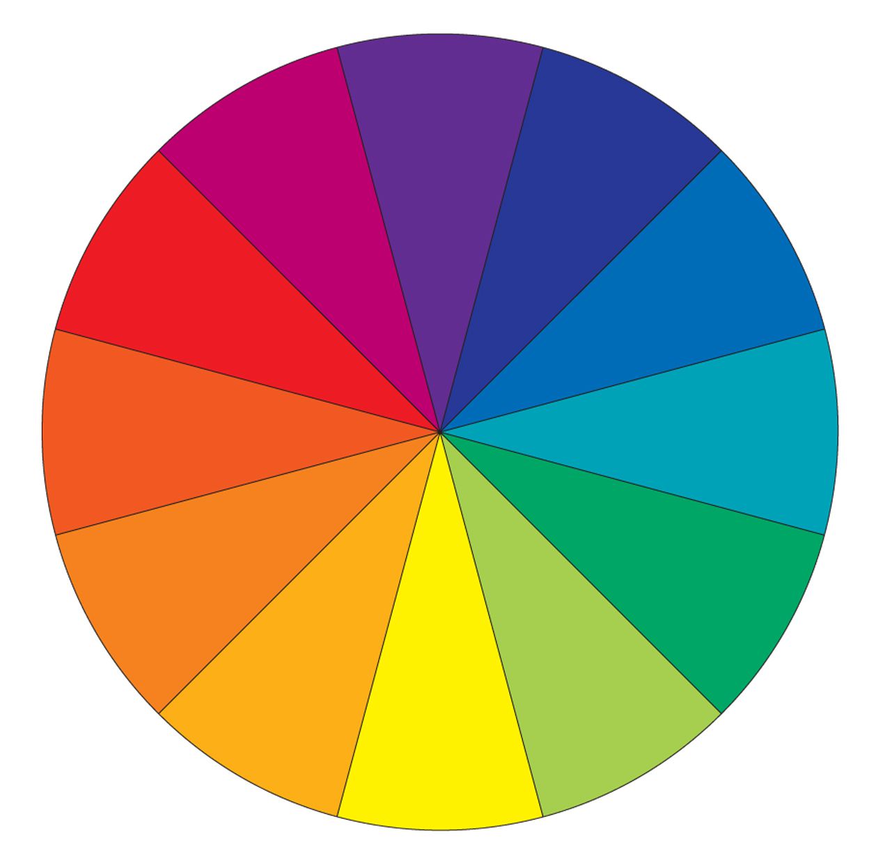
The article simply stated that purple is perceived as closer to red than green is. Do you disagree with that? I've never encountered anyone over the age of 5 that disagrees with that statement.
Most people learn that purple is near red in kindergarten. Most people know how color wheels work. Any color wheel shows purple closer to red than green.
You can also take the RGB value of purple and find the difference from red (by summing the absolute values of the differences of the red, green and blue values), and do the same with red vs. green. Purple is closer that way as well. Same goes for HSV representations of color, in which hue is represented as degrees of a circle...purple is closer to red than green there as well by any way of doing math on it.
Do you reject RGB as a reasonable way to represent color?
Do you reject the concept of color wheels?
How about the Munsell color solid? Are you familiar with it?
Honestly, it doesn't sound like you want to understand any of this. You're probably not convinced that purple is close to red, and don't know what that means, because you haven't spent much time studying color, thinking about it, or working with it. Have you ever worked with color, in any meaningful way?
Using the color wheel to explain why purple is close to red is circular logic. The color wheel is an abstract human construction that places red near purple arbitrarily. The color wheel does not prove that red is fundamentally close to purple. If you’re stuck on color wheels and the kindergarten explanation, then I understand why my questions aren’t making sense to you, and I’m happy to leave it there.
I’m not sure why you’re jumping to erroneous conclusions about my background, or why it matters to you. But since you asked, and in the hopes that maybe it could get this conversation back on a productive course, I’ve studied and used color academically and professionally my entire life, including human vision and perception, and computer graphics. I’ve written a few papers with well known color and perception experts on the topic of novel perceptually uniform color spaces, for example. But I wouldn’t say I’m a color or perception expert myself, because the topic is surprisingly deep and tricky, it bears little resemblance to kindergarten knowledge of color wheels. I’ve written high dynamic range spectral renderers in the past, studied spatial and temporal tone mapping, written color conversion code from spectral to CIE XYZ, xyY, Lab, sRGB and other spaces, and like you I’ve written programs and articles about transparency. Premultiplied alpha is one of my favorite topics when it comes to alpha channels.
Your JavaScript auto-masking prototype looks really nice. The video didn’t really say much about color, but you may be onto something if you’re pulling your mattes fully automatically. Have you released it or sold it?
Since you asked, I’m very familiar with the Munsell space and RGB. RGB has been practical and useful for a long time, but it’s just about one of the worst color spaces there is. This is why people who care about color specify sRGB rather than RGB, and why people who work in CG production and people who make LCD displays don’t use “RGB” anymore. The three biggest problems with RGB are lack of standardization (“RGB” isn’t well defined), RGB is a very perceptually non-uniform color space, and RGB is a crappy and relatively unintuitive space for artists (HSV & HSB are better, but researchers and color UX people have designed much better spaces & pickers for artists).
Okay, so, with all that in mind, maybe you’d care to take a more careful stab at explaining why you think purple is “close” to red, and what - exactly - that means?
> Using the color wheel to explain why purple is close to red is circular logic. The color wheel is an abstract human construction that places red near purple arbitrarily. The color wheel does not prove that red is fundamentally close to purple. If you’re stuck on color wheels and the kindergarten explanation, then I understand why my questions aren’t making sense to you, and I’m happy to leave it there.
The specific claim is that either red is close to purple or that all these models are showing things wrong, which is not circular logic.
You were invited to claim the models are wrong if you want. Do you want to?
Which models are you asking about, do you mean RGB & the color wheel? I feel like I just did explain my position in depth on both, did you miss it? The color wheel is an abstraction and RGB is useful but flawed. It would be silly to call either one “wrong”, but neither one was invented to chart wavelength or human cone response. Rob’s invitation wasn’t particularly genuine, nor is yours, the question is an attempted trap and his was a failed attempt to appeal to authority.
In any case, to stand by your claim that either red is close to purple or that all these models are wrong, you must first define what red being close to purple means. Rob couldn’t do it, can you?
Rob has now defined the proximity between red and purple as what’s on the color wheel. It absolutely is circular logic, because it’s a fact that the color wheel is not a physically accurate representation of color, and Rob already knows that. Purple is the only named color on the color wheel that is not a color of the rainbow, the only one that is a mix of two mono-wavelength colors. The color wheel is not naturally a circle, purple’s a synthetic addition, used for the purpose of making the colors of the rainbow into a circle by tying the ends, red and blue, together. Rob knows all this because he’s made diagrams of it that call out this fact and posted them to Quora.
This doesn’t seem to be particularly helpful here. Do you have an opinion on the left-hump of the red response curve? Do you believe Rob that it has nothing to do with the perception of purple, or any perceived closeness between purple and violet?
> The color wheel is not naturally a circle, purple’s a synthetic addition, used for the purpose of making the colors of the rainbow into a circle by tying the ends, red and blue, together.
It's a natural consequence of seeing what happens when you mix different colors. Magenta-purple is the only synthetic color that exists, and it's adjacent to both blue and red. And then you can ask people how far apart different hues are, and you get results consistent with a circle with a certain spacing.
> In any case, to stand by your claim that either red is close to purple or that all these models are wrong, you must first define what red being close to purple means. Rob couldn’t do it, can you?
All these entirely different ways of laying out the colors in the article seem to put purple and red a lot closer than green and red.
> This doesn’t seem to be particularly helpful here. Do you have an opinion on the left-hump of the red response curve? Do you believe Rob that it has nothing to do with the perception of purple, or any perceived closeness between purple and violet?
He didn't say it has nothing to do with it, he said it's "insignificant" for a lot of the closeness to red.
For my point of view, if the opponent process is relatively accurate for how vision works, then the signal from the blue cones is likely factored in to the "red/green" signal and tilts it red at very short wavelengths independent from any bump coming from the red cone itself.
> Magenta-purple is the only synthetic color that exists, and it’s adjacent to both blue and red.
Exactly right. It has to be adjacent to both blue and red, because it’s the middle of the gradient mixture of blue and red. We don’t have any other mixture gradients on the color wheel. Do you see the problem yet? What if we did have other mixture gradients?
> He didn’t say it has nothing to do with it
Hmm, that’s not my read, it was stated multiple times and quite clearly and flatly that the left hump is “not” the reason, and that nothing changes if it didn’t exist. The top of the thread declared unambiguous disagreement.
> All these entirely different ways of laying out the colors in the article seem to put purple and red a lot closer than green and red.
These are abstract organizational tools you’re referring to, they do not prove anything about the proximity of purple and red. On the color wheel, red and blue are placed just as far apart as red and green (even though we know they are different perceptual distances). Since purple is a red-blue mix, and therefore in between the two at the midpoint, then it must be closer to red than green is to red, by color wheel definition. So your point about green is therefore tautological and uninteresting, if we’re talking about color wheels.
BTW, there’s a pretty important subtlety you seem to have missed in my argument. I am not claiming that purple and red aren’t somehow close. The actual claim of this thread being debated is that left hump is not involved (splitting hairs between zero and insignificant is irrelevant in my view). I’m asking for a definition of closeness, a metric that proves it, because I believe that whether the left-hump matters may hinge on such a definition. Rob’s argument depends on how you define closeness. He is right within his definition of closeness based on the color wheel, red is close to purple, the problem is the circular logic of this definition, it means the question of whether red is close to purple is a basically meaningless question, another uninteresting tautology that dodges explaining why red and purple might seem close (or more importantly why red and violet might seem close.)
> if the opponent process is relatively accurate for how vision works, then the signal from the blue cones is likely factored in to the “red/green” signal and tilt is it red at very short wavelengths independent from any bump coming from the red cone itself.
Interesting thought! I’ll have to think about it. What if it’s not independent, but two sides of the same effect? Maybe you’re right, and the left hump is caused by the mechanisms people call opponent process. This still begs the question even more acutely of how you would define color proximity. Opponent process color theory points out that we can see completely non-physical colors, colors that don’t exist in nature and cannot be displayed, like red-blue. How far apart is opponent red-blue from the purple that is red+blue mix?
My reading is that Rob’s argument tosses your opponent process theory out as well, right? He already claimed multiple times that non-zero perception of red in blue colors is not the reason that purple is close to red. That’s the problem I have with Rob’s argument, that he ruled out perception of red from blue colors, and just cited the color wheel, without even stopping to ponder the question of whether the color wheel is the way it is because of the left hump.
Apparently, the diagram on Wikipedia page is not correct (either outdated or oversimplified). According to what I could google, the research does show a hump in L-cones sensitivity at violet colors, for example:
The CIE color matching functions are a very interesting topic, and a subtle distinction between cone response and perceived ability to match a given color. The main issue being that we haven’t had any ways until recently to directly measure cone response. The color matching functions are derived from clever experiments that attempt to figure out cone response based on what humans think they see, without opening their heads.
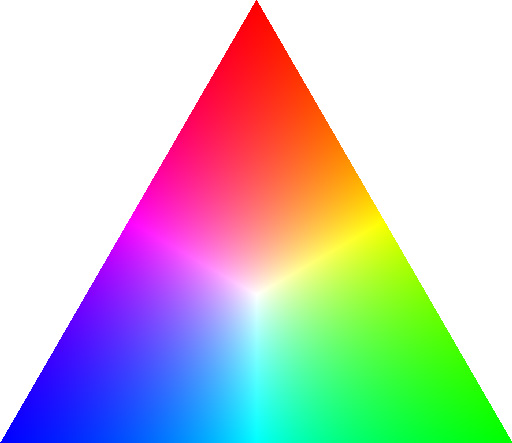
> Red green and blue form a triangle, which is essentially cyclic.
But the question then - why wavelength R=700, G=550 and B=450 form a triangle?
For your answer on Quora, it says "Hue is cyclical rather than linear" without any explanation, and this is part - in my understanding - can be only explained by "left hump" (red cells being sensitive to blue light as well) and nothing else.
The triangle comes from their being 3, nothing more. There are three types of sensors. If you try to visualize them geometrically, you get a triangle.
The gamut of all colors therefore is represented as a cube, with black, white, red, green, blue, magenta, yellow, cyan as corners.
None of this is dependent on the left hump... the left hump is just a minor quirk that causes the shortest wavelengths to also stimulate the "red cones" a bit (the cone cells whose peak sensitivity is longer wavelengths).
Its easiest to understand all this if you work with colors as RGB, as anyone who does things with colors on computers typically does (paint programs, html/css, etc). Note that when you see purple (or magenta, or violet) on a computer screen , it is by combination of red and blue, but by somehow making the wavelength of light coming off the screen actually be a shorter wavelength than blue.
When I try to visualize 3 types of sensors (without left hump), I get a straight line not a triangle - that is technically still a (zero area) triangle, but inherently NOT "cyclic".
Looks like you are mixing together magenta (red+blue) and violet (shorter wavelength than blue) - those are physically very different colors, but perceived by human eye as being the same / very similar. And the only explanation for that perception (= the reason why colors form a wheel) is that "left hump", nothing else
The triangle, and the “color gamut” of a monitor or color space - come from the projection of the boundary of a 3d color space diagram down to 2 dimensions.
What you’re talking about - getting a straight line out of 3 sensors - is because you’re plotting wavelength on the x axis. What Rob is talking about is a 2d plot of a 3d color space, where points are plotted not against wavelength, but where the axes of your space are the 3 primary colors you use to define it. This is where the RGB cube comes from - 3 separate values that range from [0,1].
If you look straight down the diagonal line x=y=z, then you are looking along the “brightness” axis, which sort-of factors it out. What’s left in RGB is a hexagon - the projection of the RGB cube down to 2d along the cube’s diagonal. The hue triangle Rob’s talking about is exactly this same idea - it’s a flattening of the color space into just hue, by removing the “brightness” dimension, and then looking at the boundary of whatever is left. This boundary has different shapes in different color spaces. (And some color spaces like HSB and HSV are defined using this linear transformation, so that one of the 3 axes lies along the RGB diagonal.) A hue triangle appears when you have only 3 specific primaries, so you can’t represent any colors outside the triangle, all colors are strictly linear interpolations of the 3 outermost colors.
In this case, Rob’s right, the left hump has nothing at all to do with the triangle shape.
Rob is right that in RGB cube 3 points always form a triangle. However, that color space does not include "true" purple (or violet), which is defined as light with shorter-than-blue wavelength, it only includes magenta = red + blue, and apparently Rob does not understand the difference.
The question is not why magenta is close to red - this is obvious, - but why magenta and violet are perceived similar by human eye, and that cannot be possibly explained by "cyclic nature of triangle" in RGB cube (simply because there is no violet in that colorspace at all).
Yeah, exactly. Spectral colors don’t exist in this RGB cube, only linear combinations of 3 specific primaries do.
I agree with you - the question of purple has not been adequately answered, and I’m also becoming convinced that the subtlety and deepness of the question is not being understood or appreciated in the answer offered above. Just because people plot colors on a wheel doesn’t explain why pure violet is perceived as containing red. I’d say it’s probably the other way around - that one likely reason that artists in the past put red-purple-blue on the color wheel is because purple was already ambiguous - there’s a strange perceived similarity to the colors on opposite ends of the rainbow. A perceived red response to short wavelength blue colors, aka the left hump, is better at explaining the color wheel than the color wheel is at explaining purple.
It doesn't seem like you are really trying to visualize the input from 3 sensors if you are putting it on a line, you are still trying to represent wavelengths. Otherwise you won't be treating each of the 3 sensors equally.... you'll be putting two of them at the ends, and one in the middle. Which one goes in the middle?
Maybe it would be better if you just think of it as a color cube, which includes black, white, and all shades of gray. It is a cube because that is the best way to geometrically represent 3 dimensions.
Just as a side note, color has been an intellectual bone to gnaw for centuries. Germany's Goethe had his Zur Farbenlehre, Newton's prism graces the cover of bestseller music, etc.
Personally, I like to picture what aliens born under a different sun would make of us, looking at colours they cannot see ...
For the first, physical hues form a straight line continuum, from red to violet. The human eye samples these hues at three overlapping points (RGB) and then the visual pathway does some math to reinterpret RGB as a closed circle of hues we see in our visual field.
For the second point, while monospectral light cannot produce magenta, you don't need multiple molecules to reflect multispectral light.
>the visual pathway does some math to reinterpret RGB as a closed circle of hues we see in our visual field<
sort of, computation of 'contrast' so to speak, or, in broad terms, differences in wavelengths
most likely done, foremost and in essence, in area V4, cortically. if damaged, cerebral achromatopsia [colour blindness results]. patients won't even see/perceive induced 'coloured' visual phenomena, such as phosphenes [Farady made a few quid by electro-shocking ppl, for instance in Jardin des Tuileries, Paris : electro-magnetc impulses applied transcranially to the occipital part of the brain can elicit, in some subjects, brief bright colourfull light sensations]
The extraspectral hues require mixing light of at least two different wavelengths (red and blue in different proportions), while the other hues can all be made from a single wavelength of light. I understand that lithium chloride can burn with a magenta flame, but that just means that its combustion reaction produces light with that particular distribution of wavelengths in its spectrum - similar to a white flame which would have red, green, and blue.
Pigments work differently than light emitting sources, as they absorb light that is not present in the reflected color. So a magenta pigment is not all that special, it just means it absorbs green. Quinacridone and crystal violet (hexamethyl pararosaniline chloride) are two such examples, each capable of a brilliant magenta or purple color from a single molecule.