Since the new Firefox UI updates, I really feel like I’m maybe the only one who actually likes the new look. Everything I read about Firefox lately is overwhelmingly negative. Either that, or it’s just the negative opinions being amplified and folks who are happy/satisfied just keep it to themselves.
From the posted image, is it really that hard to differentiate the not active tabs? There’s a clear pattern: icon, title, close “x”.
I’ve liked the direction Firefox has been going in. It’s my primary browser again after a few years of Chrome. I can’t be alone in preferring the updated look, I’m sure there are dozens of us.
> negative opinions being amplified and folks who are happy/satisfied just keep it to themselves.
Exactly this. All posts on the internet act as a selection filter; the people most likely to comment are those with strong feelings on the subject. When we read comments, we tend to think "wow, I just read 10 comments and all but one hated the UI! People must really dislike this UI". But our sample isn't random, it's heavily biased! And we develop a biased understanding of the general population -- the vast majority of whom won't have left a comment at all. Instead of thinking "9/10 people dislike this UI", it's probably closer to "9 people out of all Firefox users dislike this UI". And more exactly, it's "9 people out of all Firefox users who saw this on HackerNews dislike this UI." Actually, I wonder if you can use Bayes' theorem to get the actual population's distribution somehow...
I don't take it as negativity, per se, but in my opinion more often there are people expressing concern. For many of us, Firefox began as a relationship with Netscape; over the years this has been a living and evolving relationship, with a lot of positive things, but also a few more significant negative steps back in a direction that the community/userbase find to be antithetical to the spirit of what the project is/was/claims to be.
Thank you for this reply, and trip down memory lane; I hope it is well received. I'm not trying to be a contrarian, I just wanted to interrupt this glass of Metamucil to share an alternative viewpoint.
And Firefox has been my daily driver for years and the new tab design was enough to finally push me over to Tree Style Tabs full-time. I like everything about Firefox, except for the management practices of Mozilla and the constant unnecessary UI meddling that trashes my userChrome.css practically every update. It's very hard to guess overall user sentiment from anecdata.
This is golden; seems to consolidate and in at least one case improve the best parts of at least 3 of my addons from what I've seen and I have not seen half of all settings yet...
You have just made my day.
Does anyone have an up-to-date user CSS that hides the top tabs and moves the toolbar up into the dead space? I used to have a snippet that worked, but it broke a few dozen versions ago.
The problem is distinguishing that from Google using Gmail, Youtube, Docs, etc. to promote Chrome. You don't know whether someone stopped using Firefox because they like Chrome better or because they hit enough of those “we pinkie-swear it's not intentional” friction points and got tired of swimming upstream.
>Instead of thinking "9/10 people dislike this UI", it's probably closer to "9 people out of all Firefox users dislike this UI".
Yeah, even with your Bayes mention I'm gonna go ahead and get a second opinion on your statistical analysis there. I know, there's always someone in every crowd who quibbles with a poster's perspective, but you're hanging your entire sentiment on this one.
To rephrase what I was saying, I think that when we read 10 comments, of which nine are negative, we think "90% of people must dislike this". I don't think most people would actually think 90%, but I do think we "get a feeling" it's a very high percentage. We get this impression that the 10 comments are by 10 random people, so it's close to a random sample. But it's not, it's a very biased selection. The very post itself acts as a selection filter, only selecting people with certain properties. In this case, people with strong opinions about Firefox's UI.
In short, the denominator isn't 10, but something much much greater. And this isn't a stastical analysis (not yet anyways!), just a statistics/psychology hunch :)
>I think that when we read 10 comments, of which nine are negative, we think "90% of people must dislike this"
I don't. When I see something like that with such a small sample size, I think that the downvoters just got there first. That could be because the YouTube algorithm put the video in front of people who happen to have higher standards, or who are bitchier, or who are familiar with the poster and their disruptive complaints over on the Slack for $X. Could be anything...anything other than generalizable overall quality.
I'm hypothesising that this is a bias people have when reading posts in the internet. People are susceptible to it to different degrees.
And your statement does show this bias in a different way. You comment on the 10 being too small a sample size. That implies that if there were more posts, say 90 vs 10, you would draw some conclusions about the question "Do people like the new UI?". In the same way you're saying that the sample would be biased because someone posted on YouTube, I'm saying it will _always_ be biased, regardless of size, because the post itself (and all posts) attracts a biased sample. A larger sample is good for a random sample, but I think posts attract a sufficiently biased sample by their very nature, so increasing the sample size won't help.
That may be true. But the fact here is that UI always become more illegible and that's why people are hating this update. It needs much more load on brain nowadays to click a button as everything looks so flat. Just for the sake of new update and job security by designers.
We just get used to it later with the flatness and then they make it more flat. The cycle continues.
Tbf, 9 users is a not insignificant number of their userbase. I say that as someone who has only ever used Firefox as my default browser.
But yeah it seems like every release of ff there's a vocal group saying how it's going to pot and it's all doom and gloom.
I have been using ff since it was called Phoenix and it's fine. I fire up Chrome and Edge out of necessity for work and have never been compelled to switch.
Maybe I just don't need whatever it is that Chrome has that makes it so special but all the browsers are pretty decent these days.
At some point around IE11 I realized I wasn't writing W3C standards HTML/JS and then having to hack it for noncompliant browsers. I wrote code once and it just worked.
I think my problem with it is two-fold, but I acknowledge I'm not some kind of UI expert.
First, I dislike that I cannot quickly count how many things there are. Borders also make me feel more confident in locating a button.
Second, by detaching the borders from the main window it disconnects the analogy of a "tab" as a, well, tab. Now a button takes you to a new window, but I dislike that it breaks a long-standing analogy that is easy to grasp.
More importantly, it's really hard to see the upside. That's usually why people complain about UI changes in Firefox or anywhere else -- if you can't elucidate what the upside is, all anyone can see is downsides. And mild lack of familiarity is enough downside to outweigh an inexplicable change with no upside obvious.
if Mozilla did lay out their rationale, it'd be a lot easier to get past lacking UI expertise or being unable to see upsides (while seeing clear downsides).
UI changes attract a lot of ire from current users in general--this isn't a Mozilla-specific thing--but Firefox is ostensibly an open, OSS project. there shouldn't be much organizational discretion to just keep UI research or data private: Mozilla should be more than happy to share data or UX research demonstrating why they're making changes, but they don't.
absent explanation from Mozilla or a helpful UX expert to pip up and say "the change is actually good, here's why", the changes often feel like they're either trend-chasing or change for change's sake to show that the UI designer's salary isn't going to waste.
I think the ire comes from the lack of general stability as a concept among internet sites and apps, as even a desirable concern. If Mozilla isn't saying "ha ha tabs are buttons now!", Google is scrambling the colors and/or button locations and/or icon designs on Android, or whoops, a browser addon you like has updated and it's only compatible with the nightly build so you're going to be waiting a while to have that to use again, or the internet connection is spotty because Comcast is shit and you're a nobody.
The lack of stability in everybody's technology and online experience is a problem. Move fast and break things, who cares how it affects the users!
I felt their blog post [0] kind of did that. Maybe not as detailed as you’re suggesting (which I agree would be nice to see) but it got the point across.
I dunno, that page looks like 110% received wisdom. It's "clean," "inviting," "streamlining," and so on. All positives, sounds like every change listed is awesome!
"Good design is invisible. So if things just work, you don’t really think about it."
Ah yes, and if you can't see the benefits of a change, that just means you're blind to its invisibly good design.
"Bookmark bar – About 5% of the clicks go to the section where people bookmark their frequently visited place"
"5% of the clicks go to the thing we haven't touched in forever and have actually made worse over the years. Naturally we're going to continue this strategy of fostering attrition until you only ever go to the sites listed on your new tab page (which we're watching how much you use)."
It's all basically that, more of doing whatever they want and calling people who don't like it wet blankets. I still don't know why they changed to that supremely unintuitive "sliding panes" menu design. Ah, such is the cost of being on the cutting edge with my ESR installation.
That page says they "put a lot of thought into it," but I haven't seen where that thought might be reviewable, because I'm skeptical that a lot of thought went into this. A lot of thought may have been how to counter criticism, but that's not the same thing.
I think the way I'd put it is that most of the claims there are orthogonal to the UI complaints people make. I don't see people complain about the ease of browsing to a desired place, sometimes I do it with the toolbar, sometimes the URL bar, sometimes the start page, who cares? None of these things have anything to do with borders on buttons...
If something has a clear advantage people don't tend to complain about it. The ability to search from the URL bar has a utility that is clear. Making tabs break a paradigm and be (mildly) harder to see doesn't really seem to have any utility and the system would work the same both ways.
I still use Firefox, don't get me wrong. But I don't understand why this stuff is changing before being made into a skin so that us old people can have something stay the same for a few weeks.
When I watch a film, I don't want the film to make me aware I am watching a film. Good filmmakers can encourage my belief sometimes even as I am analyzing the film's construction and intentionally maintaining my disbelief. I can appreciate quality special effects, but no matter how technically, film-theoretically, or visually good those effects may be, if they don't serve the greater film they are a part of, they aren't good special effects.
Modern UI feels like painting the shark in Jaws hot pink in order to make sure everyone sees the great special effects. Yeah, the shark is still cool, but you've made the film much more difficult to enjoy.
>From the posted image, is it really that hard to differentiate the not active tabs? There’s a clear pattern: icon, title, close “x”.
Yes, there is a pattern, but that's not good enough. If the site doesn't have a favicon, that part is omitted, breaking the pattern. If the title includes emojis, they look like favicons, making another (false) pattern breakage. And looking at the same image you reference, it isn't clear why the "x" icon would close the stuff far away to the left of fromit instead of the favicon/title it is very close to.
This is change for "clean design" sake, not usability. Sure, we can get used to it ok, and maybe even start talking about it being a more "beautiful" (a word thrown around waaaay too much in UI design, IMHO) design, but it is a very much less usable design and that's something some of us care about.
Maybe you're just the part of the population that loves constant change. I hate it because I see my software as a tool, not a fashion statement, and I don't need my tools changing all the time.
Constant change? The fundamental UI of desktop browser tabs has been largely unchanged in all major browsers for at least 10 years. Sure, sometimes the UI changes slightly and it annoys people who are annoyed at even the slightest visible change. But complaining about "constant change" or concluding that any time you are eagle-eyed enough to spot a visual change that constitutes "software being a fashion statement" is just a bit extreme.
The threshold for what kind of UI changes are worth complaining about should not be set at drastic fundamental reorganization as you seem to want, nor at the "any visible difference" you impute to Mozilla's detractors. Rather, the threshold should generally be at any change that requires existing users to re-train or otherwise detracts from the productivity of experienced users.
Mozilla in recent years has been flagrantly ignoring the usability costs of their changes and has shown a willingness to make gratuitous changes. Many of these changes could make sense if Mozilla expected their user base to be on an exponential growth trend, such that the existing users who are alienated or annoyed by changes will soon represent a small portion of the overall username. But that's obviously not the situation Mozilla is in.
Sure, sometimes the UI changes slightly and it annoys people who are annoyed at even the slightest visible change
Considering that the visual processing model of the human brain is based on change detection (hence why animations will get your attention and are distraction), all unnecessary changes do is add mental noise and force reaccommodation, wasting countless hours of trained behaviour. Once a UI becomes familiar, you don't need to pay attention to it and can focus on the content instead. But when it changes, it attracts attention for as long as it takes to changes one's long-term-memory of it.
I haven't done any studies on it, but it wouldn't surprise me if those who hate these sorts of changes the most are also the ones with the best long-term memory and observational skills.
It's actually a case of the opposite of eagle eyed - it's a case of being partially vision impaired which means that things are now harder to grasp as quickly, increasing cognitive load.
there's a pretty clear trend towards flatter, cleaner design with more space both within Firefox and other software. Whether you approve of it or not, it's hard to argue that the changes to the Firefox UI including the tabs don't make it look more like modern UIs in general. Be that Windows or Gnome, or web-based desktop apps etc...
Why would I want the UI to take up more space? I am using it as a browser, most of the space should be available for the page I "browse" or serve as an efficient way to navigate pages.
> don't make it look more like modern UIs
If making something look more modern is the goal just take a dump in the middle of an art gallery, that is plenty of modern and about as functional.
> Be that Windows or Gnome
Edge still has proper tabs, so are you just making shit up now?
I don't care what you want, that wasn't the question. The question was how it is consistent. Preferences are notoriously subjective, plenty of people like less clutter, it tends to make things more readable.
>Edge still has proper tabs, so are you just making shit up now?
On my machine in edge and chrome both unfocussed tabs are flat and divided by like a 1 pixel grey-ish divider or something. I can't really tell much of a difference between that and firefox.
On my system Firefox tabs are only divided by space, there is no obvious "this tab ends here". I would prefer the one pixel wide divider "or something".
The active tab looks like a button, it has no connection to the content at all, while on edge I still have a clear connection. That might just trigger an ingrained mental "fuck another incomplete UI framework" response in me, it looks wrong and that the tabs actually still behave like tabs is more surprising than expected, why would anyone expect a button to behave like a tab?
Last point, as the new tab style takes up more space than the old style I had it disabled. Of course that didn't work long but somehow the option still fucked up highlighting of the active tab. With that fixed it is at least slightly lighter gray on light gray instead of just light gray for all. Still missing an option to fix that waste of space.
> The question was how it is consistent.
Then why does it take up more space then the bookmarks? Both are just an Icon with a line of text. Hah, just comparing both lists in the UI makes it clear that consistency is not something Firefox devs. have ever heard of. Note: This is not meant as a request at the Firefox designers to fuck up the bookmarks.
Not really the new tab look, but menu bars and other interface elements are more consistent now. Things like the settings hamburger and the “allow mic/camera” popup. There are still some elements that lack a consistent look and feel (I’m personally not the biggest fan of the search on page bottom bar and prefer how Chrome does it).
I've been using Firefox for about as long as a person could possibly have been using Firefox and I think this just happens every time they change the UI.
There is always a shock when a new design comes out. There was so much hate for the border less design youtube has right now but when I look back at older youtubes and older versions of almost anything, the new ones certainly feel better.
The only exception was the original iOS. They both hold up today. The original was a little cheesy but was still close enough to classy to work.
Just looks better and now we are used to it. Functionality is not better. We now have to think more about before clicking buttons and more load on brain.
I’m not arguing that it makes anything slightly worse. I’m arguing that it doesn’t make it worse at all. Of course, this is subjective.
I think this change is overall more consistent than previous Firefox versions (menus). I also think it removes clutter and looks simpler, cleaner, and less distracting.
No. It only works if you're so familiar with the previous UI than your pattern recognition kicks in. Someone who sees this for the first time will have no idea what it means. It's inaccessible to the novice.
Also, tabs without a favicon don't start with an icon at all.
To address a common complaint? Frankly, I have no trouble at all and I think most people are complaining due to change - a tale of software developing old as time
>$0.01 in Mozilla credits have been added to your account.
There's no way you can justify a change like this.
Also, why change the UI? If people are using your product that's enough market proof that they are fine with it, why change it in such futile and silly ways? No one's going to start using Firefox because tabs have no borders, literally no one; yet I can see plenty of users looking at this as the drop that spilled the cup and leaving.
Every single Firefox new "feature" or UI change has made them lose users, I wonder if they're doing it on purpose.
Yeah, this seems fine to me. Everything's delineated by favicons already, as it has been since tabs appeared.
More generally: I really like firefox developer edition's UI. It's dense and pragmatic, and I think the toolbar customizer they've built is one of the best of any application I've used. Broadly I think they've been doing stellar work, especially when they aren't blindly copying Chrome. Chrome has made some nice UI improvements that have deserved their spread, but I'm glad that Firefox has copied some and rapidly changed them, and abandoned others.
Also: container tabs. They're so, so good. And the colored bar on the tab is more than sufficient to identify them IMO. The UX is a little janky when it comes to modifying your containers, but the core concept is marvelous and steadily (if slowly) improving.
If you want to see "design for design's sake", look at Safari. It changes rather significantly with almost every major OS upgrade. I think they broadly get away with it because they have far fewer features, but it's kinda bonkers sometimes.
People can't handle change. It's pretty sad. I'm not saying we need change, or that FF should be investing in changing the UI (I really think the colorways are just a terrible use of resources), but I think all the UI updates these past few years—regardless of why they were made, for good or for senseless reasons—are fine if not highly enjoyable.
It’s crazy. My guess is they’re trying to tap into the FOMO vibe du jour with all the NFT insanity (“drops” for example) but they don’t even know or understand their own userbase. It’s really, really weird and unsettling.
Count me in. For me, it looks clean, and have no problems differentiating tabs. It's odd that people have a fit over this--not saying that people aren't allowed to dislike the changes but the negative reaction just seems over the top.
I went the other way - after years of boycotting chromium browsers I switched to Brave (and turned off all the BAT ads stuff). Stuff like built-in IPFS (including ipns domainlink), TOR, crypto wallets, adblocker, CMD-SHIFT-A to jump to recent things. It feels like it's the browser that's innovating the most and tries out new things all the time, kinda what firefox used to do in the past.
I haven’t tried Brave but speaking of CMD-SHIFT-A (which also works in Chrome), I’ve learned that Firefox has a CTRL-TAB feature that works better IMO (easier keystroke and it works just like CMD-TAB).
It’s optional. The option is called “Ctrl+Tab cycles through tabs in recently used order.”
I'm in the same boat. I didn't even notice this change but, now that I've been told about it, I like it. I also like the hover-over indicator on tabs, although it's possible that that's been around for a while and I've just never paid attention to it before.
Firefox has been my main browser for a long time, and I barely even noticed the UI refresh with 94.0. It is set to use whatever the UI defaults are; I've never changed them. My only customization is to use the extension for multi-account containers. Firefox looks nice to me, does what I want and expect, and it feels fast. I suspect that for many (if not most) people who simply want to get their work done, like me, slight tweaks to the UI are not and have never been much of an issue.
I'm in your boat. I had zero idea that this UI change had happened, nor do I know when my browser updated to FF 94. I've just been happily going about my business.
I just got the colorways update and I absolutely _love_ the new purple look. Feels super nice and I have never had any of the "issues" people rattle off here non stop.
Did you get the pattern wrong? From the screenshot, it really looks like the pattern is: close "x", then title, then icon, then a gap before the next tab.
At least, that's what I thought it was, and now I'm not sure. Without a border, there is no way to tell which "x" goes with which tab. Without a visual grouping using some kind of border or shading, wouldn't the "x" make more sense located next to the icon and title?
For the most part I agree. However, with the number of tabs I have open the close button is usually hidden, and Firefox doesn't show a default icon for websites that don't have a favicon (not sure if this is new or old behavior).
I often open up a bunch of text files in tabs from a FTP-like site without a favicon, and sometimes it is hard to tell where one tab ends and the next begins in the new interface.
https://www.reddit.com/r/FirefoxCSS/
A whole sub dedicated to making firefox look however you want it to. You can edit the entire browser with css like a website.
> You can edit the entire browser with css like a website.
And each update you have to adjust your CSS to fix whatever the UI changes broke. That is of course until Mozilla remove userStyle.css entirely - they have already disabled it by default so for new installs you have to toggle toolkit.legacyUserProfileCustomizations.stylesheets in about:config.
> From the posted image, is it really that hard to differentiate the not active tabs? There’s a clear pattern: icon, title, close “x”.
Yes, and if you're running the Multi-account Container extension you'll see a colored band up top that separates the tabs. Plus get all the perks of Multi-account Containers! (a feature which no other browser has I think)
Only in the tabs that have a container though.. It would be great if it works set a generic bar for the non container tab. Because I agree it looks great, I use containers myself.
Just tested and confirmed it's the same in Firefox 78(esr): the [x]'s disappear after (on my screen size) 13 tabs. So it's been this way for quite a while.
I thought a mac might be involved somehow but didn't consider touchpads. I guess even PCs have annoying touchpads with no real buttons these days. I really can't stand touchpads in general and avoid them. Unfortunately even Lenovo seems to rarely have trackpoints these days.
And yet, I miss something I love most about open source: choice. Yes I know, in theory you can fork it and do what you want, but in practice this rule is meaningless for complex projects like kernels and browsers.
I think you vastly overestimate "everyone else". I use Firefox and didn't even notice the change. So tabs don't have borders now, ok honestly whatever... Maybe try not to get hung up on these things and move on with life.
Same. I think I've just gotten used to things changing a little bit over time.
Releases are generally well thought out enough that they don't break any mental models or workflows, even when the UI noticeably changes (which in this case, it didn't for me)
UI people seem to start with the idea that they're right and the user should just suck it up, because they went to school and learned words like "skeumorphic." This is apparently sufficient for middle management, despite the fact that when this trend of constant annoying pointless changes started, so did the decline of Firefox's user base.
I don't even install it by rote on new computers anymore - it might as well be Edge. The rendering performance sucks, the need to constantly adapt to new ui changes is infuriating, so buh-bye Firefox. I prefer software that doesn't screw with my muscle memory for absolutely zero good reasons.
UI as a "discipline" is cargo cult corporate waste. I'd rather use a tool designed by an engineer that uses it than performance art disguised as ergonomics or accessibility.
If it looks good, fine, but the point of a browser isn't pretty tabs, it's navigating content in a way that doesn't interfere with navigating content.
I do not. I’m a software engineer. I prefer clean and minimal interfaces and I think Firefox does a good job with that. And judging by some other responses, I’m happy to hear that I’m not alone.
I like functional interfaces, where you can distinguish clickable fields from each other. And where you can distinguish clickable from non-clickable fields. And judging by some other responses, I’m happy to hear that I’m not alone.
Yeah I agree. It reminds me of all the hate that Ubuntu Unity used to get despite it being great. Seems like a very vocal minority that gets upset with UI changing at all in OS software.
that's an interesting comparison. although personally i hated the similarly received gnome 3 changes, but don't care about the firefox visual changes at all.
I rarely notice trivial changes these days since they are little more than change for the sake of change. Whether the change was made by bored UI designers, to keep up with the latest fashions, or to give a visual indication that the product is being updated is something that only the developers can answer.
That being said, it can be more difficult to differentiate some inactive tabs. Some tabs lack a favicon (e.g. PDF files) and the close button blends into the text.
While we are still waiting for home-page to work on a new tab if your home-page is local file what can we expect from those idiots if they cannot manage to fix even that?
Those idiots cannot respect me and let me choose when and what I wish to update. They bombard me with 'update available' messages jumping into my face in the middle of what I am doing, disrespecting me and my flow.
No option to turn off updates completely. Again, what can we expect from such brainless idiots?
Oh, but of course, they are too busy with idiotic useless facelifts.
I couldn't care less about their idiotic UI "inventions" never needed in the first place. Those people simply do not know what to do thus directing their endless idiotic activity to useless BS.
And then they bombard me with 'update messages' and how it is absolutely 'essential' to install their 'new' BS.
Where those people are coming from I wander ? Where are those idiots created and multiply? At least they should learn respect the choice of people not to deal with them and their 'bs updates'.
I'm on the same page. For those who aren't, they can modify the userChrome.css to suit their tastes- a level of customization you cannot achieve with other browsers.
I didn’t realize this change[0] was introduced. The good news is you can disable it, the concerning part is if that lever will be removed at some point. I guess I’m more concerned about targeted ads, and my browser behavior being logged/mined (afaict this is not the case).
This trend to flatness needs to stop. I hate it so much. It makes it unclear what elements are interactive.
It doesn't even look good. It doesn't even look "clean" or "sleek". It's just sterile. Dead. Non-functional.
I use Windows Blinds to make my Win10 look like Win98, and certainly I don't expect anyone to go that far, but some time between then and now, we've lost the plot.
I feel you. The illegibility of UI elements are a pet peeve of mine. I don't mind the aesthetics of a modern design so much as the illegibility it usually brings.
I wonder why this is happening, and am constantly surprised at how readily the world seems to accept these changes. Perhaps I am getting old.
In this specific case, what element is active is made clearer (active tab is completely set off from the others), and I don't think there is any confusion on wether you can click one of the inactive tab name to make it active.
The change is only on the delimiter line between inactive tabs, and you still have space and each favicons between them, it's not like they all magically blended together. I actually didn't even realize the line disappeared until seeing this post.
All in all, new design can look good or bad, but this specific one has sensible trade-offs and functional advantages, which is to me far from just following a random trend.
Thanks to Big Tech, web design has become a monoculture feeding off of each other, regressing at an ever increasing pace away from functionalism. Future looks very very dark.
I work for Big Tech. It has its faults, but blaming a design monoculture on it isn't fair. Design trends are bigger than a single company, and while there are definitely enough companies to see some amount of variation in UI and style, they tend to look similar because of tech's ubiquity. You don't want to be the company big or small that goes off in a different direction and can't get traction because you're using design patterns users aren't familiar with. It's like the metronome synchronization experiment: even a fully democratized space can trend towards monoculture.
It starts at Big Tech (Material Design for example). I think we should teach designers history of UX/UI and how things used to be. From 1950's typewriter UX to the latest AR tech. This education can put perspective and curate a better understanding of the user. A more empathetic approach. Not fashion trends, rounded corners and huge purple typography.
Big Tech operates like a horse-eyed A/B tests driven UX/UI machine and doesn't understand anything but. There is no Steve Jobs to overrule.
I think a lot of big corps try to emulate each other aesthetically, to an extent. It's not because they're in love with themselves or collude in the way we'd imagine, I think it's because they are afraid to risk making a dud doing something different, like the Microsoft Kin or Digg v3.
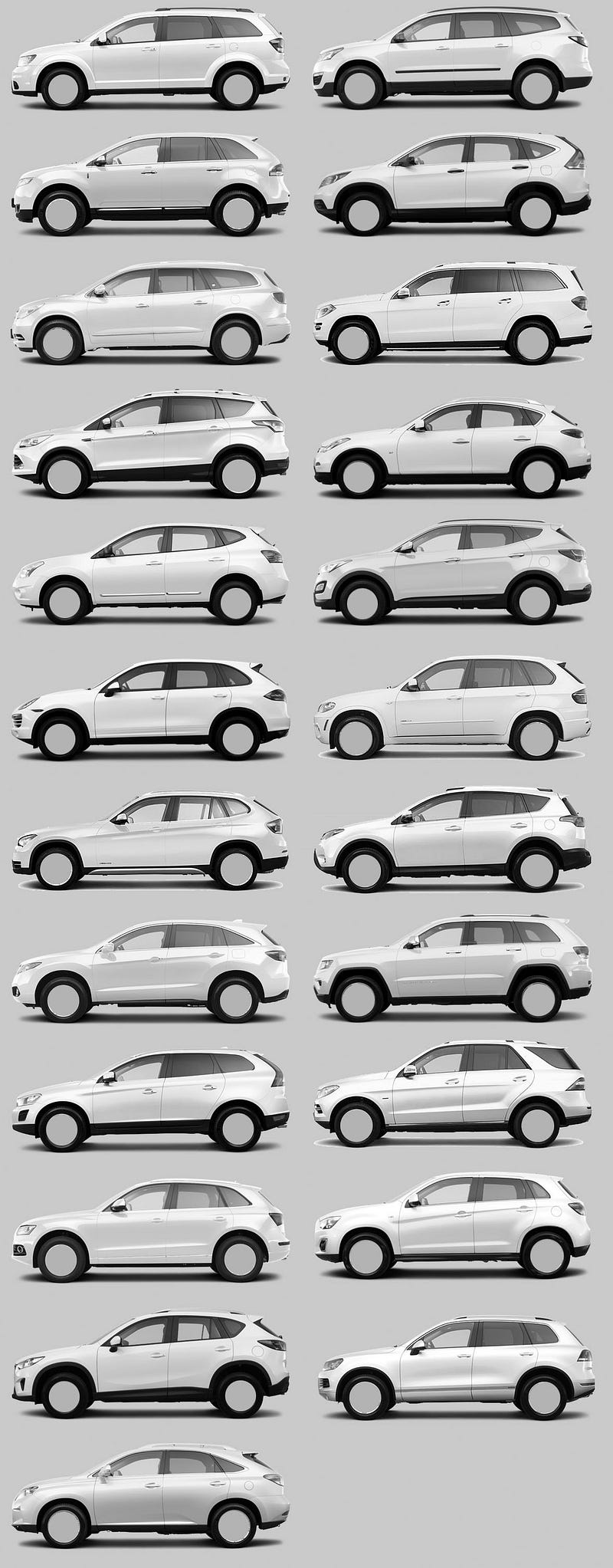
Here's a good example: Check out all of the small SUV's you see now, they're all elaborations on the same shape and form. I think this is by design, in that deviating from the norm right now is not something that is rewarded, but giving something visually 'safe' that hits most of the needs of their customer is acceptable.
It's more about the misattribution for the causes of success.
For instance I'd like to claim that Apple is an industry leader that has been misattributed as a design leader; it isn't their slick aluminum rectangles in isolation, it is them cohabiting with a marketing message and brand position working together that gave it the entire perception that leads to their success.
If say, Dolly Parton came out with a restaurant themed after a country jamboree and it went gangbusters it'd likely be incorrect to conclude Starbucks should have bales of hay and employees in 10 gallon hats and spurs to increase sales. A country themed restaurant is the correct way for Dolly Parton to execute a restaurant because she's Dolly Parton. It's not a brilliant idea in isolation and it's certainly not one that should elbow its way into other established brands in the same product category.
Yet this is the exact kind of logic that is done in software. We ignore the context of why something was successful for a particular institution and pretend it is transferable to all similar institutions regardless of context.
I don't know if that's just nostalgia speaking, but I think Windows 95 was the peak of UX. Everything interactable was clearly a button, everything had keyboard "accelerators", and all UIs were consistent (no Electron apps).
Agree, Win2K’s lightened grays are a lot less depressing than the darker tones used in 95/98. I much prefer its blue accent color over the old teal too.
I think that's actually (partially) a more pedantically correct rendering. The scrollbar isn't depressable, although the buttons on either end are. Clicking the "current location" widget portion of the scrollbar doesn't do anything, so flat isn't wrong there - it's clicking in the non-inhabited zone that jumps ~a page up or down but that's not really captured by either the Windows 95 or the Windows 2000 aesthetic, if memory serves. Windows 95 got the depressable buttons at the top and bottom of the page right, though.
It's really cool although I must confess I don't see the point in reimplementing the core OS if the goal is "a love letter to '90s user interfaces" - wouldn't have been able to more effectively address its goal as a DE for a more popular OS like Linux? Even if it needed to break X compatibility altogether (and I don't see why it would), it would still be more compatible and easier to deliver.
Of course, if it's just for fun then we shouldn't be asking why!
I think "just for fun" is probably a large part of it, but a stated reason is also that it makes tighter vertical integrations and consistency across all layers easier.
A very good test of a multi-item interface is to imagine it with exactly TWO items and see if it makes perfect sense that way. Or if it’s a toggle button, look at a single button and see if you know its state.
Now in this context, imagine the inactive item is invisible and clickable, and the active item looks like a button (that is traditionally clickable) but is not clickable. Imagine furthermore that you still have freaking buttons elsewhere in the same UI that look the same as the unclickable thing but are clickable, well, you have a problem. Now imagine the even bigger problem of reusing the exact same style for things like text fields that have an entirely different function.
This isn’t just Firefox, a lot of this is what Safari tried to pull, too. Or the entire concept of flat UIs.
I really, really want to respect the field of UI design and imagine that this stuff is hard, etc. but frankly some of this stuff is really not that hard to get right. There needs to be discipline, some science, some user testing, and someone with enough power to shoot down the truly dumb decisions, for a start.
And barring all that, I want a config file (or back in the day, ResEdit) where I can undo all the madness.
In this case. It is wrong to just test 2 tab, you need two at its 'narrowest' size. You will find nothing is even differentiable in this situation. The icon is now at middle of two title. And even worse, the gap is so big so you won't have confidence which tab will you hit unless you hit exactly on text or icon (at the cost of hit area reduced to 2/3 of original tab) or hover to see which tab lit(at the cost of delay due to visual check). As someone who likes to open many tabs, the experience sucks.
Yeah, apparently in modern design "affordances" are a relic of the past. Everything has this problem. I upgraded to Android 12 and now I have no idea what's clickable, because my world consists of floating text, and I'm just "supposed to know" how to operate it.
I miss having blue underlined links, and raised "faux 3d" buttons so I know what I'm supposed to be able to click. x.x
It's because Google's UX designers don't care about their users. They only care about getting promoted. Redesigning everything to be flat is a lot of work so a lot of people can get promoted doing it.
We can all blame Matias Duarte for creating and launching Material Design without performing any usability testing. A few days before the public launch, he presented Material Design at the Google all-hands meeting and admitted in the Q&A that they had just started usability testing.
I predict that everything will be flattened by 2024 and they will begin adding back the affordances. Then it will take a few years for other companies to start adding affordances back. Everything will be usable again in 2029.
> It's because Google's UX designers don't care about their users. They only care about getting promoted. Redesigning everything to be flat is a lot of work so a lot of people can get promoted doing it.
Arbitrary UI changes also help generate buzz for corporate marketing events.
Also, they're not even tabs - just floating buttons. Firefox is still my primary browser, but right now I have Chrome 95 and Firefox 94 open, and the tabs in Chrome just look perfectly normal - they look like tabs, you can see a visible border between inactive tabs, and the active tab stands out. The Firefox "tabs" just look ridiculous - I can think of no logical explanation as to why Mozilla decided on this look. It's neither functional nor pretty. Really frustrating...
I don't really have have any complaints, it's really easy to tell which tab is where and the mouseover makes it even clearer. Does it look better? Maybe. Does it function worse? No.
I am not sure why, because I don't actually remember how it used to work, but this version of Firefox is the first time I can remember where for some reason I keep getting confused about what tab is active and end up closing the wrong tab.
If I slow down and pay attention I'm OK, but it's definitely less functional for me.
I don't like it because the click area doesn't line up with the visibly-highlighted area, even on mouseover. The actual button extends beyond the highlight in every direction. Because the borders are visually indistinct, I have to aim for the center of each tab when I want to click instead of being able to confidently use the whole active area.
Yep. It's had the side-effect of making me use the keyboard for everything, which is a net positive, but the design itself makes it more difficult to target specific tabs with a mouse.
You're gonna have to actually defend the notion that having borders around interactive UI elements is "clutter". Calling it "clutter" doesn't make it "clutter".
> I presume there are high-contrast modes that can be enabled if you need that.
I don't, but I also don't see a reason to make "inaccessible" (or even "less accessible") the default.
If anyone robustly defending the previous border? Calling it useful doesn’t make it useful.
Ultimately we’re all just giving opinions and a proper study should be done if people want to argue either way. Until then it’s up to the devs as the people doing the actual work I guess.
The UI/UX department of the future will have only two employees, a hipster and a dog. The hipster will be there to feed the dog. The dog will be there to bite the hipster if they change the UI/UX.
That's what Google Chrome has done (in Incognito mode) on Android. Been that way for most of the past year. It is literally impossible to read the URL, or edit it reasonably. (I'll typically copy it to some open edit-box somewhere to do so.)
The depths of idiocy across the development landscape are ... depthy.
Firefox / Fennec remains my general very strong preference, though on this specific older Android device, Firefox/Fennec performance remains abysmal.
On a newer Android device, Mozilla's aversion to keyboard shortcuts is another major pain-point.
On e-ink devices, EinkBro is superior for some tasks (Chromium-derived), though it also has its annoyances.
From Google's perspective, an unusable privacy mode is a feature. It's the same reason that gstatic.com is refusing connections from proxy/VPN services, breaking most Google apps and slowing down loading of every website that uses Google-hosted fonts (which is most websites).
Trust me, I've realised this and it makes the gratuitous breakage all the more aggrevating.
I've been aggressive in removing Google from all aspects of my computing experience. When purchasing an e-ink reader/tablet earlier this year, avoiding Android was high on the list.
I ended up with the Onyx BOOX line, which is Android, though a somewhat de-googlified variant. Google Play ... won't actually work, which I'm fine with. I've installed Google Play Services, though I'm aware of a third-party alternative. App stores are F-Droid, APK-Mirror, and Aurora. I'm trying to minimise use of non-free software as well. Not entirely successfully but within reason.
The stock e-reader, Fennec Fox, EinkBro, Termux, and Pocket are my principle apps. Pocket is the only one of those that's not reasonably available from F-Droid (there's a very old version there, very badly broken --- the current version on Aurora is only badly broken.)
To be clear: I'm referring to text/background in the Navbar / Unibar on Chrome. In Incognito it's an ever-so-slightly-lighter-shade-of-pale against a nearly white background.
Again, for doing its job, of showing, you know, text, it's an absolute fail.
I can't even screenshot the brokenness because Chrome thinks the content is DRM'd.
Even in a new tab not opened to any page. (I've just tested this.)
My estimate is that trying to use a soft keyboard drops my effective intelligence by at least half.
Typing is slower and far more error-prone. I'm staring at the keyboard rather than what I've typed, so if there's an error, I don't see it as it occurs (which would enable me to correct it immediately), and navigation is exctremely imprecise. My error / typo rate with a software keyboard is through the roof.
With a keyboard, all of that is much more fluid, and I can focus on what I'm actually trying to say. Being able to toggle between apps and access application hotkeys is another huge bonus.
Downside is that many applications literally don't know what the fuck to do with a keyboard. Apparently keyboard entry is not a consistent low-level Android feature.
- The Pocketbook e-book reader interprets spaces when writing notes or search expressions as "page scroll" events. This is always delightful.
- The Mozilla Pocket app loses focus on each motherlovin' keystroke when entering tags. My enthusiasm for this behaviour is utterly without bounds.
- Depending on the keyboard and perhaps Android version, input of escape (hullo, vim), function keys, and other modifier keys ... is variable ... with Termux. The Logitech keyboard largely functions as advertised, though there are some workarounds required for function key usage (say, with Midnight Commander).
I'm sure you'll discover other fun surprises in your own preferred apps / workflow.
That it's easier to write longer pieces with a keyboard may or may not be a feature, though on balance I'd consider it a plus.
Using Termux or remotely accessing a Linux / *nix system with a real keyboard is also a huge improvement over soft keyboards. Termux (Linux userland available through F-Droid) remains the one thing on Android that does not precisely suck.
Is there perhaps a fundamental issue where some teams of UI/UX designers design for the sake of design? Maybe as a form of job preservation or having creative sessions on someone else's dime or something else?
I've wondered what happens when you stand up a team of people who mostly aren't necessary after a while and how good some might be at making themselves necessary.
I feel like a reasonably competent designer can make user studies and tests and research point to whatever conclusion they want about the need for more changes. But do we really need the change?
Or put it this way: how often does a team conclude, "our studies revealed that we're in good shape. Don't change anything!"
Simple answer: The change is a cargo cult. They see how Apple does this with their products and keep increasing uptake. They don't know that it isn't only the visible change itself that motivates adoption. Apple is keenly aware. Apple's customer isn't the person using Apple's product--that person can be inconvenienced (plus they tend to self-brainwash). The real Apple customer is the person watching an affluent/influential person using an Apple product and imagining how nice it must be based on the (superficial) clean simplicity of it all.
What is it with UI design slowly creeping to the extremes? Before "The Great Flattening" there was a series of prominent, increasingly skeuomorphic UI designs, culminating (in my mind) with the ridiculous Calendar app in OSX Lion[1].
Around this time, there seemed to be a growing sense that maybe things had gone too far. But instead of just backing off the skeumorphism a little we got a complete reversal and a trend towards increasingly flat and abstract UIs. Now most buttons have no affordances at all and we get decisions like this to remove useful visual cues for no apparent reason.
What's seems to be missing here is any sense of moderation or restraint.
On the other hand, when using "Tree Style Tab", it looks much nicer without borders (old TST screenshots have borders, but my current version does not).
With every Firefox update, I'm less and less interested in switching my personal browsing from Chrome to Firefox (I'm already using FF at work, so I follow the changes as they arrive). In theory I'd support the change to a more privacy-focused browser, but I can't really be bothered if the UX is way inferior
I used to use this extension, but when they went to WebRTC I couldn't find this extension anymore and gave up looking for it. Haven't used this in years but is easily one of the best tab interfaces ever invented.
Tabs are actually a great UI element, both visually and functionally – and are easily readable (how form and function combine). Moreover, these non-tab buttons are not only lacking definition, they also occupy precious visual bandwidth by their clutter. (Bandwidth clutter and aesthetic clutter are quite different beasts, and for some reason, this knowledge seems to have been lost recently.)
This war on tabs in browser UIs has to stop. There is no such thing as a functional square wheel. I'm also speaking of you, Safari.
I feel that the trend of UI/UX regression has been going on for some time now, and it is not limited to Firefox.
I recently fished out an old laptop with windows 7 on it. I turned it on after years. Although it was pretty slow (I think it was underpowered even when it was new), the UI in windows 7 looks absolutely beautiful. Pretty icons with lots of detail, copy and move dialogs with amazing animations, pleasing translucent window borders, sensible control panel, perfect start menu. Windows 10/11 feel amateurish by comparison.
Ubuntu 20.04 made console windows borderless, which is seriously annoying when several console windows are open. Doesn't matter which one has focus, either.
I really like Firefox. But this Tab design decision is smelling like function follows form instead of the other way around. Seems to be the Zeitgeist that utilities are designed to look good instead of being as useful as possible.
Lots of people here defending making the tab bar less accessible who have probably never thought "gee, I wish those tabs didn't have lines delineating where one ends and the next begins!"
I don't know if it's because my screen is small (~11 inches) but I hated how Firefox made the tab bar so "important" and attention taking. I'm one of the people who liked when Apple tried to change the safari tab bar [1].
The lack of visible tab bothered me, I ranted to a friend, then googled. i just switched my theme with a firefox color theme. Here, click this link if it bothers you and move on!
Imagine if Microsoft did that back in the day when it got hit with an antitrust lawsuit because it was bundling Internet Explorer with Windows. The Government is pro-corp today.
It's pretty awful if you have some tabs open to sites without a favicon. Or some without a favicon or <title>. Like happens in a dev environment quite a lot.
Yeah, I don't like it. But the tabs don't bother me as as the insufficient contrast between the search and url boxes and the rest of the menu in light theme.
Didn't something like this change already a couple of releases ago? I found it annoying for a couple of days and after that I have not really noticed any more.
I have Xubuntu and run the Firefox release they give me. Last week there was an upgrade, but I did not notice any major change to tabs. Maybe the same change I saw a while ago ended up in ESR now? Just a wild guess, have not checked their release status for ages.
A work-around I've been using on Linux is to set the GTK_THEME environment variable to the "high contrast" theme. With that theme it will draw a black outline around the focused tab.
Why was there even an edge there to begin with? Did it do anything? Hopefully one day they can remove the edge of the window as well. Imagine thinking that was a good idea.
It does make which tab is active easier to see, and that is the only reason i like it. My eyes are worse than they were and I hate fighting for clarity in the interfaces I use. Sometimes low contrasts themes are just more cognitive load.
By using a Chromium based browser you're making it more difficult for Firefox to stay up to date and you make it more difficult for websites to see the need to support Firefox at all. Once Firefox is out of the race, Google can do whatever it likes with its browser.
Firefox doesn't matter at all. Google already does whatever it likes with its browser. Firefox exists only because of Google money, so Google can credibly point at a competitor.
Personally, I can't imagine hand installing crx files every time an extension is updated. I can't imagine not having sync or container tabs. I can't imagine having "experimental settings" instead of about:config.
From the posted image, is it really that hard to differentiate the not active tabs? There’s a clear pattern: icon, title, close “x”.
I’ve liked the direction Firefox has been going in. It’s my primary browser again after a few years of Chrome. I can’t be alone in preferring the updated look, I’m sure there are dozens of us.