This is a fun follow-on article building on another fun article. Unfortunately it seems that with a decent probability the entire premise of the first article is wrong.
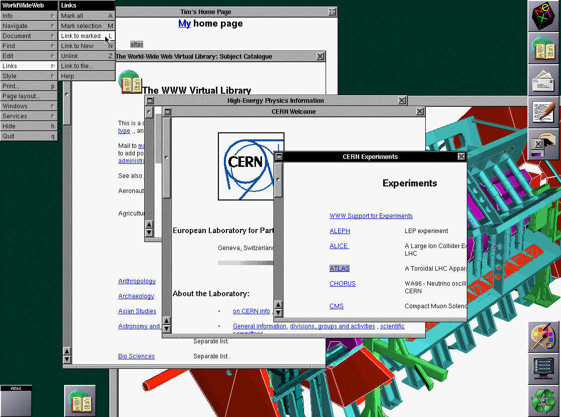
The original article concludes that Marc Andreessen added blue hyperlinks to NCSA Mosaic in 1993, and that's where blue came from in web browsers. This appears to have stemmed from the mistaken notion that WWW.app (Tim Berners-Lee's browser) was only monochrome. And this follow-on article makes the same claim:
> It is also interesting to note that WWW.app, the browser he was creating at the time, did not use blue hyperlinks.
But that's not true. It's true that WWW.app as originally created didn't have blue hyperlinks because it was written on early NeXT cubes, which were 2-bit monochrome. But NeXTs were color as of 1990. And it's clear that as of 1993 WWW.app had blue links, as we had dug up in https://news.ycombinator.com/item?id=28318055 In 1991 Tim Berners Lee had added comments indicating support for color hyperlinks in the immediate future. At some point between 1991 and 1993 this feature was turned on, and links were set to blue.
Since they both had or added blue by 1993, it is not clear whether Marc beat Tim to it or vice versa, but it seems to me likely that Tim was first. This is because (1) Since they both chose blue, it seems probable that one was copying the other. NCSA Mosaic was copying WWW.app wholesale in most aspects, and not the other way around AFAIK. And (2) Tim was influenced by earlier hypertext systems which used blue, as discussed in this article.
Unfortunately neither of these articles actually ask Tim when he added it: they just assume WWW.app ran only on monochrome machines when, long before 1993, NeXT workstations were in color.
I feel like the only other plausible color that could have been chosen is green, and even that seems too opinionated. Reasons being mostly associations (red, orange, yellow meaning danger or stop, and green meaning go) and legibility on white or gray backgrounds. Add to that that people seem to disproportionately pick blue as their favorite color and they especially seem to favor it as a conservative or relaxing color choice.
That is to say, I think the odds of two people independently picking blue are pretty good.
Q: I'm a student of visual communications and asked myself why links are blue. I found some answers that might be, for example blue is a color of learning, but I'm not sure what is right. Is there any reason, why links are colored blue ?
A: There is no reason why one should use color, or blue, to signify links: it is just a default. I think the first WWW client (WorldWideWeb I wrote for the NeXT) used just underline to represent link, as it was a spare emphasis form which isn't used much in real documents. Blue came in as browsers went color - I don't remember which was the first to use blue. You can change the defaults in most browsers, and certainly in HTML documents, and of course with CSS style sheets. There are many examples of style sheets which use different colors.
My guess is that blue is the darkest color and so threatens the legibility least. I used green whenever I could in the early WWW design, for nature and because it is supposed to be relaxing. Robert Cailliau made the WWW icon in many colors but chose green as he had always seen W in his head as green.
One of the nicest link renditions was Dave Raggett's "Arena" browser which had a textured parchment background and embossed out the words of the link with a square apparently raised area.*
That doesn't seem to suggest that links were green? "I used green whenever I could in the early WWW design" makes it sound like webpages were green, which is why the icon ended up being green.
> I used green whenever I could in the early WWW design, for nature and because it is supposed to be relaxing. Robert Cailliau made the WWW icon in many colors but chose green as he had always seen W in his head as green.
Maybe he meant here the webpages themselves (closer to how NTPSec's website (https://www.ntpsec.org/) looks now) than to the hyperlink themselves.
He is clearly refering to the link color. Partially because that was the question and partially because his other comments, like "embossed out the words of the link with a square apparently raised area" are also clearly referring to link styles.
That said, I find his answer very unsatisfying, though that should perhaps be expected of color arguments.
I date myself but I actually used the Arena browser way back when before moving on to Netscrape. It was kinda cool the paper look though so many things were novel in the early 90s internet.
I must have experienced this article completely differently from you a couple of hours ago when reading it - I thought that it claims that the origin of the blue links was user experience research from the 1980s?
I think OP is glossing over how much of a leap it is from Hyperties to Berners-Lee. (I was curious because the story 'red is too strong!!!' is a good fit for my https://www.gwern.net/Red page.) As written, it sounds like the color research was reported in the _Hypertext on Hypertext_ package, and Berners-Lee had a copy and was deeply immersed in it. Neither is true.
The first paper from the Hyperties group cited (https://www.gwern.net/docs/design/1986-koved.pdf) does not cover color at all. It does mention some user-testing. I checked all the papers in _Hypertext on Hypertext_ and none mention Hyperties or color in any major way. (The keynote is a good read, incidentally: https://www.gwern.net/docs/design/1988-vandam.pdf ) If you look at the Berners-Lee document cited, the Hyperties mention is buried in the bibliography; it is not even cited in the main text nor is Hyperties or link coloring mentioned, so I'm not sure why it's there at all, but it sounds like one of those cites-just-to-be-comprehensive, which often mean the author has never read the citation in question - so based on that, I'm unsure that way over in Europe Berners-Lee read any of the papers, much less actually saw the disk in action. The historical Hyperties page includes videos which show that by the time of the disk, they had defaulted to blue for link coloring, and mentions testing 3 colors (red was also used in Hyperties for other interface parts, so obviously they tested red vs blue vs ???). But the Hyperties papers after that do not mention color anywhere either. In fact, I can't find any Hyperties publication at all which reports the color usertesting or even that the results favored blue. It seems you just had to look at _Hypertext on Hypertext_ and assume that they picked blue because it was good?
So, checking OP's references, I think Berners-Lee may never have seen _Hypertext on Hypertext_ (at least, in computer form); and if he had, he would not have known the blue was the result of user testing (because nothing in it says so); and if he had both seen & deduced that, he may not have both remembered & cared years later when setting up his own browser defaults for color monitors, and he doesn't say so anywhere.
It's an interesting pattern with academic HCI work like this. For instance, Shneiderman (who did legitimately innovative design work!) often claims not only Hyperties's hyperlink styling as an academia -> industry success story but also the iPhone keyboard: his group had done a series of usability studies on various tiny keyboard approaches. And yet Ken Kocienda, who actually created the iPhone keyboard, has told me he was unaware of this work (and in fact never surveyed prior work). I've heard the same story for CSCW interface elements. Not encouraging!
I think it's common to a lot of tech work where convergent evolution or exogenous drivers are important. This is something that I rant about in machine learning too: very often, researchers invent something by trial-and-error or just independently, and then they forge an academic pedigree or theory to retrodict their results. It's everywhere, just most researchers drop all of the failed experiments and focus on post hoc explaining the ones that worked. (Schmidhuber is the patron saint of this kind of intellectual fraud, which raises 'post hoc ergo propter hoc' to the only rule of history.)
I would merely roll my eyes at this (does it really hurt anyone to believe that 'Shneiderman designed the iPhone keyboard'? HCI people know almost all their work is useless anyway), but it leads people to greatly overvalue the role of theory and understanding in ML progress, and undervalue the role of compute. If you believe that resnets were invented by thinking hard to come up with a beautiful theory about identity transformations & gradient propagation, then you are going to make different forecasts and emphasize different things than if you knew the reality was that resnets had been repeatedly invented but failed because there wasn't enough compute to show that they worked on anything but toy problems like the swiss roll and the final invention of resnets was grad students throwing random archs at the wall to see what stuck who happened to have enough GPUs that they could show it worked amazingly well on ImageNet and then had to explain why mashing together multiple layers with additional connections did anything.
You gotta admit, it's an awesome new name for some good old concepts (kinda like "AJAX"). Many Millennial Brogrammers eat that edgy macho shit up. They should throw Mega Monster Extreme Learning Machine Hack-O-Thon Training Rallies every Sunday, Sunday, Sunday !!!!!!
The same kind of macho dick oriented subversion happened when Mark Weiser's sissy Calm Technology / Ubiquitous Computing got rebranded by IBM's macho Pervasive Computing Division. (Because it's all about dividing and penetrating and grabbing and embedding trophies of desire and charging attacks and swearing about war metaphors in the trenches!)
>IBM vows to make computing pervasive: Big Blue voices its intention to grab a piece of the pervasive computing market, where computing power and Net access are embedded in everything from handhelds to cars.
>IBM Takes on Pervasive Computing: While everyones still talking about the potential of wireless technologies, Rod Adkins, general manager of IBMs pervasive computing division, is in the trenches, helping the Armonk, N.Y., company develop wireless solutions for its customers. A major initiative at IBM, pervasive computing extends e-business to new devices. Adkins is charged with integrating IBMs technology, software, hardware and services into wireless and mobile solutions.
DonHopkins on Dec 11, 2019 | parent | context | favorite | on: Flutter: UI platform designed for ambient computin...
31 years late, Google attempts to re-brand "Ubiquitous Computing" (aka "Calm Technology") as "Ambient Computing". At least it sounds more mellow, less intrusive, unwelcome, penetrative, and phallic than the other attempt at rebranding UbiComp as "Pervasive Computing" in order to sell it to the military.
>The term pervasive computing followed in the late 1990s, largely popularized by the creation of IBM's pervasive computing division. Though synonymous today, Professor Friedemann Mattern of the Swiss Federal Institute of Technology in Zurich noted in a 2004 paper that:
>Weiser saw the term 'ubiquitous computing' in a more academic and idealistic sense as an unobtrusive, human-centric technology vision that will not be realized for many years, yet [the] industry has coined the term 'pervasive computing' with a slightly different slant. Though this also relates to pervasive and omnipresent information processing, its primary goal is to use this information processing in the near future in the fields of electronic commerce and web-based business processes. In this pragmatic variation -- where wireless communication plays an important role alongside various mobile devices such as smartphones and PDAs -- ubiquitous computing is already gaining a foothold in practice.
You say pervasive, I say perversive. Let's call the whole thing off.
Going off the main topic—just went through your “Red” page and, as always, it’s a treat. (I think you might be a bit too quick to dismiss the historical paucity of inks, given how very traditionalist typography is, but then again even among the most progressive of artists it’s still the bathing of the red horse for some reason... Also a bit surprised to see no mention of amber screens alongside green ones, even if colours of early monochrome terminals seem to have been more constrained by the available coatings and their properties than by ergonomics.) A technical note: it seems unfortunate for an article about red on white background that illustrations have their colours transformed by default in dark mode, so maybe a manual exception is in order for this specific page?
I've never run into much material about amber screens, so while I know of them, I dunno if they were anything but a minor variant or if they worked better or if users liked them more. The green motif is so much more dominant in computing history memories.
(You make a good point about dark mode - it uses a heuristic to decide to invert, which is correct on images with a lot of white, which you usually don't want to see in dark mode, but /Red is an exception where the page is specifically about the color. I'll disable inverting on those images.)
I have to admit I have no deep knowledge of amber screens, I just thought of them because the first computer I’ve seen had one (and even now I prefer amber on black to green on black).
I think there was the thing where a green screen requires less beam energy for the same brightness, but while I can see why this might be relevant for oscilloscopes, which use electrostatic deflection (and indeed almost universally have green screens), for a large terminal screen with electromagnetic deflection it shouldn’t be that important. And besides, colour TVs existed (if perhaps not in a very affordable form) long before the 70s, so one would think that by the time of the VT100 it should have been possible to make a screen of whatever colour one wanted. Yet that is apparently not true?
I think it's possible that the blue links do in fact derive from earlier work, but the article seems pretty muddled. The connection it makes from the earlier work to the web browsers seems to be via the impact it had on Tim Berners-Lee: yet the article once again argues (seemingly incorrectly) that it was Marc and not Tim who introduced blue links:
> Besides that, I was also bothered by the fact that even though I was able to determine that Mosaic was indeed the first browser to use blue hyperlinks, I was not much closer to determining why the hyperlinks themselves were blue.
Thanks - I think I'll have to puzzle over this one for a little longer (so I don't have much to add here), but wanted to acknowledge your response (it does help in understanding your top-level comment).
Ben Shneiderman recalled that "Tim told me at the time that he was influenced by our design as he saw it in the Hypertext on Hypertext project".
Ben Shneiderman wrote the following email to John Gilmore and I, in response to a question John asked me about the origin of the term "hyperlink" raised in a discussion on the Internet History mailing list. John then forwarded Ben's email to the Internet History mailing list, here:
>My students conducted more than a dozen experiments (unpublished) on different ways of highlighting and selection using current screens, e.g. green screens only permitted, bold, underscore, blinking, and I think italic(???). When we had a color screen we tried different color highlighted links. While red made the links easier to spot, user comprehension and recollection of the content declined. We chose the light blue, which Tim adopted.
>His systems with embedded menus (or hot spots), where a significant user interface improvement over early systems such as Gopher. But Tim told me at the time that he was influenced by our design as he saw it in the Hypertext on Hypertext project that we used Hyperties to build for the July 1988 CACM that held the articles from the July 1987 Hypertext conference at the University of North Carolina. The ACM sold 4000 copies of our Hypertext on Hypertext disks.
Here's some more information about High-Precision Touchscreens, 1988-1991 HCIL Research, which may be what whoever mis-quoted Ben about inventing the iPhone keyboard was actually referring to. Specifically, Ben and his students developed the "Lift-Off Strategy" and other visual feedback techniques that made it possible to precisely select small targets on touch screens. Below, he simply and truthfully stated that "the iPhone uses a lift-off strategy", not that he invented the iPhone keyboard.
At the time, touchscreens were notorious for being hard to use, and they usually triggered on the location you initially touched the screen, instead of giving preview feedback when you touched, and letting you change the selection while providing visual feedback before lifting off and selecting something like a key or text or pixel.
Also, the precision touch screen work at HCIL was cited as prior art in legal cases contesting the Apple patents related to the "Slide to Unlock" touchscreen slider that unlocks the iPhone.
During 1989-1991, we worked on a home automation system and explored several direct manipulation designs (e.g. clocks and calendars to schedule devices to go on and off, ON-OFF switches with buttons or sliders) . A playful fingerpainting exploration tool and toy called Playpen was developed. Finally we worked with National Cash Register (NCR) to explore how touchscreens might be used to replace keyboards when store cashiers needed to enter a little bit of data about shopppers (such as phone numbers or addresses). We stopped doing research on touchscreens as successful applications found their ways in museums or cash registers. Pen interfaces, made popular by the Palm Pilots, continued the work as they afforded a similar sense of "real" direct manipulation. Eventually touchcreens came back as the input device of choice of mobile devices, especially after the launch of the iPhone is 2007.
For a quick summary of our work refer to:
Shneiderman, B. (March 1991), Touch screens now offer compelling uses,
IEEE Software 8, 2, (March 1991) 93-94, 107.
Also in Sparks of Innovation in Human-Computer Interaction, Shneiderman, B., Ed., Ablex (June 1993) 187-193.
For a longer review of the state of the art of touchscreen use at that time see:
Sears, A., Plaisant, C., Shneiderman, B., A new era for high-precision touchscreens (1990 tech report),
CS-TR-2487, CAR-TR-506
Later published in Advances in Human-Computer Interaction, vol. 3, Hartson, R. & Hix, D. Eds., Ablex (1992) 1-33.
We produced the first HCIL Video Report in 1991 by recording the demonstrations from 1988-1991 (most are now on YouTube and embedded below). Those videos were given along with copies of our papers to all the sponsors of the lab, and attendees of the annual HCIL symposium. The videos were available for sale, and have been used extensively in HCI classes. Many were also published as part of the ACM CHI videos.
Between 1988 and 1993 Apple was a sponsor of the HCIL lab, Steve Jobs visited in person in 1988, and Ben Shneiderman was a consultant for Apple at several occasions. Demos were also shown to our lab's visitors, and videos shown during invited lectures at conferences or during industry visits (see Ben Shneiderman's resume for a partial list)
From bad reputation to high precision touchscreen
In 1987 (and still long afterwards) touchscreens had the bad reputation of being imprecise. Most user interface books would state that touchscreens selections were "of course limited to targets larger than the average finger". To use touchscreens for browsing information systems such as Hyperties, we had to be able to select small targets (e.g. the letters of the alphabets of the index table of content). At the time, all touchscreens selections were done in such a way that a target was selected as soon as the finger came over it, and the corresponding action was performed immediately (we called it "first touch" or "land-on" strategy). Errors were common, due to parallax or calibration problems, and users were frustrated when the wrong target was repeatedly selected by mistake.
Lift-Off strategy
A first breakthrough was to propose an alternative technique for selection: the lift-off strategy. As users touch the screen, feedback is provided as to what will be selected and the action takes place when the finger is lifted off the screen. In our implementation a cursor was drawn on the screen slightly above the finger. When the cursor was over a target, the target was highlighted. Users could then either lift-off their finger to select the highlighted target, or adjust their position by sliding their finger to a neighboring target. This was a major breakthrough: only the cursor position mattered for the selection, not the finger itself. Selecting a single character was now possible.
The touchscreen technology has greatly improved but overall the lift-off strategy is still useful (e.g. the iPhone uses a lift-off strategy.)
88-04 Potter, R.L., Weldon, L.J., Shneiderman, B. (May 1988).
Improving the accuracy of touch screens: an experimental evaluation of three strategies,
Proc. of the Conference on Human Factors in Computing Systems, CHI `88 (Washington, DC) 27-32.
Also Sparks of Innovation in Human-Computer Interaction, Shneiderman, B., Ed., Ablex (June 1993) 161-169.
High-Precision touchscreen: the next step was to try to stabilize the touchscreen so that the cursor would stay put when the finger didn't move. This was accomplished with a clever time-dependant averaging of the positions returned by the device. Now, individual pixels could be selected (in the 480x350 high resolution screen of the time). An experiment showed that there was significant difference in selection times and error rates between mouse and touchscreen for targets down to about 1mm2, when using a lift-off strategy with a stabilized touchcreen. Companies such as Elographics and Microtouch, with whom we had good relations, integrated stabilization techniques into the drivers of their touchscreens. From then on, high-precision was possible, and designers could do everything with the touchscreen that they could do with the mouse.
89-17 - Sears, A., Shneiderman, B. (June 1989)
High precision touchscreens: design strategies and comparisons with a mouse,
International Journal of Man-Machine Studies, (1991) 34, 4, 593-613.
Also Sparks of Innovation in Human-Computer Interaction, Shneiderman, B., Ed., Ablex (June 1993) 171-185.
[...]
Toggles (buttons, sliders, rockers etc.),
In 1990 we designed and compared a series of touchscreen toggle switches allowing devices to be switched ON or OFF. The designs included button type toggles and sliding toggles.
This video was distributed to the attendees of the 1991 Human-Computer Interaction Laboratory Open House on June 7, and later on published in the SIGGRAPH Video Review, Issue 77 corresponding to the CHI '92 Technical video program.(see the accompanying CHI'92 Proceeding short paper). The video and its short paper are now being cited as prior art in legal cases contesting the Apple patents related to the "Slide to Unlock" touchscreen slider that unlocks the iPhone.
Designed originally for home automation, those toggles were also later used in a NASA design toolkit. Now slider designs can be found everywhere in touchscreen-based smartphones (such as the first iPhone in 2007). As we mentionned in our paper and video a slider design is more secure so that the phone cannot be turned on by mistake. A click confirms the action. Any design that enforces a sliding gesture would achieve a similar goal.
90-08 Plaisant, C., Wallace, D. (Nov. 1990)
Touchscreen toggle switches: push or slide? Design issues and usability study,
CS-TR-2557, CAR-TR-521
There are some more links in the Internet History mailing list discussion started by Vint Cerf about the origin of the term "hyperlink", including some email from Ben Shneiderman and Marc Andreesen that they agreed to share:
>I asked Jeff Rulifson if he could help us figure out when "hyperlink"
entered into usage. Jeff was the principal programmer for Douglas
Engelbart's NLS editing system in which such links were introduced. Ted
Nelson coined terms like "hypertext" in his Xanadu concept - the two were
contemporary in the 1960s.
>Here is Jeff's response: [...]
Here's my reply quoting email from Ben Shneiderman and Marc Andreesen with more citations and links:
>I contacted Mark Anderson who provided some useful information – he agrees to passing this on, so you can share with others. See below and attachments. Claus Atzenbeck also works on hypertext history, but he could not provide further information.
>So we don’t know who coined hyperlinks, but I think the claim that my idea (some time in 1984) and the work of UMd grad students (especially Ostroff and Koved) defined, implemented, and validated the visual design of highlighted selectable hyperlinks within a paragraph (what TBL called hot spots) remains intact. A strong piece of evidence is the April 1986 CACM paper with Koved. For those checking exact dates, the paper says “Received 9/85: accepted 11/85”. The Ewing et al paper from 1986 says “Received 6 March 1985” …both are attached.
>Ewing J, Mehrabanzad S, Sheck S, Ostroff D and Shneiderman B (1986), "An experimental comparison of a mouse and arrow-jump keys for an interactive encyclopedia", International Journal of Man-Machine Studies, Jan., 1986, Vol 24, pp. 29-45. [Abstract <>] [BibTeX <>] [DOI <http://dx.doi.org/10.1016/S0020-7373(86)80038-4>]
>Ostroff D and Shneiderman B (1988), "Selection devices for users of an electronic encyclopedia: an empirical comparison of four possibilities", Information Processing and Management, Nov., 1988, Vol 24(6), pp. 665-680. [Abstract <>] [BibTeX <>] [DOI <http://dx.doi.org/10.1016/0306-4573(88)90004-0>]
>The 4000 copies of the PC-based Hypertext on Hypertext disks, using Hyperties from Cognetics Corp, published by ACM appears to have been widely influential in gaining adoption. That is what TBL cites in his Spring 1989 manifesto for the web, and his choice of light blue highlighting comes from our work…. As he told me at some conference.
>The video made around 2015 by me, shows it in operation:
>You are welcome to pass this around and/or post to the discussion boards that are debating this issue. Comments or clarifications are welcome.
>--Ben
>From: Mark Anderson
>Sent: Tuesday, April 14, 2020 10:17 AM
>Ben,
>[cc-ing in Mark Bernstein who often seems to recall erly hypertext-related facts. Mark: this is discussion on first use of the term ‘hyperlink’, as well as use of coloured links. You might also add a useful reference on first use of the history (i.e. nodes traversed i-session) , booksmark and breadcrumbs ("Bookmark & Compass" perhaps?)]
>Oh yes, please do. I do think early hypertext history likes this needs collecting, while we can. Straddling the start of the digitised print age, much of the early stuff is now on paper and hard to find. My bookshelf is now growing with publisher proceedings. They are bought second-hand and mostly come with (cancelled) university library. Thus for subjects that would have been niche at outset, the scope for loss if knowledge is high.
>I have also know skim-read the ECHT’90 Proceedings (uot of print and no ebook available [sic]) and not found any mention of ‘hyperlinks’.
> Anyway, here is the first mention, in context. The ABC paper (links as per my last email) in HYPERTEXT’91 Proceedings, page 185, original authors'styling of text:
>Referring, once again, to level 1 of the data model: the server differentiates between structural links and hyperlinks. Constraints on structural links determine the type of the subgraph; –e.g., no node in a tree subgraph may have more than one incoming link. Hyperlinks, however, may join any two nodes in the same subgraph or in different subgraphs. … Thus, the first level of the data model actually consists of nodes, structural links, hyperlinks, subgraphs, and hypergraphs, all with associated contents and attributes.
>I attach an RTF file with a number of hypertext-related proceeding (some only available in paper form). Both DL.ACM and IEEE proved incapable turning results for the term ‘hypertext’ in the full text of documents. In the case of DL.ACM it couldn’t even find the above which suggests OCR-recovered texts aren’t being indexed/searched properly. Oh dear! DL.ACM looking at the 1960-90 window did find 4 instance of the word hyperlink in 1991—none in hypertext papers.
>The word is not indexed [sic] in my 1992 edition of O’Reilly’s “The Whole Internet” and I can’t find the term in the brief 36 pp chapter (#13) on the Web. I’ve also checked Nelson’s Literary Machines (I have a digitised copy of the c.1991 edition) as well of some of his early (late 60s) papers I’m helping archive at present. Nothing there.
>Here is the file:
[I have uploaded the PDF attachments and linked to them here (and inlined the text one), since the internet-history mailing list email size is limited. -Don]
Embedded menus: Selecting Items in Context.
Larry Koved and Ben Shneiderman.
Communications of the ACM, Computing Practices, April 1986, Volume 29, Number 4, p. 312-318
An experimental comparison of a mouse and arrow-jump keys for an interactive encyclopedia
John Ewing, Simin Mehrabanzad, Scott Sheck, Dan Ostroff and Ben Shneiderman
International Journal of Man Machine Studies (1986) 24, p. 29-45
p. 185:
Referring, once again, to level 1 of the data model: the server differentiates between structural links and hyperlinks. Constraints on structural links determine the type of the subgraph; –e.g., no node in a tree subgraph may have more than one incoming link. Hyperlinks, however, may join any two nodes in the same subgraph or in different subgraphs. … Thus, the first level of the data model actually consists of nodes, structural links, hyperlinks, subgraphs, and hypergraphs, all with associated contents and attributes.
HyperCafe: Narrative and Aesthetic Properties of Hypervideo pp1–10.
https://doi.org/10.1145/234828.234829
p.7 Fig. 8 Caption: A portion of the HyperCafe script organized and hyperlinked using Storyspace
Moulthrop, Stuart. Dreamtime, A hypertext with time-constrained hyperlinks,1992.
This still causes issues for me from time to time with a dark GTK theme + Firefox on Linux. Developers like to set the default color to something like #222 and leaving the background as default, or unreadable black on black. Mozilla also still lets you set different defaults if you want. People shouldn't assume a default background color and if you want white, set it to white.
As someone who's colorblind, I'm grateful for blue links. The worst are pages where the links are red and they've turned off the underscore--I have to drag the mouse all over the page to see where the pointer changes so I can find them. :)
This is more easily, faster and better done as a user stylesheet:
  a {
      color: blue !important;
      text-decoration: underline !important;
      text-decoration-style: solid !important;
      text-decoration-color: blue !important;
  }
(Unfortunately, extensions like Stylus <https://github.com/openstyles/stylus> don’t handle user stylesheet priorities correctly: !important in a user stylesheet should override absolutely all site stylesheets, including inline style attributes. But because of lousy technical limitations, they load stylesheets at the site priority rather than the user priority. But then, what you presented doesn’t conquer a site !important spec anyway. See https://wattenberger.com/blog/css-cascade#origin for a really good explanation of all this stuff.)
You call a function passing a string of "blue", but the fuction's variable is named hex implying it will hold something formated "0000FF". yes, it's still a string, but....
I don't mean to be overly critical of pseudo code examples. I just wanted to point out how naming things is hard even in quicky code.
We now return to your regularly scheduled discussion already in progress.
The html color attribute can be given either a hexadecimal string or a named html color keyword. I'm on my phone so I can't run their code, but it looks like it should work with both "blue" or "0000FF" (it might need to be "#0000FF"?).
So that actually makes naming it even more difficult, in my opinion :P
Other thoughts: pure blue is a colour that is representable even in very old colour computers. It's also the only readable pure colour. (I'm guessing, human eyes see it badly, so it intrinsically looks "dark" at full brightness.)
"I just happened to choose the color that everyone else in the industry was choosing for no reason at all" is not very persuasive, especially 28 years later.
On the contrary, it's very persuasive, because if it was mere fashion, plenty of people would dissent, while if it was convergent evolution because it was the only feasible choice...
I’m putting this lightly edited archive of a bunch of different discussions and email about HyperTIES, all together in one place here on Medium. Please forgive the rough wall of text and redundancy, but I haven’t yet had time to distill it all down into one sentence. I will just include the email I sent to Ben Shneiderman summarizing the interesting posts and links, for now. Here goes:
I recall purchasing Framemaker in a PC brick-and-mortar store around those early times for something like $650, it was by far the most expensive piece of software I'd purchased. I'm not sure I've personally bought any software for that much in the decades since.
I used to call it "Painmaker", because it was "Riddled With Features".
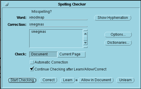
The NeWS Toolkit version of Framemaker had a spelling checker that was uncannily apt in its cheeky suggestion for correcting the spelling of "xmodmap".
I used The NeWS Toolit version of FrameMaker 2.1.1 on OpenWindows (whose user interface was developed by the legendary NeWS hacker Stan Switzer) to write the manuals for the version of SimCity that ran on NeWS (whose user interface was written in and rendered with PostScript), and HyperLook (which was like a networked PostScript based HyperCard for NeWS). Both manuals credit Framemaker on the second page. I was using the PostScript version of FrameMaker to write more PostScript code to document even more PostScript code!
Speaking of writing PostScript with PostScript, Stan also wrote an elegant PostScript Quine, which is even shorter than the Lisp Quine (PostScript is like a cross between Lisp and Forth, but homomorphic and more like Lisp actually -- but PostScript is even homomorphicier than Lisp because it has an even shorter Quine!):
    Date: Thu, 14 Sep 89 20:29:28 -0400
    To: NeWS-makers@brillig.umd.edu
    Subject: A PostScript Quine
    From: spectral!sjs@bellcore.com  (Stan Switzer)

       "'Yields falsehood when preceded by itself in quotes" yields
       falsehood when preceded by itself in quotes." -- W. V. O. Quine
       (paraphrase)

    A "quine" is a program which when evaluated yields its own
    representation.  A quine can be formally described as a fixed point of
    a language's denotation function.  Trivial evaluations (e.g.:
    literals) are excluded and the program cannot require any input data
    (e.g.: "cat cat.c").

    In my experience, the merit of a language is inversely related to the
    length of its shortest quine.  (Though I _am_ prejudiced toward
    reflective semantics.)

    For the heck of it, let's say a PostScript quine is a procedure
    "{...}" which when followed by "n { exec } repeat" yields the same (or
    equivalent) value for any non-negative integer value of "n"
    (including 0).

    The shortest I have found for PostScript is

      {{[ exch /dup load /exec load ] cvx} dup exec}

    Compare to Lisp:

      ((lambda(f)(list f (list 'quote f))) '(lambda(f)(list f (list 'quote f))))

    or (ASCII) C:

      char*f="char*f=%c%s%c;main(){printf(f,042,f,042,012);}%c";main(){printf(f,042,f,042,012);}

    Not that it'll change your life or anything...

    Enjoy,

    Stan Switzer  sjs@bellcore.com
The only problem I have with Stan's theory about the merit of a language being inversely related to the length of its shortest Quine is the existence of "10 LIST" in BASIC, which is a decidedly un-meritorious language. But to its credit, DECSYSTEM 10 BASIC even has a "LISTREVERSE" command, which might be useful for implementing a Eniuq. For what it's worth, "10 LIST" and "10 LISTREVERSE" are also Line-by-Line Palendromic Quines, since single line programs are the same listed forwards and backwards.
>LISTREVERSE and LISTNHREVERSE print the contents of the user's memory area in order of descending line numbers. LISTREVERSE precedes the output with a heading, LISTNHREVERSE eliminates the heading.
Stan now works at Adobe (of course, how could they NOT hire him after he wrote that beautiful PostScript Quine! ;) ):
SimCity, Cellular Automata, and Happy Tool for HyperLook (nee HyperNeWS (nee GoodNeWS)):
HyperLook was like HyperCard for NeWS, with PostScript graphics and scripting plus networking. Here are three unique and wacky examples that plug together to show what HyperNeWS was all about, and where we could go in the future!
I like Stan Switzer's definition that "[a] quine can be formally described as a fixed point of a language's denotation function", but it's insufficient. It has to be some interesting fixed point.
Because, not only is this such a fixed point of Lisp's denotation function:
((lambda(f)(list f (list 'quote f))) '(lambda(f)(list f (list 'quote f))))
because it calculates its own source code when evaluated at the REPL, but so is this:
0
But 0 isn't a satisfactory quine. A quine should be some sort of surprising fixed point.
The requirement that a program must produce its own image in a character stream when run in batch mode, in a language in which programs don't have access to their source code in any shape, and in which expressions do not print their values, usually is enough of a restriction that eliminates the trivial, uninteresting quines.
I really appreciate Elise Blanchard following up and publishing a timeline combining all the information she gathered!
Regardless of whether it was parallel evolution, or people just copying things they’d seen somewhere without remembering where it was, the fact is that Ben Shneiderman arrived at the color blue by user testing and scientifically measuring comprehension and recollection, and widely published papers and software to the other academics and researchers who were bothering to pay attention at the time, like Tim Berners-Lee, who he discussed it with.
While Marc Andreesen is apparently implying that Netscape just got lucky by choosing the only color that wasn’t yet used.
Personally I prefer user interfaces whose designs are conscientiously based on peer reviewed published scientific research and sound scientific theories like Fitt's Law (which inspired pie menus), rather than blind luck and cargo-cult cloning of shallow surface features, and I hope that more commercial companies look to, credit, and support academic research and history for inspiration of their designs, instead of just hoping to get lucky.
We certainly appreciate and acknowledge all the generous support that companies like Apple, Sun, NCR, Elographics, Microtouch, and other institutions like Smithsonian Museums and the Library of Congress gave us at HCIL.
I wish more companies, investors, and government organizations strategically supported the academic research and open source software development they so wisely and successfully exploit.
>There are many ways for companies, institutions, and non-profits to engage with HCI at UMD and many reasons for doing so, including sharing real-world challenges and perspectives with our talented students and getting fresh perspectives on your design challenges. Below is an overview of opportunities for your consideration. [...]
>Fitts's law (often cited as Fitts' law) is a predictive model of human movement primarily used in human–computer interaction and ergonomics. This scientific law predicts that the time required to rapidly move to a target area is a function of the ratio between the distance to the target and the width of the target. Fitts's law is used to model the act of pointing, either by physically touching an object with a hand or finger, or virtually, by pointing to an object on a computer monitor using a pointing device.
>Comparison with other interaction techniques: Pie menus are faster and more reliable to select from than linear menus, because selection depends on direction instead of distance. The circular menu slices are large in size and near the pointer for fast interaction (see Fitts's law). Experienced users use muscle memory without looking at the menu while selecting from it. Nested pie menus can efficiently offer many options, and some pie menus can pop up linear menus, and combine linear and radial items in the same menu. Pie menus just like any popup menu are shown only when requested, resulting in less visual distraction and cognitive load than toolbars and menu bars that are always shown.
>My students conducted more than a dozen experiments (unpublished) on different ways of highlighting and selection using current screens, e.g. green screens only permitted, bold, underscore, blinking, and I think italic(???). When we had a color screen we tried different color highlighted links. While red made the links easier to spot, user comprehension and recollection of the content declined. We chose the light blue, which Tim adopted.
>His systems with embedded menus (or hot spots), where a significant user interface improvement over early systems such as Gopher. But Tim told me at the time that he was influenced by our design as he saw it in the Hypertext on Hypertext project that we used Hyperties to build for the July 1988 CACM that held the articles from the July 1987 Hypertext conference at the University of North Carolina. The ACM sold 4000 copies of our Hypertext on Hypertext disks.
>Between 1988 and 1993 Apple was a sponsor of the HCIL lab, Steve Jobs visited in person in 1988, and Ben Shneiderman was a consultant for Apple at several occasions. Demos were also shown to our lab’s visitors, and videos shown during invited lectures at conferences or during industry visits (see Ben Shneiderman’s resume for a partial list)
[...]
>During 1989–1991, we worked on a home automation system and explored several direct manipulation designs (e.g. clocks and calendars to schedule devices to go on and off, ON-OFF switches with buttons or sliders) . A playful fingerpainting exploration tool and toy called Playpen was developed. Finally we worked with National Cash Register (NCR) to explore how touchscreens might be used to replace keyboards when store cashiers needed to enter a little bit of data about shopppers (such as phone numbers or addresses). We stopped doing research on touchscreens as successful applications found their ways in museums or cash registers. Pen interfaces, made popular by the Palm Pilots, continued the work as they afforded a similar sense of “real” direct manipulation. Eventually touchcreens came back as the input device of choice of mobile devices, especially after the launch of the iPhone is 2007. [...]
>High-Precision touchscreen: the next step was to try to stabilize the touchscreen so that the cursor would stay put when the finger didn’t move. This was accomplished with a clever time-dependant averaging of the positions returned by the device. Now, individual pixels could be selected (in the 480x350 high resolution screen of the time). An experiment showed that there was significant difference in selection times and error rates between mouse and touchscreen for targets down to about 1mm2, when using a lift-off strategy with a stabilized touchcreen. Companies such as Elographics and Microtouch, with whom we had good relations, integrated stabilization techniques into the drivers of their touchscreens. From then on, high-precision was possible, and designers could do everything with the touchscreen that they could do with the mouse. [...]
Don't know if this is related at all, but some 80's home computers used white or yellow text on blue background because of all color combinations that was best readable with the "worst case" TV connection (coax cable) - the blue seems to have been very "analog signal" friendly.
by 1993, blue was becoming the industry standard for interaction for hypertext.
The operative words here are "industry standard". In other words blue links are merely a convention, like driving on the left.
Many websites don't conform to the 'industry standard', and use colors like red unaccessed links, followed by another 'non-standard' color for an accessed link instead of the purplish color that most websites use.
I hadn't come across this book before, but I popped for the Kindle edition, and found an excerpt about HyperTIES. It also goes into fascinating detail about many other early hypermedia systems. Jakob Nielsen writes deep well-researched books and articles about usability and user interface design, and he gives excellent talks and keynotes! (He's aka "guru of Web page usability", "king of usability", and "usability Pope", but definitely not "usability Godfather"! ;) )
His raises important points about Hyperties' design being focused on ease-of-use by museum visitors and ease-of-authoring by museum curators and historians, the simple consistent keyboard interface, configurable link colors, and the definition window at the bottom of the screen that previews descriptions of link targets in context before you even visit them (often making it not necessary to even follow a link and lose your context). And he describes the different touchscreen interfaces like the "Lift-Off" strategy that Rich Potter designed and empirically evaluated with Hyperties. Some of these ideas are useful but missing features that I wish modern web browsers would natively support (like pie menus, of course).
What Jakob Nelson's book didn't mention was that the Sun NeWS research version also featured built-in and use-defined pie menus for navigation, window management, font and color selection, embedded PostScript applets with interactive widgets, scalable color PostScript pictures and animations, pop-up cut-out embedded graphical links, as well as tabbed windows in the emacs based authoring tool.
>Hyperties (1983)
>Hyperties was started as a research project by Ben Shneiderman [Shneiderman 1987b] at the University of Maryland around 1983. It was originally called TIES as an abbreviation for The Interactive Encyclopedia System, but since that name was trademark by somebody else, the name was changes to Hyperties to indicate the use of hypertext concepts in the system.
>Since 1987 Hyperties has been available as a commercial product on standard PCs from Cognetics Corporation. Research continues at the University of Maryland, where a workstation version has been implemented on Sun workstations.
>One of the interesting aspects of the commercial version of Hyperties is that it works with the plain text screen shown in Figure 3.3. It is thus suited for DOS users. Hyperties also works with the main graphics formats on PCs and PS/2s and can display color images if the screen can handle them.
>The interaction techniques in Hyperties are extremely simple and allow the interface to be operated without a mouse. Some of the text on the screen is highlighted and the user can activate those anchors either by clicking on them with a mouse, touching if a touch screen is available, or simply by using the arrow keys to move the cursor until it is over the text and then hitting ENTER. Hyperties uses the arrow keys in a special manner called "jump keys," which cause the cursor to jump in a single step directly to the next active anchor in the direction of the arrow. This way of using arrow keys has been optimized for hypertext where there are normally only a few areas on the screen that the user can point to and the use of keys has been measured to be slightly faster than the mouse (see Chapter 6).
>In the example in Figure 3.3, the user is activating the string "Xerox PARC," which is indicated by inverse video. In the color version of Hyperties it is possible for the user to edit a preference file to determine other types of feedback for selections such as the use of contrasting color.
>Instead of taking the user directly to the destination node as almost all other hypertext systems do, Hyperties at first lets the user stay at the same navigational location and displays only a small "definition" at the bottom of the screen. This definition provides the user with a prospective view of what would happen if the link were indeed followed to its destination and it allows the user to see the information in the context of the anchor point. In many cases just seeing the definition is enough. Otherwise the user can of course choose to complete the link.
>A Hyperties link points to an entire "article," which may consist of several pages. Users following the link will always be taken to the first page of the article and will have to page through it themselves. This set-up is in contrast to the KMS model, where a link always points to a single page, and to the Intermedia model where a link points to a specific text string within an article. The advantage of the Hyperties model is that authors do not need to specify destinations very precisely. They just indicate the name of the article they want to link to, and the authoring system completes the link.
>The same text phrase will always point to the same article in Hyperties, which again simplifies the authoring interface but makes the system less flexible. Many applications call for having different destinations, depending on the context of perhaps on the system's model of the user's level of expertise.
>Many of the design choices in Hyperties follow from the original emphasis on applications like museum information systems. These applications need a very simple reading interface without advanced facilities like overview diagrams (which cannot be supported on plain DOS machines anyway). Furthermore, the writers of the hypertexts were museum curators and historians who are mostly not very motivated for learning complex high-technology solutions, so the similarity of the Hyperties authoring facilities to traditional text processing was well suited for the initial users. Now Hyperties is being used for a much wider spectrum of applications.
>The commercial version of Hyperties uses a full-screen user interface as shown in Figure 3.3, whereas the research system on the Sun uses a two-frame approach similar to that of KMS.
He compares and contrasts the designs and features of many different hypertext systems. Here's a section on pointing devices that discusses the "Lift-Off" touch screen strategy developed for Hyperties, which explains the importance of performing empirical user studies, and measuring the performance of specific applications, as opposed to just guessing colors and whinging input handing strategies:
>Pointing Devices
>Almost all current hypertext systems are used with a mouse as the pointing device. Several human factors studies of computer interfaces in general have shown that the mouse is a good pointing device, and it has certainly seen wide use in recent years.
>Ewing et al. [1986] compared the mouse with a special use of the keyboard arrow keys for activating hypertext anchors in Hyperties. This special use of the arrow keys has them jump the cursor in a single step to the hypertext anchor that is nearest to the previous cursor location in the direction indicated by the arrow key pushed by the user. It turned out that the mouse was somewhat slower than this special use of the arrow keys (3.3 min. vs. 2.8 min. for anchors that are close by and 3.5 min. vs. 3.3 min. for anchors farther away).
>For some hypertext applications, such as information kiosks, the mouse is too fragile to be used. In these situations it is common to use a touch screen as the pointing device instead. Touch screens are not used in the standard protected office environment because having to raise their arms quickly becomes tiresome for users and because the touch screens are normally less precise than the mouse.
>The simplest implementations of touch screens emulate the mouse and can therefore be used with any hypertext system without any need to change the software.
>Touch screens can, however, be used in several different ways to activate hypertext anchors. Potter et al. [1989] tested several strategies for activating anchors in Hyperties, including the "land-on" strategy, which activates a point on the screen the moment the user touches that point (similar to a MouseDown event in mouse-driven interfaces); and the "take-off" strategy, which activates the point which the user last touched when the hand is taken off the screen (similar to MouseUp events). Users performed about the same with these two strategies but had a tendency to be slightly slower with the take-off screens. Error rates were significantly lower with the take-off strategy since users could see what they had selected before lifting their fingers.
>Potter et al. also tested a touch screen strategy called "first-contact", which activates the first selectable area on the screen entered by the user's finger. If the user touches down on selectable area, the result is the same as the land-on strategy, but if the user touches down on a blank area, nothing is selected until the user's finger has moved to the first active region on the screen (similar to a combination of MouseEnter and MouseWithin events in a mouse system) There was no statistically significant difference between the first-contact and the take-off strategies in this experiment done with Hyperties, even though fairly large and significant differences had been found in an earlier experiment [Potter et al. 1988] on selection in a traditional text environment. In the earlier, non-hypertext experiment, subjects had to select targets that were two characters in width and were separated by a two character space. For such a task, the first-contact strategy gave rise to a lot more errors but was somewhat faster than the lift-off strategy where users could see what they were selecting. In Hyperties, however, the anchors are typically whole words which are far apart on the screen so users have a much smaller risk of touching something by mistake and they don't need to rely as much on the feedback. The different outcome of these two experiments shows the importance of conducting usability tests of as high a validity as possible with regard to the actual final use of whatever is being tested. For selecting hypertext anchors, the first-contact and take-off strategies performed about the same, so the take-off strategy might be chosen by a designer because it is the simplest to explain to users. But for a text editing application, one should choose the first-contact strategy.
>Potter, R., Berman, M., and Shneiderman, B. (1989). An experimental evaluation of three touch screen strategies within a hypertext database. Intl. J. Human-Computer Interaction 1, 1, 41-52.
>Touch screen were more usable when a take-off strategy rather than a land-on (touch-down) strategy was used for registering user selections.
Here's another discussion of the lessons learned by Hyperties:
>In contrast, Shneiderman [1989], in his discussion of the lessons learnt from building more than thirty hypertext structures for Hyperties, emphasized the key lesson that each project was different and had to have its information structured according to a principle that was suited for its specific domain. Shneiderman's experience also showed, however, that it is necessary to have a single managing editor to coordinate a project and to copy edit the final result. So there is certainly the potential for tension among the people whose work it will be to create future, large information bases. Just as software developers may feel frustrated by user interface standards restricting their design options, information base developers may be frustrated by having to place consistency over their individual creativity. One hopes that the unique individual needs of each project will provide enough variation to keep this problem to a minimum, but only further experience can tell.
>Shneiderman, B. (1989). Reflections on authoring, editing, and managing hypertext. In Barrett, E. (Ed.): The Society of Text, MIT Press, Cambridge, MA, 115-31.
>Surveys several Hyperties applications, including one about the Hubble Space Telescope implemented in a two-frame version of a Sun workstation. The chapter also contains a discussion of the authoring aids in Hyperties. A large part of the chapter is dedicated to the lessons learnt from building more than 30 hypertext structures for Hyperties. One key lesson is that each project was different and had to have its information structured according to a principle that was suited for its specific domain. Experience shows that it is necessary to have a single managing editor to coordinate a project and to copy edit the final result.
Here's a reference and description of an early hypermedia system called "gIBIS" that used color links, however it doesn't mention and I don't know which colors it used -- but according to Marc Andreesen, there are only four good ones, so you can probably guess ;) .
>Conklin, J., and Begeman, M. L. (1988). gIBIS: A hypertext tool for exploratory policy discussion. ACM Trans. Office Information Systems 6, 4 (October 1988), 303-331. Also in Proc. 2nd Conf. Computer Supported Cooperative Work (Portland, OR, 26-28 September) 140-152.
>Describes the gIBIS system (graphical Issue-Based Information System). gIBIS is used in the MCC Design Journal project to provide a computerized record of a software design process with special emphasis on capturing the rationale behind the design decisions through hypertext links among issues, positions and arguments. gIBIS is designed for color workstations and uses color to indicate node and link status (for a color screen shot, see [Begeman and Conklin 1988]). Preliminary empirical observations indicate that users had a greater tendency to add supporting comments than to add objecting ones. Some users complained about the danger of premature segmentation of new ideas and would have liked a proto-node" simply to record ideas before structuring them. The first half of this paper (describing the system itself but not the empirical evidence about its actual use) can also be found in [Begeman and Conklin 1988].
Unfortunately this PDF is not color, but here is the Begeman and Conklin 1988 iBIS paper:
Memex (1945), Augment/NLS (1962-1976), Xanadu (1965), Hypertext Editing System (1967) and FRESS (1968), Aspen Movie Map (1978), KMS (1983), Hyperties (1983), NoteCards (1985), Symbolics Document Examiner (1985), Intermedia (1985), Guide (1986), HyperCard (1987), The World Wide Web and Mosaic, HTML, Hyper-G and Harmony, Navitext SAM, gIBIS, Half-Dead Hypertext and the Electronic Business Card, conversions of The Manual of Medical Therapeutics and Oxford English Dictionary, and a comprehensively annotated bibliography of surveys, societies, compendium, conferences, journals and magazines, videotapes, books about the Internet, and references to classics like:
Bush, V (1945) As we may think. Atlantic Monthly, July, pp. 101-108.
>Map of Philippine island where Doug first encountered the article.
>Because we're on the Doug Engelbart Institute website, we've added what we know about Doug's first encounter of Bush's article, and how it influenced his work, as one case example of Bush's influence on this Pioneer of the Information Age.
>In September 1945, shortly after arriving in the Phillippines to serve as a US Navy radio and radar technician, then twenty year old Doug Engelbart ran across the latest issue of Life Magazine, which included a reprint of Vannevar Bush's article "As We May Think." He found the magazine in a Red Cross library located in a traditional hut on stilts on the island of Leyte. Watch Doug describe his first encounter (and in more detail here in his CHM Oral History video). Additional accounts can be found in his Stanford Oral History Interview.
>The article made a big impression on Doug at the time, but did not appear in his work until around 1959 or 1960 when he began developing his "augmentation framework." He dug up a copy of the article to study in depth (see his notes in the margins in his copy of the article at right), and described it in detail in his seminal 1962 report Augmenting Human Intellect: A Conceptual Framework (beginning at paragraph 3a4), including several quotes from Bush's article, and discussion as to potential relevance.
>While preparing said Report, Doug wrote a letter to Vannevar Bush, seeking permission to quote his article, outlining his own work, and describing his earlier encounters with Bush's 1945 article. Doug enclosed with this letter a summary description of his work titled "Program On Human Effectiveness." See also Doug's Abstract for his talk at this 1995 Bush Symposium for a brief glimpse into how his thinking evolved vis-a-vis Vannevar Bush's "As We May Think."
This writing style is very off-putting. How many times is the author going to throw in references to their destroyed home and "hate mail" before getting to the point?
I actually vividly remember the first article, as it was riddled with assumptions about things that were easily verified or looked up. I have no interest in reading the follow-up.
Ugh, who cares about this person and their recent experiences? I just want to know about why hyperlinks are blue and they've mentioned their circumstances in both paragraph one and paragraph four, wasting at least four seconds of my time! It's a blog on internet culture, it doesn't need any personal element. /s
The original article concludes that Marc Andreessen added blue hyperlinks to NCSA Mosaic in 1993, and that's where blue came from in web browsers. This appears to have stemmed from the mistaken notion that WWW.app (Tim Berners-Lee's browser) was only monochrome. And this follow-on article makes the same claim:
> It is also interesting to note that WWW.app, the browser he was creating at the time, did not use blue hyperlinks.
But that's not true. It's true that WWW.app as originally created didn't have blue hyperlinks because it was written on early NeXT cubes, which were 2-bit monochrome. But NeXTs were color as of 1990. And it's clear that as of 1993 WWW.app had blue links, as we had dug up in https://news.ycombinator.com/item?id=28318055 In 1991 Tim Berners Lee had added comments indicating support for color hyperlinks in the immediate future. At some point between 1991 and 1993 this feature was turned on, and links were set to blue.
Since they both had or added blue by 1993, it is not clear whether Marc beat Tim to it or vice versa, but it seems to me likely that Tim was first. This is because (1) Since they both chose blue, it seems probable that one was copying the other. NCSA Mosaic was copying WWW.app wholesale in most aspects, and not the other way around AFAIK. And (2) Tim was influenced by earlier hypertext systems which used blue, as discussed in this article.
Unfortunately neither of these articles actually ask Tim when he added it: they just assume WWW.app ran only on monochrome machines when, long before 1993, NeXT workstations were in color.