The problem with "data driven" approaches is that they often miss the context.
Which can make their results absolute garbage.
Like data driven can tell you a button is "not used often" it can't tell you that a button is "essential to be fast available in some safety critical situations". (Or for other examples, that a feature is not unused because people don't want it but because it's hidden or bad designed.)
But somehow I still meat people which believe that poorly data driven approaches will yield the best results, which as far as I can tell is complete unrealistic. (Which doesn't mean in any way you shouldn't also use data for decisions, just be aware that data just shows a part of an picture and can often be very misleading.)
This reminds me of my ex gym. About a year ago they put counters on all the machines. After some time they decided most of the machines were not used often enough and should be removed to expand the free weight section (which was comapritavely busy). What the didn't account for was the free weight section was essentially busy with the same set of people who spend all their time at the gym for heavy training.
Myself and quite few others who come by themselves to the gym more infrequently andwere using the machines (you need a spotter for the same exercises on the free weights). Now both groups paid the same for membership, but they essentially removed the ability for one group to train, needless to say I moved to a different gym. By blindly following the data they optised for worse customers (you want people to subscribe but not show up often).
> By blindly following the data they optised for worse customers (you want people to subscribe but not show up often).
There are other considerations. If it costs a lot more to have someone using the machines than to have someone using the free weights, you might be better off with just the free-weight crowd than you are also having the intermittent machine guys. You want customers that are profitable, which isn't the same thing as customers that only rarely show up.
Err... what? Gyms literally live off the customers that just go once in a month or directly never show up. They are dimensioned taking this into account, and they charge factoring this in. If 100% of the customers were body-builders using free weights, they would have to charge them at very least 2x.
My take is that the gym changed course, and instead of having half ghost customers who only reluctantly pay, they choose to go for heavy users who will take space, but also book coaching sessions, buy products and are more than willing to put the money on the table.
If it's really what happened I'd see that as a pretty great move.
>were body-builders using free weights, they would have to charge them at very least 2x.
At same spaces, yes! Good quality barbells and weights, while expensive, keep for over 30 years. Bodybuilding and powerlifting doesn't take much space, so you don't need a large space, and the customer base is dedicated and can often tolerate their gyms being a bit out of the way. Machines, however, like to break and are incredibly expensive compared to barbells and weights.
It isn't about the customers never showing up, it is the machines taking up space on the floor, unused 90% of the time, which stops more of the free-weight crowd from joining because the gym is too crowded.
When people want to join a gym they ask the fit guy which gym they recommend. It's a bit like techies recommending thinkpads or macbooks which gave those respective products massive boosts.
It reminds me of the study of WWII airplane, when trying to figure out where to reinforce the planes. The key was the absence of data was more important than the plethora of data.
"Context" is definitely a word of the decade nominee.
As a non-English computer user, I'm increasingly annoyed by Crowdin-style jumblations. Missed context is the common trope for both - whether the less-used feature do mean the feature is less important, or whether the "Play" on a button do mean "I instruct you _Play_ this media" or "I want to _Play_ this game" depends on the context(the language I mainly use do use separate words for the latter two).
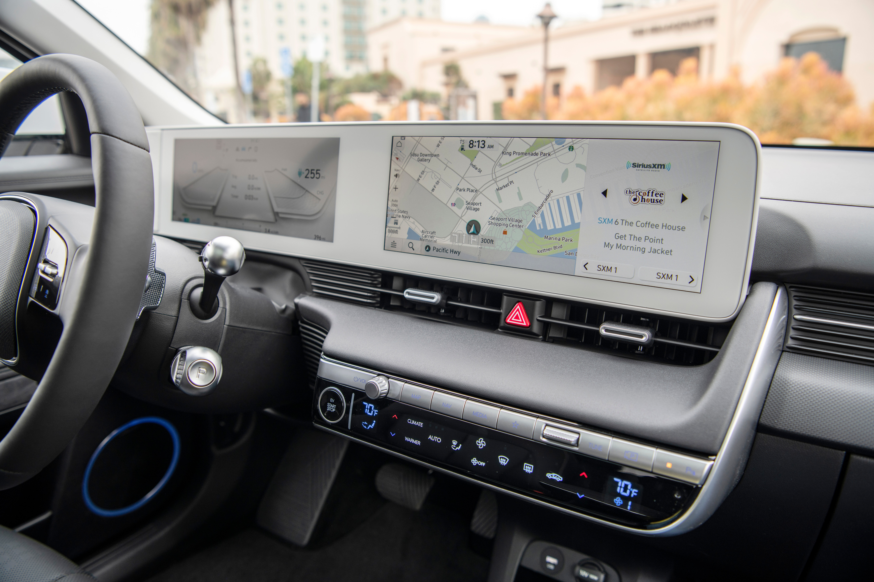
By regulation (at least in Europe) that's a physical button, so is unchanged. But the point applies for fog lights for example. They used to be on the quick controls menu, which was already bad compared to physical buttons, and are now a further click away as if they're not something that you need to use while driving when suddenly entering a foggy area. The new UI is quite bad.
I find it hard to understand why these things are allowed to be more than one button away in the first place. You really don’t want people driving a 2 ton monster taking their eyes away from the road to locate something 3 submenus deep.
Tricky thing about "data driven" / behaviour observation is:
App/icon X may be the most COMMONLY used one.
But it doesn't necessarily make it the most IMPORTANT one, the one I need to reach in a hurry / most easily.
I don't know how to capture, via automated telemetry, "this occasional button I REALLY REALLY need"... so it's just hubris then.
I'm an outsider, I've only entered Tesla's as opposed to driven them, but the UX is such a massive deal-breaker for this old grouch, it's unbelievable. I wish it weren't so but c'est la vie.
It's also subject to an unhealthy feedback loop. Oh, this button isn't commonly used, so let's move it to a slightly less prominent place. Oh, this button's usage dropped, it must be super unimportant, let's move it behind a menu. Oh, nobody ever presses this button, let's get rid of it.
I get this a lot with URL autocomplete. For some reason it decides “news” means “some other URL with news in its <title>”, then out of habit I type news+enter and it takes me to that website, further reinforcing “Yeah he goes to this website a lot, let’s keep that at the top autocomplete priority!”
So now I have to type “news.” before it will fill news.ycombinator.com, because it started showing me the wrong option and I kept inadvertently picking it because it used to give me the right one.
There doesn’t seem to be any mechanism for it to realize “every time this happens he closes that website immediately and goes to a different one that we ranked #2 in the autocomplete search.” So until I retrain my muscle memory I’ll just keep on mistraining the autocomplete even further.
> “every time this happens he closes that website immediately and goes to a different one that we ranked #2 in the autocomplete search.”
This is a disheartening yet frighteningly common problem with UI automation. It doesn't learn enough to actually be aware of the expected result, yet it can't be programmed to behave exactly as you want or need.
Automation in user interfaces should be exactly the opposite. It should try to learn your repeated actions so that you can perform them automatically, yet if the learning goes wrong, the user should be in control at all times and override the automatic deduced actions.
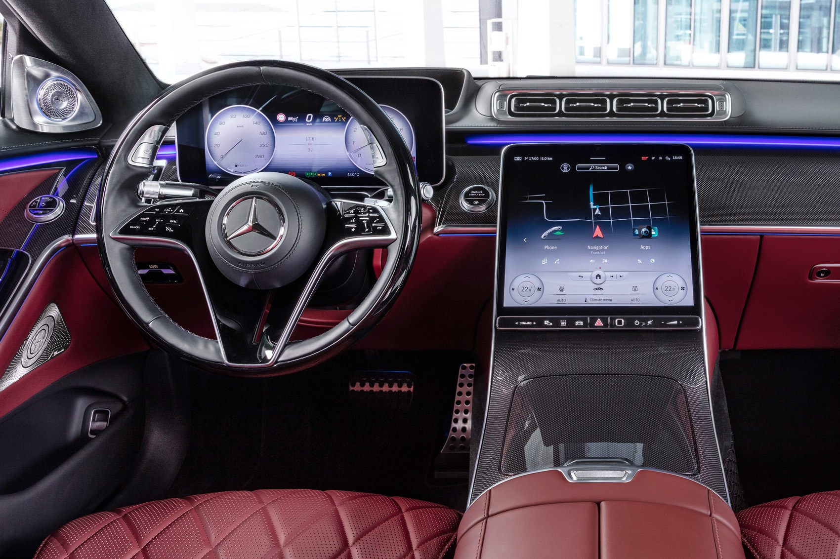
Indeed. What is the largest button I have in my Renault's dash? It's the triangle-shaped hazard light switch. Do I ever use it? I hope not. Do I want it to be that big? Yes, I do.
That's actually one complaint I have about the 1st gen Chevy Volt - the hazards switch is a physical button... on the right side of the center console, over by the passenger. It's not a location that is either rapid to find if you don't know where it is, or particularly rapid to hit when you need them - it's a substantial span reach, unsupported, on a smaller button than I think reasonable. Though, admittedly, I miss the ones on the top of the steering column. That was standard enough for a long time that I still look for the toggle there.
I use them at least a few times a year, though far less than I used to when I was on the interstate a lot more. Any time traffic rapidly drops more than about 20mph, I light up my hazards to let following traffic know, "Yes, you see brake lights, no, they're not just people scrubbing a few miles an hour off - get on your brakes now!" Probably a habit I picked up from truckers, a lot of them do this for the very understandable reason that a big rig doesn't stop on a dime, and even if they will, you're likely to unstack your cargo in the process.
Super infrequently used compared to other buttons, but also not something I really have the time go sorting through menus for when I need it. And neither do I trust the car's automatic systems to turn them on for me.
Though, if I could dream, we'd use LED brake lights to encode braking intensity somehow. The car knows if I'm barely touching the pedal to cancel cruise control and light up the brakes, or if I've just mashed them to the ABS actuation point, but the brake lights don't encode any of this useful info. You couldn't rely on it for car behavior (trivial to spoof, and get rid of tailgaters), but it would be an additional useful input for driving - "Woah, hey, that car in front of you just nearly locked up their wheels, radar data agrees, slow down!"
Actually, I've seen that some cars will rapidly flash the brake lights a few times if the brakes are applied hard. I don't know off the top of my head which cars though.
Is there a good reason for these regulations in the U.S.? I've seen illegally modified brake light flashing under heavy braking and appreciated it. It catches my attention extremely well (which is the point).
Maybe the concern is that in heavy traffic a sea of flashing lights will overwhelm / distract people too much? Or cause seizures? I'm really not sure.
Brake light modulators are many decades old, generally illegal, and therefore aftermarket modifications. The ones that light up like a Christmas tree for feathering the brakes are obnoxious (other than for motorcycles, perhaps), but I'm totally on board with this being standard for ABS situations and similar.
I heard more than a decade ago that Mercedes designed that system but could not pass regulations back then. Plenty of cars do it today so that must have changed.
I've mostly installed them on motorcycles over the years. The combination of a modulator/flasher (several pulses and then solid) and a bright LED tail light makes a HUGE difference in how cars behind you follow - I converted several motorcycles at different points in time and observed the rather significantly increased following distance on each one as I converted them.
I don't know the legality of them, but nobody ever complained on the motorcycles.
This is pretty common in Europe. This may be different because regulation is usually a lot more flexible here regarding car lights (e.g. adaptive headlights) than in the US (although I understand the US is catching up, and there are obviously some areas where the EU has been more strict in terms of daytime lighting and side visibility, mostly for safety reasons).
Most German cars will flash the brake lights when you push the brakes hard, and they will also automatically turn on hazard lights if you brake hard to a (near) full stop (assuming you were going some minimum speed of 50 or 70 km/h).
ABS stepping in is not a requirement as far as I could tell (had this a few times when erring on the side of caution when the light turned yellow). Not requiring ABS makes sense because even if you’re driving on proper roads and your recent German car has great tires and brakes and doesn’t need ABS to decelerate quickly, the truck behind you probably still needs a bit more time and early warning to avoid a collision.
Many dealerships install them on all the new cars on the lot, along with protective films and the like. This lets them have a reason for the list price to be well above MSRP without it being a straight dealer surcharge.
I think Chevy got feedback on that or something, as that's something they changed on the Gen 2 Volt. The hazard switch is now right by the driver's seat, "down-left" from the shifter.
I use it occasionally, when there is a sudden traffic jam, or a potentially dangerous situation. It's not every day, but certainly more common than the fog lamps (and I really don't want that to be less accessible either). In my old car it used to be a big button in the front of the console (not a Renault, but a Citroën). It was really easy to hit, which was great. When I need it is usually not a situation where I can take a second to make sure I am pushing the right button.
Not about the Tesla issue, but telemetry isn’t the issue here. Bad goaling and not being context aware is the issue.
For the type of situation that you mentioned, it’s common to design counter metrics or context dependent metrics. Define the “really important” situation, see how often people can use the necessary button in that time. Define your goals based on that ratio and you are on the right track.
The thing is, interfaces are limited. I think there’s a reasonable discussion around how important different features are, especially when they are rarely used in general.
Again, I’m not too familiar with Tesla, and it sounds like they made choices different than you think they should. But it’s not the approach that is the problem - setting bad goals or bad strategies is at issue.
Think in terms of financial day trading, I always had a panic button that wired to the deepest dark pool to get out of the situation ASAP, even with a hefty cost.
> I don't know how to capture, via automated telemetry, "this occasional button I REALLY REALLY need"
I suppose a way is to correlate use of the button with activity that may indicate an emergency situation. For example strong accelerations, quick movement, etc... Some touchscreen can also sense how strong the push is, and we have a tendency to push harder on important buttons.
Right, and in the original scenario the defogger button would still be unused in critical situations... Because nobody would be able to find it in critical situations.
What might actually be useful is instead of a "recently used", you've got a "used in similar circumstances" or "popular with other drivers RIGHT NOW". So if everybody is suddenly turning on their fog lights, maybe you should too.
That's exactly the point: you want the button you need to be there.
Rarely used buttons may be hard to find and yet very important in specific situations. If car companies really want to use some form of AI in the UI, that's going to be bad in almost all cases, except if they use it to help you find that important but rarely used buttons in those rare situations where you need it.
Of course it should also still be immediately accessible in its normal spot.
> I'm sure the decision was "data driven" based on real life usage.
You're assuming Tesla's end goal is to make the car more usable, and not to maximize revenue.
Their goal is to be transportation smart TV. Sell apps, media, advertising, etc. That's why so much money is being poured into self-driving cars. Americans in particular spend a massive amount of time staring at pavement, and that represents a huge untapped market.
Self-driving cars aren't about the betterment of humanity; the deaths and injuries are certainly horrific in scale, but self-driving cars don't solve the primary problem: our heavy use of low occupancy vehicle trips is not sustainable environmentally, energy-wise, land-use wise (roads or parking), logistically, economically (6+ year car loans, crumbling infrastructure because we can't afford to keep it all in good repair, etc)
Even assuming that you are correct in your absolutely ridiculous assumption that self-driving cars are about controlling the movement of the population, why would you think it would be government control and not control of the company that is trying to develop the self-driving technology?
All the articles posted regularly on HN about governments requesting data on users from companies --- and the latter obediently doing so --- aren't enough evidence?
Why? The government already controls city layout. If they don’t want you to go somewhere, just don’t build a road there at all. If they don’t want you going there sometimes, use tire spikes.
City layout can gently recommend things just as easily as it can force something. Allowing roads to fall into disrepair, not mentioning stuff on maps, putting stuff you want people to see nearby stuff that people have to go to.
I think it's more that big co want us to lease everything so they can dictate the prize. You can't afford a house, you have to pay even for the transport to your non-self-controlled work... All you have is your ass.
Precisely. Unvaccinated? Your car won't allow you to drive to a restaurant.
(If you think this sounds like an exaggeration, just look at how technology is currently being used for government control around the world, and consider how self driving cars will be different).
I'm more concerned with cars taking certain route to pass by a restaurant that is paying for advertisement. But I can understand how the whole covid narrative gave some pople an excuse to feel opressed.
If it's anything like most of the software industry, being data driven means you look for data to support what you wanted to do already, but pretend you're being objective and rigorous.
Uh. Really? On the ceiling? Or have I screwed up my perspective entirely there?
If it's actually on the ceiling, I either know it's there, or I'll be into pulsing my brakes manually before I bother to find it should I actually need it.
That was my reaction too. It took me a few seconds to realise I was looking up at the dome lights, and the object half-visible in the bottom of that image is the rearview mirror. This video confirms it:
On every other car I've been in, any switches in that location I would naturally assume are for controlling the lights right next to it, but evidently no one in Tesla's design chain thought of that...
IMO not an unreasonable placement. The button is quite recognizable and right at the fingertips, unless it's been prone to accidental presses.
The trim of the dash in the picture, as much as luxurious it may be, reminded me of driving a desk, a walnut or ?mango wood desk... sitting in a comfy four-wheeled office chair. Also notable so many buttons on the driver side door, not sure for what purpose.
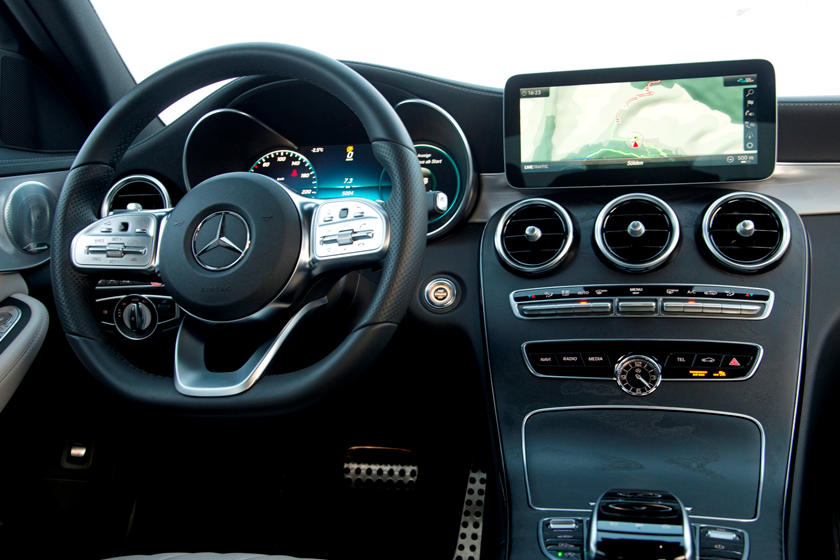
W203 nailed it. I'm a hazard light trigger happy driver, and I can hit it without looking, but if you weren't used to it you would find it immediately.
This is bad. Maybe it is because this switch is often used in Germany (when you approach a traffic jam on the autobahn you should press it), they though after a few of these incidents one would have figured out.
That one was even harder to find because it's not centered. In that image I noticed what looks like two Chevy bowties on either side of the steering wheel, before I found the hazard light button (spoiler: it's toward the passenger side and looks almost like the other buttons in the area.)
I doubt the move was "data driven". Elon has made it very clear his vision is to make the car automated enough that the driver doesn't need to interact with the UI. If anything, he's intentionally trying to change user behavior and train drivers they don't "need" these controls.
I don't very much trust Elon's vision in this regard, with respect to the near-to-medium term (say, the next 5 years or so). It seems very unlikely that within the next 5 years technology will have advanced sufficiently to enable that level of automated driving in day-to-day traffic.
He might have intuition in this area, but one individual's intuition is a poor substitute for actual data.
Hm, when they took away the defog button did they control for cold/wet/rain? Sure, the defog button isn't used much when you don't need to defog, but when you do, you need it right away!
I'm a big Model 3 fan but I hate the new UI. At least let us use the new docking areas for every possible function.
Up till now the windshield wiper control was the biggest model 3 UX issue. When I took delivery of my model 3 it started raining and I almost had an accident trying to figure out how to get the wipers working. The auto-wiper function sucks big time. But now there's more fairly important functions that are really hard to get to, from annoying (driver profiles) to safety (defog).
> Can you imagine, taking your Honda Accord in for an oil change, and you find out that dealer completely re-arranged your center console?
That got me laughing. :) I would be _convinced_ it's a joke and my friends are behind this and want to give me a treat in already sucking Covid-times..
> I'm sure the decision was "data driven" based on real life usage.
This is also how we ended up with the ribbon interface in Microsoft Office 2007 and beyond, then later other places within Windows (Explorer, Paint, etc). Microsoft essentially collected click statistics across various UIs and used those for decision making to choose which buttons would be big and which would be buried under small icons or sub-menus.
I'm used to it now, but it was jarring and took a while.
It's a bit disturbing they're able to make such drastic level of changes without heads up.
Can you imagine, taking your Honda Accord in for an oil change, and you find out that dealer completely re-arranged your center console?
I wish more features tied to safety should be available via physical switches. Even Model 3 has a physical hazard light switch.