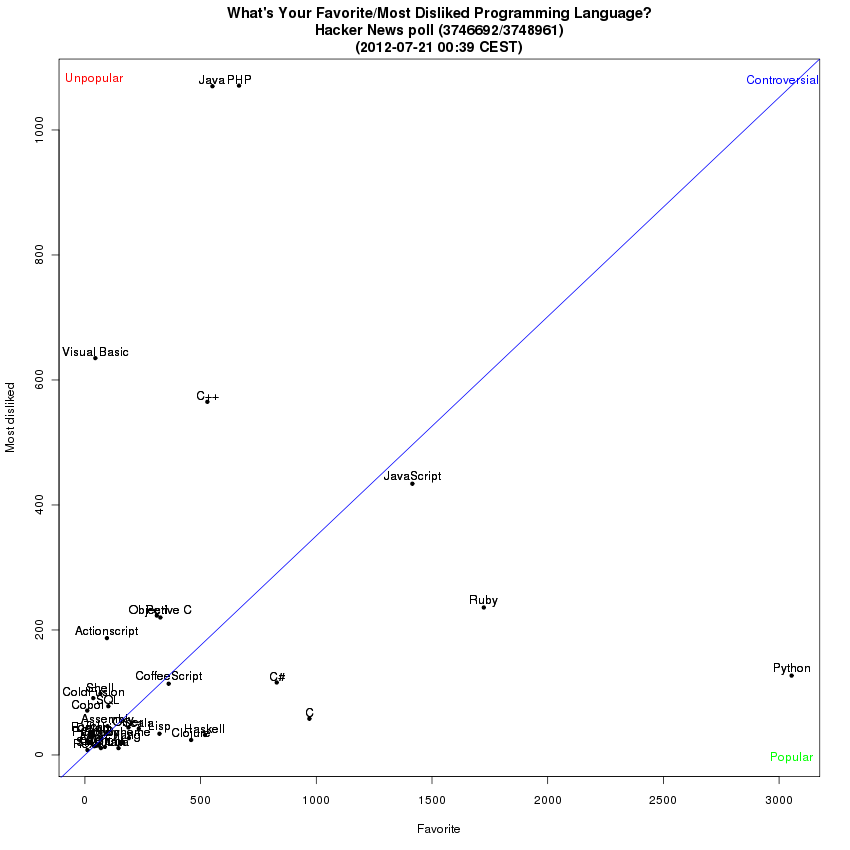
I would like to make a bar chart with favorite votes pointing up from the x-axis and dislike votes pointing down, but my rudimentary R skills doesn't stretch that far yet.
Haha! Great minds think alike. I just went through a very similar sketching sequence and reached basically the same conclusion!
I've plotted the positions using proportion of max votes (as a proxy for response rate) to account for the different number of voters responding to each poll (with actually counts added). And my axes are reversed!
The bipolar bar chart you're aiming at should be pretty easy to achieve if you first make the dislike values negative. I'm happy to write some code to demonstrate if you'd like.