I'm sure there's a substantial population that this redesign was successful for, but it's nobody I've talked to.
I can no longer tell which of my slacks has pending messages at a glance, and my actually important channels' notifications are hidden in a sea of irrelevant ones when they used to be the only attention-attractors on the interface. I gather that you think the list of people and channels is just one aspect of your lovely platform, and we should use the other interfaces like "DMs" and "Reactions" too, but .. that list is the core of your interface, please stop hiding it every time I do anything.
The change in the mobile app where pulling down on the channel list focuses a search box and opens the keyboard is quite jarring too, especially when that UX generally means 'get me the lastest updates'
Because when you have 500 devs, they have to build _something_. It's why every single good software product bloats to become a slow, confusing, mess of features.
Software development feature entropy is the 4th law of thermodynamics.
> I'm sure there's a substantial population that this redesign was successful for, but it's nobody I've talked to.
I think the measurement of success in this case has less to do with the customer's feelings about the product and more about people understanding and using the full feature set of Slack. All the new features they've been adding in just kind of floated by and we never used them. Either they were embedded in the middle of a series of steps we already had habits around (so we just ignored them) or they were so subtle that we didn't see the point in trying them out.
In other words, the problem they were really trying to solve was around scaling the product with all the features they had. That's likely where measurement of success will take place.
In other words, the new features are not something the users were looking for.
Instead of admitting adding new features just for the sake of adding new features, they want to force them into the faces of users still not wanting to look for them
> We were adding in new features like huddles, canvases, lists, and others into a UI system that was originally designed solely for messaging capabilities. Meanwhile, research showed users on the biggest and most active teams were struggling to stay on top of the basics.
"Our telemetry says that the random stuff we're bolting onto the product (like a document system (?) to go inside our chat app) is making it less usable and less good for users. So instead of listening to that feedback and telling management that our projects weren't actually helping users, we decided a better way to get promoted was to do a redesign."
> Operationalize transparency to build alignment
"We spent a bunch of money on a huge all-company onsite/whiteboarding session, then we proceeded to ignore the feedback from everyone who wasn't middle management or higher."
As a fun and instructive exercise, read through this, then read through Slack's post-Salesforce-acquisition Glassdoor reviews[1].
I'm on the opposite side of that argument. I love threading.
It allows me to easily have multiple different conversations in the same channel at the same time.
And, if I need to, in the future, share that conversation with someone, I can link them directly to that one thread.
What would I do otherwise, when I needed a team mate to get up-to speed on a convo that happened months ago... Hey go back to August 8th at 1PM and read everything while filtering out all the things that aren't relavent? Crazy talk!
Edit: I will say for this to work, a higher up at your company needs to slap people when they don't use threads. In my org. our CTO is very good about reminding people to use threads.
If they exposed an api or used an open protocol, power users could build their own app for slack instead.
I really hate this change too, on my laptop, slack has to be full screen to make sense whereas I can have four screens of terminals and email without issue otherwise. Wish they at least made the design adaptive
HN does this thing where it automatically strips out "how" from titles, presumably because someone once decided that the "how" is unnecessary or clickbait. The original title here is "Slack: How our..." The most interesting thing for me is that this error-prone moderation rule has made me realize how linguistically load-bearing the word "how" is in many sentences.
was wondering what was up with the title when I read it .... On their end, would have even gone as far to drop the yet..... How Our Biggest Redesign Came To Be
Confession time: I was never a real big fan of Slack's UI before. All channels and conversations being in the same pane just made everything so noisy.
But now it's pretty atrocious. The Activity tab is uselessly cluttered. If someone is trying to get my attention in a thread and it's not a DM, I rarely ever see or notice it.
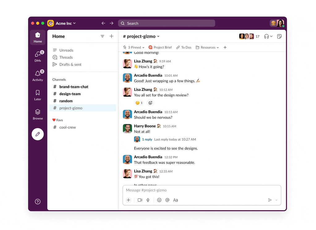
Maybe we just use Slack differently, but I find just staying in Home largely mimics the old interface. Enough so that I don't really mind this redesign. Anything that pops me out of Home is jarring and unwelcome.
Before Slack I was a big "Inbox Zero" kind of guy. But Slack is such a noisy product that it has essentially trained me to ignore alerts.
I like that DMs are pulled out from channel activity. But "Home" for me is such a hot mess of hundreds of channels with no easy way to discern important things from noise.
The activity tab not defaulting to unread-only is the most perplexing design in history. Given that the setting is per workspace, you end up switching so many times to avoid a persistent white dot that you just start hating that tab. Ignoring it is an option but "Inbox Zero" type of guys like us just can't I think.
It really feels like the intended usage is to ignore white dots and focus on red, but then we really need a setting to remove all white dots who really can't proceed to real work until they're gone.
Ah, yeah I can see that. I suspect your company and mine use it differently. To fight the noise, people get @'d almost all the time, as a way to elevate the notification. So at our company, unless someone is @'d, they pretty much always ignore the message. Which does work. But being constantly @'d has its own plethora of problems.
Not just you - if you never leave Home then basically works exactly the same as it ever has. I don't mind it at all, and can understand how for massive companies it makes things a little more manageable.
I guess the classic reaction to any design change is 'I hate this'... but damn I hate the slack redesign :< I can't see a quick overview of all my workspaces with notifications and have to hover with the mouse to see them - even though most of the rest of slack is designed to be used keyboard-only!
Cmd+Shift+s pops all the workspaces in the side bar like before the redesign. This is a new change after—I am sure—many many people complained about that very thing.
Such a stupid change. Just show me the workspaces by default gosh darnit.
The Cmd+ kind of gave away your use of macOS. That's how I was able to do the same thing using FF on my MBP. Kind of on obvious oversight on your dismissive non-answer to the question of "what browser"? Assuming Safari at this point, but you could be a Chrome user, so I'm still asking the same question.
Personally, I've disliked just about every change they made after initially adding message threads (that was a good change). It's all been downhill since, making it harder to use and harder to find things (though I've not used this latest redesign, as I'm no longer at a place that uses Slack)
Leaving aside feature bloat, who decided that reviving Yahoo Purple as a big new part of the color palette was a good idea? I'm sorry, but to me that just radiates "arrogant and clueless."
They're probably chasing Teams, where it's more of a platform for all your stuff than a chat app. You can edit word documents in Teams, for god's sake. MS project management tickets open directly in Teams if you click a link. Meetings scheduled over email generate Teams private chats with all the people in them (this is a cool feature but is backwards of what would be ideal, but that's another topic) and all kinds of other automatic stuff—if you use enough other MS shit.
And, notably, it's really bad at being a chat app, which is probably where Slack is headed if they keep going.
I do question how wise it is for such an essential tool (I am in Slack all day, every day, all the time at work) to be driven by profit. I've always expected the choices Slack has made were because their tests and metrics show they are profitable. I even have a small script I run that hacks the JS source code to remove a feature that infuriates me.
> However, redesigns usually fall into the “high effort, high variance, questionable benefit” bucket that businesses try to avoid at all costs. Unless something is absolutely broken, not many companies are willing to invest.
I have no idea what kind of feedback they received, but Slack was not absolutely broken; it was not great, and the redesign made it worse, not better. If you already know that redesigns should be avoided at all costs, why did you still do it?
Also as a sidenote Slack's notification system is still hopelessly broken; I will regularly respond to a DM on my phone, get back to my laptop, click on a notification, only for it to bring me right back to the message I literally just responded to on my phone!
Discord handles this beautifully, the moment I look at a message on my phone it's marked as read on the desktop client. I can't believe a feature as core as notifications in a chat app can be this broken compared to Discord's beautiful implementation.
This re-design is a disaster in every respect. They've removed the ability to have mentions and reactions open in a sidebar, so now the messages pane stretches the full width of my enormous monitor. They've added an "Activity" thing which shows unread messages even when you're looking at the message it's telling you you haven't read. They've added a "Canvas" feature that is so useless that today the button for it turned blue with the words "Try this" because literally nobody is using it. They've added a "More..." button in the sidebar despite the fact that there's acres of empty space for those items. Huddles are the worst video calling experience available on any app, and yes, I am including Teams. I could go on and on, but Slack seriously needs to hire some good designers, I hate absolutely every aspect of having to use it now.
Slack went downhill when they changed their logo from the hashtag to the most generic random logo they could find. I miss the days when companies would spend money and effort into good logos.
I hate the redesign. However a big improvement I made was to go into the theme editor, click customize, set the "Brightness" to the third from the right and then tick the "Darker sidebars". That returns the UX to something that I find a lot easier to read at a glance.
> We kicked off the project in earnest with a three-day in-person onsite for design, engineering, product and program leads. With the prototype as our guide, we started to sketch out the path to production. Which teams would need to be involved? How quickly could we move? When might we start bringing customers into the process? Which questions were most important to answer first?
"When might we start bringing customers into the process?" Seems like this should be much earlier in the process, no? Sure relying on automated metrics to help guide your process was part of the path, but if you aren't really talking with customers and figuring out what your needs are, your designs are going to be more biased towards how Slack operates and the culture of Slack.
I realize that Slack is more complex then it appears, and able to do more things then it may seem.
But by looking at those whiteboards and reading parts of the description, the amount of effort, people and time involved in a redesign was just a bit more than I was expecting. Looking at the images of the resulting whiteboards alone had me wondering "what could all of this possibly be about?". Details within details about ... something.
And then I went to check if I was even using the redesigned version, which it seems I am ... I just never noticed.
I use it everyday, for chats intermixed with an occasional huddle. Those work as one expects them to, and that's about it. So in my mind it's difficult to mix "chat and huddle app" to the level of effort needed to redesign it. It seems my minimal usage pattern may not typical.
I assume it boils down to there are being many customers, doing many things, it is essentially what Slack the company is, and it has to be done right.
Anyway, the chat and huddle thing works fine, and I'll move on from this topic.
If they hadn't spent so much time, you would have noticed. That's the point.
Adding features and capabilities to a without making it more complicated for users who only use a fraction of them ("chat and huddle app"), is part of why this is so complicated.
> If they hadn't spent so much time, you would have noticed. That's the point.
I get that idea ... been a software engineer for quite some time now. Users will quickly let you know how much they don't like it when you change things. It also means I should easily be able to answer all of my own questions, and shouldn't be surprised by the level of effort required.
I guess it comes down to the basic cost/benefit analysis, and if the answer is "redesign", doing what needs to be done while trying limit any downside. That would include your users asking why everything just changed. I don't enjoy reading messages written in all capital letters either, where it seems those 10 exclamation marks are required to clarify how much you dislike it.
Anyway, from here, based on that alone ... seems successful. Back to work and Slack messages.
"Get your employees addicted to work notifications" seems to be one of their core premises, and this redesign is yet another step in that direction.
The biggest issue of this redesign for me was getting rid of the "unread message badge" both on the desktop app icon and the browser tab. They used to have a badge with numbers for missed notifications (e.g. direct messages) and one (empty circle) for unread messages, but now a missed direct message and the 100th message on an HR channel thread show the same badge.
I found that Slack was nagging for more of my attention after the redesign (gotta get those engagement numbers up!). I ended up using a Chrome extension (Tab Modifier) to hide the Slack tab's badges.
They also made a fairly subtle change to what the "new messages" status actually means. Previously, it meant you hadn't clicked on a channel yet. The status would clear as soon as the action was taken, even before the network requests to load the channel were finished. This meant you could go through and clear dozens of channels pretty quickly without reading them.
Now, that status is only cleared after the client fully reloads the channel, which can take multiple seconds (yay, modern software). As someone with dozens of channels I don't read and can't organize, it's very tedious to clear them so I can focus on the channels I actually care about.
At least on Linux they've never allowed turning off the "blue dot" notification. Thankfully people figured out how to turn it off by hacking the JS code:
Annoying how some things moved, still not enough emphasis on channels that have unread messages (light text vs. normal for “bold” to call attention), and still no way to mute all but direct @ messages… so you can’t ever mute @channel or @here without muting the channel. The way Slack handles and automatically closes direct messages and private chats is annoying and I want to be able to turn that off… but I can’t. I have a group I check in with like once every two weeks and I have to rebuild the list or “star it” to save it. But stating it moves it to another area above group messages… not a fan.
Honestly Discord is better in almost every way still. Kinda wish they stole more from Discord.
I could be wrong, but worth mentioning -- my DMs at my work slack have never auto-deleted. Looking through setting shows nothing that calls this out, but one note is that when I click on "Direct Messages" on the sidebar and go to "Show and sort", I have "Show in this section" set to "All", and "Sort this section" set to "Alphabetically". Maybe something with those settings is persisting mine? I have 1 chat that has been there well over 2 weeks now, and another where i never even messaged them, just opened the DM window.
Either way, it all sucks, and I totally sympathize. :(
Besides staring you can group them in named sections. I have a section with "frequent DMs" and they stay available without auto closing. Works okayish for me.
I had managed not to use Slack for ~5 years, and unfortunately I come back to it just in time for this... atrocious mess.
5 years ago Slack was a very focussed chat tool, and it rang rings around the other solutions available at the time (our company was heavily invested in Skype for Business, aka Microsoft Lync, aka Microsoft Communicator).
Now it's a confusing forest of duelling messaging paradigms. Is the message I'm looking for in Connections or DMs? Is the channel in Connections or in Channels? Maybe it's in Threads? I know, I'll check the Activity panel, which doesn't know how threads work...
"You have to remember you won’t satisfy everyone (or even be able to address every opinion or suggestion). It is in these moments that the importance of strong leadership and a deep commitment to the product’s core vision becomes key." - TLDR; We choose to ignore user feedback because we know better.
Look I'm all for improving UX/UI but at the end of the day your users need to be 1st priority. Seems like they're still in the denial phase.
I immediately noticed how slow it was. It was confirmed when I resized the window. Moving the corner around in a circle has the contents refreshing and lagging at maybe 2fps.
Then I had to dig around and figure out how to de-WindowsVista-ize the theme: disable transparency and gradients, then used "Surprise me" for the theme colors until I got something not-too-loud.
If anyone working at Slack happens to read this: You might want to shoot a message over to whoever is responsible for designing the linked page. Ask them to turn their phone to landscape mode and notice the lack of left and right padding around the text.
I'm somewhat surprised that the design blog for the company has such a glaring design problem.
There seems to be two ways for a product to die: (1) make changes, (2) don't make changes. Choose the one that makes it die less slowly depending on how good you are at actually knowing what your customers value and delivering on it.
I can no longer tell which of my slacks has pending messages at a glance, and my actually important channels' notifications are hidden in a sea of irrelevant ones when they used to be the only attention-attractors on the interface. I gather that you think the list of people and channels is just one aspect of your lovely platform, and we should use the other interfaces like "DMs" and "Reactions" too, but .. that list is the core of your interface, please stop hiding it every time I do anything.