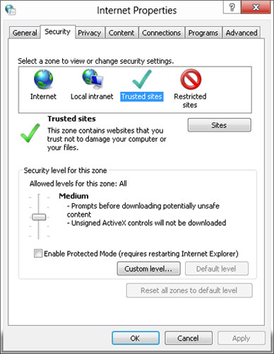
> The better UI would be for the circles to be visually connected somehow to illustrate that only one selection is possible like you have in physical switches with more than two positions
This is an interesting point. Radio buttons are kind of weird in terms of their initial position because unlike with checkboxes, there's no way to get back to the "empty" state where none is selected. It took me a bit to wrap my head around what you described, but the more I think about it, the more it seems like a "slider" with clearly marked stopping positions. If it's too confusing for people to have some sort of "default" option, maybe having a different color for the part of the slider that's moved based on whether it's in a valid position could help; at the top of the slider, it could be one color indicating "must be moved", and then when you slide and drop it at one of the marked options (or click the option; it could move automatically to the position like a scrollbar), it changes color to show it's valid.
It's not the exact design you describe: The slider is there, but only the label of the selected option is shown, the other options are only represented as tick marks.
I think there are two problems with the design though, (which would also still be there if all labels were shown):
- The slider widget back then was normally used for selecting continuous numeric or at least interval scaled input values: That's what the mechanism of dragging it with the mouse was developed for. It could be configured with a small number of discrete values as options, but then dragging became awkward: Either the ticks were spaced very far, then you had to drag the cursor a long distance before there was any kind of visual feedback at all - or the ticks were spaced closely, like here, but then dragging the slider to one specific tick became difficult.
- It's possible to click the slider, but there is no visual indication that you can do so. In fact, the visual indicators are almost inverse to how you'd need them: The selected option has a big handle that you can not click (only drag), the unselected options have no handle though you can actually click on the empty slider bar to move the handle in that direction.
I guess that's why they never did this again after this one try - which is sort of a pity, because you could probably build a redesigned slider widget optimized for discrete input that solved those problems.
Not always. I've seen plenty of forms that are like "only fill this section out if XYZ" and if you accidentally start before reading that you're screwed.
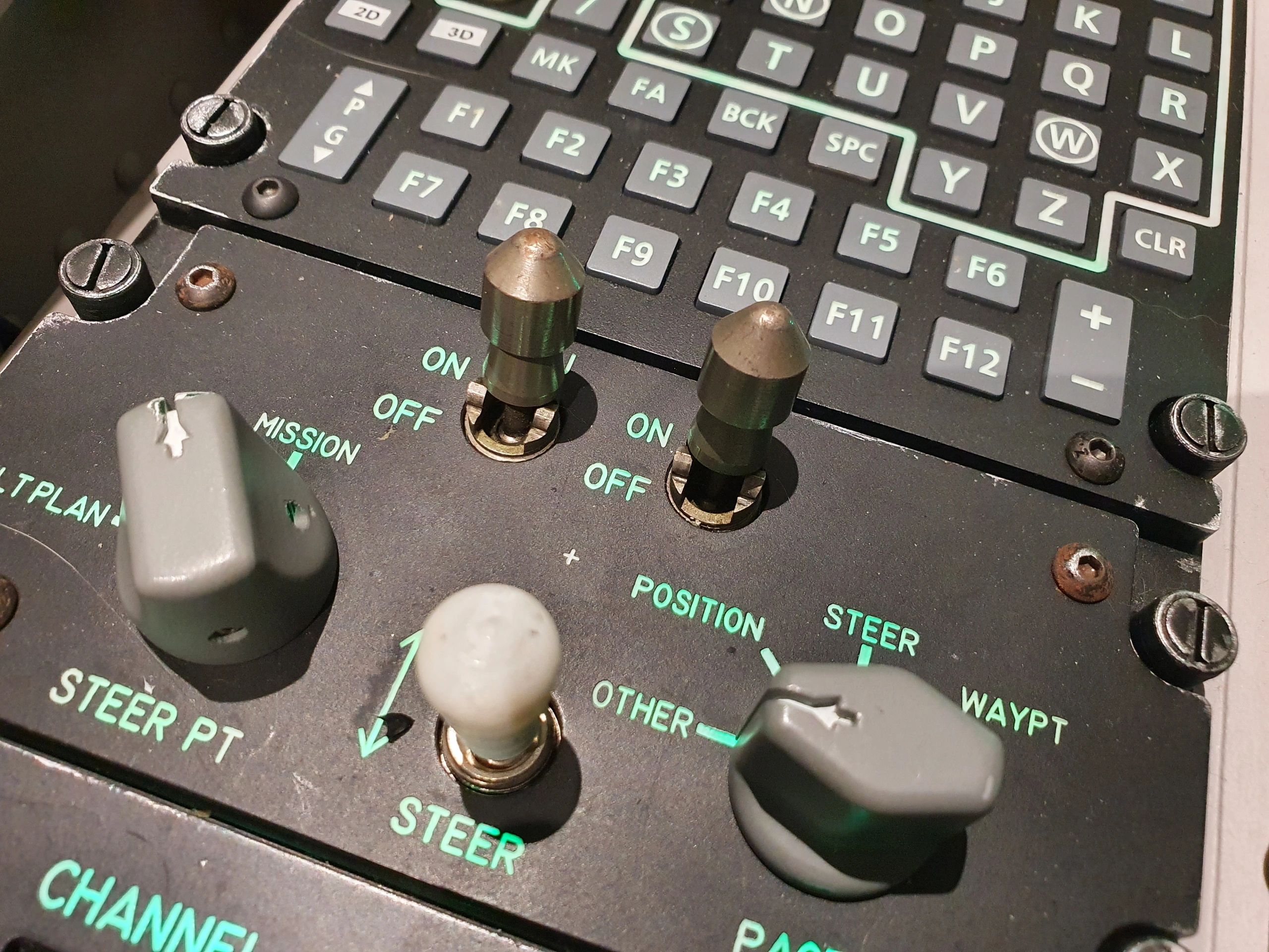
Could be a slider with the same radio circles denoting the stopping position, could be those circle volume buttons with labeled marks, could be non-circle switches like these (other/position/steer on the right) https://img1.wsimg.com/isteam/ip/b81ca6f4-730a-4561-852c-096..., etc
Re. the missing default - you can have an explicit element "none selected" with the slider positioned there
This is an interesting point. Radio buttons are kind of weird in terms of their initial position because unlike with checkboxes, there's no way to get back to the "empty" state where none is selected. It took me a bit to wrap my head around what you described, but the more I think about it, the more it seems like a "slider" with clearly marked stopping positions. If it's too confusing for people to have some sort of "default" option, maybe having a different color for the part of the slider that's moved based on whether it's in a valid position could help; at the top of the slider, it could be one color indicating "must be moved", and then when you slide and drop it at one of the marked options (or click the option; it could move automatically to the position like a scrollbar), it changes color to show it's valid.