I've never understood the benefits of a pie menu in regular computing.
They've always seemed difficult to read (my eyes travel linearly easily, but following around a circle is non-intuitive), and similarly difficult to click. Even using a gamepad joystick, I often find myself accidentally selecting a neighbor of what I meant to pick, because I wasn't getting the angle exactly right, or inadvertently relaxed the joystick as I clicked the button to confirm.
Keyboard shortcuts, or just regular linear context menus, have always seemed a lot faster and easier to use, respectively, on the desktop. On game consoles I can understand that they're more useful because you don't have a keyboard or mouse... but even then it's more a question of being the least-bad alternative when you really need to instantly select between 8 alternatives.
Am I missing a context where the usability of a pie menu is superior?
You don't read them, you use icons for instant recognition, your eyes don't even need to travel anywhere as that will fit in your focuse'd vision (as is illustrated in the repo's gif), gamepad joystick is worse vs. a mouse since in a mouse you can move it further away faster to the distance where you avoid any angle issues.
This is the superior usability - a pie menu you can switch to any item with the same distance while in a regular list to get to the last one you have to skip everything, so the menus tend to be smallish in height, thus making the selection harder
For example, while moving horizontally to a sub-menu, you can easily cross the width of a single line since it's not easy to move your mouse absolutely steady horizontally (in pro graphic apps you'd usually hold a Shift for that), so instead of moving to a sub-menu, you switch to another item. In a Pie menu that's much harder since as you move further the menu's area increases, so the tolerance is higher
Keyboard shortcuts can also be enabled for this type of menu.
> For example, while moving horizontally to a sub-menu, you can easily cross the width of a single line since it's not easy to move your mouse absolutely steady horizontally (in pro graphic apps you'd usually hold a Shift for that), so instead of moving to a sub-menu, you switch to another item. In a Pie menu that's much harder since as you move further the menu's area increases, so the tolerance is higher
This is why properly implemented context menus don't strictly require you to move in a straight line. Implementations vary; I just tried it with the firefox context menu on linux and found that, once the submenu was open, I could move the cursor quickly to the submenu on any path, even taking a diagonal line to the most extreme options in it. I have also seen implementations where you had a ever widening path you could take as the cursor moved closer to the submenu, making the active area of the currently selected parent item trapezoidal.
What implementation allows you to move diagonally? What if you slow down or move diagonally to another top menu instead of a submenu, do you know have to wait a bit before selection changes?
This is tricky dynamic guesswork, and isn't great UI even with the visual height increases guiding you, in pie menus you see beforehand all the borders, so it's more explicit and predictable
It does not add lag to the submenus when I just tested on Firefox. I have two add-ons that install submenus to the context menu, and if I move off of one and click the other one, the submenu immediately opens. Same for non-submenus (I can click to activate).
It does, necessarily, add lag if I want the submenu to open on hover, but I suppose I've used enough UIs where submenus don't open on hover that clicking is muscle memory for me.
> I've used enough UIs where submenus don't open on hover that clicking is muscle memory for me.
yeah, that's one of those UI busywork fails, but that's also a workaround to lag
With a pie menu you could have it activate if you move your mouse far enough from the center (so that there is no way to do so in a wrong sector because the sector area is at that distance is large enough to make it easy to avoid such errors), so no clicks and less precision required
That astonishingly clever technique was invented by Bruce "Tog" Tognazzini and described in the first edition of the Apple's 1987 Human Interface Guidelines (page 87, "drag delay").
>Two delay values enable submenus to function smoothly, without jarring distractions to the user. The submenu delay is the length of time before a submenu appears as the user drags the pointer through a hierarchical menu item. It prevents flashing caused by rapid appearance-disappearance of submenus. The drag delay allows the user to drag
diagonally from the submenu title into the submenu, briefly crossing part of the main menu, without the submenu disappearing (which would ordinarily happen when the pointer was dragged into another main menu item). This is illustrated in Figure 3-42.
Implementations certainly do vary, but the point is that it's essentially a weird magical non-standardized behavior that isn't intuitively obvious to users why or how or when it's happening. It's extremely difficult to implement correctly (there's not even a definition of what correct means), and requires a whole lot of user testing and empirical measurements and iterative adjustments to get right (which nobody does any more, not even Apple like they did in the old days of Tog). Many gui toolkits don't support it, and most roll-yer-own web based menu systems don't. So users can't expect it to work, and they're lucky when it works well.
Pie menus geometrically avoid this problem by popping up sub-menus centered on the cursor with each item in a different direction, so no magic invisible submenu tracking kludges are necessary. Don't violate the Principle of Least Astonishment!
I think it's important for users to intuitively understand how the computer is going to interpret their gesture, without astonishment, and for the computer to provide high fidelity unambiguous instantaneous feedback of how it will interpret any gesture.
I like how Ben Shneiderman defined "Direct Manipulation" as involving "continuous representation of objects of interest together with rapid, reversible, and incremental actions and feedback".
>In computer science, human–computer interaction, and interaction design, direct manipulation is an approach to interfaces which involves continuous representation of objects of interest together with rapid, reversible, and incremental actions and feedback. As opposed to other interaction styles, for example, the command language, the intention of direct manipulation is to allow a user to manipulate objects presented to them, using actions that correspond at least loosely to manipulation of physical objects. An example of direct manipulation is resizing a graphical shape, such as a rectangle, by dragging its corners or edges with a mouse.
Those ideals also apply to pie menus. Pie menus should strive to provide as much direct feedback as possible, via tracking callbacks, previewing the reversible effect of the currently selected item (possibly even using the distance as a parameter), so you can easily use them without ever popping up the menu.
For both novice and expert users, the directly obvious geometric way pie menus track and respond to input is more intuitively comprehensible, predictable, reliable, and most importantly REVERSIBLE than traditional gesture recognition (like Palm Graffiti, or StrokePlus.net) or "magical" kludges like the submenu hack.
With pie menus there's a sharp crisp line between every possible gesture, that you can see on the screen.
But with a gesture / handwriting recognition system, you wonder where is the dividing line between "u" and "v"? The neural net (or whatever) is a black box to the user (and even the programmer). Some gestures are too close together. And most gestures are useless syntax errors. And there's no way to cancel or change a gesture once you've started. And there's no way to learn the possible gestures.
But with complex magical invisible submenu hacks, you wonder if it's based on how long you pause, how fast you move, where you move, what is the shape, why can't I see it, how does it change, what if you pause, what if my computer is lagging, what if I go back, what if I didn't want the submenu, how do I make it go away, why can't I select the item I want, what do I do?
But with pie menus, if you make a mistake or it doesn't behave like you expect, you can at least see and understand what went wrong (you were on the wrong side of the line) and change it (move back into the slice you meant to select). No fuzzy gray area or no-man's-land or magic hand waving. And the further out you move, the more "leverage" and precision you have.
The area and shape of each item target area should not be limited or defined by the font height and the width of the longest label. It should be maximized, not limited, to encompass the entire screen, all the way out to the edges, like the slices of a pie menu. If you move far enough, it's practically impossible to make a mistake, as the target gets wider and wider, so you can even use pie menus during an earthquake or car chase.
Consider how pie menus completely saturate "Gesture Space" with meaningful obvious gestures, instead of useless syntax errors and dangerous ambiguities and gray areas:
>The space of all possible gestures, between touching the screen / pressing the button, moving along an arbitrary path (or not, in the case of a tap), and lifting your finger / releasing the button. It gets a lot more complex with multi touch gestures, but it’s the same basic idea, just multiple gestures in parallel.
>I think it’s important to trigger pie menus on a mouse click (and control them by the instantaneous direction between clicks, but NOT the path taken, in order to allow re-selection and browsing), and to center them on the exact position of the mouse click. The user should have a crisp consistent mental model of how pie menus work (which is NOT the case for gesture recognition). Pie menus should completely cover all possible “gesture space” with well defined behavior (by basing the selection on the angle between clicks, and not the path taken). In contrast, gesture recognition does NOT cover all gesture space (because most gestures are syntax errors, and gestures should be far apart and distinct in gesture space to prevent errors), and they do not allow in-flight re-selection, and they are not “self revealing” like pie menus.
>Pie menus are more predictable, reliable, forgiving, simpler and easier to learn than gesture recognition, because it’s impossible to make a syntax error, always possible to recover from a mistaken direction before releasing the button, they “self reveal” their directions by popping up a window with labels, and they “train” you to mouse ahead by “rehearsal”.
Thank you so much for the detailed and thoughtful response!
Do you know if anybody has done research into discoverability on linear v. pie menus? I ask because other people in the thread have asserted the subjective belief that scanning a linear list is faster than scanning in a circle, which is also my experience. Possibly because of the software I grew up using[1], I use a menu almost exclusively for operations that I use rarely enough to not know where they are; if I know the path to find it in the menu, I probably know the shortcut for it.
1: Think lots of cardboard templates that fit over the "F" keys
You can remember the 2d position easier than a shortcut (partially because there is less precision needed, "roughly at the bottom of a file menu" is good enough), so there will definitely be more menus you roughly remember the position of without remembering the shortcuts.
I've experimented with incrementally revealing more information about menu items as you browse the menu, including short labels and longer descriptions, hiding or shrinking unselected items so they're not as distracting and cluttered, showing the description of only the selected item, and also bringing the selected item and label and description to the cursor, because that's where the user is looking, so it's easier to read.
Menus have a title and description that's initially displayed in the center of the menu when no item is selected. Items have an icon (a 3d object), a label, and a description. Disabled items have a description explaining WHY it's disabled. This video demonstrates them (the code is 11 years old so the web demo probably won't not work, but the code might still work with some minor tweaks):
(If you don't have the Unity3D browser plug-in installed, it should show you a link to install it.)
They have a full set of useful notifiers so you can tightly integrate them with your application to give rich feedback during tracking (for example, modifying the 3D menu items, or previewing the effect of the menu item and distance parameter in real time, making them more like "direct manipulation").
For example, to show how you can implement feedback like The Sims pie menus with the head in the center that looks at the selected item, I've made a 3d object in the pie menu center with the webcam texture on it, so YOUR head is in the center of the menu, looking at the selected item! (That's why the demo asks for permission to use the webcam.)
The pie menu and each item has a title as well as a description. One feature I've added is the ability not only to disable an item, but also to provide an explanation of why the item is disabled! (PacMan in the demo is disabled, for example.) I wish other menus and widgets would do that -- it's frustrating when you can find an item you want, but can't figure out why it's disabled!
Another nice thing about them is that you can either configure algorithmically with an API, or with JSON data (which makes it easy to make dynamic data driven menus downloaded from a server or database), or construct them in the Unity3D editor out of objects (which makes it easier for artists to design them)!
I've made a custom Unity3D editor that lets you edit the properties, drag and drop textures and objects, edit and rearrange the items, and has some convenience commands, so you can place the 3D item objects in a circle in the 3D world, and call a command that figures out which item is in which direction by their position, and tidies them up. (That is much easier than arranging their order in a linear list of items.)
I'm going to play around with more in-world editing features, to make them easier for artists to design them.
This is a pie menu with eight items for SimCity, for selecting an editing tool.
Now you pop a menu up and you see in the center, right next to your cursor where you're looking, the menu title and the menu description, and then you see all the labels of the items.
The neat thing about pie menus is that every item is very close to your cursor, the target area is right next to you, and they're in a different direction, and they're very big area, so they're very fast to select from, especially when you learn them.
Now if I move towards a item, it brings it to my cursor here, and it hides all the other labels, and it shows the item description, and I can browse around the menu and read the different descriptions.
It's bringing these to my where my eyes are looking at the cursor, instead of forcing me to to move my eyes around a lot.
Now one thing is that you could disable a menu item, but it also tells you why the items disabled.
So pac-man was misbehaving, and I'm not going to even go into it. You don't want to know. So he's been disabled. Don't worry.
Now there's menus, and sub menus, for example, here we can click up a submenu.
And we get, you know, these extra items.
Notice how it won't let the labels go off the screen.
It shrinks and hides all the other things, so you can concentrate on what you're going to select.
I don't know if you've noticed, but there's this head in the middle of the menu that's looking around the menu items, kind of like in The Sims.
Now this is to demonstrate the kind of things you can do by having notifiers, that react to tracking, that modify objects in the world to show you like what's going to happen before you selected it, or just, you know, give you some interesting feedback.
Now I'm not actually moving my head around, it's just twisting this 3d object with my face on it.
That's accomplished with some notifiers, and you can also react to things, change these 3d objects in interesting ways.
A minor thing: strokeplus type gestures are partially reversible / cancelable via garbage - I usually do a few random movements if I feel the gesture start is wrong to guarantee that recognition fails. Think there is also a more direct cancellation mechanism, but garbage always worked
However, the bigger flaw vs the pie menu is the lack of those icons showing you the list of the possibilities, so learning is indeed very limited, so you only usually use just a few frequent gestures
Keyboard shortcuts don't have the discoverability of a menu interface but are good for power users. Ideally they would complement each other.
I really like the ergonomics of pie menus, though my experience is limited to Blender. Navigating linear menus require more fine movements than flicking the mouse in one of 8 or fewer directions. And the direction of mouse movement becomes muscle memory the way a keyboard shortcut does. I find a pie menu works well in a mouse-heavy workflow like 3D modelling. But there are definitely applications where it wouldn't be the right fit.
> I find a pie menu works well in a mouse-heavy workflow like 3D modelling.
Ah thank you, that's very helpful. I can see how you wouldn't want to move your hand from mouse to keyboard for keyboard shortcuts that aren't one-handed, but the pie menu would allow you to develop a spatial/directional muscle memory (like keyboard shortcuts have) that linear context menus don't have.
Exactly the context I was missing -- I've never done any 3D modeling!
It's "point free" (can be initiated from anywhere), and can be "regular" (same motions results in the same actions), making it navigable without looking or requiring precise selection. Close cousin to "gesture" interfaces.
With three gestures you get ~4x3x3 => 36 actions => a whole alnum-keyboard of 26+10 digits! (assuming you only allow four gestures and remove the "reverse" after choosing any direction, eg: Left/Right/Left would be equivalent to Left/... with pending input). Even better if you throw in an 8-way selector minimally in the first position.
If that's a common gesture for you, you are going to learn some muscle memory to initiate the menu lower on the screen. (Also, I think the gesture distances in the demos are exaggerated for effect?) If you are discovering your way through the menu you don't need much distance at all to make your choices obvious, and some of the pie menu implementations in the worst case let you reposition the menu entirely if need be.
(now Autodesk) Maya has a form of this, called hotbox, since first beta around 1997 when I first saw it, and probably before during development and probably before that from Alias where it probably originated. They researched a lot on UI and interaction between a designer and the model and that's one of the things they went with. It's context sensitive and eventually you build out muscle memory for it, you don't even read anymore what's in it. https://www.youtube.com/watch?v=8MrjMy3N6vo
I mocked up an "infinite" circular menu concept last year. Idea was to use for navigating a non-linear timeline of photos / dates (in limited space on a website / map). Felt like a good use case.
Fitts' Law intuitively and mathematically explains why pie menus are faster and have lower error rates than linear menus. Fitts's Law says in effect: the bigger and closer a target is, the faster and more reliably you can hit it.
>Fitts's law (often cited as Fitts' law) is a predictive model of human movement primarily used in human–computer interaction and ergonomics. The law predicts that the time required to rapidly move to a target area is a function of the ratio between the distance to the target and the width of the target. Fitts's law is used to model the act of pointing, either by physically touching an object with a hand or finger, or virtually, by pointing to an object on a computer monitor using a pointing device. It was initially developed by Paul Fitts.
Pie menus both minimize the target distance, while also maximizing the target size. And the physical directional gesture required to select an item does not demand your continuous visual attention and cognitively taxing hand-eye feedback loop. You don't need to look at the screen to select items from a pie menu, so you can reliably "mouse ahead" or gesture, which is impossible with linear menus.
Another advantage is that they support "rehearsal", by seamlessly training novice users to become experts.
Unlike keyboard shortcuts, the physical action of the novice and expert is the same, only experts can do it faster without looking at the screen.
Unlike traditional "invisible" gesture recognition systems like Palm Graffiti or StrokePlus.net, pie menus are "self revealing" in that the can pop up a menu that shows all the available options and their direction. It's quite difficult to learn which invisible gestures are available and what they all mean, but easy to discover them with pie menus.
Pie menus also support "browsing" and "reselection", which gesture recognition doesn't, allowing users to correct errors or even browse around highlighting every item to preview its effects.
Since pie menus can provide live continuous preview of the effects of the selected item in the application itself (which is especially nice when you use the distance as a parameter, for example a pie menu that lets you create eight objects, with a pull-out size parameter: the more you pull out, the bigger the object previewed at your cursor, which switches to different objects as you browse around the menu, then turns into a real object when you release the button), so you can see the effect and release the button when it's perfect, or go back to the center to cancel. Often the only feedback you need is the live preview of the pie menu selection, and popping up a menu would be a distraction.
Once you learn the directions, you can quickly select items by stroking in the desired direction without even looking at the menu, so pie menus can perform the selection without popping up the menu. There's no need to pop up the "self revealing" menu until you stop dragging the mouse, or you can pop it up instantly by "clicking up" the menu. So a novice can get directions instantly, while an expert can fly ahead without waiting for directions, then pause for directions or confirmation that you have the right selection at any time.
There's a smooth escalator moving you up the learning curve every time you use a pie menu, training your muscle memory through rehearsal.
That is how pie menus "Lead, follow, or get out of the way".
We performed an empirical study in 1988 that measured eight-item pie menus to be 15% faster than linear menus, with less frequent errors.
An Empirical Comparison of Pie vs. Linear Menus (Jack Callahan, Don Hopkins, Mark Weiser, and Ben Shneiderman, Proc. ACM CHI’88):
>Pie menus gain over traditional linear menus by reducing target seek time, lowering error rates by fixing the distance factor and increasing the target size in Fitts’s Law, minimizing the drift distance after target selection, and are, in general, subjectively equivalent to the linear style.
[...]
>Pilot study results:
A pilot study of 16 subjects showed that users were approximately 15% faster with the pie menus and that errors were less frequent with pie menus. Statistically significant differences were found for item seek time but not task type. Subjects were split on their subjective preference of pie and linear menus. Some commented that they were able to visually isolate an item easier with linear menus and that it was hard to control the selection in pie menus because of the sensitivity of the pie menu selection mechanism. These subjects tended to be the most mouse naive of all whereas those who had heard of or seen a mouse/cursor controlled system but had not used one extensively tended to prefer pie menus. The most mouse naive users, while finding linear menus easier, tended to be better at pie menus and commented that with practice, they would probably be superior and in fact prefer the pie menus because of their speed and minimization of hand movement with the mouse. Not surprisingly, therefore, most of those preferring linear menus did not have a strong preference on the scaled subjective questionnaire.
More about Fitts's Law and pie menu in this thread from Sept 27, 2022 on: Cairo: Alternative Windows Desktop:
I'm surprised to see that this whole thing seems to be implemented in typescript and css, even though it lists a bunch of specific platforms/desktop environments like Windows 11, KDE, etc. I guess it's for use in Electron or something?
Grepping through the code I found no references to aria or roles or title, which makes me assume it's completely inaccessible to screen readers or other assistive tools. It would be cool if the README called that out at least a little bit. It also makes me wonder whether it can be used via keyboard or gamepad instead of just mouse, since pie menus are pretty analog-stick friendly and fairly keyboard-unfriendly. (Incidentally, Windows 11 has pretty comprehensive gamepad support, at least for apps using the UWP/WinUI stack. If you're on Win11 and have an xbox controller, try it sometime - the settings window is a good spot to mess with it.)
Hey, I am the developer of Kando. Currently, it is primarily designed for touch and mouse input. Adding gamepad support in the future would be pretty cool though! I have seen people using Kando on the Steam Deck, so this is definitely an interesting direction.
I have never seen a menu like this before, but seeing the video, I think I would like it. Looks like a very fast way to find whatever you're looking for.
Radial menus are heavily associated with video games. The Sims in 2000 really used them extensively and IMO well in a mouse/keyboard environment, and they've become a common method to visually surface options in gamepad- and joystick-focused games.
The One Laptop Per Child/Sugar UI also used them since they were accessible independent of language and input method, and also self-surfaced options in a way that allowed or encouraged exploration. (And then, full-circle as it were, Maxis/EA's Don Hopkins, who implemented The Sims' radial menus, reimplemented a radial menu for the OLPC port of SimCity.)[1]
Glad to see Don Hopkins mentioned, I came to this thread hoping he had seen it & commented already. I'm curious to hear his thoughts on it! I know he loves radial menus, understandably so -- they really can be quite effective.
When I saw the article about Pie Menu, I thought of Don Hopkins' work with radial menus in SimCity. It's probably (one of?) the earliest implementations of this UI concept.
I haven't actually used it, but the circular shape seems a bit wasteful of space compared to typical nested dropdown menus. Maybe a circle of icons is more suited for touch-based interface.
The earliest known implementation of pie menus was in an early CAD system called PIXIE developed at Cambridge University by Neil E. Wiseman, Heinz U. Lemke, John O. Hiles, on a PDP-7 with a 340 vector display with a light pen.
Neil E. Wiseman, Heinz U. Lemke, John O. Hiles, PIXIE: A New Approach to Graphical Man-Machine Communication, Proceedings of 1969 CAD Conference Southampton IEEE Conference Publication 51, pp. 463–471.
In 1986 Mike Gallaher and I together came up with the same idea, and I implemented a prototype proof-of-concept for the X10 window system I called "theta menus":
Mitch Bradley suggested the name "pie menu", and I implemented them in the X10 "uwm" window manager, which I integrated into Mitch's Sun Forth system so it was possible to script the window manager in Forth:
You could define both pie menus and linear menus in a special menu definition syntax in your .uwmrc file, and configure them to run various window management, application launching, and shell scripting commands. But there was no pie menu editor, just a text file defining the menus.
We performed an experiment to compare the speed and error rate of pie menus and linear menus, which I programmed in Forth to randomize and present the menus and measure the error rates and timing statistics.
Implementing a Forth scriptable pie menu window manager for X10 led the way to implementing pie menus in PostScript for various versions of the NeWS window system. It was easy for me to make the transition from Forth to PostScript, which is much more like Lisp than like Forth, and NeWS had an object oriented programming system like Smalltalk which is great for implementing user interface toolkits.
Then I implemented pie menus for TCL/Tk on X11, which I used for the X11 version SimCity (which EA later relicensed under GPL-3 and released for the OLPC).
I later implemented the pie menus in The Sims, which you can see an early version of here, including a graphical zooming/rotating pie menu that didn't make it into the game:
Another take on pie menus that did make it into the game was the object placement tool that let you rotate objects both as you picked them up and set them down, like an invisible "direct manipulation pie menu" (see the demo of object placement tool placing chairs around the dining room table at 4:45):
Not only can you rotate it while placing it down, but also while picking it up. Clicking picks up or places down without rotating, but pressing and moving rotates to face the direction of motion. Unfortunately, later versions of The Sims didn't implement that simple feature, so instead you have to use the keyboard or repeatedly click multiple times until it rotates around to the direction you want, which is much more difficult and less natural than simply dragging in the direction you want it to face when picking up or placing down.
Here's a later web based version of Micropolis (open source SimCity) with pie menus implemented with OpenLaszlo / Flash -- at 3:00 it demonstrates how the pie menus work as an alternative to the traditional tool palette, and once you learn the pie menus you can hide away the palette to gain many acres of SimCity "screen real estate":
The ActiveX pie menus were implemented as an OLE Control, which supported editing via a tabbed property sheet using traditional gui widgets like buttons, tree editors, text editors, and a wysiwyg (but not editable) preview. One nice feature was that you could simply type in an indented outline into the text editor to produce a whole tree of nested menus, which saved a whole lot of pointing and clicking gui widgets to create the menus and items one by one. But I hit a wall because I wanted more control over the graphical presentation and dynamic feedback, that was extremely difficult to program with MFC/Win32/C++/GDI, and I wanted the full features of a web browser to render each item, including animated gifs, css styles, etc.
So implementing pie menus inside the web browser in JavaScript with DHTML and CSS was the obvious next step, which also made it easy to define menu structures with XML and presentation with HTML. You could put anything you wanted into the pie menu center or items. But Microsoft's IE5 Behavior Components were a dead-end.
In those earlier days was there a concept of “UX?” Or even “UI?” - the only thing I’ve come across is “human to machine design” but that’s a vague role/title. It seems that anyone working on software from my ignorant perspective was expected to also know what we call “information architecture / UI / ux” today, to some extent anyway? Any insight you can shed here on the history / context? When did software even start getting associated with “designers?”
Also what did you find most disappointing that isn’t around but was back then? What was a surprising failure / surprising success?
Thanks for taking the time.
From my “historical diving” and personal experience; I’m most surprised that almost all computer form factors and software used today was “engineered” at Parc, even down to the UI/ux. Then surprised Forth didn’t win out as a language but I guess it didn’t get popular for whatever reason. Then similarly to Parc it’s weird how much of the engineering powering the engineering is bell labs.
There is ACM SIGCHI (Special Interest Group for Computer Human Interaction), but Ben Shneiderman made it a point to name his lab HCIL (Human Computer Interaction Lab), to put Humans BEFORE Computers! ;)
The term "interface designer" has degenerated into describing people who are merely shallow cargo cult fashion oriented graphic designers, and never heard of nor care passionately about important topics like Fitts's Law, Hick's law, steering law, power law of practice, keystroke level model, GOMS model, human processor model, working memory, human factors, interaction design, direct manipulation, cognitive psychology, ergonomics, accessibility, anthropometry, ethnology, information architecture, user research, usability testing, etc.
I 100% agree with you and felt the same nuances with my experience in the industry from the late 90s to a few years ago.
Given the knowledge was more silo'd before the internet, how did one come to learn these things? Was it specific universities? Specific companies? Was there any mentoring? Who did you look up to for UI along your journey?
Counter Strike: Global Offensive used a similar concept for its round-start buy menu because of needing to support console controllers. You can see an example here:
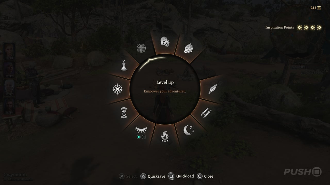
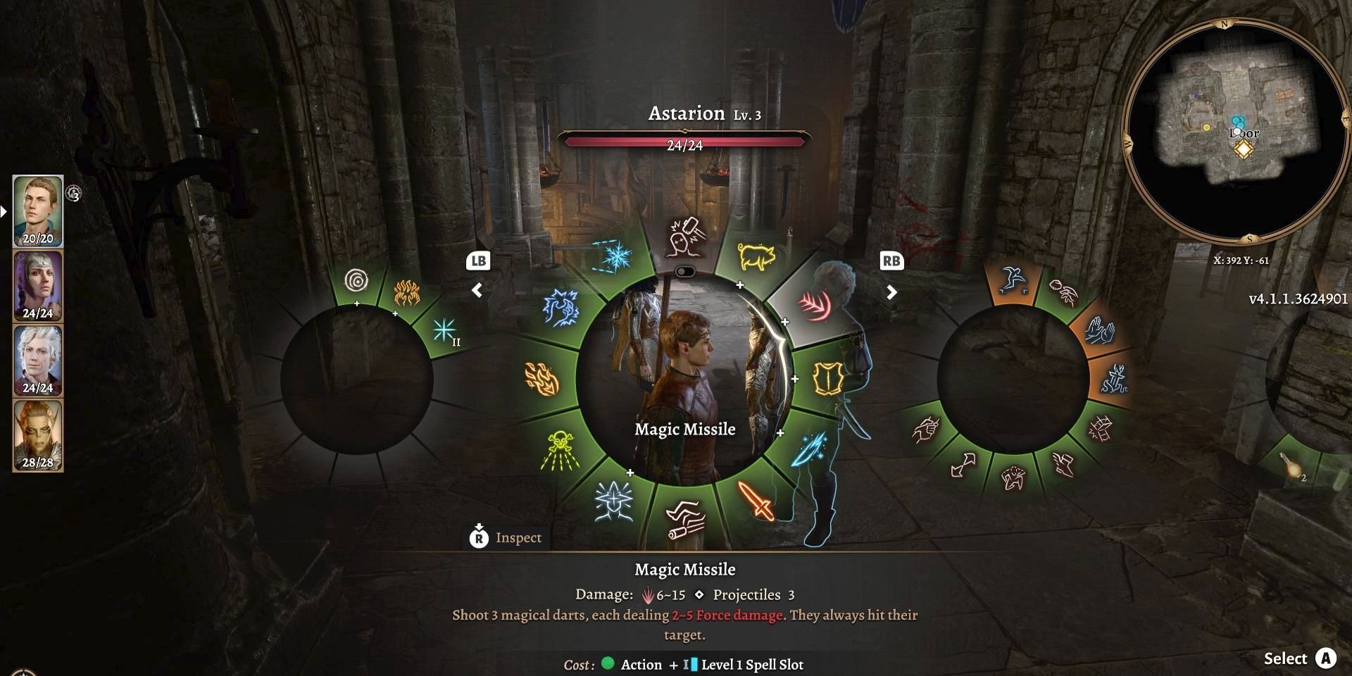
Baldur's gate 3 took it to the next level. It's multiple radial menus for the actions/items. I wish they also applied the same idea for the context menus rather than a list. It works really well in practice.
That's true; now thinking about it I also remember it from very-desktop-based Anno 1800. The quick-shortcut menu for the mouse (to build a shortlist of buildings, etc.) is a pie menu.
Aside from video games, another place you commonly see pie menues is in 3D CAD software (Blender, Inventor, I think SolidWorks has one?). I guess it's because these programs are inherently more mouse-reliant than other software.
Pie menus are great on consoles where items can be selected with muscle-memory alone using thumbsticks. For computer interfaces the tradeoffs (unfamiliary, don't fit text well, hard to navigate by keyboard) have outweighed their benefits (fixed distance to target).
Pie menus are often used in 3D modelling programs (Maya, I think Blender and SolidWorks). The situation seems to be:
"I'm a professional in a kind of flow state, I frequently need extremely quick access to a fairly small subset of context-sensitive commands, I'd ideally not like to move my mouse too much away from the thing I'm focused on, much of my work is mouse-driven because it involves making fine visually-directed adjustments by dragging the mouse."
Exactly this. And in addition, I think there's lots of potential for touch screen users. As soon as you do not have easy access to a physical keyboard, pie menus can provide a great alternative to keyboard shortcuts.
When you press-and-hold, the menu pops up, and you swipe in a direction for an action. Think of it more as gesture navigation with an on-screen aid to show you what gestures you can do.
There used to be a thing nearly a decade ago to do this on Android, before the current gesture navigation:
touchscreens don't have to be small. one of the only pie menus I can really think of in the wild is Adobe Illustrator on iPad, which is relatively interesting because its an "ipad first" app of sorts. its separate than their desktop apps, and was designed for the larger tablets, not a small phone.
the menu itself is pretty good, especially with the Apple Pencil, which you'd be using to draw on the iPad. Image editing/3d modeling software tends to need a lot of UI, and I think it makes sense for the most part. these tools are hopefully used by everyone. that means more sporadic use — if I'm only opening your app a couple times a week for a couple minutes, I probably won't remember the keybaord shortcuts. not to mention people who are unfamiliar or don't use keyboard shortcuts at all. anyways, bit of a rant since it doesn't answer your original question, but we should consider how to make our computers computable by all users.
I am more thinking about tablets and convertibles. But even on a phone a similar concept could work: You summon the menu with some kind of gesture (for instance dragging over a screen edge). The menu pops up in the center of the screen and you can select an item with just a single directional swipe. If the selected item is a submenu and contains some child items, it will slide to the center of the screen and you can do another swipe to select one of the children.
So you could select an item extremely quickly with just two swipes. And there are already quite a few items at level two! If your top-level menu has eight submenu items and each submenu again contains seven items (+one to go back to the root) you have already 56 possible items in this menu. And you could select one of them in well beyond a second, even without looking at the screen!
The pie menu in Maya was one of the greatest things IMO. I haven't used it in a long time but when I was heavily working in there and had it customized to my tasks it was unbelievably fast to work.
The benefit is not fixed distance to target, but having the target be essentially whole sector of your screen so you do not need to accurately control the distance you move, just the direction. This makes them vastly superior to traditional context menus where you need to hit tiny target.
Interfaces are meant to have friction, that’s what guides the user more than the “happy path”. This radial menu is all happy path. Having a list in a menu, with the most used selections higher up in the list, give the user context like “this is higher so it is more likely to be what I next” meaning they usually don't traverse the whole list to get to the lower and less used options.
Interfaces aren’t meant to have friction in as much carpets aren’t meant to give you rug burns. Friction is a by product of user experience that hasn’t successfully automated what the user needed. The ultimate form of software is one that functions on its own without user input, the second is “wish” based, as you say it does. Caveat emperor.
I wonder if it would make more sense for the previously-traversed UI to move off to the side, rather than having the user move to follow it, as a way to reduce the amount of mouse travel required from the user.
They'd always need to move some, especially when the new options would otherwise move off the screen, but in general this would require less movement.
They've always seemed difficult to read (my eyes travel linearly easily, but following around a circle is non-intuitive), and similarly difficult to click. Even using a gamepad joystick, I often find myself accidentally selecting a neighbor of what I meant to pick, because I wasn't getting the angle exactly right, or inadvertently relaxed the joystick as I clicked the button to confirm.
Keyboard shortcuts, or just regular linear context menus, have always seemed a lot faster and easier to use, respectively, on the desktop. On game consoles I can understand that they're more useful because you don't have a keyboard or mouse... but even then it's more a question of being the least-bad alternative when you really need to instantly select between 8 alternatives.
Am I missing a context where the usability of a pie menu is superior?