Hacker News new | past | comments | ask | show | jobs | submit login
Show HN: Wikipedia Browser a La Andy Matuschak's Evergreen Notes (steezeburger.com)
117 points by steezeburger 8 months ago | hide | past | favorite | 49 comments
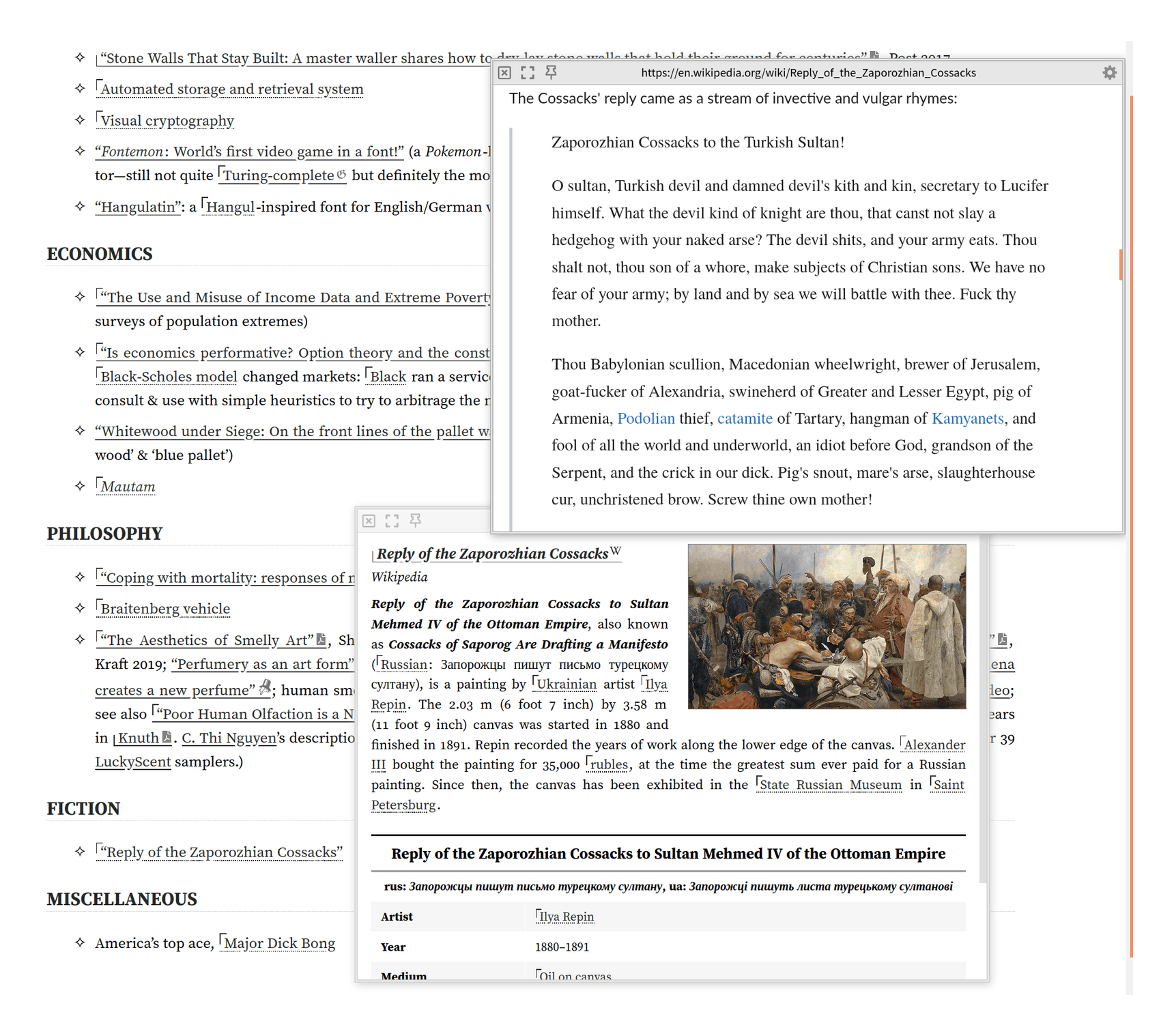
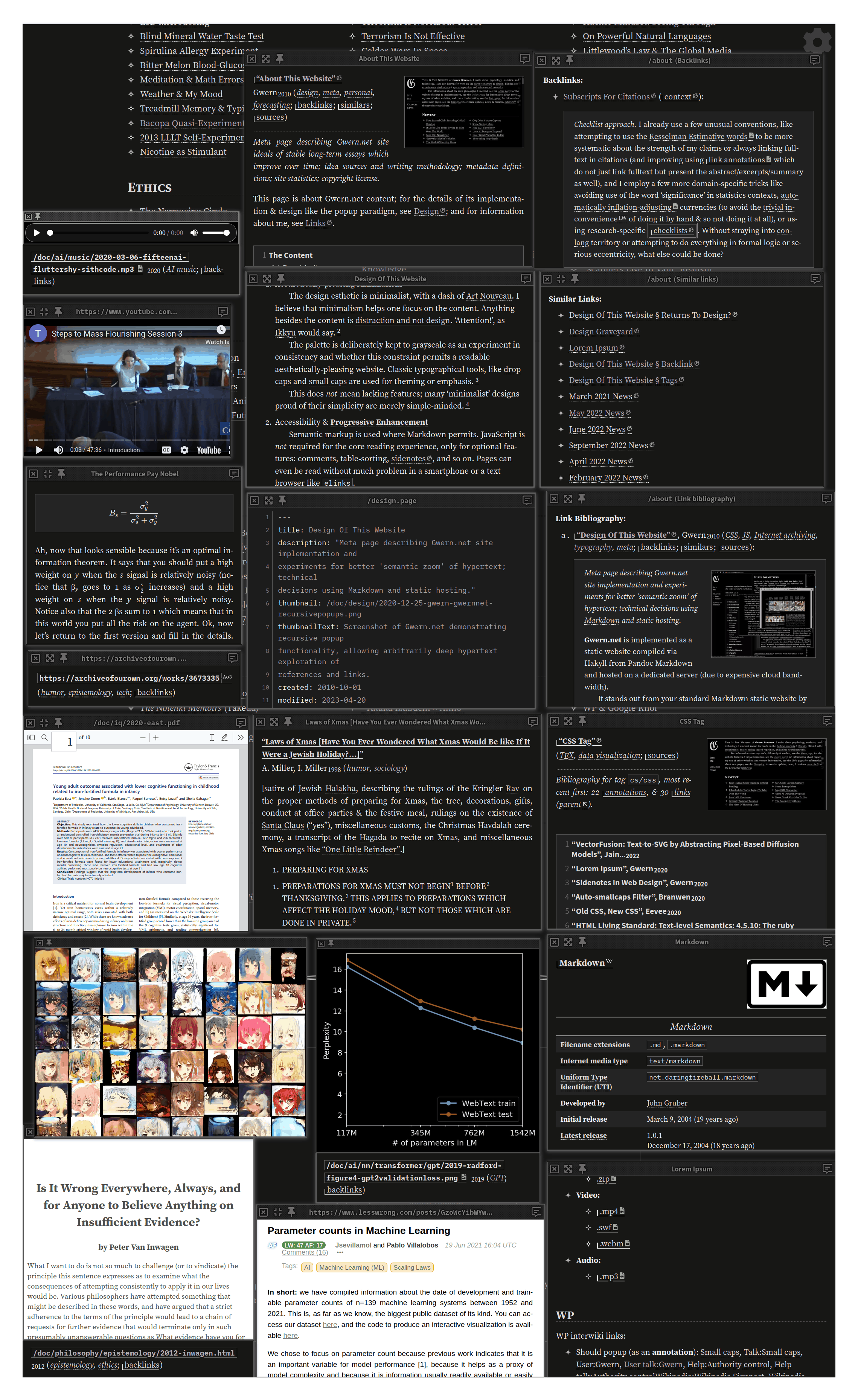
I was inspired by Andy Matuschak's Evergreen Notes viewer and created this small web app to browse Wikipedia in the same way. Clicking on a link opens the content in a new pane to the right. And you can resize panes. It's really nice for following rabbit holes or checking out lists from articles. Let me know what you think!

Code here: https://github.com/steezeburger/wikipedia-browser


I wonder if this-view-but-for-browser-tabs would be useful.

E.g. instead of opening 4 google search links as tabs, you could just open one "to the side" and quickly go to the next link if it turns out to be SEO spam (and avoid a click to close-tab or back-buton).


I've thought of this too, along with the possibility of having multiple tabs visible in the same window generally (almost like a screen/tmux/byobu/… for a browser with tabs being panes in tmux's terminology⁰, tabs->windows and a browser window being a session).

That is probably a very niche desire though, so I don't hold hope of seeing it implemented/supported and don't have time to try write it myself.

--------

[0] https://arcolinux.com/everthing-you-need-to-know-about-tmux-...


This is not built in, but fyi I've used PaperWM for this (scrolling tiling window manager on Linux) and open new tabs as windows. New windows open to right in a large scrolling desktop basically.


I came here to say the same. PaperWM is pretty neat.


Arc browser is doing something like this. Not as sophisticated but at least you get split views (panes).

https://arc.net/


I've found that I'm using this feature much more than I thought I would in arc. Before, I'd figure that it's the same as opening two windows side by side. It's not, having it as a built in feature opens up a lot of things. Opening an article on HN and the comments on HN side by side, for example. I NEVER did that before, now it's second nature.


I think this style of browsing really shows its strength for research and review type tasks. Maybe I'll research what it would take to write an extension to implement some of these ideas.


I was trying out Arc and almost forgot about it, but now knowing about this feature changes everything, thanks for pointing it out! Very often I need to see two or more pages side by side and I just hate making a mess in my browser with multiple windows open. They just tend to get lost and I have to move them out of the way or close them one by one, it is just annoying.

You can even have more than two splits, which I did not expect. Also, holding the option/alt key when clicking on a link opens it in a new split which is super convenient.


Zen browser does this as well though as a Firefox derivative, though as a quick disclaimer it is a relatively new project.

https://www.zen-browser.app/


Vivaldi has this functionality as well, although the UI around it isn't great. There's no easy way to swap one pane with a different site - you have to untile the existing sites and retile the ones you want.


YES! I've wanted EXACTLY this in my browser and IDE for some time. I'll do a little research every once in a while to see what it takes, but never get very far. I really like iterm's keyboard shortcuts for new panes (vertical and horizontal split) and tabs. I think it would be such nice ux for browsing web and browsing code.

Also with the ability to fullscreen the active pane quickly. It's SO nice.


This reminds me of the old File Browser concept from NextSTEP/OpenSTEP (which, I think, was at some point also adopted by MacOS X).

I could never get used to the "horizontal history" style of browsing anything.

But I admit that for the Ultra Wide displays that are all the rage recently, this might be actually very workable


"Miller columns" are what you're thinking of, and I wish more browsers (web or file) supported them.


And this is why I love HN. I did some research before this project, but now I can go look into Miller columns. Thank you!


Wow! It's great to see an Andy Matuschak related post. I've been checking out his content over the last week, and it's really inspiring.

I've been theorizing a similar idea for browsing Wikipedia (or pdfs), except it's only two panels. One is the current page, and the other is a Obsidian-like node graph. As you click on links, words, terms, or phrases in the article, new nodes are created. These would be concepts you're unfamiliar with.

This would build out a tree of ignorance, with an implicitly generated knowledge dependency graph, which you could systematically study.

My goal is to be able to delve into highly advanced topics for which I have little background knowledge, building out a "syllabus" as I go.


Have you considered using Golden Layout [1] to implement infinite panels + tabs that can be dragged around?

[1] https://golden-layout.com/


Golden layout's unfortunately somewhat abandoned.

I like the look of https://github.com/mathuo/dockview


This type of browser mode would be good for reading 2 or 3 articles at the same time, instead of switching from tab to tab.


You can open several browser windows and tile them next to each others too. Funny how people seem to forget they can use windows and their desktop capabilities instead of tabs.


You could also buy several monitors, turn them sideways, and set them up side by side. Or you could have skilled artists draw things out and present them to you in paper. Or you could get multiple Neuralink implants patched to your visual cortex and pipe the window renders directly to your brain!

It's not about how things possibly could be done, it's about minimizing friction. Desktops have become something of a pain in the ass; all the major operators are incentivized to push you to the browser, so they can pipe ads down your throat.

There are apps and custom shells and sometimes even baked in OS features that allow sophisticated GUI interactions, but the learning curves are steep, the features change or require upkeep, and sometimes it's just easier to have a feature built in to the thing you want the feature for.


> Desktops have become something of a pain in the ass.

I will respectfully disagree. Even on the link OP provided, I cannot read it via my mobile device, while I cwn easily do so via desktop browser.

As for the last paragraph, development isn't any simpler on mobile. Not just consideration of different platforms but also different versions and what they can support (both from features and hardware capability).

Your take is interesting, though. Thanks for posting it!


I didn't mean to indicate a trend toward mobile over desktop, but a trend to browser over desktop experiences. Native desktop apps and functionality should be the environment targeted by most apps, and conformity to those expectations would maximize user experience. Unfortunately, everyone wants everything run as PWA in browsers, to try and get some of that sweet, sweet adtech revenue.


I know but this is easier and that's the thing about software UX.


Vivaldi is especially good for this. You can select many tabs (with Shift) and choose to tile them. Tiling layout can also be changed.


You'd need a wide screen to make more than 3 articles pleasant, I think. The more you open, the more you'll want to rearrange or be able to increase/decrease or tile vertically.

For example, on gwern.net, we have a very nice Wikipedia popup integration (which is in some ways better than OP - eg we follow redirects and handle dark-mode natively), and while most readers never notice it and will use it in the basic recursive popup mode like https://gwern.net/doc/design/2021-04-01-gwern-gwernnet-annot... , it doesn't do just recursive popups.

It's actually basically a full-blown tiling WM with keyboard shortcuts! You can have an arbitrary number, drag & resize, resize them to fullscreen or aligned to an axis, etc. So you can popup as many as you want to fit on your screen and rearrange them like in this demo screenshot: https://gwern.net/doc/cs/js/2023-09-14-gwern-gwernnet-popups...


Thank you for making and sharing this!

Do you envision it predominantly being used on a mobile device?

I (personally) found it a bit "fiddly" to aim for the horizontal scrollbar with my mouse -- maybe I missed an easy-to-use mechanic here?

In any case, I love this exploration of alternative browsing interfaces. Kudos to you for building this prototype!


It's desktop first right now. I haven't put much thought into mobile yet! As for horizontal scrolling, it works great with a laptop that has a gesture for horizontal scrolling. Some mice also have second scroll wheels that can be used for horizontal scrolling. In general, you can also hold shift while you scroll with the wheel and it will scroll horizontally. Eventually I would like to add customizable keyboard shortcuts to this app! It would be nice to navigate the whole thing with a keyboard.

And thank you for the thanks! :)


Really great job! I spent a good 10 minutes just clicking through links.

The design encourages opening a new link but I wonder if the temptation distracts from reading a full piece. Still, loved it!


I use Arc Browser's split view though it's not as smooth. I hope they evolve and get closer to this UX eventually.


This is a nice UX experiment. What I'd like to see though, is the ability to choose whether the link opens in the current tile, or open on the right.

IMO, this behavior should be the default on Web browsers when middle-clicking a link.

Especially since people tend to have wide screens and websites don't always constrain text narrowly enough to make it readable.


I love this style of rabbit holing. I would love a way to view my code at work with this method. Does anyone know if such a thing exists?


There was a project like that on HN a few months ago, I wish I could remember the name.


I'd expect it to auto-focus on whatever pane is the newest one, but I have to manually scroll to the right to reach it?


I'll add that! Thanks for the feedback. I built this in a few hours last night as a proof of concept, so it DEFINITELY needs some polish! I've put zero thought into mobile so far.

Edit: the most recent pane should auto focus now!


Yes it makes it look like nothing happens on mobile when you click.


Interesting concept, but also a great way to obtain zero browsing history on the topics you research.


Heard that! I made this proof of concept in just a few hours last night, so there's still quite a bit of work to be done. I've already created an issue to add browsing history https://github.com/steezeburger/wikipedia-browser/issues/1


The Split View in edge does this, but it’s temperamental. Surprised this mode hasn’t taken off tbh.


Oh wow, I've wanted this feature in my browser for a long time! I'll have to check out Edge more deeply.

I think a similar feature to how tabs and panes work in iterm/tmux would also be really really nice in my web browser and IDE.


Isn't that only one split (two pages) and without any hierarchy?


I forgot Edge has it....it's actually quite useful when reading and comparing 2 news articles or 2 reviews etc.


Super simple and super effective tool to learn about [somewhat random?] new topics quickly.


I like this a lot, would be neat if you supported wikipedia's new dark mode.


Would make for an incredible Obsidian plugin


Awesome, thank you!


It's already a feature of Obsidian — turn on stacked tabs

https://help.obsidian.md/User+interface/Tabs#Stack+tab+group...


super cool, I have been looking for a tool like this.


A reminder that Federated Wiki has a similar flow of opening side-by-side panels: http://fed.wiki.org/view/welcome-visitors/


Join us for AI Startup School this June 16-17 in San Francisco!

Guidelines | FAQ | Lists | API | Security | Legal | Apply to YC | Contact

Search: