I really like this - they've taken the best ideas they found in WebOS (flicking cards), Windows Phone (flat UI, but NOT the idea of live squares, or the ugly typography), and Android (swipe screen and more swipe notifications, what else?). It'd be nice if others looked again at WebOS as we lost a lot of good ideas there - I still feel like they could radically reinvent multi-tasking and just let apps present as many cards as they want in stacks or something, base it all around cards/views rather than apps.
The typography looks nice - Helvetica Neue works well on devices with a retina display, though we've yet to see how it works on older devices, perhaps iOS 7 will require retina?
I'm really pleased to see they've removed some of the tasteless fake leather etc that iOS previously indulged in (compass app, games centre etc), while retaining hints of real depth and physical relations where it actually helps the design (as in the translucent keyboard). I wonder how much of that was stuff that Steve personally insisted on?
Some of the icons could do with some polish, but it's hard to redesign an entire set probably coordinating with different teams and keep them all up to the same standard - I'm sure revisions to those will come with time, and at least we've lost all that faux 3D render effect which doesn't work so well at small scale - these flatter logos are an improvement in most cases I think, though things like the photos app icon don't make sense to me. The radio and itunes icons are an example of something that works extremely well in this style though.
There are far better screenshots on this other story:
I like the design overall, but am I the only person who thinks these icons are awful? In particular, the color palette they used and the ugly gradients used (app store icon).
It's always hard to create a flat design version of something created non-flat before. I really thought that Apple will do it's best to preserve the functionality of it's own designs and I think it really did it at 99.9%. Those icons aren't the best they could do, but it will change in time for sure!
Personally, this was exactly like what I was thinking-- to me, some of those icons look like bad mockup-stage design. Some of those gradients, in my opinion, are pretty bad and do not work.
Well you can never tell this, until you see it on your phone. Most of the icons may look like a basic photoshop tutorial, but still that's the minimalistic approach of flat design.
You've got a really different view of something ( a gradient ) outside of it context ( the whole UI ) and the same element as part of a whole design. That wasn't pretty obvious to the great super-pixel-detailed skeuromorphic design, where each icon was a whole design, but I'm pretty sure we'll speak differently by the end of the year when we get that iOS and evaluate the change for real.
Take a look at their new demo paga [1] it looks pretty nice and flattened. I'm afraid of what will happen to the 3rd party apps, that will not get a flat-design update.
Even looking at their site, the mail icon drives me nuts. Personally, I don't like the cyan-to-blue because it looks odd that the gradient shifts so dramatically in hue. The Twitter icon, on the other hand, is fine because it's not really a shift in hue but in lightness.
It just feels like the like source is different for different icons (some go light-to-dark, others are the reverse), and it's driving my designer eye crazy.
You're not, though the safari controls (especially in the bookmarks screen) shocked me more, the blue-on-white is very odd-looking. I'll have to see the actual result, but I'm really wary on that (though I like the new style overall, even if it might take people time to get used to it)
Agreed; the design of the OS is quite good but the icons seem disproportionate. The Safari icon seems quite odd, and the iTunes and App Store icon "circles" are too far out on the edge of the icon.
Overall though, it's a remarkable effort by Apple. Let's see how good it is to develop for, though.
I'm sure it will be repeated indefinitely, but I might as well kick it off:
Looks a lot like it was inspired a bit by Android and a bit by Windows Phone. To my eye, the font looks like an Android device and the rest of the UI looks like Windows Phone.
Note: this is a good thing. The old iOS looked tired and dated.
I feel like all of the design and promotion in this WWDC was a notch or two less egocentric than the mean of the last 5 WWDCs; even their tagline has become less idiosyncratic ("the intersection of liberal arts and [whatever else it was]") to "making good products people love". They made fun of themselves relentlessly ("no stitching, yet the calendar doesn't fall off the screen") and showcased unrepentantly nerdy features. It felt a little like a shift from the Apple of Jobs to the Apple of California, down to the new OS X names.
I agree; this was a developer's conference first, and a product unveiling second. As much as I hate to say it, I think I like Cook's, Federighi's, and Ive's Apple more than I liked Jobs', Serlet's, and Forstall's Apple.
They care more, they listen, and that speaks a lot.
I've used both Windows Phone and iOS quite extensively and one of the few things I think WP does well is the UI. To give Apple credit, the new design looks incredibly different whilst maintaining the familiarity.
I have not owned an iOS device since the original iPhone, so take my opinion with a huge grain of salt. Since that time, this redesign is the first that has actually caught my eye. So I completely agree, the new design is refreshing and they deserve a great deal of credit.
The Mobile Safari tab switcher looks like a clone of Chrome of iOS/Android. Control Center? Christ, that's been in Android for ages.
What irritates me is that other companies get accused all the time of copying the smallest things from Apple, even microphone icons, gloss, or rounded corners.
However, Apple clearly was a late comer on many of these features, and they are inspired, and in some cases, downright cloned, and they're going to get a pass.
What if Google had a patent on Chrome's tab switcher and sued Apple? Or on a Power Controls setting pane? Or on cross-device open-tab sharing? There's be outrage among Apple users, because people just don't seem to see Apple building on other people's designs, because Apple presents all of them as major, radical innovations without acknowledgement of their prior existence.
I wish all of the claims of theft and copying would get dropped, I don't have a problem with Apple "stealing shamlessly" the ideas of others, I just wish they'd stop going nuclear when other people do it.
Rather than "stealing shamlessly" we could call many of Apple's actions and assertions "hypocritical." Do they have nice products with a massive amount of advertising to shill them. No doubt. But the (recently fading) Cult of Jobs' bombastic claims were stultifying to anyone that was familiar with the industry and technology of the time.
because Apple presents all of them as major, radical innovations without acknowledgement of their prior existence
I don't think that happened in this case. Indeed, the presentation seemed to have an awkward elephant in the room feel where Apple needs to both embrace functionality that their competitors have long had (e.g. Control Center for iOS is a close to identical clone to what Samsung has had in TouchWiz for years, later to be adopted by Google into Android...but swiped from the bottom rather than top), only celebrating that it is now available for iOS.
Apple is absolutely stealing a lot of functionality from Android for this release. There was one point early in the demo where they showed an iOS 7 lockscreen and I actually thought they were showing a Galaxy S4 lock screen. Bizarre.
And there is nothing wrong with that. And as a current Android device user, if they can pull that off with excellent Apple execution, it may just induce my next purchase.
I hate Google for their lack of respect for privacy, but I disagree. Copied is pushing it, definitely. I'd say "inspired". There has been plenty, plenty of innovation on Google's side.
Also, the concept of a capacitive touchscreen existed before the iPhone, take the LG Prada. Apple wasn't the first to do it. They were the first to do it right, and if people are inspired to improve upon it further, I see that as a great, positive thing, not a bad thing. I don't see how you could call yourself a hacker with that kind of mentality.
Since I work at Google, you'll have to qualify that claim, because in my opinion, Google has more respect for user data than most other companies.
The iPhone 4 actually looked like an LG Prada as well.
James Hahn demonstrated many of the multitouch gestures before Apple, proving that other people were coming up with the same ideas independently as soon as the tech for detecting multiple touches accurately was available (capacitive touch)
Apple did bring a lot of things together in the iPhone 1, but that shouldn't give them the right to own the entire concept of a touch screen phone, nor should they be allowed to hamper competition through stupid patents like the data-tapping patent.
Imagine if IBM had patented the PC or Xerox the UI, and aggressively sued anyone who tried to use them, as well as refusing to license at a reasonable rate. The entire PC revolution, which was kicked off by cloning and free-form building on the work of competitors, might have been hampered.
Apple stands on the shoulders of giants too, and they should not attempt to cripple those that want to stand on their shoulders.
IBM did quite the opposite of Apple. Remember that they invented the FFT? They patented and released it into the public domain. They wanted you to use more computers and FFT's required computers. Quite far from the ambient retrotacular patent land grabs like Apple just now patenting NFC POS payments with a phone that have been out for many years.
2002 - Steve Jobs started thinking about working on a Phone
2004 - Apple Engineers started working on touchscreen technology for a tablet PC and had convinced Steve Jobs that they could build a similar interface for a phone.
2005 - Partnership with Cingular(AT&T)
Early 2006 - Work on the iPhone started.
Dec 2006 - LG Prada was released. <===============
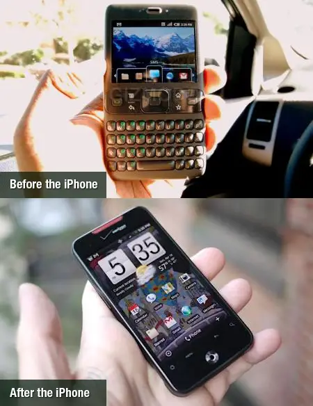
Android was built as an amorphous, multi-form factor OS from the very outset. That "before and after" picture is completely dishonest and only plays on enthusiast sites.
Where "entire concept and design" encompasses the totality of "touchscreen". That is it, and comparisons between iOS and Android 1.x are almost comical. To take that even further, Google didn't so much copy (because there were many other touchscreen smartphone devices pre-iPhone), but rather learned from Apple's commercial success.
Don't let the anger of the late Steve Jobs guide reality.
I'm not a fan of the icons at all :( The gradients and bright colours make it look too cartoony and childish, and some of the icons themselves (eg phone, safari) look strange.
I quite like the typography and new design style for apps though, so overall I think it's pretty good. The messaging app definitely looks inspired by Windows Phone, but I haven't really got a problem with that.
I was confused that they used different interactions for safari tabs vs multitasking. I feel like the multitasking interaction is cleaner ie. right/left swipe to change tabs, swipe up to dismiss.
So will developers have to redesign their apps to bring the visual look more in line with this new version of iOS?
The old iOS had such a defined design language, I wonder if opening an app that doesn't have the new "flat" look will feel terribly inconsistent or jarring.
The free radio service sounds unbelievable though. I'm very jealous of iOS users just for that (even though I'm not a big music listener)
This is a damned if they do, damned if they dont moment for Apple. The UI needed a refresh. They have to follow design trends that make sense. The mobile UI is maturing and standardizing since there have been a lot of smart people thrown at the problem. I think the design is classy, functional and is refreshing. I dont know that there is a "best" in class anymore. I think WP stepped up the UI frontier and Android seems to get the message that things need to have good design aesthetic. I dont think apple nailed every aspect of the refresh, and its not perfect. I do think that it will provide a solid foundation to move iOS forward, and Im very glad they got away from skeuomorphic design. I've never been much of a fan of that design, as it usually ends up negating all the advantages of software UI.
> Instead of white bars on a black background, Apple will now tell you what kind of service coverage you have with five little dots, which are white and grey depending on how strong the signal is across a translucent background.
I don't understand why Apple dropped signal bars for "dots". The term "bars" for cell signal is common, mainstream terminology. The dots take up more status bar space than the bars (unless Apple really plans to remove the carrier name from the status bar).
Perhaps Apple is trying to marginalize the carrier's branding and distance themselves from "signal-gate" by not using the common "bar" terminology? In the future, there will be no cell networks, only FaceTime. And bars will be obsolete.
I'm pretty curious will this affect 3rd party apps, like Facebook and Twitter. Apple didn't show them on the demo ( and any other 3rd party app ), so basically we should be careful of how we design apps in the future!
ah, sorry, got from the linked article on the bottom of the page.
can't edit... well, just let's look at the weather app then and bash apple for outright copying 100% of the app from yahoo (except the flickr photos on the background) :)
From a corporate perspective: Apple's pretty much wholesale using Google's new design philosophy now, with some stuff grabbed from WP and webOS along the way. This really isn't helping the innovation debate too much.
From a personal perspective: Yay! I have an iPad and iPhone and I'm looking forward to them looking much better.
Too bad people don't speak about the fact that Apple participates in PRISM, at least that should've tarnished their products release. Instead you have glib masses waiting for handmedowns of great products(electronic collars) in exchange for liberty and right to privacy.
They allow changing Wifi settings without even unlocking the phone.
Be really careful about letting anyone touch your phone, esp. at conferences/airports. A hacker could setup an easy MITM Wifi, to capture all of your traffic. But, now, without unlocking your phone (but still getting their physical hands on it), they can connect your phone to the Wifi SSID of their MITM attack network.
Then, you're just surfing facebook, email, bank sites, & everything looks 100% legit. Meanwhile all of that traffic is going through their wifi & they can capture your sessions & impersonate you. Nasty stuff.
All it'd take is one malicious network, and a band of attractive agents to shmooze unsuspecting people into showing them their phones to harvest tons of sessions & data.
It only allows you to disable or enable wifi/bluetooth/airplane. This is pretty much 100% lifted from this old jailbroken iOS app: http://cydia.saurik.com/package/sbsettings
> Turn on or off Airplane mode, Wi-Fi, Bluetooth, and Do Not Disturb. Lock your screen’s orientation or adjust its brightness. Play, pause, or skip a song. Connect to AirPlay-enabled devices. And quickly access your flashlight, timer, calculator, and camera.
The typography looks nice - Helvetica Neue works well on devices with a retina display, though we've yet to see how it works on older devices, perhaps iOS 7 will require retina?
I'm really pleased to see they've removed some of the tasteless fake leather etc that iOS previously indulged in (compass app, games centre etc), while retaining hints of real depth and physical relations where it actually helps the design (as in the translucent keyboard). I wonder how much of that was stuff that Steve personally insisted on?
Some of the icons could do with some polish, but it's hard to redesign an entire set probably coordinating with different teams and keep them all up to the same standard - I'm sure revisions to those will come with time, and at least we've lost all that faux 3D render effect which doesn't work so well at small scale - these flatter logos are an improvement in most cases I think, though things like the photos app icon don't make sense to me. The radio and itunes icons are an example of something that works extremely well in this style though.
There are far better screenshots on this other story:
http://techcrunch.com/2013/06/10/live-blog-wwdc-2013-keynote...