There seems to be something being missed in this thread with the back and forth of effective tutorial screens:
What if we created UX that didn't require explicit hand-holding?
I'm sounding snarky I'm sure, and maybe that's because this is kind of a snarky comment, but as someone who makes mobile apps for a living it's a position that is surprisingly infrequently considered.
Yes, I know it will look really cool, but do you really need to break platform conventions (that users have already spent a lot of time learning) just for your one thing?
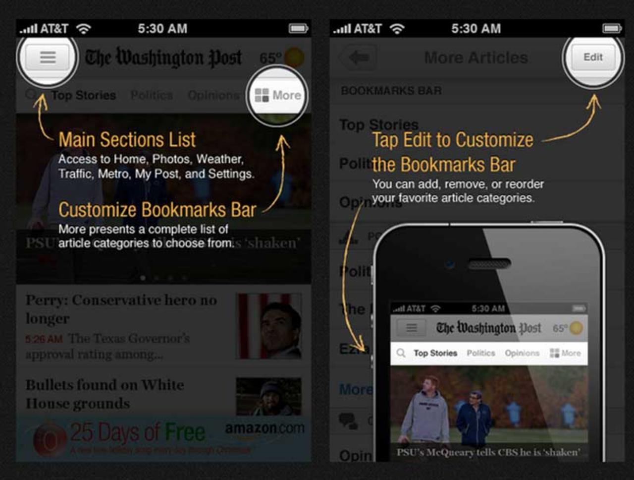
Maybe instead of pointing an arrow at a hamburger button and telling the user what's under that button, we should consider something less insanely vague and useless as the hamburger button?
Having built a pretty large number of apps so far, my position right now is: if you find yourself building a tutorial screen/mechanism, you have already failed, and the only good you're doing for your UX now is controlling the degree of failure between "mild" and "utter".
My experience with tutorial screens - not just on the implementation and UX side, but also where they seem to come up during the product development process - suggests that they are at least a bit cargo-cult-y. People suggest them because other apps have them and it's at least a superficially sensible thing to do.
A lot of projects start with the fundamental premise that tutorial screens will be necessary, and when these projects inevitably run into conversion/completion barriers because of the tutorial screens, attempts to mitigate rarely involve completely removing the screens. It's as if the presence of tutorial screens is fundamentally non-negotiable.
Completely agree here. I think the main theme of that section being "Don't over-educate users" if you can reach for high engagement and conversion rate without overlays, arrows, etc. then that's the way to go.
It's great to design the experience at the outset to not need the tutorial screens. And then test into the possibility of including them anyways.
One "in-between" possibility would be to have something similar to Slack's old onboarding experience where you'd see some elements that gently pulsed prompting the more curious users to click on them and learn more. And everyone else to safely ignore them and move on.
Interestingly Slack has moved on to more explicit explanations during their most recent onboarding iteration. But I am sure that they'll also try something without any tool-tips at all.
The larger point is that many apps have sliding screens that force users to read in order to learn about their app. And that users did not install and open the app to read about it. They're there to use it.
We've seen massive increases in conversion rate and engagement by replacing these screens with "learning by doing" interactions.
If that "learning by doing" step can be accomplished without tutorials then even better!
> "If that "learning by doing" step can be accomplished without tutorials then even better!"
Sure, but I'd still argue that 95% of the time you're still negotiating the degree of failure.
Honestly, the times I've been able to exert enough force on a project, we have always come out with a better, more refined, and clearer design that required no tutorials whatsoever.
5% of the time, user confusion comes from the fact that you're doing something truly new and groundbreaking and that the user will simply have to learn it somehow.
95% of the time, your design simply isn't good enough and you haven't iterated enough on it, or you have a tolerance for convention-breaking that is poorly-justified in the context of your app.
Mobile devs (me sometimes, too) have an annoying tendency to think they are in the 5% category all the time. My challenge to people is to accept that almost all of the time when users can't figure out your app, the solution isn't user education, it's to un-fuck your design.
[edit] I just read your post more carefully...
> "It's great to design the experience at the outset to not need the tutorial screens. And then test into the possibility of including them anyways."
Wait what. That seems entirely unreasonable. If you've designed an experience that is intuitive and requires no tutorial screens, you want to include them anyways?
Am I reading your post wrong?
Tutorial screens and mechanisms are never a good thing. They can (rarely) be justified as a necessary evil, but at no point are they actually good, and at no point do they make your UX better. A well-designed tutorial is simply less awful than a poorly-designed tutorial. Both scenarios are categorically worse than simply not needing a tutorial.
Note that I'm drawing a distinction between onboarding and tutorials - one introduces the user to the product, the other introduces the user to the UI. Onboarding (like, say, an online dating app helping you import your first photo so your account is even marginally useful) is entirely legit, tutorials aren't. The screenshots provided in the original article are tutorials, not onboarding.
> "Tutorial screens and mechanisms are never a good thing."
What's your definition of a "good thing" or "actually good"? If it's quantifiable as higher engagement and retention then these mechanisms are far from "never a good thing". They're a good thing quite often - when done correctly. This is why you see them in many products that have growth teams dedicated to the task.
Agreed that the screenshots do not do a great implementation justice.
Note that when I'm talking about onboarding, I am talking about combining introducing users to the UI with introducing them to the product.
Sure introducing the user to UI by itself is not great.
> "If you've designed an experience that is intuitive and requires no tutorial screens, you want to include them anyways? Am I reading your post wrong?"
Slightly yeah. It should be read as: "If you've designed an experience that is intuitive and requires no tutorial screens, you want to test them anyways."
Because we've seen their inclusion improve engagement and conversion even in experiences that are intuitive. Sometimes that's not the case, but the possibility is strong enough to justify testing them out.
^ I really like Raskin's piece on intuitive UI. By all means we should leverage the conventions that users have worked so hard to learn, but sometimes 'intuitive' isn't going to provide the best long-term experience. His quote about the mouse, which we today assume needs no introduction, is illuminating:
"My subject was an intelligent, computer-literate, university-trained teacher visiting from Finland who had not seen a mouse or any advertising or literature about it. With the program running, I pointed to the mouse, said it was "a mouse", and that one used it to operate the program. Her first act was to lift the mouse and move it about in the air. She discovered the ball on the bottom, held the mouse upside down, and proceeded to turn the ball. However, in this position the ball is not riding on the position pick-offs and it does nothing. After shaking it, and making a number of other attempts at finding a way to use it, she gave up and asked me how it worked. She had never seen anything where you moved the whole object rather than some part of it (like the joysticks she had previously used with computers): it was not intuitive. She also did not intuit that the large raised area on top was a button."
Sure, but at the risk of more snark - are you building a new paradigm for computing interaction, or are you building an app to add kitten ears to selfies?
One of the more pernicious things I've seen from mobile developers and mobile designers (including myself from time to time) is that we all want to work on some Cool Ass Shit(tm), but not every app we get to work on is some groundbreaking advancement, and so we see a lot of very non-standard UIs that violate a whole lot of established conventions on apps that are supposed to be very straight-forward.
This is also very commonly justified under the guise of "branding", as if featuring a UX that's wildly inconsistent with the entire rest of the platform is an exercise in marketing (see: AirBnb's old app navigation, where screens shrunk and with 3D perspective flew off to one edge... that's just switching between sections)
Yes, there are scenarios in which you really must break the rules, or that breaking the rules will result in a substantially better experience in the long run. These scenarios are few and far between, and I suppose my main complaint is that app developers seem to have an inflated judgment of whether or not their scenarios (which are usually fairly straightforward) fit the description.
A good example of this I think is Tinder: the card-swiping UI was definitely new at the time (and cloned inappropriately to a disturbing amount, but I digress), and IMO was well justified. More importantly, the rest of the app is very by the numbers - they knew they were breaking a huge convention and so they built around it. Many, many apps are guilty of not only breaking conventions, but breaking many unrelated conventions all at once, resulting in a mess of shit that nobody can figure out how to use without resorting to heavy-handed tutorials.
Yea, we're pretty much on the same page -- if the app _doesn't_ need a revolutionary paradigm (and so many don't), then excess user-education is not needed if the app follows platform conventions.
> Yes, I know it will look really cool, but do you really need to break platform conventions (that users have already spent a lot of time learning) just for your one thing?
> Maybe instead of pointing an arrow at a hamburger button and telling the user what's under that button, we should consider something less insanely vague and useless as the hamburger button?
I'm not a huge fan of the hamburger button either, but it's certainly not a good example of something that breaks platform conventions. In fact, some use the hamburger button over other, more descriptive icons precisely because, in today's UX landscape, it's conventional to do so.
I disagree, though I guess it might be over semantics.
The hamburger button is common, but it is not any clearer to the user today than it was when it first started popping up - and for good reason, because the hamburger button was never a well-defined piece of UI.
The hamburger button is literally the Everything Button(tm), and as such it's unlearnable, because "Everything" is different for every single app, and "Everything" is far too broad for users to develop expectations around.
So maybe we're arguing over semantics about what's a convention and what isn't - the hamburger button is an incredibly common UI element, but the users never learned any conventions around its use, because there were never any.
And this isn't just idle complaining - in every single app I've ever done, and in all the apps where I've had visibility into user patterns, and with all of the mobile devs I've been able to ask this question to, the answer has been unanimous - when subject to quantitative testing, the hamburger button falls apart.
Screens placed in hamburger button menus receive way fewer clickthroughs (1-2 orders of magnitude) than screens that are clearly labeled by buttons or tab bars. When placed in situations where the user is unsure how to proceed, the hamburger button is literally the least touched UI - users will touch just about anything before they touch the hamburger button.
Putting features behind hamburger menus is quantitively a death sentence. It's a great way to guarantee it gets minimal (if any) exposure to users at all.
So I guess I'm being a bit roundabout - but the distinction I'm trying to make is that while developers seem to think the hamburger button is well-established convention, this does not bear out when observing user behavior. "Users know what the hamburger button does" is a faulty assumption.
Yep it does look like we're only disagreeing on semantics.
I consider using the hamburger button as the Everything Button(tm) a convention onto itself, simply because it's used so pervasively that users don't really have a choice but to become accustomed to it.
I don't believe it's a very intuitive or useful convention, but it's a convention none the less.
As much as planning for failure is dumber than regular planning, sometimes failure really is inevitable and you have no choice but to accept and mitigate it.
Not a fan of screen overlay tooltips as in [1]. My first instinct as a user is to get them out of my way, and I do that every time, feeling guilty. And adding a "next" button and going through tooltips one-by-one doesn't make this any better, just more annoying.
Actual games (such as GTA or Cut the Rope) do a great job with onboarding, and apps tend to take the simpler show-everything-in-the-beginning way.
Two alternatives I've tried as an indie dev:
- Gamification, where you ask the user to perform one task, such as "drag X to Y." Only after they performed the action move on to the next prompt, and perhaps not even immediately.
- Utilizing badge counts or "bouncing" animations to indicate some action that needs to be performed. The benefit is that the user can try it on their own time, and you're not rushing them. The downside, though, is that some users may never actually click.
On the flip side, these approaches can add complexity in both code and how you structure your UI.
I like the tooltips better than either of the approaches you've suggested. If I'm confused, I glance at them and then am less confused. If I'm not confused, I just dismiss them, not feeling guilty.
I hate "help" mechanisms that keep popping up in normal operation, because usually I know exactly what I'm doing in normal operation.
You're on point, these help mechanisms should be rare and few, or they would be a nuisance as well.
The problem with forced screen of tooltips in the very beginning is that you haven't had a chance to explore the app yet, and so it's hard to mentally assign importance to them. And later, they're gone.
This is my issue with them. Maybe I do need a tooltip to figure some feature out. But I certainly don't know which one I need yet.
If you bombard me with "Hit the + button to make a new document!" on first launch, of course I'm going to dismiss the tips. It's 2015. Figured that one out on my own.
Better to design an app where functions aren't hidden in secret menus and I can explore without accidentally screwing things up. Is that too much to ask?
Assuming that users who installed the app already understood the need to provide their location data. This allowed them to axe out the long-winded welcome flow and make the permissions request the second screen. The text was changed to say that users needed to “Enable Location Permissions”
Yup - I wonder if the article misrepresented the actual change because it seems a bit odd?
This article has a lot of good points but some are really debatable. Not long ago, Hopper (app for flight price monitoring) published their experience in re-doing their onboarding [0]. Some take aways from that go against what this one says.
Ultimately you have to see what works for you and what doesn't. Copy & paste (just like the Social links paragraph funnily) will never just work without some thought.
It should be no surprise that decreasing the tutorial from 6 pages to 2 will increase number of users "registered" from 40% to 80% (or more). In my experience, tutorial dropoff follows a power law, that is, every new hurdle you place before the user can use your app gives them one more chance to bail. You can try all the fancy design tricks you want, but the end result is still the same...you're creating friction points.
In reality there's a delicate balance. Train users to use your app early and take the hit in registrations. You should end up with more engaged users who retain better. Or let everyone in and teach them as they use your app and risk retaining them because they don't understand what the hell they're doing. There is no silver bullet.
When you look at user tests, no one pauses to read this text. And the very few who do immediately forget what they read...
Even though some of the technologies discussed are hillariously obsolete, nearly everything published on joelonsoftware.com 10+ years ago remains surprisingly relevant:
I love this article and it is a pretty great handbook on a variety of tactics you normally don't get much depth about. But I wish the whole thing was prefaced with, this mostly matters after you've found an audience. (Or product/market fit if you're pmarca)
What if we created UX that didn't require explicit hand-holding?
I'm sounding snarky I'm sure, and maybe that's because this is kind of a snarky comment, but as someone who makes mobile apps for a living it's a position that is surprisingly infrequently considered.
Yes, I know it will look really cool, but do you really need to break platform conventions (that users have already spent a lot of time learning) just for your one thing?
Maybe instead of pointing an arrow at a hamburger button and telling the user what's under that button, we should consider something less insanely vague and useless as the hamburger button?
Having built a pretty large number of apps so far, my position right now is: if you find yourself building a tutorial screen/mechanism, you have already failed, and the only good you're doing for your UX now is controlling the degree of failure between "mild" and "utter".
My experience with tutorial screens - not just on the implementation and UX side, but also where they seem to come up during the product development process - suggests that they are at least a bit cargo-cult-y. People suggest them because other apps have them and it's at least a superficially sensible thing to do.
A lot of projects start with the fundamental premise that tutorial screens will be necessary, and when these projects inevitably run into conversion/completion barriers because of the tutorial screens, attempts to mitigate rarely involve completely removing the screens. It's as if the presence of tutorial screens is fundamentally non-negotiable.