I agree about older Windows UI. In my opinion, the worst is the increasing abstraction of UI elements like icons. Floppy disk and folder icons may be small, but if you can see them then it's easy to relate to the real world. It's been difficult explaining modern smartphone icons to my >80yo grandma after I got her a phone, when everything is a flat and abstract symbol.
Do you think that the problem is your grandna is 80 year old? I am in the early thirties and cannot understand the Google Drive and Google photos icons in my phone. Even the Gmail icon is so similar to all other Google icons I actually need to think hard about what I want, to press the right one. Often I just stare at the icons for 5 seconds. It used to be obvious. Maybe I am mentally challenged :(
I think a little bit of it is due to being old, but being serious, I'm a software engineer and still often find myself baffled by modern design choices. I often hover over icons, hoping that a popup will explain what the button does, or highlight whole web pages that choose to have grey instead of black text. I think we're at a point where designers are just pushing novelty over function to justify their positions.
I also agree on the google icons. After years I still get google photos and google drive confused, not to mention youtube and strava (both red/orange-ish icons). I think you're fine, it's design trends that are getting ridiculous
I suspect that it’s this idea that the icons should have a consistent design aesthetic for branding purposes that makes them all look the same. And there’s definitely been a trend towards ever more abstract icon design.
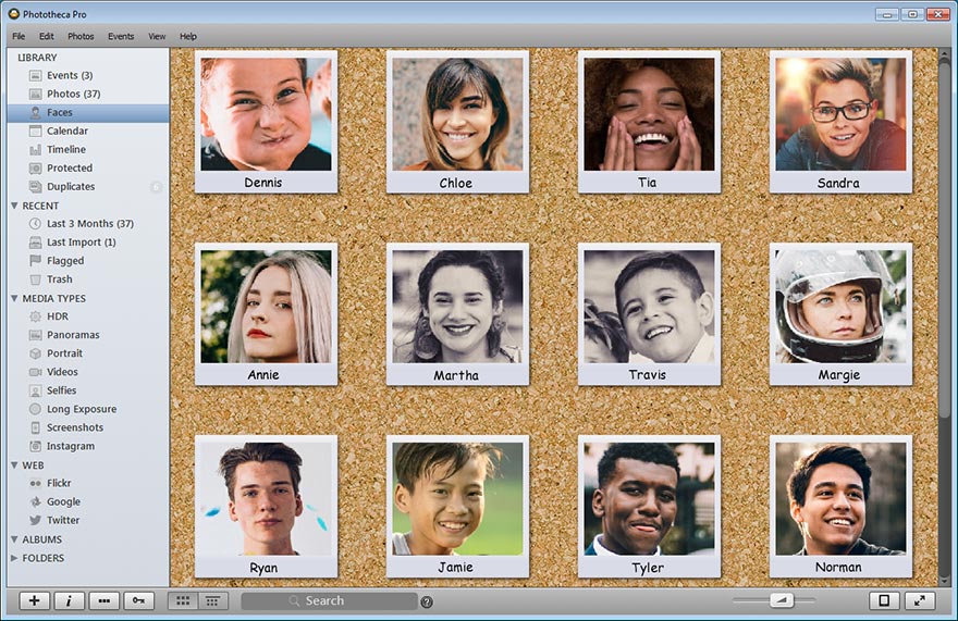
There is this photo organizing software, Phototheca [0], which is the best photo organizing software I have found thus far (at least according to my needs and workflow [insert appropriate XKCD here]).
A version from a year+ or so ago used nice, colorful icons [1] in the sidebar to access the main functions. The late(st)? They made the icons grayscale... on a gray-ish background [2]. It is really giving me a bad user experience, since I have to stop and read the text every time, instead using the RGB-shorthand (aka color) that is way faster to my brain.
This could have been fixed with a simple option in the configuration dialog, but TMK it is not.
I see the same problem with elderly relatives who struggle to use technology. I am hoping that things like activity blocks on Android [1] become more streamlined and I can use those to make a simplified interface to help make it more navigable.
Just wanted to point out that neither a floppy disk nor a Manila folder have been in public use for almost two decades. Still they survive as these icons and I hope they’ll continue on for the next 500 years.
Floppy disks are still in use for a lot of legacy systems that can't be easily upgraded or replaced for a variety of reasons (mostly it's some combination of they still work for their intended purpose and/or the manufacturer went out of business 20 years ago).
Manila folders are still sold at office supply stores, so I'm pretty sure that they're still in widespread use.
I still use minila folders at home. all of my documents go into my file-folders in my file cabinet. I keep all sort of document in there from warenties to manuels to account information for various things like utilities medical information. I don't know how people function with out filing their papers.