I really think that Windows 2000-era Windows Forms had the user experience nailed perfectly. It wasn't the prettiest UI paradigm ever, but it was the most functional and easiest to teach. Nothing was omitted, and the user was shown everything they needed to see in order to get a complete idea of the state of the application.
I don't think that efforts to hide UI elements that aren't in use is going to prove to be a good idea when we look back at today from the future.
Here's a good rule, in my mind: Don't hide UI elements from the user. End of rule. I do not care if it looks better without whatever UI element. The toolbox in my garage would look better if I could only see the tools I needed at the time I need them, and I would return that toolbox (or never buy it in the first place) because it is constantly lying to me about the state of the toolbox, which is absolutely insulting position for a toolbox designer to adopt.
This is just the symptom of a larger, deeper and more insiduous problem - design education, short-term corporate targets, discipline, anti-functionalism, celebration of aesthetics, marketing overreach, lack of rigorous criticism and unwilling to convince users.
We're not going to solve it. It requires complete scrub of how we think about building excellent products with deep understanding of humans (not users). Furthermore, needs overhaul on multiple fronts since great design doesn't sell apparently according to most rebuttals. Just look at Apple.com and see how loud it all is. Developers love Stripe design, but it is overrated - full of animations, bright colors, sexy transitions and for some reason they love diagonal lines. We need to revive some people like Paul Rand and Josef Muller-Brockmann, may be get Stankowski and a few others to do marketing. We don't celebrate great design anymore. If it wasn't for Elliot Noyes, no one would ever think of IBM in the same way.
We've gotten so worse, it is appalling and we should all be ashamed.
Agreed. Steve Jobs once expounded the notion of 'discoverability' with the Macintosh UI - in particular the use of drop-down menus - which was a response to the keyboard shortcut-heavy applications of the IBM ecosystem.
A lot has changed since then. GUIs are standard, touch-based 'appliances' like the iPad are the norm, and there are fewer people for whom computing is totally new to (a big issue back in the 80s and 90s that drove efforts of approachability you saw in the Macintosh and Windows 95). Despite this, I think there's still a timeless usability lesson in that early approach. Gestures, it could be argued, are just another form of the IBM keyboard shortcut.
It feels like the OS vendors pulled the rug out from under us. There used to be reliable well-researched style guides. They moved slowly, to the point where the pack-in software from Windows 1.0 looks pretty much sane in Windows 2000, or 1984 Mac software on OS 9 looks reasonable.
At some point, they decided to toss all that out the window for aesthetics and shininess.
I feel like this could have been done much better by making theming a first-class citizen. Sure, put a pretty theme on by default, but let the user make every button look like a football and have the text blue-on-purpole if they want. If anything, this would further encourage developers to stick to established conventions and style guides, because they'd need to make sure it still looks and works fine when the user is running a theme that makes everything look like a particularly ugly Enlightenment theme.
> feel like this could have been done much better by making theming a first-class citizen. Sure, put a pretty theme on by default, but let the user make every button look like a football and have the text blue-on-purpole if they want. If anything, this would further encourage developers to stick to established conventions and style guides
This was very much the case for Classic Windows themes. Everything could have been set to any colour, font, style. Dare I say, it was more customisable for end users than any Linux UI today.
> and there are fewer people for whom computing is totally new to ...
Including current UX people. They are young enough, digital-native enough to take things for granted ...
... whereas people originally building the interfaces from the "golden age" mentioned upthread could not assume anything, having to build, research, and test everything from scratch.-
Yes and no. Aesthetics are always going to be critical to the consumer experience of technology; the problem is that there are difference schools of aesthetics, and presently the high-status UX school is a minimalist one that values showing as little information as possible in order to look 'easy to understand' in screenshots and at-a-glance tours.
If Windows 2000 wasn't "aesthetic" then we wouldn't have Vaporwave, after all; look how that late-90s look is glorified now. There's no shortage of people (myself included) that will still defend it as being a pinnacle of sorts, though I'd point at NeXT as being the real high water mark.
I'd call that late 90s style Modern Desktopist, where the metaphor of being a 'desk' we may have seen in some 80s Classical Desktopist has been left behind and replaced with functional, well-designed UI widgets building on years of refinement. There was a reaction to this modernism, and it came first in the form of Late 2000s Skeuomorphist UI as on iOS and in many creative applications on desktops preceding it: the 90s style being seen as too corporate, too 'suit', we ended up with skinnable apps, and apps that mimic the real world (I'm thinking of Propellerhead Reason here as the king of these). What skeuomorphism added in terms of enjoyment was lost in terms of losing all of the expected conventions of normal desktop applications: drag-n-drop, multiple select, keyboard shortcut consistency, etc.
Skeuomorphism was rejected in favour of what some call "flat" or "material" design, first in the Microsoft Metro form emulating highway signs, and then in the Google form emulating... nothing. Developer laziness, perhaps? I call this Digital Brutalism, it's at once "function over form" but at the same time missing a great deal of the "function" that the previous era had. It's fundamentally a skeuomorphic UI evolved to lose the skin and to hide most of the controls.
We're honestly all just waiting for someone to come out with a drastically more efficient UI paradigm. There's still room to make a real difference with people who use a desktop from day to day....
> If Windows 2000 wasn't "aesthetic" then we wouldn't have Vaporwave, after all; look how that late-90s look is glorified now.
Isn't vaporwave a self-consciously nostalgic aesthetic though? It's glorified because it captures a kind of ideal of human-computer interaction that wasn't recognized as such at the time.
Personally I don't mind material design (which is not really the same as flat design). I'd just like to see a little less padding and fewer hidden UI elements.
I have to add that 90s design was highly skeuomorphic as well. Chiseled buttons everywhere, icons and interactivity metaphors like trash cans or "My Briefcase" in Windows land, or even fully metaphorical things like Microsoft Bob.
Skeuomorphs, by their technical definition, are a core part of art and design that goes far deeper than just "photorealistic icons and extraneous textured backgrounds." The modern iOS calendar and phone dialer are natural skeuomorphs, since they're carrying forward a familiar mode of interaction. There isn't any real reason why a calendar has to be a grid of dates, but it certainly is a lot easier to think about it that way due to generations of familiarity.
- popped-out but greyed out - usable, but disabled in the current context
- popped-in - currently has the mouse button depressed on it, but will not fire until you let go. in case of the taskbar, the current selected application (radio button)
- flat/not 3D - not an interactive element, likely just a label
Far beyond being skeumorphic in appearance, they also had a unique visual language that communicated the state of a control. The modern flat UI interfaces entirely gave up on this, and created a simplified experience that also glosses over many UX affordances that people would subconsciously pick up on if present.
Yes! This is one of my biggest gripes with modern flat UI's. What's that thing? Is it a button? I'll just have to hover over it to see... and hope the developer didn't forget to implement a hover state to show me whether this element is interactive.
Very interesting insights here - thank you. I think you could write an extended version of this post as a very engaging blog article (maybe with some example screenshots), if you were ever so inclined :)
To the ether: Pardon my ignorance, but is there something obviously wrong about the parent comment? It comes across as reasonable to me, but seems to be fairing poorly in the opinions of others.
I post dumb things people don't like in other threads and usually they go into my comment page and downvote everything else I've said. Comes with the territory, doesn't bother me
Don't forget "dark patterns" that serve deliberate goals.
It's often perfectly functional for a company to force you into certain courses of action due to apparent mistakes that aren't.
Forget cookies. It always felt that if your site is related to travel, it absolutely must be filled to the brim with dark patterns. An airline that sneakily adds useless insurance to your order? Why not!
We should dial it back to the last known good state and build from there: bash and vim, praised be thy names.
The supposition that modern UIs are based on is that they should be drop dead simple for a brand new user to pick up and use without training, but at the expense of flexibility and utility. You can't overwhelm them with options, even under menus, and you need to present large buttons for them to immediately identify and mash. Basically, Fischer-Price toys. However, you're only briefly a new user. You may be using a tool every day for months or years, so the obvious design philosophy should be focusing on efficiency (i.e. keyboard control, snappy response, advanced features) for the long term user.
> The supposition that modern UIs are based on is that they should be drop dead simple for a brand new user to pick up and use without training, but at the expense of flexibility and utility.
Spend almost a decade building enterprise software and heard EXACTLY that a stressful number of times. On one hand, I think that maybe my customers (mostly Fortune 500) couldn't hire anyone with at least 90 IQ, because, shit, it had to be simple! And also, probably, those companies provided the worse customer service ever, since they wanted to have people operating their software with zero training.
Now, besides making the interface dumb, less productive, we had the problem that people were much more concerned with making things easier to use (and pretty) and not productive.
(and don't you think that they'd ever talk to the actual user...)
This is totally true (other than the bash/vim part, there certainly is value in having a graphical UI).
My conclusion is that these inefficient designs aimed purely at someone who is seeing the app for the first time are a result of two things:
1. Designers / UX "experts" generally have no clue what they're doing. I don't know why, but every single designer I've met has only designed trivial software. I've never met anyone who's designed complex systems, like MS Word, 3DS Max, etc, stuff that people use for hours every day to perform complex work. At the same time, half the developers I know have worked on very complex software at some point in their careers, so it's not like complex software does not get built at all. Does anyone know a single UI designer who has designed an app of that level of complexity? It's really strange that they literally don't seem to exist. So they've never worked on an app that users use extensively, daily, for years, to perform complex tasks, and their whole mindset is about "how will someone seeing it for the first time use it". So when you do bring UI experts on such an app, they have no clue what they're doing, and users complain about their design decisions. And people who get hired to design things are people who've designed e-commerce web sites and mobile apps in the past, because those seem to be the only people that exist.
2. If it's an app that will be demoed in person or demos will be provided as a part of marketing, anyone involved with sales in any way will push hard for this because it demos well. They're not demoing to the guy who's been using the app for 4 hours a day for 5 years, they're demoing to the guy who is going to be using the app, or not even to that guy, but to his boss who isn't even going to be using it. I regularly get requests like "can we make this automatic so the user can do it with 1 click" when it's an action the user will very rarely perform so it doesn't matter whether it takes 4 or 2 seconds, and it provides more flexibility to the user to do it in 2 clicks instead of the app making an assumption that joins 2 actions into one. The reason? They will do it in the demo and they can say "look you can do this with 1 click" even though from the perspective of actually using the application it's not helpful.
I am almost ashamed that I worked on an app where you upload stuff by having an "Upload" button on the main page, that you press, and then it guides you through the process of selecting where to upload and what to upload, and then it uploads. Think about how inefficient and cumbersome this is. I guess the point is that if you've never seen the app before, and want to upload, you see "UPLOAD" staring at you, so you press it and it guides you through the rest, there is basically no way to get confused. In fact every action in this app works through a "wizard" of some kind, there is no concept of freely navigating and contextually performing actions on objects as you navigate. If you want to perform an action, you start by pressing a button with the name of that action, then get guided through the rest over multiple pages. It's the literal opposite of how I would build an app if I was building it for myself.
I've been starting to think a dangerous thought - that maybe UI/UX designers aren't very good as a group. It seems like they SHOULD be, and hand-waving away an entire profession seems like a rookie mistake... but it's the only thing that makes sense at this point. Sure, there are some great designers, and they command a high price, and work for companies who's founders or leadership understand user needs instinctively (as Steve Jobs did), but I think most are just carrying forward things they learned in design school... bad ideas they learned and are repeating by rote.
Oh they deserve to be hand waved. The going trend is to sacrifice functionality, for a bit of beauty.
Thats not a tereible thing to do, but the UI UX group has too many loud characters that are hell bent on applying this minimalist beauty to everything.
Casepoint is the recent update to Youtube android app. Earlier, when i would search something, on the top right corner was a small button that allowed me to filter the results. Now its hidden behind a menu. Why? God knows. The worst part is, its not like the menu has 10 items and the filter icon was moved into it. The menu has just one item and its the filter.
I hated Apples shift to minimalist design.
I hate apps that think minimal design is functional.
There is a place for minimal design, and its not everywhere.
To this day I am embarrassed to discover entire options in apps I had been using for ages, that were hidden behind invisible scroll regions. I even reported a bug once because I thought a feature was removed in an update, when in reality it was just a stupid default clipping issue with no visible scrolling.
When something looks like two simple controls in a small rectangle, and you have to accidentally shuffle your trackpad over it to figure out that it will move to reveal a dozen more controls, that is a failure of design.
We were doing one of those online escape rooms the other day and I had this problem. We couldn't figure anything out and then finally realised the invisible scroll bars were hiding the fact there was A LOT more clue!
On desktop at least, there is a very subtle vertical line coming out of the top of the avatar image of the linked tweet. When you start to scroll up, you'll see that this line is part of the "thread" indicator that links all the posts above it. On my screen, it's about the same as the "x-height" (lower-case letter size) of the username font, at the thickness of the UI grid lines.
It would of course be much better to have the previous tweet partially on-screen, possibly under a small gradient.
It's still Twitter's fault - there should be some indication that it isn't the start of the thread. Normally you'd do it with a scroll bar, but they are forbidden these days apparently.
We have an FAQ dedicated to this for our users. We get so many tickets from Mac users saying options are missing from our menu. Nope they are there, Apple just decided you shouldn't know they are there.
I agree. I have a UHD monitor and I get angry when I have to scroll to read the second sentence on a web page. That is not an uncommon thing anymore, and it sickens me.
Worse is that apparently Medium requires the stupid, and often irrelevant pictures. Apparently some numbskull decided there would be more "engagement" if an article included pictures. So pictures there shall be, regardless of whether they add to the content or not.
I feel exactly the same. I stare at full screen picture of some political correctness and then to have scroll all the way to find standard links where I can find anything related to real info.
What is even worse is that they've started dedicating yet another giant pic for each item/link.
It is a theft of one's time. Normally when
I see such design I would leave the site immediately but unfortunately I must actually read some.
The trend to value aesthetics over all else (particularly functionality) is very unfortunate and leads to the current crop of software that is mostly useless for anything other than the very linear basic use case of a beginner.
I get to sit in many user testing sessions and while well-intentioned, the environment of observing someone who has never seen the system before do a few very basic tasks naturally selects for a design that optimizes for that use case. But in real life use, nobody gets to have less than an hour of experience with the system for more than one hour of their life. But now every subsequent hour spent using the system is hobbled by the limitations of that first hour.
Good thing for me that I mostly just still use emacs, mutt and zsh, or I'd go crazy.
This infantilization of users can be seen in industries far removed from software even. Look at sailboats from the 70s and 80s, mostly designed for usability at sea. Visit a boat show today and new boats are optimized for the initial 20 minutes someone spends touring them at the show, making them mostly terrible for life at sea.
Interesting you talk about sail boats, RV's caravans and a lot of cars suffer the same focus on the initial impression. What they don't realise is that a lot of real users a put off by the bling, as they realise it's just an added cost down the line when it either breaks or needs specialist cleaning.
I agree about older Windows UI. In my opinion, the worst is the increasing abstraction of UI elements like icons. Floppy disk and folder icons may be small, but if you can see them then it's easy to relate to the real world. It's been difficult explaining modern smartphone icons to my >80yo grandma after I got her a phone, when everything is a flat and abstract symbol.
Do you think that the problem is your grandna is 80 year old? I am in the early thirties and cannot understand the Google Drive and Google photos icons in my phone. Even the Gmail icon is so similar to all other Google icons I actually need to think hard about what I want, to press the right one. Often I just stare at the icons for 5 seconds. It used to be obvious. Maybe I am mentally challenged :(
I think a little bit of it is due to being old, but being serious, I'm a software engineer and still often find myself baffled by modern design choices. I often hover over icons, hoping that a popup will explain what the button does, or highlight whole web pages that choose to have grey instead of black text. I think we're at a point where designers are just pushing novelty over function to justify their positions.
I also agree on the google icons. After years I still get google photos and google drive confused, not to mention youtube and strava (both red/orange-ish icons). I think you're fine, it's design trends that are getting ridiculous
I suspect that it’s this idea that the icons should have a consistent design aesthetic for branding purposes that makes them all look the same. And there’s definitely been a trend towards ever more abstract icon design.
There is this photo organizing software, Phototheca [0], which is the best photo organizing software I have found thus far (at least according to my needs and workflow [insert appropriate XKCD here]).
A version from a year+ or so ago used nice, colorful icons [1] in the sidebar to access the main functions. The late(st)? They made the icons grayscale... on a gray-ish background [2]. It is really giving me a bad user experience, since I have to stop and read the text every time, instead using the RGB-shorthand (aka color) that is way faster to my brain.
This could have been fixed with a simple option in the configuration dialog, but TMK it is not.
I see the same problem with elderly relatives who struggle to use technology. I am hoping that things like activity blocks on Android [1] become more streamlined and I can use those to make a simplified interface to help make it more navigable.
Just wanted to point out that neither a floppy disk nor a Manila folder have been in public use for almost two decades. Still they survive as these icons and I hope they’ll continue on for the next 500 years.
Floppy disks are still in use for a lot of legacy systems that can't be easily upgraded or replaced for a variety of reasons (mostly it's some combination of they still work for their intended purpose and/or the manufacturer went out of business 20 years ago).
Manila folders are still sold at office supply stores, so I'm pretty sure that they're still in widespread use.
I still use minila folders at home. all of my documents go into my file-folders in my file cabinet. I keep all sort of document in there from warenties to manuels to account information for various things like utilities medical information. I don't know how people function with out filing their papers.
| The toolbox in my garage would look better if I could only see the tools I needed at the time I need them, and I would return that toolbox
This comment has completely broken my brain. That's exactly what a toolbox with drawers does, hides tools. Until you, the user, pull a drawer out and select the tool you need. Because you probably put the tools in their place you also have a high likelihood of knowing where they are. Maybe that's the paradigm? Show everything and let the user hide?
The opposite of hiding tools in a toolbox is littering your workspace with tools that you can see, but you soon run out of real estate with any decent amount of tools.
I don't quite disagree, but yet I do. A toolbox organizes your tools so you know exactly where they are (and take much less space). You may not see the tools, but each drawer may have a label (should you choose to slap one on) fully visible at any time. That they are not transparent is an effect of their material. A transparent toolbox seems like it would be more difficult to construct with the same strength and the same inexpense.
Imagine walking into someone else's garage and searching their toolbox for a specific item. Now imagine they instead had a nice pegboard where all tools are laid out and visible. You still have to visually scan the items but finding it is a lot less effort than drawer by drawer.
You are not wrong. For me, when I've been in my dad's machine shop, he doesn't use pegboards but rather small drawers for drills, milling bits, lathe tools, carbide inserts, taps, etc. It isn't totally straightforward, but once I understood how he organized each drawer in a set of drawers, and from one drawer cabinet to the next, it was easier. The tool itself may not be in sight, but if you understand the nomenclature and labeling, the tool's location is still in sight.
That being said, I do agree about pegboards -- they are so nice even if the drawers are well organized. I find it more seamless to put things away to their "home" when it's directly visual instead of a layer of organization like that. Alas while some tools are well-shaped for that kind of organization, some do not do well with that (drills, lathe cutting tools/inserts, etc).
Exactly. This is what I had in mind when I said "toolbox". I tried to save some time and it cost me the ability to accurately convey the idea I was trying to convey. "Don't omit useful information."
This is what I get for using the wrong analogy for the sake of saving myself some typing...
When I wrote this, I was thinking of my time in a maker space where all tools belonged on a wall in a specific spot. You could see, at a glance, if the tool you needed was there, and you could see at a glance if any tools were gone at the end of the day.
I would not want to keep track of tools in a common-use area without a system like this. (I've only described a portion of the entire system.)
This at-a-glance inventory system is what I meant when I said "toolbox" and there was no way for you to know that.
Garage is a great example, 100% agree. The sad thing is that what you just said, being able to see everything at a glance, is a taboo in the design circles. The argument they're making is that too much information overloads the user. I don't buy that - we are bombarded by complexity every moment. We evolved to spot prey/threat in the enormous complexity of foliage. Our vision system can take a lot of abuse.
What designers fail to understand is the difference between complexity resulting from disorganization vs. complexity resulting from logically laid out tools on the wall - all available for selection in a moment's notice. The latter is the complexity all humans can handle. We do this everyday when shopping groceries, driving cars to navigating airports.
The human brain is capable of so much; can adapt to SO MUCH.. I also do not believe that too much information overloads the user. A sudden wall of info may he a bit of a surprise, sure.
Look at how much information is on a single page of literally any novel! Or a complex spreadsheet. All of it easily ingested when you just take the time required to see things in the required way(s).
I got a new macbook pro for a new job. I had to use hdmi since I didn't have a usb-c to displayport adapter. I wanted to check the refresh rate. You have to hold 'option' when you click one of the radio buttons, and then you have to click a check box with some label about 'low resolution modes' to see the refresh rate option.
Windows 10 in dark mode is just horrible. Overlapping windows are really hard to see where one begins and another ends.
I long for Windows 3.11/OS2 Warp style window decoration with goofy distinct colors and a menu bar in every app. These days all apps in Windows hate the menu and hides it.
Personally I found that a general issue with windows 10 when they reduced borders down to a 1 pixel line. The invisible zone to 'grab' it with the cursor is still a bit larger, but the actual graphical representation of "this is the window" is practically nothing.
Windows 7 had the best window design. Not only did it look cool, it was very functional. I get a very strong sense of nostalgia whenever I see a screenshot from Windows 7.
When Win10 was initially released (IIRC 1507, 1509), it won't support title bar coloring. That's horrible to detect which window is foreground. At future version, they added an option to coloring title bar. I suspect that what is foreground windows is not important for touch oriented device, but it's problem for keyboard operation.
I just wish there was also a "prefer full-contrast body text" mode too. I want white-on-black and black-on-white, not gray-on-gray. Most OSes have some high-contrast accessibility modes, but they're not ideal because they tend to affect all text.
I was in complete agreement until I got a car with a built in screen. At night I really do need it to be dark. Even dimming a white screen doesn't do the job. I use it almost exclusively via Android Auto, and in particular Google Maps. It's a Good Thing that it has a dark mode.
I dislike modes of any sort, but day and night are modes in the real world, and the device might as well accommodate that.
I would definitely be grateful to never again hear "When is X going to introduce dark mode?" for every single app and web site. Outside of that very specific instance where I'm required to have an app in my face while maintaining night vision, I'm perfectly happy to use "day mode" with the brightness adjusted.
I'm puzzled by this, too. But I think Willison (the linked tweeter) is complaining about a web-specific manifestation of this, when a web page has a sub-section that needs to scroll independently of the larger page that it's contained within. (The list of messages in Gmail is a good example of when this is useful.) Having said that, though, I'm not actually sure under what conditions his lack of scrollbar is occurring. Personally, I've noticed this can be more of an issue on iOS devices, where sometimes the contents of a <div> are meant to be scrolled, but it's almost entirely nondiscoverable due to iOS's lack of scrollbars.
IIRC, the default setting for "Show scrollbars" is "Automatic based on mouse or trackpad": if you have a mouse connected, they're always visible, while if you have a trackpad, they only show up when you're scrolling. (There is no "never visible" setting.)
Scrollbars aren't visual noise, they are an indicator that tells you a) that there's more stuff than fits on the screen, b) where you are spatially, in relation to all that stuff, and c) how much more stuff there is, relative to what's shown on your screen. Hiding them leads to users often not figuring out that there's more stuff, and scrolling will get them there.
> Scrollbars aren't visual noise, they are an indicator that tells you a) that there's more stuff than fits on the screen, b) where you are spatially, in relation to all that stuff, and c) how much more stuff there is, relative to what's shown on your screen.
They are visual noise if that information isn’t relevant to you.
If you’re proofreading a long book, they are likely to be more useful than just browsing the web.
> Hiding them leads to users often not figuring out that there's more stuff
Does it?
> and scrolling will get them there.
Really? With most content it’s fairly clear from the content itself.
I first turned on my ipad, then sat for several minutes staring at a box on the screen that clearly wanted input but had no continue button. Only slowly did it dawn on me that there was a hidden scroll region that would enable it.
I agree. Designers are favoring "looks nice" over usability. It takes multiple taps to even show the UI, then taps to manipulate it. With tap-failures, you're talking 5-6 taps to get work done on the device.
Overall UI design has regressed heavily since the 90s. It's clumsy, counter intuitive, un-responsive and high-latency.
The latency alone drives me bonkers. My smart tv literally takes 5 seconds between tapping the remote and feedback on the UI
I'm still a fan of drop-down file menus. Actions laid out (roughly) hierarchically, by theme, written in a language I already speak? Context menus when you could right click on a thing and do stuff to it? We'll get back to those things eventually.
How do you feel about the infamous Microsoft Office ribbon? Compared to standard 2000-era UI design it made a lot more things visible (by taking things that were "hidden" in File/Edit/etc. dropdown menus and making them into persistent toolbar buttons), but that didn't keep it from being maligned at the time.
They weren't "hidden" in the menus. It's always been very clear that commands live in the menus. They weren't up front and center, but you knew where they were if you wanted them. The fact that there is a menu bar makes it very clear that there's more you can do.
The ribbon design is in your face, it takes up valuable real estate, and (to this day) I still find it hard to locate the options I'm looking for. I find it to be a HUGE step down from the functionality of menus.
I love the Office 'ribbon' because it has icons whereas the menus don't. It makes it very easy to quickly pick the tool I need by muscle and visual memory. Also, MS does icons and design well, IMO, because they don't make everything too flat or hidden, they give very intuitive indications of mouse position and such, like with a slight popping-up of the button or whatever. With the menus, I have to engage my language part of my brain rather than just looking for an icon and clicking it.
> It makes it very easy to quickly pick the tool I need by muscle and visual memory
When you are at the point of muscle memory, menu shortcuts are far better -- because they have keyboard shortcuts associated with them that for power users with muscle memory are 5x faster than mousing around.
It is not by accident that MS has kept those menu keyboard shortcuts even when killing their discoverability by killing the menu bar -- because their most valuable power users still press ALT-D-F-F first when encountering a new table rather than hunting around the ribbon bar.
I'm one of those people who use keyboard shortcuts sparingly. I actually prefer the mouse, even for things I do over and over everyday. Why? I'm not quite sure, but I've tried using the keyboard in the past with vim or whatever, and I just prefer to use my mouse for most things. It was hard to remember the combos, even after a few weeks. I do use cli quite a bit, but that's slightly different. If I used office more, maybe that'd be the application which converted me to more keyboard use. I basically only use vscode, slack, and Firefox/Chrome everyday.
The ribbon gets a lot of grief, but I think it is a step forward from conventional menus in discoverability. The secret is having multiple types and sizes of controls. If you have 3 top level menu items with 4 option each, a user can very quickly scan for what they're trying to do. If you have 6 or 8 top level categories and 10-30 items under each, it's a totally different story.
With menus, you have to use sub and even sub-sub menus for organization, and the user has to mouse over or use the keyboard to see the sub-options. Every sub(-sub) menu looks the same, maybe with a tiny icon to help find it. With the ribbon, every top level category naturally has major sub-groupings (horizontally), within which more important / commonly-used items can use larger icons, split buttons can be used to show a default action with related actions in a drop-down, and option-groups can be presented as a dropdown or expanded to show them all at once (think "view layout" in a file explorer).
I have to admit I had a negative reaction to the ribbon initially, but especially with the thoughtful integration into Windows Explorer it's really grown on me since. I'm not sure it's appropriate to replace every use of a conventional menu bar but I think it's the best fit in a lot of places.
The great thing about Google Docs is that it just doesn't have 99% of the features for which Ribbons were invented.
MS Office had accumulated thousands of features, most of which were beloved by a tiny fraction of users, and completely useless to the rest. That tiny fraction wanted instant access without having to memorize keyboard shortcuts, but no two wanted the same one.
Ribbons are about the best way I can think of to accept that premise. Aggravating at first, but you and it gradually learn what you do most often, and reach a steady state.
But better is to reject those features, put up a simple interface that captures the things you do 99% of the time, eliminates the .9% of fancy flashy stuff that some people use occasionally but everybody else is grateful to have gone, and just tells you to suck up the remaining .1% of stuff that you might actually use sometimes but can't have.
There are still days when I have to boot up LibreOffice or MS Office for some document that just absolutely positively needs something extra. Today, it's edit marks on a document, and being able to switch back and forth between the original and edited form, restoring old edits. But that's a special use case and I'm just as glad to not have to be ignoring that feature most days.
Wait till they desaturate the icons like they did in Visual Studio recently or make them all look the same splash of colors like google did with their product icons.
A big beef a lot of users had (myself included) was that those menus were so convoluted it was difficult to find the appropriate option for a given scenario. Made worse by the modal nature of the UX: upon clicking an option which was deeply hidden, the menu 'breadbrumbs' would immediately disappear.
I think it was a good change. Anecdotally, I noticed a big drop in people not being able to find particular functions since it's introduction (if you exclude the spate of complaints about the shift to the ribbon itself, which fizzled out over time as people got used to it).
The ribbon changes where things are depending on how big it is! Even reading the instructions online is embarrassing; I do love the fact that Office for Mac still has a working normal menu bar in addition to the ribbon.
On the one hand it's a much more approachable and user-friendly design (especially the preview feature), on the other hand it blocks valuable screen real-estate; this is especially an issue ever since the 16:9 trend took over the mainstream laptop and monitor markets.
The issue most users had at the time (and some still do to this day) was that they felt it unnecessary and obtrusive. Personally, I welcomed the change since the old menus weren't as discoverable and obvious to me.
Since the shortcut keys stayed compatible (I think?) and the ribbons could (and still can) be hidden by default, I never really understood the bad reception of this feature by many (old-school & power-)users.
I've never used MS Office for more than a few minutes at a time, but I always thought the ribbon was great design for discoverability. The part that seems like a fail to me is that it takes up a lot of vertical space and came out at a time when the screens many users had were getting shorter. A 14" 16:9 laptop needs every bit of vertical space optimized.
On a 9:16 or 10:16 portrait display, it would be perfect, but an element like that should probably be on the side for a newer laptop. A very quick google image search suggests that isn't a configuration option.
AFAIK, when collapsed the ribbon interface should take up no more vertical space than a conventional menu. This is mostly a user education issue -- I think if they shipped products where the ribbon was collapsed by default, people wouldn't get used to using it as quickly, but they also don't loudly call out the fact that it's collapsible, and maybe they should.
You can collapse the Ribbon, you know. Then it works similar to a standard menu and auto-closes after you click away. Just double-click a Ribbon tab, or click the expand/pin button on the right-hand side.
The problem I always had with it is that the little symbols are inscrutable, and mouse-over for a description is inconsistent. Because of this I found the ribbon far less discoverable than text based menus.
If you're referring to Microsoft Office, very few of the options are unlabeled. The only icon-only buttons are on the Home tab, and those are all frequently-used options. Most of them are obvious, and the ones that aren't are easily discoverable with ToolTips.
ToolTips also work very consistently. Hover, and a box appears, in most cases containing a full description and keyboard shortcut(s), and sometimes even helpful graphics.
I think you just don't like it because it's different to what you were used to.
I like it when I'm using my sidearm in tablet mode, because I get big touch targets (I learned to appreciate the ribbon in Explorer in particular).
I hate it when I'm in laptop mode, or on my desktop PC. My biggest problem is that their layout is unstable - it's context-dependent, size-dependent and seems to magically change with time from one use to another.
The second thing that annoys me is that the ribbon only shows a configurable subset of actions - which means I have no easy way to tell if the feature I'm looking for does not exist, or is just not assigned to ribbon.
That's now how I remember it. Before the ribbon you had a huge amount of tiny icons on toolbars, then came the ribbon and replaced with a small number of big icons. Many tools are hidden, because they are in different ribbon-tabs from the one you currently have open.
that was about the time I said fuckit and went full Linux all the time were i had been duel booting previously. I hated the way MS was going and gnome looked good and got out of my way unless i wanted it to (compiz was fun to play with i miss my wobbly winds and desktop cube). of course they then did their own brain dead UI and I switched to Mate/Cinnamon for saner desktop environments
The ribbon is both good and bad.
For low to medium skilled users it increased their ability and speed.
For users like myself it was a step back as I skim read incredibly fast and have a hard time with remembering icons. I could vertically scan a drop down menu for what text I want 5X faster than finding the same option on a ribbon menu with half the items.
I was the same person who absolutely hated the vista and up start menu. I had about 4 columns on my xp start menu and could find anything I wanted very fast just skim reading it. Vista+ was horrible until I got an ssd as the search was always several seconds long.
Now I like the search on a ssd these days but until they worked the kinks out and I got an ssd it was way slower than a popout style menu.
As long as you realize that this isn't how the majority of people work, I see nothing wrong with this. The vast majority of users, though, are easily overwhelmed by excessive options, especially those that are infrequently used. It's been proven in study after study that progressive disclosure is the most discoverable paradigm. I'm not saying that Apple is getting this right (they have screwed it up several times) but seeing every option you have is rarely useful for the average user. Case in point - the Office Ribbon interface. It's terrible and somehow uses both progressive disclosure (new tabs show up in context) while also showing you ever possible option in the most non-intuitive groupings.
I would say that the vast majority of users can adapt to anything you throw at them. Users are not delicate flowers which need to be coddled and babied.
Remember that the majority of the computer usage growth of the past 50 years was on home computers that booted to a command prompt when powered on. Certainly the earliest days, when adoption was most vulnerable and the most difficult.
Saying that users can't learn something complex or intricate is just not true, and if you look for it, you'll see that users almost always take pride in their ability to wield a complex piece of software.
I'm not saying that good design is wasted effort, mind you. I'm not saying that good UX is bad for anyone. I'm saying that a user will often (always?) opt for an option that they believe will make their lives easier, because people almost always underestimate what they are capable of.
Simplifying a UI so much that you decide to hide scrollbars is simplifying to the point that you think your users are boneheaded idiots who cannot learn and who are confused by slight movement or strange noises. It's insulting and denigrating, even if this is the outcome that UX/UI testing reveals.
Current UI/UX dogma comes from endless studies, done at the dawn of wide scale adoption.
Yes, many users between the late 90s, and early 2000s, were a mass of people which had never, ever used computers. They bought them for the Internet, and as their workplace adopted them, to work at home.
Many of these users grew up without televisions, calculators, you name it. Yet all new users today are essentially using a tablet or phone at age 5.
Users are not as easily confused as they were in the 90s. I mean really, Amazon's website has more complexity than most desktop apps.
> Current UI/UX dogma comes from endless studies, done at the dawn of wide scale adoption.
That's the late 90s / early 2000s UI/UX dogma. Research-backed and sane.
Current UI/UX dogma is based on taking designer opinions and throwing them into A/B testing blender, optimizing for conversions. What comes out isn't something that delivers value to the user - it's something that streamlines their journey through the sales funnel.
Current UI/UX dogma is tainted, to put it bluntly.
It's been A/B tested and optimised to death not to empower the user, but to disempower them. The push to get the user to click on the "subscribe"/"buy now" button, or to stay engaged with the app so that you can keep pouring ads down their eyeballs, is an overriding concern.
In contrast, 90s/2000s research was all about empowering users, acknowledging psychological limitations so that you can work around them to let people work more efficiently, and making your workspace/playspace your own. Modern UI/UX is a near opposition of that.
>Current UI/UX dogma is tainted, to put it bluntly.
I would agree with this statement but only outside of academia. UI/UX dogma in academia is still about proper user experience design and it's simply being taken advantage of by companies looking to cash in on users. That doesn't make the dogma flawed but I can see how that would make you say it's tainted.
>Users are not as easily confused as they were in the 90s. I mean really, Amazon's website has more complexity than most desktop apps.
What are you basing this on? Current research does not agree with this and, anecdotally, my daily experience also doesn't agree with this. People can buy things on Amazon easily because Amazon has optimized for that. Anything outside of that (account management, returns, etc.) are still not intuitive for most people.
2000 era windows forms are literally the worst UI ever. A design language where it's developers seem compelled to put a million fields and buttons on one page.
Yes, and making a tool that's so counter intuitive that most users find it a confusing mess is a bad idea.
In every place I've worked, a major project has been replacing a grey forms application with every screen so stuffed with information even users who sit and use the software every day are confused by it.
> In every place I've worked, a major project has been replacing a grey forms application with every screen so stuffed with information even users who sit and use the software every day are confused by it.
That's just one big exercise in burning money. The end result of these major projects is software that is significantly less efficient to use.
Information density is good. Seamlessly filtering out irrelevant things and focusing on important ones, and switching these filters on the fly, is the one thing human visual system is good at. Information density plays to our natural strengths. Meanwhile, our working memory is limited, so splitting things into multiple screens plays into our weaknesses.
When you replace an information- and functionality-rich screen with a bunch of sparse screens connected by buttons, doing everything takes longer - there's extra operations, a switch delay in the UI, and working memory delays. This scales with use - so when talking about software used every day by salaried employees, that's literally setting company dollars on fire. People do their jobs slower, doing less work, getting increasingly frustrated, wasting time they could spend on something else[0]. It's hard to see such major projects as anything else than sabotage.
Yes, information-dense software has steeper learning curve. But that's a solved problem - people using such software at work are usually trained in using it. They get leveled-up to proficient very fast. Information-sparse software doesn't even offer the option of becoming a proficient user, because there's nothing to skill up in (except patience for loading screens).
--
[0] - or watching cat videos, or doing personal stuff, or chilling out - ways of keeping sane and improving morale, which raises overall productivity too.
Don't blame the hammers when you find your valuables shattered. Blame the people wielding the hammers.
WinForms can only do what they're told, and they can only look how they're designed to look. Blame the people creating the user interfaces that suck instead of the tool they chose to use to build the bad UI. It isn't the UI's fault.
The absolute best and most useful user interfaces that I have ever used were windows forms. They were designed my people who understood how their program was to be used by its users, and who understood what information a user needs at any point in the workflow.
I'm pretty sure that it doesn't matter how nice your form library is, businesses and government will find a way to make it ugly and overstuffed with fields and buttons. The funny part is the team that did the winforms project was replacing horrible some horrible text-mode database form that users said all the same things about.
I agree with a lot of what you say, but let's take a step back and acknowledge that, on the whole, desktop and mobile UI design has improved a lot in the last 20 years.
Interfaces are generally more standardized than they were back then. The type and layout hierarchies are clearer. There are better patterns (and better technologies) both for orienting and getting help when you're lost. There's better feedback from the UI when there's an error or a state change. And that's not even getting into accessibility improvements.
It's definitely not better across the board, and the MacOS scrollbars are a good example of that. But, on the whole, it's a lot better than it was, and I wouldn't want to go back and unlearn all the things we've learned in the last 20 years.
Mobile I give you -- of course that is obvious, it would be hard to get worse UI on a 1080p OLED screen that we had on a 50x100 pixel monochrome display.
Desktop, no way. Windows 2000/Office 2002 usability by beginners was head and shoulder above today's versions, even at 10x less dev effort and 100x less HD/RAM/CPU usage (yes the functionality was lesser, but the UI wasn't).
And add to that the counterfactual of 200,000 man years of development within sane UI paradigms that don't live under the pretense that every Windows PC is a touchscreen tablet, and you could have so much more!
90s UIs had clear guidelines and concepts - many apps did not follow them but there were references like Apple’s Human Interface Guidelines telling everyone the conventions and when to use them.
When we entered the “an artist designed everything in Flash” era and its successor flat design we saw a big hit to discoverability (I still routinely witness people being amazed at core app functions existing because they hadn’t realized that plain black text was a button, etc.) and some specific usability hits which disproportionately affect certain users: click targets requiring very high precision, lack of or inconsistent keyboard navigation and shortcuts, contrast/color/size choices which are hard for many people to read.
iOS is interesting for the degree to which you can re-enable functionality but non default options definitely get less testing.
I just changed my linux desktop theme to Reactionary (Windows 9x like)
One big reasons was to get better scrollbars. They used to have buttons to scroll a single line/item, but the modern scrollbars do not have it anymore, very annoying. It got the buttons back in all programs, except for Firefox.
I seem to recall using a system in the 90s/00s where the menu bar was dynamic-- based on where your cursor landed, it changed.
I think it might have been the Andrew system - https://www.cs.cmu.edu/~AUIS/ - but given it hasn't been touched since 1997 judging by the datestamps, I'm guessing it won't be an easy apt-get to experiment with.
> I have a really hard time believing anyone would chose this as opposed to some design lead at Apple pushing a weird personal preference for tidyness on their entire user base
Maybe I don't understand completely what he is referring to, but on mobile I certainly prefer having a bit more space than a always visible scrollbar. It is usually clear enough that there is more to see below the fold.
Scrollbars used to be sometimes useful to get a sense of how much content there is. But everyone using infinite scroll broke that, not apple.
Mobile touch screens aren't really the issue here - the problem is mouse users on laptops, where they don't get to touch the screen to discover elements and they need to be able to interact with a visible scrollbar in order to scroll.
I'm not a mouse user so this issue caught me completely off guard!
Need to is pretty strong. My company did UX testing on scroll bars and the overwhelming majority of our users on laptop scroll using the keyboard or the scroll wheel (which on laptop is done using two finger dragging). I forget the exact number but it was less than 10% of users actually interact with the scrollbar.
Not interacting with it doesn't mean you don't use it - I glance at it to see if there is more content and where in it I am, even though I use the scroll wheel to move.
Not only that, but seeing the scrollbar tells you that there is more content that you can't see.
This is especially useful if you made your modern front page super fancy so that the above-the-fold space looks like a tidy complete package. Or if you have a sub-panel containing a list of something.
I make web sites for students. I've frequently found that, if it's necessary to have a scrollable list of something, I need to dynamically change the height of stuff so that the list starts with some list item partially peeking out over the fold, otherwise half the users with hidden scrollbars won't know to scroll and find more stuff.
Modern web pages get me on this every time - I filed multiple bugs on our new site because there was so much whitespace that I didn't realize there was more content below the fold.
I suppose this has made "above the fold" more valuable, or perhaps mobile devices show so little content that everyone has to scroll ...
I just realized that the "mobile-first" web has made using a computer with large screens a super-power. I have 17m pixels (and many more if I wasn't using Retina-like resolutions to get crisper text) - others I work with are stuck at barely over a million pixels.
This makes no sense to me. Why can't I look at the scrollbar(s) and see where I am in the document without scrolling? Why is it important that this information be hidden from me?
The scrollbar doesn't just let you know that you can scroll, it shows you the size of the content in relation to the size of your viewing window, and it shows you
the location of the viewing window within the overall content, and it does this at a glance. A scrollbar is an extremely efficient use of screen space.
Don't hide things from the user that provide the user with information.
You can do that to, moving your mouse over the window reveals the scrollbars, as does scrolling.
The reason we hide the scrollbars is because scrollbars are not the one and only consideration that we make when designing a page, information density also matters and so we have to weigh these options together and conduct user testing to see what the impact of various design decisions are. Certainly there is a vocal minority of people who are dead set that scrollbars must always be visible, and we can respect their choice, but we also have to optimize our software for the majority of our users who would rather see more content.
The balance we went with was if you want to see the scrollbar, you need to perform an action that engages it, which is moving your mouse over the scrollable area, or performing a scroll operation. We have other things too that we have to consider, like until the mouse approaches the scrollbar it appears very thin and when the mouse is within a certain distance it expands to allow it to moved.
Will every single user like this approach? No of course not. But based on our user testing, it optimized for metrics that we care about.
> You can do that to, moving your mouse over the window reveals the scrollbars, as does scrolling.
The problem with revealing scrollbars it that they then obscure whatever was shown there before. (Or reflow the page, dear god). If you use that space, well you can't see it when you're scrolling; and if you don't use that space why not show the scrollbar the whole time?
Name me 3 websites/application where hiding the scrollbar is used for more content. Please don't use examples where is's obvious you can scroll. (ie Timeseries/tables).
> Don't hide things from the user that provide the user with information.
We already hide 99.9999% of things that provide the user with information. Thank god, because the real maxim should be don't overload the user with information.
We try to show only the things that show the most useful information at the times it's needed, and hide them the rest of the time.
Scroll bars used to be necessary primarily for scrolling. Once people switched to scroll wheels and trackpad gliding this the primary use case disappeared.
Knowing where in the document you are isn't usually that useful. You started at the top and already know how much you've read. For the infrequent moments where you really do need to know, just jiggle the scroll and you can see it instantly.
It's a very elegant solution. It really does work.
Why is hiding the scrollbar(s) today so necessary for real estate reclamation, when it wasn't necessary when 1024x768 was an above average screen size?
Mice with scroll wheels existed then, and were common, at least in Alaska, where I was at the time.
It's only in the last few years of computers with mouse-driven GUIs that suddenly the scrollbar is intolerable for UX people. Suddenly users are saying that a scrollbar is unacceptable? Really? Or are the survey questions worded to produce the results desired by the designer? The latter seems much more likely. (It's hard NOT to bias survey questions, if you don't know how easy it is to bias them accidentally.)
I can't believe that is the honest truth of the situation. I worked with my fair share of excellent designers, and I can't recall any of them ever groaning about any browser chrome, like a scroll bar, ever, with the notable exception of the viewable page space consumed by browser plugins which each added their own toolbar to the browser UI itself. What a horrid period of time that was...
If it is such an urgent need, where was that need 20 years ago? The web hasn't changed THAT MUCH. Scroll bars were an accepted thing; unquestioned. But today they're too intrusive? Or they consume too much space? What the?
I understand that the science of interactivity has matured, so I'm willing to admit that we know more about how users behave than we did 20 years ago. I still don't believe that any UI would ever benefit from hidden scroll bars over always visible scroll bars.
> We already hide 99.9999% of things that provide the user with information. Thank god, because the real maxim should be don't overload the user with information
> We try to show only the things that show the most useful information at the times it's needed, and hide them the rest of the time.
Surely there's a middle ground between showing a user everything and showing a user practically nothing and then trying to guess what they might need.
Software that tries to figure out what I want instead of just letting me just pick what I want is, frankly, annoying. How does software handle a situation where an option I might want is hidden because I have a use case that the developers didn't anticipate?
> Knowing where in the document you are isn't usually that useful.
Disagree. If I'm reading a document on the Internet, I probably don't know how long it is before I start reading it (and those ridiculous tags that say an article is XX minutes long are almost always so wrong that they're useless for me). If I'm scrolling with my scroll wheel, I'm probably not paying attention to the scroll bar. If I've been reading said document for fifteen minutes and I want to know approximately how far into the document I've read (and if I have any hope of finishing it up in the time before I have to do something else) the position of the box in the scroll bar is a great way for me estimate that at a glance. Jiggling the page or moving the mouse all the way to the side or doing some other incantation to make it appear completely breaks my flow reading the document and can make me easily lose my place (especially if I'm in the middle of a paragraph). A quick glance at the scroll bar also breaks the flow, but not quite as badly, and it's a lot easier to resume where I left off.
> Surely there's a middle ground between showing a user everything and showing a user practically nothing and then trying to guess what they might need.
Yes, that's what software already does. And a scroll bar that appears but only when you jiggle the scroll is that middle ground.
> Software that tries to figure out what I want instead of just letting me just pick what I want is, frankly, annoying.
That's literally all software though.
Otherwise every screen would be covered in every possible option, and would be unusable.
The use case didn't disappear. If you're looking at a very long list - could be a document, could be a list of files - it's simply quicker to scan it by scrolling than by finger-gliding. Especially with the Magic Mouse.
It's physically tiring to scroll through a long document with multiple finger drags on the surface of the mouse. And knowing how much there is left to look at is clearly useful.
Worse, the default MacOS micro-scroll bars are too narrow even when they're visible. I assume this is to encourage track pad and finger-drag use - but that's not a user-centric decision.
This is how chrome does it to. The first time you scroll a little you see how long the page is. You don't need to keep seeing something that doesn't change.
The funny thing is, if scroll bars never existed and someone tried to add them they would be considered terrible UI.
You need to hit a tiny target with your mouse, that gets smaller and smaller in proportion to the size of the document. Missing the scroll bar, and hitting the gutter moves you to a random page with no simple way to get back.
On small documents a small mouse movement scrolls by a small amount, but on a large document a small mouse movement can scroll way too fast.
On some systems clicking the gutter is "page down". On others it is "move to this relative point in the document".
With a mouse wheel or track pad the scroll speed is consistent no matter the size of the document, and the user can scroll faster or slower very easily. And you have a huge target - the entire document. There is no chance of paging when you mean to scroll. Scrollbars are obsolete.
Scrollbars aren't meant to be clicked ever since the invention of the mouse wheel. Their primary job is to tell you that you can scroll, because there's more content. If you hide the scrollbar until you scroll, then users often won't scroll, because they won't know there is more to see.
The secondary job of the scrollbar is to tell you where you are in relation to the content, and how much of it there is, relative to what you see on your screen. Both of these roles are best fulfilled when the indicator is persistently visible.
You could make scrollbars transparent to clicks and they'd do 90% of their job already. The ability to click on them to quickly jump to a desired location is a useful bonus, even if not frequently used these days. What matters is that they're visible.
>If you hide the scrollbar until you scroll, then users often won't scroll, because they won't know there is more to see.
Do you have evidence for this, even if it's anecdotal? To be honest a statement like that sounds like a hypothesis and a reasonable hypothesis, but I am not joking when I say when we did user testing, it was absolutely never the case that someone actually didn't scroll because they didn't see a scroll bar. Now we didn't test specifically for that but I'd be surprised if a controlled experiment testing that hypothesis concluded that people will actually just never bother to scroll unless they explicitly see a scrollbar.
Scrolling is actually a very natural thing that people do without the need to visibly see a scrollbar. Using a dedicated scroll button or gesture is a very cheap and consequence free action to perform. I'd be very surprised if you have data that contradicts this and indicates that an actual human being would simply not scroll because the only visual cue/indicator that people use is a scrollbar, rather than the multitude of context specific information available to indicate whether more content is available.
I only have anecdotes to support this, but unless I'm a really weird outlier, I'd say it's indicative:
- Almost every discussion on Apple and scrollbars I see on-line has someone telling a story of how they didn't realize some app was scrollable, because its visual grid happened to align perfectly with viewport size of their iPhone/iPad;
- I got caught myself by this a few times on PC, where the design of the page looked complete, scollbars were hidden, and I didn't realize I could scroll down;
- I've been the person to tell some confused non-technical people that they could scroll down to see more, because the layout of a webpage did not make this obvious, and without a scrollbar visible, they were just puzzled why there's so little information on the screen.
Plural of anecdote is not data, so I'm open to the possibility I may have just had peculiar luck, but I think it's fair to assign a low prior to that.
> that an actual human being would simply not scroll because the only visual cue/indicator that people use is a scrollbar, rather than the multitude of context specific information available to indicate whether more content is available
What these cases had in common was that there was insufficient context-specific information available to make it apparent the content is scrollable (and - anecdotally, again - in my experience, non-tech-savvy people don't have the nervous tick of just randomly scrolling on the wheel, to check if it does something). Sometimes, the only such contextual information was the feeling you got after reading everything on the page, that something is missing. But if your users have to reach that point to figure out they can try scrolling, the UI failed at its job, and wasted them a minute of their lives.
The worst offender I've seen is the share button on the iphone. You can scroll down to select more sharing options, but the first row of options aligns perfectly with the bottom of the screen. I've seen at least two people have no idea there are more options.
Is that how it works on macOS? If so, it's plainly broken.
On Windows, and in every Linux GUI framework I can think of, clicking anywhere above or below the scroll thumb scrolls exactly one screen page up or down, for the very reason you've described. To navigate to an arbitrary spot, you're supposed to drag the thumb.
On GNU/Linux systems, at least, you middle-click to say 'go to this place'.
I love my scrollbars, and I want them always visible. I don't use the mouse often, and I certainly don't want to have to use the mouse just to see context.
Chrome implemented even worse nasties on GNU/Linux with scrollbars though, including forcing a snapback to original position if you drag the scrollbar but happen to move the mouse a few pixels too far left or right of the scrollbar [1]. Apparently that's how Microsoft Windows users do things. So now we have to as well.
Windows does it, but "too far" is actually closer to 500 pixels, not "a few". You'll certainly never run into it in normal use. I actually find it useful because I can refer to two places in the same document without losing my scroll position (I don't think that's its intended purpose, but it works).
macOS can be set to either behave the way you're describing when you click above or below the scroll thumb, or to navigate to that point in the document when you do that (e.g., click 80% of the way down the scrollbar and jump to the 80% point in the document).
I think the point is that I don't necessarily know by looking at a page that there is anything to scroll to without seeing the scroll bar. I may land on a page that contains enough content "above the fold" that it appears that's all the content available, so I navigate away without scrolling down to discover the additional content below.
It's possible the first time you go to a page or use new software that this is true, but for desktop productivity software that is repeatedly used on a daily basis, you usually come to identify multiple cues to know if there is more content, so hiding one specific cue in a specific circumstance won't inhibit your ability to use our software.
People's preferences about usability can change over the course of familiarizing themselves with your software, things that are friendly when they first use the software may end up being useless as they become more familiar with it. We obviously don't want to make our software hostile to new users, but for our purpose we want to ensure that people who are more familiar with our software have the optimal experience.
Hiding relevant information from the user is a bad idea. The computer is a tool that the user employs to accomplish a task. Do not hide tools from people who need to use the tools.
A computer is a tool. It's not a design statement. It is not a canvas on which you paint. It is a toolbox full of tools a user needs to do work. Treat it as such, please.
The scrollbar is still there if you really want to use it, it's just not always visible. You can always move your mouse over to it and use it like always, but it's not going to appear unless it's being engaged in some way.
In many cases yes we do that too. Text is hidden until the user performs an action, types something in, or hovers/focuses over an element (think tooltip).
Why... (Tooltips I understand, as those are often something you only need a single time.)
Yes I am a vocal opponent of hidden UI elements. Shame on me, I guess.
If I were the innocent target of a firing squad, I would be a vocal opponent of the actions being taken against me there, too. "It's just a vocal minority. Fire."
Being a vocal minority doesn't make me wrong. But it probably means I have thought about the problem space more than those who are not. At that point you put the A/B testing aside and you talk to the people and listen to them, and see if they are informed or if they are crackpots.
For the simple reason that we want to present to the user only the information that is necessary for them to accomplish their immediate goal, and nothing more.
If you aren't scrolling, then the scrollbar provides little information in proportion to the amount of space it consumes. If you are scrolling, then the scrollbar is very important and it gets displayed. If you want to know where in a document you are, our experience is that users tend to already have a good idea of where in a document they are based on multiple cues including the fact that they are likely the ones who positioned themselves to that point in the document already. In the very rare moments where they need that cue, they can move their mouse (scrollbar appears when the mouse moves).
As screens are a finite resource, by minimizing information that isn't necessary towards accomplishing a goal, we can maximize the information that is.
If you are reclaiming the sliver of space occupied by a scrollbar because you need it to display other information, do you also do this on high resolution displays where the scrollbar does not consume as large of a fraction of available space, or do you just apply the rule no matter the situation?
I would genuinely love to see a UI where valuable information is unavailable without scrolling because of the presence of a scroll bar. I am not being sarcastic or snarky. I would love to see that UI
Sure, this is what our current software looks like but it's in the process of being redesigned:
[1] is an image comparing a list of trades with and without the scrollbar. The scrollbar literally hides an entire column's worth of data.
[2] is an image of a typical trader's layout so you can get a sense of the context and how the size of a scrollbar can add up.
As you can see, given that the scrollbar consumes around 20% of the width of a trade list, by eliminating it a user can can add one additional trade window for every 5 that are open. That's literally money in their pocket and our pocket.
Some additional info is that the Windows 10 titlebar is too tall and those minimize/maximize buttons are enormous, so we redesigned a new title bar that is not only slimmer, but allows us to make better use of it while still retaining the functionality. I am not going to declare that we are the masters of UX and everything we decide is absolutely correct, but we do really care about these issues because they make a measurable impact on our performance.
Alright. I had a feeling you were in stock trading. Those users are power users (truly) and know what they are asking for.
That said, almost all of those windows in the "typical usage" image have space enough to display everything fully AND show a scrollbar. And I would imagine a trader would shrink those windows enough to allow another window or two in the row, and be very happy without a scrollbar.
On another topic, I have an AutoHotKey script that, with some modification, may be of extreme use to those people. Felt appropriate to inform you of it.
Don't worry, they're killing that too, with infiniscroll!
Seriously, that's another thing I hate about infiniscroll: if I come to a giant list where I know I've looked at the top 10% of, it makes it impossible to jump down approximately 10%, or otherwise to a region I know I haven't explored.
Edit: And, of course, if you do want to go n% down, there's no choice but to page down, wait, page down, wait, page down ...
The #1 thing I hate about infiniscroll (and I actually kinda like it when I'm vegetating and pouring crappy content directly into my eyes) is that clicking on something and then hitting back almost always takes you back to the top of the list; at which point I bounce out and never return.
However, that one I blame the browsers for. I distinctly remember the back button working differently, where it would reliably take you to the exact state of the previous page, just as if you had opened the current link a new tab and closed it, but it changed at some point, and most sites do something that destroys the state when you back into them as well.
As a user of a laptop, the reason I use arrow keys to scroll is because of infinite scroll. Websites with that feature are effectively unusable via the scrollbar because it gets hijacked as you're in the middle of using it, move from 50% to 25%, and suddenly you're pressing down on 50% of double the original lines and get jerked past a quarter of the open entries in your feed. It's a terrible experience that forces you to use arrows or the scroll wheel as a workaround, not because that is an actual preference.
Quantitative finance where information density is of the utmost importance and our interest isn't in getting the most number of users, it's retaining the most skilled users.
For our application we have many tables of data that are narrow in size, maybe two or three columns, and having a scrollbar constantly displayed takes up valuable screen real estate that could be used to display more tables.
It's also a fallacy to think that because we optimize our application for 90% of users, that we end up losing 10% of them. People are not static automatons that make binary decisions about using your product strictly on the basis of how scrollbars function. People are fairly flexible and can adapt, get used to new things, and balance many different factors against one another when making choices.
This goes against the rule of thumb where if 5% of attendees are vegetarian you serve vegetarian and omnivores will adjust to it, while if you served the omnivore option the vegetarians would likely go hungry (more likely go find something else nearby if possible).
No because it's not as extreme as that. What you are talking about something that Taleb talks about which is a kind of minority rule [1] where for example kosher people will not eat food that isn't kosher, but non-kosher people will eat food that is kosher and so the end result is that Coca-cola, Pepsi, etc... all ensure their products are kosher even though only like 1 percent of their customers care about it.
That is a very important principle in UI design and we certainly adhere to it and take it into account, but this has nothing to do with that. We're talking about scrollbars here, and unfortunately the people who prefer to always see a scrollbar are not going to ditch your product strictly on that one single criteria.
If the business is "restaurants", but if it's "programming language conferences" I don't think vegetarians are going to start picking up C++ because PyCon didn't have a vegetarian option. No one is picking software based on scrollbar preferences just like no one is picking software conferences based on their dietary restrictions.
But unlike Apple or most other replies in this thread, your case has a valid justification: omitting scrollbar increases information density and usability, which are good things. I'm also guessing you train new users, so that there's no possibility they won't realize some table isn't scrollable just because there's no scrollbar.
We don't know Apple's justification for it but I wouldn't be surprised if their testing concluded something similar to ours... users don't depend on an always visible scrollbar to scroll.
It would be crazy to ignore 10% of the user base--to provide them no means to use your product or some features therein. However, it's not crazy to reprioritize their preferences. This happens all the time, and rightly so--if you can choose between delivering real functional value for a supermajority of users or cater to usability preferences of 10% of users, the former should win every time.
Note also the distinction between "prefers scrollbar" and "touched the scrollbar at all". At most 10% of users prefer scroll bar; the parent only claimed that 10% of users touched the scroll bar at all.
if you can choose between delivering real functional value for a supermajority of users or cater to usability preferences of 10% of users, the former should win every time
Not "every" time. I work in healthcare. I don't have the luxury of leaving ANYONE out.
I'm talking about preferences, not accessibility requirements. And healthcare is one of the most dramatic examples of giving no shits about preferences (I also work in healthcare, but on the provider side, not the consumer side)--my major hospital chain's web portal deliberately breaks on browsers (and versions) that it doesn't explicitly support. You certainly don't have to support scrollbars unless they're billed as an accessibility requirement.
Healthcare is certainly a "fun" space, but catering to scrollbar purists isn't usually part of the gig. :)
> I'm talking about preferences, not accessibility requirements.
It's not clear to me that those two things are neatly separated. I have a ~25th percentile visual memory - my brain does very poorly having to process and retain images, but text is very easy. I can, eventually, navigate visually, but at a much higher energy cost than the average. Is my affinity for text a preference or an accessibility concern?
I wouldn’t be surprised if some tiny portion of the population could legitimately claim an accessibility reason for scrollbars, however tenuous. But certainly not 10% or even 10% of 10%. Further, “accessibility requirements” refers to explicit, medically diagnosed issues not speculation about a preferences vs needs continuum. Moreover, as previously mentioned, accessibility requirements are out of scope—the assumption is that we’re talking about (at most) 10% of users who have a simple preference or custom for scrollbars. If we’re talking about accessibility the calculus is different, but that’s a distinct topic for another thread.
Nearly every industry. Pareto optimization implies that in almost all circumstances you get more bang for the buck investing in improving the experience of your 90% of users than the remaining 10%.
Seems a bit hypocritical to me, since I have hardly ever met a startup programmer/sales person that cares about the accessibility for disabled people of their product.
> less than 10% of users actually interact with the scrollbar.
I wonder whether this was tested with the average modern website or a well-designed UI. Or on a desktop, which usually does not come with a touchpad.
The main reason I rarely drag the scrollbar is that it's become a total pain: they're generally hard to hit with the mouse because they tend to get narrower every year(Fitts' law anyone?), they auto-hide or even when not hidden have such a low contrast that I have a hard time making out the edges, or they're simply in a half-broken state thanks to convoluted web design. All those things basically go against the whole purpose of scrollbars.
Please don't mess with the scrollbar and scrolling in general. It provides no benefit and breaks UX in ways nobody can predict. With so many operating systems, user interfaces and browser plugins it's often trivial to make many websites near unusable because they were built by people who think they know better than some boring standard.
To be honest most of our tests for UI components are fairly abstract which has pros and cons. The way we test UIs is by creating multiple prototypes that differ in various ways (hidden vs. not hidden scrollbar), giving the user time to familiarize themselves with the prototype, and then asking them to perform a series of tasks. For example after asking them to familiarize themselves with an abstract spreadsheet like software, we might ask them to find a specific data item and we check how they go about it. Or we might give them a form and ask them to fill it out and we see their usage. Or we might present to them a large set of changing data, ask them to mentally keep track of any numbers that change to be between 100 and 200, and after 2 minutes we ask them how many numbers did they see and measure that, then we change the UI (increase information density) and have them repeat it and see what the effect is.
After we give this to a bunch of our users, for our specific business, we split users up according to a bunch of criteria including people who performed the task the fastest in terms of time, performed it using the fewest actions, in terms of precision, sometimes eye tracking is important, and a host of things.
Now the next thing I will admit people will find distasteful but for our industry it matters a lot... we then design the software according to how the "optimal" users accomplished the task. Sometimes it's possible most users accomplished the task one way, but the optimal users accomplished it another way... in many cases we will then design our software for the optimal users even if they are a minority.
For this case we were predominantly interested in information density and the scrollbar was taking up about 10% of the width of a table (on 96 DPI the scrollbar is I think around 15px and the window as a whole is about 150px). The optimal users, and the vast majority of users overall tasked to find data in a table as well as the ones who did best in terms of keeping track of changing numbers, don't move the mouse over a scrollbar and use it directly. I don't have all the details off the top of my head although I could ask the UX researcher about it if there's a lot of interest, but I seem to recall that the small number of users who did drag the scrollbar are "clumsier" and slower.
Since I work in quantitative finance, it's better for our business to design our software to appeal to the so called optimal user and try to find ways to get the majority of our users to adopt more optimal usage patterns. That means if we can get our users to prefer using more precise ways of using our software through familiarity, training, or other means, we'd rather get them to do that instead of trying to design our software to accommodate usage patterns that they are currently comfortable with, but that we measure as being suboptimal.
None of this is perfect, we don't always get it right, but we do care about it and put quite a lot of effort into it and have seen a lot of substantive improvements in our users that translate to substantial earnings for our trading firm.
Fascinating! Could you tell me more about who these optimal users are? Are they optimal because they are the most valued users in their firms? (Make the best trades or some such?) are they optimal as their opinion on the software matters a lot? Or something else entirely that I am failing to imagine
Would be curious to see the results controlling for page size and for type of task. For example, I normally don't use the scrollbar... until I do (because I'm scrubbing a huge page looking for some specific thing). And then I get annoyed that grabbing the darn scrollbar handle with a touchpad feels like a dumb peekaboo game.
90% of users don't use the scrollbar on laptop/desktop? I find that hard to believe unless your apps don't really need a scrollbar to see all the options.
If you're on a Mac with a trackball, the scroll bars would show up all the time the same way they would if you were using a mouse. Unless the trackball says it has a scrollable function to the OS, you'd see the bar.
I never used a trackball, but I would have expected there to be either a button on the mouse or some key you could hold to turn the ball into scroll mode?
A search on Amazon, Best Buy, and Newegg for trackball and sorting the results from lowest to highest price all include scrolling buttons, either by touch, scroll ring, scroll wheel. The dirt cheapest option I could find for 20 bucks, the Logitech Trackman Trackball has something called WebScroll buttons and other cheap Logitech trackballs use SetPoint.
It appears, at least from all the evidence I can gather, that trackballs without a scroll option is a very rare exception and would need to be from a model older than 10 years.
Ah I see you don't work at CD Projekt Red - where they decided to hard-bind "use" in Cyperpunk 2077 to the middle mouse button which many mice have problems detecting due to prioritizing wheel smoothness over clickability. My partner had to borrow a different mouse to make it through the tutorial - after which it allows you to rebind the button.
The game doesn't let you rebind keys until after the tutorial? That's insane. So anyone who needs some unconventional control setup cannot play the game. Not to mention the tutorial is supposed to be the part that lets you test out the settings and familiarise yourself with the basics.
Those scrollwheels you described are definitely part of the problem too, though. I had the pleasure of using one like that and a few minutes were enough to generate the urge to throw it in the bin. It's already hard enough to find a decent mouse without worrying about the scrollwheel.
We absolutely did. As I indicated in another reply, we develop quantitative trading software and we use our own software internally as a trading firm. While we're not perfect by any means, we take UX research quite seriously.
I think mouse users don't generally suffer from this problem: by default, MacOS always shows a scrollbar in all contexts if you have a mouse plugged in to your computer.
A customer of mine was surprised to see some extra VMs in vSphere a few days ago. He never tried to scroll a list somewhere in the app and always missed the extra content because his Mac doesn't display the scrollbar. He has a laptop, so no mouse. I tweaked my Gnome desktop to always display a transparent scrollbar (only the outline is visible) so I could see that the list had extra elements.
By the way, vSphere is part of the problem. It's one of those web applications that try very hard to look like a desktop application. It doesn't use the standard HTML behavior of building a page that scrolls. It clips everything at the borders of the screen. Ironically that reduced functionality probably cost them a lot of developer time.
Not only does it not show the scroll bar by default, but (not sure if this is a Chrome or Mac issue), when it does show up during a scroll operation, you have to have great reflexes to grab it with a click if you want to.
I enable persistent scrollbars on any machine where I'm doing front-end web dev, so that I can better see what (some of) my users will see (not doing this has bitten me when it affected layout). But on my personal laptop I leave the scrollbars off. I virtually never drag them with the mouse these days and they just clutter my visual landscape; I'm glad the option is there to hide them (and dear god would they get in the way on the already-limited real estate of a phone screen).
Not GP, but I pretty much only ever use the mouse/trackpad for testing from a user perspective or in some apps that don’t have good keyboard support.
For the browser I use the Vimium plugin to navigate and only need to use the mouse in the case the site is badly made and e.g. a button is not a button but some styled div element with an event listener attached.
Most of the other daily needs like functions of the tiling window manager (AwesomeWM), Editors (IDEA, VS Code, emacs), terminals, etc. come out of the box with good keyboard control support.
I've had two separate users tell me that they use a mouse and they can't my scroll tables horizontally without first scrolling to the bottom of the page.
I like a UI that lets you scroll in every direction by clicking and holding the middle mouse wheel/button down. This is a more precise gesture than any trackpad can offer. Plus, with a vertical mouse you won't be killing your rotator cuff.
In web browsers this is referred to as "auto scrolling" and it works automatically on Windows but on Linux I have to install a chrome extension to get that feature in Chrome at least. It works in Firefox.
Not sure if it works on my Mac because I gave up trying to use third-party peripherals on Macs since they never work well.
It's a precise gesture, meaning that it happens when you want it to happen and not any other time.
I certainly cannot say the same for scrolling with a trackpad. If I happen to brush two fingers on the thing, things start scrolling when I don't want them to.
I can scroll horizontally on my touchpad, but on a mouse it doesn't work. Horizontal scroll wheels are rare (the Logitech Master series has them, but that's about it). Most apps allow you to hold ctrl while using the scroll wheel to scroll horizontally. Some implement some kind of drag-mechanic, but that feels incredibly awkward with a mouse and is unusable with a touchpad.
On some mice they do, and it's a really useful feature. But it's fairly niche and mostly on the more expensive mice. I would feel pretty confident betting that over 99% of Windows users don't have a tiltable scroll wheel.
Even though I have trackball with tilt wheel (MX Ergo), I noticed that I never use them. When I should scroll vertically, I just middle click and move cursor, or grab scrollbar and drag. Maybe because tilting wheel isn't comfortable way to scroll.
I don't exactly like invisible scrollbars either (and it sucks that Gtk+3/Adwaita has adopted thin/invisible scrollbars in Linux) but modern mice have dedicated scroll wheels.
> It is usually clear enough that there is more to see below the fold.
I feel like the big argument here is that it is often not clear. Maybe a scroll bar "wastes" too much space, but watching mobile device users you can sort of see there needs to be some sort of system-wide scroll indicator. A lot of mobile users have nervous habits/tics of randomly scrolling every screen of every application they use. It doesn't waste a lot of time in a day, but it makes everyone look nervous or mentally ill and it's a bunch of papercuts better interface design could solve.
When Microsoft briefly flirted most directly with hidden scrollbars by default in Windows 8 their design guidelines required that grids never align perfectly to available viewport so that stuff always "peaked out" if there was something to scroll into view. A lot of people found that aesthetically displeasing for whatever reasons, but it certainly was a good scroll indicator. Even mobile devices could use something to avoid the "random swipe syndrome" that seems to plague mobile users.
> When Microsoft briefly flirted most directly with hidden scrollbars by default in Windows 8 their design guidelines required that grids never align perfectly to available viewport so that stuff always "peaked out" if there was something to scroll into view.
And that was good advice. Because whenever there's a thread on Apple and scrollbars on the Internet, I can find someone telling a story of how they never knew some app was scrollable, because the grid aligned perfectly with their iPhone/iPad viewport.
I guess it depends quite a bit on usage types. I don’t use many web apps, don’t visit many product and landing pages. Probably 90% of the sites I visit on mobile are news sites, blogs, recipes and similar, all of which usually fulfill the basic assumption that there is more content than what fits on screen. Top of my head I can’t actually remember having recently visited a site that had all there is on a single screen.
> on mobile I certainly prefer having a bit more space than a always visible scrollbar.
I very much disagree. On all of the mobile devices I've used it has never been clear that scrolling is a thing unless there's a scrollbar.
I didn't even know you could "pull down" menus or pull up some app status thing until I called support and asked how to close background apps or turn off wifi
With mobile UI, that's kinda necessary. You don't have a whole lot of space to work with there. It's either really tightly packed touchscreen interfaces, or its horribly overloaded buttons ("when you're in the email app, press the Hang Up button to delete a message").
There is no excuse for it on desktop except blindly imitating mobile UIs.
> With mobile UI, that's kinda necessary. You don't have a whole lot of space to work with there. It's either really tightly packed touchscreen interfaces, or its horribly overloaded buttons ("when you're in the email app, press the Hang Up button to delete a message").
Or using a PDA-like UI with miniaturized desktop UI elements, but that style requires a stylus to use which is why the simpler, chunkier smartphone touch UIs became popular in the first place.
Messed up a college entrance exam form once that used a small <textarea> with several lines requiring a response. Thought there was only 2 or 3 questions when the remaining 5 or so were out of view. Without the scroll bar I had no way of knowing I wasn't viewing the entirety of the element. An example of bad form design, but still.
Wouldn't a "submit" button be located at the bottom of the form?
In which case, in order to submit the form you would scroll down until you see the button, and would therefore have scrolled past all the fields?
It sounds like the form itself had a lot of problems. Either there wasn't enough contrast on the fields to know they existed, or the submit button was located above fields that needed to be saved, which is an inexcusable interface design choice. Also one could argue that there should be form validation as well to alert the user of critical unfilled form fields. Then again, we can't rule out simple user error.
I don't know, it just sounds like a lot of stuff was going on here. I doubt a scroll bar on the side of the webpage would be the critical element that solved all of the problems. I have no problem criticizing Apple, but its hard to put the responsibility of the entire internets' usability problems solely onto their shoulders.
The whole editable portion of the form was just a list of questions in a single <textarea> (you'd give your response under each one). Below the <textarea> was a submit button, so it was unclear that more text was in that element than was immediately shown. Obviously they should have created a proper form with separate inputs for each question.
As a specific example I routinely ran into forms that rendered like this (hidden scrollbars in three different browsers concealing content, though Safari rendered _just_ enough text that it might indicate there was more to see): https://nprescott.com/public/no-scroll-bars.png
In this specific case it is probably obvious enough that hey maybe I need to try scrolling randomly to find "baccalaureate" but the particular form that drove me to capture the above was littered with similar cases where it wasn't at all obvious. More than anything though the invisible scrollbars just meant I had to second guess every single form I ever submitted.
Ok, I haven’t thought of this inline case since I haven’t seen it in a while. But to be honest I’m not sure I would have noticed the scroll bars if those were full width elements. Personally I’d prefer some other visual indicator at the bottom of a cut off element or page.
Phones and tablets have had a extremely negative effect on desktop GUIs. Just an example: AMD's website. I wanted to price and compare some desktop CPUs and their site is just atrocious. Huge, pretty spreads with zero information on them that you must scroll past. Twelve different marketing takes, each a huge chip that begs to distract...please click ME...on something or other irrelevant...and finally...finally at the bottom, a cartoonish over-sized table with a massive font.
Strangely enough, a lot of computer hardware websites are really horrible.
Ever gone to motherboard/RAM/etc manufacturer websites? Unmitigated disaster. Is this the same ram stick model? Why are there 3 million variations and no explanation of the distinction between them? How is it that there are 5 different filters and none of them seem to filter for the thing you’re looking for? Why does the marketing page take me to a different sub domain for this one product, but not for the other? On and on.
A modern smartphone has a much higher screen resolution than a typical desktop PC of the 90s. Yet you can't spare the few pixels needed for a scroll indicator, while the page content itself is full of useless whitespace like it often is?
I can dislike overuse of white space and scroll bars at the same time. Also I like my phones to be as small as possible, not the size of a baking tray.
I’m not an Apple user on desktop, but even there I have scroll bars disabled everywhere including the IDE. Why use the space for something I never use.
And btw, I’m not saying it should be like this for everyone. From my perspective this should be configurable. Same as I wish apps and sites would offer a dense mode toggle to reduce white space.
I routinely need to do this using interfaces that aren't driven by a mouse. On my phone, for instance, where despite having inertial scrolling, it's strain inducing to repeatedly flick through pages with large quantities of content.
It makes sense on mobile, it doesn't really make very much sense on desktop. At least there's an option to make them always visible. One of the first things I do when I get on an apple machine. Along with turning off all the autocorrect junk in textedit.
An interesting output of this is, if you keep scrollbars visible, you'll find that a lot of websites end up with weird extra scrollbars on random elements.
What often causes this is some HTML element overflowing by one pixel, but no one saw it during the QA process because all the webdevs were using Macs, which have invisible scrollbars by default. I always enable visible scrollbars on my dev computers specifically so I can catch problems like this.
Hah if your Github repo name is at the right length, you'll get that bug with the fork pop-up window.
[0] https://i.imgur.com/dS5acnx.gifv The gif doesn't have enough fps. IRL the animation is about 10x faster than that so there's no time to click the username.
Reported it but the support agent couldn't reproduce ¯\_(ツ)_/¯
I call it Made-By-A-Macitis because it's so common in this industry since MBP's are issued by default almost in web dev companies, which inevitably leads to weird scrollbars here and there on their startup websites until someone else finally reports it or a dev finally breaks down and tests it on any other non-Apple device.
> dev finally breaks down and tests it on any other non-Apple device
Why the need for an extra device? There's a setting in the System Preferences > General > Show scroll bars: "Always".
Or it will automatically show scroll bars if you're using a mouse.
If you're a web developer and your target audience is not limited to only macOS and mobile, you should have the Show scroll bars set to Always. I'm using a mbp for most of my web dev career and I've always caught these bugs during development.
What I do agree is that Windows or Linux makes this setting a default, which makes it more obvious. While testing on different devices is always better, it's not necessary to catch these trivial problems.
> no one saw it during the QA process because all the webdevs were using Macs, which have invisible scrollbars by default.
We've had this happen numerous times in the past. As a result, I had to make it mandatory that devs on my team and the QA team have scrollbars always on on their Macs. They get frustrated that I require it but it catches so many minor layout issues that it's worth it.
mac user & web dev here, I often employ a trick where I wrap my scrolling div in another div which has overflow hidden just to hide the scrollbar. QA & usability engineers must hate me :p
I honestly think that this is the main reason that Apple hides scrollbars by default. I have turned on "always visible" scrollbars before and it really does ruin the internet experience.
Now I'm not sure if you blame the OS maker (Apple/Microsoft), the browser makers (Apple again, Google, Microsoft, Mozilla), or the web developers of the websites. But regardless of who accepts or deserves the blame, it is hard to dispute that the experience is far worse with scrollbars forced always on. It shouldn't be this way, but as of right now, it ruins the experience.
Like you mentioned, some websites simply don't work or don't work how they should. You end up with scrollbars on elements that aren't even form fields because of weird hacks that web developers are doing with overflow elements or strange CSS anomalies.
I'm not sure how you address this issue. But it is definitely more deeply seeded than the OS level, and I think web developers (a lot of us here) should take some of the responsibility for ruining scrollbars. It is our company's apps and sites that drove Apple to this decision.
I suspect that one of the reasons for hidden scrollbars by default is because the teams at Apple have tried to use the web with "always-on" scrollbars and didn't want their users experiencing the web that way. Remember also that defaults are important. Most people will never change the setting, even if it was obnoxious. Most Mac users are going to use the default setting, regardless of whether the default is always on, always off, or auto. Whatever the default is, that will be how most people use the computer and just accept it as "how it works". So Apple has to choose the best option (between three bad choices) that will best best for MOST people. Not everyone, but MOST.
I also think that MOST people are used to automatic scroll bars at this point. Again, my Mom is the person that will never change a setting. So she will always use whatever the default is. And she is used to automatic scrollbars. She knows that if she wants to see the scrollbars, she has to do a micro-flick of the scrollwheel (or her finger on mobile/touch) to reveal the scrollbar. It requires minimal-to-no effort and most people have grown accustomed to it now. Is it flawless? No. But I do think it is the best option MOST of the time.
> I have turned on "always visible" scrollbars before and it really does ruin the internet experience.
You have scrollbars everywhere precisely because they're hidden from developers who don't even know about them, and it seems ~all developers use Macs for web dev those days.
I want the table to scroll horizontally so that the map can stay visible.
The two complaints I've had from users about this are:
1. They didn't realize it could be scrolled, so they missed out on the extra columns. I'm probably going to fix this using some kind of visual indication - maybe a shadow.
2. Mouse users have to scroll to the very bottom of the page in order to find the horizontal scrollbar. I'm looking at adding a duplicate scrollbar at the top of the table using the trick implemented by https://github.com/avianey/jqDoubleScroll/blob/master/jquery... (re-implemented not to depend on jQuery)
I'm in Firefox on Windows and would not have noticed that the table is scrollable either.
The horizontal scrollbar is way down below row 100 (about 6 pages of vertical scrolling to get there), and since column sorting is set at the top you don't go down to the bottom of the table unless you're looking at it thinking "I wonder what dam has the 100th largest capacity?"
Maybe different for someone taking a serious look through the data, but for anyone getting a glanced impression off of it they're going to sort by X and look at the top 10-20 rows.
As for the Mac people with no visible scrollbars, I don't know if there's a fix. Maybe you just rely on 95% of them being on trackpads where they're much more likely to notice a horizontal scrolling table than people with scroll wheels.
I wish we had some standard but more compact UI affordance to indicate scrollable content without needing a scrollbar. Like an ellipsis for truncated text. But touchscreen phones have definitely driven user behavior to "just try scrolling everything, if it doesn't scroll that's how you know it's not scrollable."
Not great for scroll wheels, and I'm sure there are plenty of phone users who have issues with this too. Not everybody is constantly touching everything to see if it works. But the only thing you'll see is sometimes there's a line of text that's only half visible. And with the amount of whitespace everywhere lately, that's not even likely to happen most of the time.
If you constrain your table with respect to the viewport, with overflow scroll, your horizontal scrollbar will show at the bottom of the screen if enabled (similar to how google sheets does it). Either way having a shadow to indicate more content this way on the right side would indicate to touch users and scollbar hiders that this element can be scrolled. If you pin your header row in place your table will become a lot more scannable.
Even with scroll bars always visible, as they are on my system (Firefox on macOS 10.15), I can't see that there's a horizontal scrollbar until I go down several pages.
If I change from "Always" to "When scrolling", the only way I can make the horizontal scrollbar appear is to start scrolling by pressing my mouse wheel to the side. It's otherwise utterly invisible, even when I hover over that region. Edit: the table doesn't initially have focus, but if I click it, I can also use the arrow keys.
When I wrote a page to display a very information-dense table, I tried very hard to avoid horizontal scrolling. I abbreviated, used icons and colors, and allowed wrapping. You're implementing a general purpose utility that can have arbitrarily many columns, so you can't really control that.
I'm not much of a web dev, so I may be off base, but I think part of the problem is that you're mixing a page-wide vertical scrollbar with a div- or table-specific horizontal scrollbar.
Can you paginate your tables to fit the window height?
That would obviously fit less data by default, but allows people to see the scroll bar and you can just offer an option to increase the number of rows (at the bottom of the table)
If you can, try to cut off the content as the visual indication at the edge of the page. You might try bumping up the contrast of the headings as well so that the cutoff is more obvious.
Not quite as complex a dataset, but the NHL + MLB have done a reasonable job of making their various stats & standings tables responsive:
https://www.nhl.com/standings/2020/division
Maybe, something like `max-height: 90vh;` helps. (So, without interfering too much with the browser UI, a user should eventually see the entire viewport of the table. It even provides some extra space for a textual hint, which is obviously, how we do usability nowadays.) Moreover, the table head may be a classic use case for fixed or even sticky positioning inside a scrollable element.
re #1 that's one of my pet peeves on ios, but for vertical scrolling components.
Because there's no affordance that says "there's more scrollable content down there!", I never know if the last item that I can see is actually the last item or if there's more. If the height of the scroll area is nearly exactly a multiple of the height of each item in the area, these can hide all over the place, so I end up trying to swipe up on tons of things that aren't actually scrollable.
ios has all kinds of affordances for accessibility ("button shapes" and "on/off labels" as two examples that actually change how apps look), why not one more toggle that makes standard scrollable views end with a fade-out effect or something if there's more stuff in that direction?
1. Consider using Excel style sticky headers and sticky left columns to give users column and row headings. Here’s a proof of concept: https://output.jsbin.com/qiqozum (sorry my example isn’t larger than viewport like your example, but it can be made to work with a large scrollable body on a smaller screen).
2. You can make the second scrollbar position:sticky so that it sticks to the bottom of the viewport (I think your idea of putting it at top would confuse users)
3. You can measure the “thickness” T of a scrollbar by looking at the difference between content height and container height for a div with a forced scrollbar at bottom.
4. I think you can get the second scrollbar to hide using CSS when the real scrollbar comes into view. You could use a container div with overflow:hidden and a negative margin at the bottom of height T, and put the scrollable div within, with an extra margin at the bottom of of it if T. Put the position:sticky scrollbar inside the container div. Edit: IGNORE this bullet point - it’s only relevant for small scrollable area, not whole body viewport.
5. You now run into the problem where the user doesn’t know they can scroll vertically to see more. Perhaps add an extra 20px of transparency below the sticky scrollbar, perhaps a little dark opacity, so user can see scrollbar is floating and that there is more data.
Things to watch for:
1. NEVER use the fake scrollbar as a 100% replacement for a real scrollbar... they are janky (JavaScript cannot provide smooth scrolling) and there are many many ways for the scrollbar to not show properly and screw the user over.
2. Scrollbar thicknesses can change dynamically. You can detect this as an event, but it isn’t necessarily simple.
3. Page zooming can cause troubles. Pinch zooming can cause troubles - needs lots of testing on touch laptops or Windows tablets.
4. Only Chrome, Safari and Firefox engines. Microsoft Edge before Chrome transplant is your enemy - nothing will work right. You can get everything above to work well in IE11 including jankfree sticky column and row headers, by using JavaScript, but it takes tricks that are not well known.
5. Test in Safari on Mac by switching on scrollbars in preferences.
6. Take a lot of care to ensure the second scrollbar never occludes the real scrollbar (bottom or right) - there is a risk the user can no longer scroll.
7. I haven’t had much experience using a fake scrollbar to scroll the viewport as needed by your example. I am fairly sure I am missing a couple of difficulties because my experience is mostly for scrollable elements rather than a scrollable body, and I know there are some troublesome differences between the two.
8. Keeping the scrollbar synchronised to content is not always as easy as you might think. Use non-blocking onscroll event so jank is not introduced.
Sorry but horizontal scrolling is just abhorrent UX for everything but maps, and I'd argue that that interaction is not actually perceived as scrolling by the user.
I'm glad that it hidden scroll bars make that more inconvenient,
feels like a win win situation to me.
As for your datasette use case:
Why not have explicit buttons to move between colums at a time, or the ability to toggle and reorder individual columns, so that they become more wieldable, or both.
I'm planning on adding the ability to toggle columns, but the whole goal of Datasette is that you can point it at ANY data - including some crazy government data CSV file with a hundred columns in it - and start exploring it without having to do any customization first.
Compare the scrolling behaviour of OPs example table, with the scrolling behaviour of Excel or Numbers.
With OPs version you get immediately lost in the grid because the headers don't float along with the scrolled view, which makes this best case useless, worst case harmful (e.g. confusing important columns).
If you have thousands of columns you're not going to do manual eyeballing of values anyways, you'll lose track because scrolling is not accurate enough, so you might as well represent rows as documents which densely shows the fields/columns and values, and which can then in turn be shown in a vertically scrollable list.
The problem you describe isn't horizontal scrolling, it's scrolling as implemented by OP. It also applies to vertical scrolling, as the headers don't follow around.
If you have both horizontal and vertical scrolling, gesture-scrolling systems (like touchscreen and two-finger trackpad) behave weirdly. It either wobbles back-and-forth, or it locks to a particular direction.
Also, mice with physical scroll wheels can only scroll in one direction.
You can have pretty much as many things as you want in one dimension, but the other dimension has to be limited in turn, or people will get lost and confused.
If your users start to hold a piece of paper up to their screen to not loose their row you've failed as an UX designer.
Give them the ability to make sub-selections, and to reorder data. And compress the rest into interdependent interactive charts where selecting a data point in one, highlights the corresponding values in the others.
That's awesome that your suppositions work for your use case. But they are not universal truths.
Try comparing five Medicaid plans, in a method that is easy for people with an eighth-grade reading level to understand, that will also pass the scrutiny of three different government agencies.
Sub-selections, reordering data, and all the other things you list won't matter a whit.
Also part of a trend to add more “hover and wait” elements pointlessly:
- Can’t see scrollbar without hovering and waiting.
- Can’t see folder drag icon in window title without hovering and waiting.
- Can’t interact with notifications without hovering and waiting.
- Can’t see full menu of options on Full Screen window button without hovering and waiting.
Dear Apple: this is a fundamentally backwards design trend that creates major productivity hits. These were arbitrary changes that made things harder to use. In short: there was no “design” happening here, it was just “fiddling”.
One of my pet peeves with the HTML title attribute is that it requires “hover and wait” to view the content as a tooltip. MDN [1] links to a wonderful guide [2] on how to avoid tooltips whenever possible and make them accessible if needed. For some reason, the accessible tooltips require custom implementation and is not the default browser behavior for the title attribute.
The worst part is when some app implements that poorly, so you end up with a scrollbar that disappears while you're still hovered, causing your click to fall through and hit something you didn't want.
Or you're trying to select text from the last line of a text file but the horizontal scrollbar keeps popping up and getting in the way. This absurdity happens in the default text editor in Mint Cinnamon.
> Can’t see full menu of options on Full Screen window button without hovering and waiting.
So it's not just me! Correct me if I'm wrong but I don't think this is used anywhere else in macOS. It's obviously a button and it opens a normal vanilla macOS list-menu (don't know the term they use) without you clicking it. The hidden folder icon for dragging is a bit annoying, but this infuriates me for some reason.
I liked the Mavericks fullscreen button the most, but even the click-and-hold solution was better than this crap.
Visible scrollbars should be a user preference. If you're on macOS, it's easy to set: System Preferences > General > Show scroll bars. Done. Set it once and move on with your life.
If you're a web site, you need to respect the user's preference. Don't play tricks trying to jam a visible scroll bar onto your site if the user has it off in their preferences. Also please don't try to use tricks to hide a scroll bar if the user has it on in preferences.
Can't these web sites just focus on their content and not always be worrying about what magical 50 lines of JavaScript they can use to override the user all the time? Maybe I like to browse in a really long 4096 x 256 pixel window, and use a pink background color and Comic Sans font. Deal with it!
Not just Apple. Windows 8 and beyond horrors aside, I have this friend of mine to whom I already installed three Linux machines in the past (1 x XFCE and 2 x Mate) who was 100% satisfied with them. Having brought a new faster laptop for reinstall, I wanted to give him something prettier which wouldn't slow down. Turned out he came back frustrated because of the asinine way KDE Plasma desktop menus behave, literally hiding things from view based on mouse position and not following a click, which is against every rule of good UI programming.
Please stop following bad designs just because they're new and/or come from big names; Windows XP UX still beats everything out there both in usability and intuitiveness. If users have to read a manual even to do the most basic things with a new user interface, I call it a failure.
When I was 8-10, I absolutely sailed through new programs in Windows XP. Now that I'm 25, every new thing I want to do in a "new" app (Discord, Slack, Facebook, Zoom, etc.) is precluded by "Google, how do I..."
There's so little conceptual integrity in modern applications. I can't stand it.
Since you mentioned Discord and Slack together here, I have to point out that one of the worst design choices a company can make is hide CRITICAL interaction elements behind a hover state.
Slack and Discord are both incredibly guilty of this. Lots of important things that you do everyday is only visible to the user if they are hovering over a certain element on the page. For some of us this isn't as big of a deal. For me, I tend to move my mouse around as I investigate a UI and try to figure out how to do something.
But when I watch my mom interact with a website, she works entirely differently. For example if she wanted to edit a message, she wouldn't naturally hover over the message and see the gray pencil appear on the far right of the message in a light gray bubble, and then think to click on the pencil. She is looking for something that says "edit". And she will stop, lean back, take her hand off the mouse, and start looking around with her eyes to the various parts of the app. She will NEVER find the edit button. Even if she is hovering she would probably see the pencil and not have it register that the light gray pencil means, "edit".
Furthermore, neither of these apps like to use "buttons". So when you do various things like editing a message or writing a room description, and stuff like this, they just assume you will press the ENTER key. There is no button to save or submit. In discord, light gray text shows up on the bottom that says "Press ENTER to save", but many people won't notice that.
Zoom is equally guilty, but not as bad. Zoom seems a little more logical in most places and they tend to use brighter colors on buttons and messages as opposed to Slack and Discord that want to use 50 shades of gray (and not in the sexy way) as the color palette throughout their app. Although I will admit, about once a week I forget how to leave a Zoom call. Zoom makes it far too complicated to do something that every Zoom user will do on every Zoom call, which is inevitably leave the room.
> I have a really hard time believing anyone would chose this as opposed to some design lead at Apple pushing a weird personal preference for tidyness on their entire user base
I strongly prefer the invisible scroll bars in about 95% of cases.
I'm either using a trackpad or a scroll wheel on my trackball. In the former case, it's trivially easy to jog the screen up and down or sideways, to see if there's missing content. In the latter case, yeah, horizontal scrolling is challenging, but I'm going to be on a widescreen monitor, so my response is to fill more of the window with the content (quick shout-out to Moom, which makes this easy).
It very occasionally happens that I won't notice that there's more content available, and scroll bars would help with that. But I'd rather optimize for the usual case, and get the cleaner lines and extra real estate which go with it.
> In the former case, it's trivially easy to jog the screen up and down or sideways, to see if there's missing content
"I jog my screen around to see if anything moves" is a clear sign of two things:
One, that you're looking to see if there's missing content.
Two, that you do not know if there is missing content.
Missing content should be made evident by a display system designed to make it easy to access content. If your display system is hiding content from you and not showing you this, then is it really doing a good job of helping you access content?
Plus, consider how many users won't do the trivially easy thing. At scale, I would lay good odds that it's a disturbingly high number.
This is actually a non-issue (or at least a minor issue for extremely long pages) on a Mac, because macOS has system-wide kinetic scrolling and all Apple input devices use touch sensitive surfaces for scrolling.
Not saying you're wrong, it's certainly annoying on mobile devices (compounded by the narrow screens and responsive content).
You can always click on the scroll bars -- invisible doesn't mean they don't exist, they simply go out of the way when they're not needed (i.e. most of the time / when not scrolling). You can do that on iOS and Android as well, tap and hold on the scroll bar to quickly scroll through an entire document.
It's trivially easy. Just put your mouse at the edge and move the scroll wheel. You can then click it. There is also an option in System Preferences to change this behavior and always show the scroll bars. Since this motion is more intuitive on a trackpad than on a mouse, scrollbars always show when using a mouse by default.
Designers call this a "false bottom" and try to make sure it doesn't happen, but it can be a near impossible task to make sure there's never one given variation in screen sizes / orientations.
Often you see websites with hero areas and panels that fill the full screen on standard desktop sizes, but attentive teams will make sure something is cut off so that the page looks unfinished and people scroll.
For what it's worth, I've also seen data that Apple users are more likely to scroll by default simply because they've made the scrolling experience so pleasant.
Yup, that's possible too. Probably a bit of both TBH.
Though again, from user testing sessions I've observed, I'd say that "not knowing whether or not content is scrollable" can be a universal problem, not limited just to Mac users.
To be honest, nobody needs text unless they read it. Moreover, all these different typefaces, sizes and tints are a serious threat to any corporate UI identity and professional UX. Especially, as texts from various sources are fighting for the display and user attention. Let's get rid of visible text, unless you hover or swipe on it! Much cleaner UIs and smooth UX are guaranteed, which is exactly what customers want!
(Disclaimer: this is obviously in the sarcasm category, but is still meant to provide viable food for a thought experiment.)
One of Apple's core design philosophies is that when something is not in active use it should be hidden from view. Through this perspective it makes sense that they would hide scrollbars when the user isn't doing any scrolling.
That being said, I would rather have it always be visible because I'm not that much of a minimalist and I still think that non active information has value at a glance.
Edit: This doesn't mean Apple tries to hide everything that isn't in active use. It's a design convention, not a law.
I miss this behavior all the time when using Windows. I recently discovered that Windows actually has a setting to enable this behavior, but it's up to each individual application to check for the setting and implement the behavior. And as far as I can tell, literally no one does.
On a similar note, I get annoyed with how Excel won't show the highlighted row or cell when moving focus to another window. Sometimes I want to look at that specific row while using another program, and it's hard to find the data that was just highlighted when that disappears. I don't for the life of me understand what problem that behavior is supposed to help with.
Scrollbars are terrible UI. You have to drag them in the opposite direction to the way the way you want things to move. How far you need to drag the bar to move a certain distance is dependent on the length of the whole document. In general, I think many mistakes were made on early GUIs that simply became entrenched and it is now hard for people to imagine them being any different.
I long ago disabled scroll bars in my terminal and text editor and I never miss them.
Drag down to see the content below, up to see above. Total scroll height is 100% of the page and the bar will have an height equivalent to the portion of page you're seeing, allowing to predict from a simple glance how long a page is. I'd say it's quite beautiful in its functional simplicity.
I usually have them disabled too, yeah. I think with modern cursor devices they become redundant— you don't need a UI element to move around the document with the mouse/trackpad, because the mouse/trackpad usually has built-in scrolling with a wheel or gesture. I can see how in the past they were a necessary element though.
Worst thing about this, for me is at least 5 times a year since this started I have to go back to our engineers and tell them that users can't tell whats scrollable because on windows all the scrollbars are hidden, or appearing in weird places where they shouldn't because the dev team who only tests in Chrome on Mac can't see any scrollbars anyway.
I don't like the hidden scroll bars either, so I've set "Show scroll bars" to "Always". If I understand correctly, Simon wants his web site to display a scroll bar on a system that isn't so configured. I'm not sure why--does it mess with the viewport width or something?
Edit: simonw just posted more information on this thread.
One thing I agree on wrt removing scroll bars is that scroll bars make a lot less sense now for articles, because you'll think you're 20% through an article, only for it to turn out that 60% of the article is ads and other crap. In that sense, it feels as if they've lost some of their meaning.
For articles, it might be interesting to do something to inform the user that not all content is alike, possibly through metadata.
A weird but possibly relevant question: is this more of a factor for mouse users on macOS?
e.g, I use a magic trackpad... it feels very natural to swipe on anything and expect it to move a little (or a lot). You lose this interaction with a mouse, or it's not as simple to do.
I actually very much dislike scrollbars after being trackpad only for some years.
Layout of visible scrollbars, to be precise scrollbars that take space off scrollable, may oscillate - not always has a determined solution in case of `overflow:auto;`, steps:
1. You start layout width without any scrollbars to determine height of the content;
2. If content height exceeds height of the scrollable you will need to show v-scrollbar, and so goto #1;
3. While reducing available width at #2 you may have content width overflow width of scrollable container minus v-scrollbar, so you need to show h-scrollbar that reduces available height, and so goto #2;
There are conditions at particular content/container sizes and layout algorithms when the solution oscillates.
So `overflow:auto;` (show scrollbars only when needed) is a) quite expensive (layout happens multiple times) and b) not that easy to implement.
Floating scrollbars that appear on top of scrollable content and so do not take screen space are technically better.
I think it's pretty clear at this point that OS X is meant to be interacted with using a trackpad, and that anything else is getting a second-class experience.
+1 for this. One of the most frustrating parts of MacOS is how miserable it is to use it with a mouse. Turning off mouse acceleration needs to get a settings menu entry, stat.
After I learned of this issue a while back, I activated always on scrollbars on my Mac. It's amazing how many websites are clearly designed only by people on Macs, who don't realize all the extra scrollbars they have.
I don't mind disappearing scrollbars, but Gmail on iOS takes it even further, and completely eliminates the scrollbar! This is indeed rather annoying.
And even worse, amazingly annoyingly, long-ish emails are not downloaded in their entierty by default! So you get part way through the email, and then have to tap "view entire email" to get the rest. And extra super annoying, the rest is not cached, so if you're without internet, too bad for you -- you don't get to read the entire message.
So far, I've always ended up coming back to Gmail for one reason or another -- while there are lots of little UI annoyances, it always gets the fundamentals right, which is better than my experience w/ 3rd party clients so far. Fingers crossed for this one. :-)
I also tried various 3rd party clients and would always end up going back to gmail's app. My dad kept recommending Spark to me and I just didn't have the energy to try another 3rd party app. I eventually gave in and tried Spark and I haven't gone back to Gmail since. That was about 18 months ago.
It isn't just Apple, I'm seeing an increasing number of web sites where the scroll bars disappear, and only re-appear if you click or maybe hover in just the right place. A couple of times I've wasted time not knowing that there was more content the next screen down, or that I needed to scroll some iframe or other object to reveal additional content.
Apparently designers have decided that scroll bars are ugly and should disappear when possible, and they get "when possible" wrong sometimes.
On macOS as well iOS and AFAIK also Android, there is a rubber band/bouncy effect when you scroll to the bottom and reached the end. So you DO get a visual indicator when you are at the end. When you scrolled down and didn't get that "bounce" you know there is more to scroll to. Additionally, the scroll bar will show during scroll and indicate your position in the page.
Not saying this is good UX or in any way intuitive, just pointing it out. I think its a matter of taste and long-learned habits. Similar to "natural scroll" that is now the default for macOS. Being >20years a computer user, natural scroll felt just wrong to me, I always switched it back and thought Apple was just plain stupid. This changed when I introduced my father, who had long gotten away with not using computers, to a PC. When I showed him that he can use two-finger scroll on his laptop's trackpad on a website to get down, he said "oh, but its the wrong way!". I was puzzled, and he insisted and told me that its just the wrong way, reaching out to a piece of paper showing me that the content at the bottom would move UP into his view, if he puts 2 finger on the paper and moves them up, too. That was when I realized that "natural scrolling" is actual the physical way of doing it, and my hatred against it was just based that I was used to it in 20+ years of computers being the other way around.
It is also the same with Y-Axis in computer games, basically the default setting of the first computer game you ever played determines how you set your controllers (non-) inverted Y-Axis for life :)
On mobile it makes sense, since the user has much more direct control over the scrollable area and the area is quite small.
The thing is, apple has been trying to converge the desktop and mobile UI into one single interface, and this is a prime example where this approach fails.
A visible scrollbar is extremely important to the desktop user, but not really so to the mobile one.
On my iPhone, not only do I have invisible scrollbars, but when they do show up, it's in the middle of the screen. And not always exactly at the same spot.
Someone said it's a bug, and goes away if you don't use 'reduce motion' under accessibility settings. But it's been around for several versions of iOS, so I don't know that it's a priority to fix.
Plus, is not "reduce motion" a very common setting to get away from useless animations? I recall using that setting to make the whole iPhone feel snappier.
This seems easy to solve; at least on MacOS: "System Preferences" -> "Show scroll bars" -> "Always".
Update: Ah, I now realise that the goal is to make sure that an app always displays scroll bars. I hope that's impossible; personally I don't mind either scrollbar setting but I do want consistency and I do want apps that respect my OS settings.
This has always drove me bananas, too. I still have 10.14 but `defaults write NSGlobalDomain AppleShowScrollBars -string "Always"` has worked for me for years now. Does it work in 10.15?
I personally prefer auto-hiding scrollbars for my own general use.
But I was recently in the same position as OP trying to make horizontally scrollable sections more discoverable and it’s really a pain.
OP is using JS so there’s a lot of options, but my use case was CSS-only and I ended up giving up on the scrollbar visibility and using a “scroll shadow” instead—where overflowing content displays a small shadow over the content which fades out at the end of the scroll.
It’s not as clear as an explicit scrollbar but it’s a fairly common pattern users do often recognize.
First thing I do on a new mac account is enable "always on" scrollbars. They give me visual clue as to how much of the information I am reading - am I 10% down the page or 80%?
This is especially a problem for me, since I use an extension to make my websites dark. To fix this, I recently downloaded the Rescroller Chrome extension. Not only are my scroll bars now visible, they are a fun lime green (users pick color)!
I love it. I just dislike how when I plug in an old-school mouse to my Mac an old-school scrollbar returns. The scrollbar only needs to be visible during a scroll event.
They are converging their desktop ui towards their mobile ui.
The scrollbar is learned functionality; if users know it, they know what to do. If you haven't seen it before, then it is not obvious and it is not an obvious way to interact compared to a scroll gesture on trackpad or a touch screen.
Apple can see that more user will be coming that are used to mobile os'es than users experienced in classic desktop ui's.
> Apple can see that more user will be coming that are used to mobile os'es than users experienced in classic desktop ui's.
Modeling a desktop UI off of a mobile UI is just as dumb as modeling a mobile UI off a desktop UI. Each platform has totally different constraints and strengths, shoehorning one into the other will always be a failure.
1. Plug a monitor and external mouse into your MBA.
2. Now close the lid.
3. Open Safari, navigate to Tesla.com.
4. Open the hamburger menu, click the country down the bottom.
5. Try scrolling the "Select Your Region" content to pick United Kingdom.
If you use the mouse wheel, the div doesn't scroll. You can click-and-drag to highlight text and as you drag past the bottom of the div it will scroll.
Now open the lid of the MBA and the div can be scrolled using two finger gesture on the trackpad.
I have a pet theory that as design is oriented around the conventions and abilities that users bring to the product, designers are couched in cultures and locations where users are highly tech literate. This anchors designers expectations of the average user towards the high end, and allows designers to justify stripping away ui hints in favor of aesthetics.
I feel like designers at Apple at large with others following in tow to emulate them have been waging a silent war against the scroll bar for a while now.
Making it less and less visible until it ultimately disappears sounds reasonable when infinite scrolling (and heavens forbid, scroll hijacking) has rendered it far less useful.
On the topic of scrollbars and UX, I like it when a program shows a mockup of the rest of the window in the scrollbar area. For example, Kate from KDE does this. It's helpful not just to know where you are, but to see the basic structure of the document that's left to view.
I haven't thought about scroll bars in years! I just use the two finger gesture on my trackpad to scroll. In System Preferences/General you can select Always for 'Show scroll bars' if you so desire. At least Mojave provides that option.
Hidden scrollbars are cancer. Me, as a developer, using computers pretty much at least 8 hours per day still struggle with finding that god-damn scrollbar several times per week!
What about all the ones with even less know-how, or less patience?
You can use ::-webkit-scrollbar and ::-webkit-scrollbar-thumb to force the scrollbar to be visible. It seems to be the easiest way to make sure the user knows a div is scrollable, even if it is fairly hacky.
I recently noticed that the Facebook android app never has scrollbars when you're reading a post (not in an infinite-scrolling situation), and I haven't found a way to make them appear.
I really hate it too, I don't understand why they do this... Even using Chrome on mac I can't scroll properly if I'm not fast enough to catch the scrollbar after a light scroll.
I believe that design should be done in such a way that no matter your background you can still use the tool without having to spend more time learning then actually using the tool.
I think another part of this problem is that websites are aloud to change scroll bar colors via CSS. The scrollbar is a UI element, not a part of the page and it adds to the problem.
The Mac's hidden scroll bar is normally quite usable in Safari and Firefox, when you move the cursor to the side and start scrolling, it'll automatically pop up, with a thick bar that you can hold on to with the pointing device. That is, unless you are trying to figure out the exact behavior on Chrome or some Electron app, which is half the most used desktop apps on the macOS these days, and took you a while to figure it's actually a bug in Chrome.
I hate to say it; this entire thread is perfect case study of why engineers should never be put in charge of UI design. This is how you end up with a UX like AWS.
This is annoying in macOS, but I do prefer having no scrollbars in iOS. There's limited screen real estate, and messing with a scrollbar with my finger doesn't feel any better than just scrolling to where I want to be.
Learning never stops! I did not not know that you could actually use iOS scrollbars as real scrollbars. They are extremely fiddly indeed but I am pretty sure I am going to use them from time to time.
I always thought they were simply a sort of dumb progress bar.
Lol people here need to chill. I like apple’s UX and i think the point here is a uniform experience across platforms. That being said, I think it works perfectly fine like it is now IMO.
I think the scroll bar getting smaller is a by-product of it being less prevalent as a usable control since swipe and multi touch scrolling is the fashion now.
It's in the default gnome theme too and changing themes on gnome is kind of a bitch if you're not actually using it as a DE (plus the devs hate it.) Now I have to run some kind of theming daemon (WTF?) just so I can have scroll bars. Sometimes it eats escape keys and launches random crap (occasionally an entire DE) just to throw a full screen modal dialog box telling me that escape isn't mapped to any shortcuts.
Defaults should be sane, not fashionable and many people still expect and even need scrollbars.
I’ve often made mistakes from not seeing extra data, because the data required you to scroll down to see it.
It’s a really infuriating situation. And quite a terrible UI design.
And by hiding the side scroll bars, it removes your ability to quickly page jump down to the bottom of the page, or to anywhere else on the page, from clicking on the white space of the scroll bars.
Visible scrollbars are unnecessary with proper design.
Eg. Reading the Twitter thread I intuitively know that I can scroll to see more because the last line of text is partially cut off by the edge of the screen. This signals to my brain that there is more, and I can scroll.
Whereas as I type in this text box as I reply the box is sized perfectly to 6 lines of text and I don’t have the same visual accordance informing me that content exists outside the viewport.
Exactly, I find it funny how now I have to download additional 1MB of Javascript for a webpage to show me the place in the document I am at the moment.
This is only true if your particular mix of vertical resolution, aspect ratio, zoom, and content visibly show a cut off element. Invisible scrollbars should not be the default.
It's a lot of work to get the elements on the page to always space themselves such that one element is cut off. I think it's pretty impressive if a site bothers with that, but it's hard to call that "proper design".
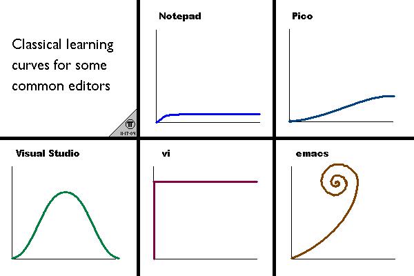
I don't think that efforts to hide UI elements that aren't in use is going to prove to be a good idea when we look back at today from the future.
Here's a good rule, in my mind: Don't hide UI elements from the user. End of rule. I do not care if it looks better without whatever UI element. The toolbox in my garage would look better if I could only see the tools I needed at the time I need them, and I would return that toolbox (or never buy it in the first place) because it is constantly lying to me about the state of the toolbox, which is absolutely insulting position for a toolbox designer to adopt.