Not trying to be a luddite and/or vehemently defend the noble profession of nuanced graphic design, BUT...
Those iterations suck. I'm not worried for my colleagues and I.
That being said! Many, MANY clients have questionable taste, and I can, indeed, see many who aren't sensitive to visuals to be more than happy with these Dall-E turd octopus logo iterations. Most people don't know and don't care what makes good graphic design.
For one thing, that final logo can't scale. For another, the colors lack nuance & harmony. The logo is more like a children's book illustration, and not something that is simple, bold, smart, and can be plastered on any and all mediums.
Just my 2 cents.
I bet in another 10-15 years, though, things might get a bit dicier for fellow graphic designers/ artists/ illustrators, though, as all this tech gets more advanced.
I feel like you look at this too much as a creator rather than the customer. The logo may be not optimal for every medium, not have a great palette, not have the feel you would give it... But the author is happy with the result, so who are we to say it's bad/good? Paraphrasing @mipsytipsy "colour harmony doesn't matter if the user isn't happy".
(yes, I get the nuance where it's part of the designers job to explain why certain design elements are more beneficial, but the general point stands for "i want a logo for my small project" case)
Why is the creator the only one that needs to be happy? I assume they created that project to be used by others and to possibly monetize it. That sounds more like the users / clients are the ones that are supposed to like it...
I never understood this logic, where the creator of something does something seemingly stupid and people are like "Well, don't use their project then if you don't like it". Instead of constructively calling the problem out, so the creator can try to make it better.
If my logo sucked, I'd like people to please tell me...
> Why is the creator the only one that needs to be happy?
Because they define what the success is. If their goal is to make money they may want a logo which is the closest to optimal for getting clicks. If they want a private project, they may want it to be fun. And many other scenarios... You're welcome of course to do constructive criticism, but in the end it's up to them if they want to apply it.
You're right. A million shitty logos are created every day, and for the vast majority of them, they will serve their purpose. And contrarily, there will always be a marketplace for companies/entities who want a logo that has purpose, novelty and intelligence behind its design. I definitely see a chasm between an AI-catered subclass and human-catered superclass forming.
Weirdly, with the advent of AI, we might start to see exactly what it is that makes human beings special.
I think a tool like this might be good to help clients get through a few ideation phases on their own prior to showing up to the first discussion with branding / graphics / design professionals. At least it might get them closer to understanding the impossibility of their 7 perpendicular red lines requirement.
It certainly reduces the # of designers necessary. Just because it doesn't obliterate all of the designers doesn't mean the profession isn't at risk. Today fewer data viz experts are hired despite the proliferation of data, since we now have Tableau, Looker, etc
A more obtuse example, how many lift operators do you see today?
I think this is valid criticism and feels similar to restaurants that don’t put pepper on the table because the chef considers the food to be seasoned to the intended level before it leaves the kitchen. Some customers may be turned off by that level of pride, but other customers are willing to pay a premium for that level of pride to be shown by their chef.
That's some strong copium you got there, can I have some of what you're smoking?
Ultimately the average person (who is likely the target audience anyway) won't notice anything wrong with most of those iterations and given that they're basically free in comparison would make me worried. I wouldn't be surprised if they manage to make it output svgs soon.
I will say, though, I think DALL-E has opened up a new market for artists. I've gone to freelance graphic designers before, and been generally happy with the results, but it's pricey. So pricey that I honestly can't justify it for a new project I intend to sell or for an open source project I don't expect to make money from. It's usually much more cost-effective to even hire lawyers or even UI/UX people.
If I were an artist, I'd be experimenting with DALL-E, trying to run my own pirate version and learning everything about it. An artist empowered with DALL-E could give quick options to a client, iterate with them quickly, and test out some ideas before making the final work product. I'd guess a good artist who made good use of DALL-E could get a project done much faster and cheaper, and this would likely mean a lot more people hiring artists (if I could spend $100-200 for high-quality assets within a few days rather than $1000-2000, I'd gladly hire artists frequently).
I'm sure this will make some artists feel cheapened, but the reality is that art & technology have always evolved in dynamic and unpredictable ways. ML being essentially curve-fitting means that genuine inspiration and emotion is still far beyond our capabilities today, and that, ultimately, these models will only give us exactly what we ask for. A good (human) artist can go beyond that.
EDIT: Also, I agree with your assessment of the "work product," if we can call it that. I was unimpressed with the iterations, and especially the final product. I guess it's good the product is an open source tool. Nothing about the generated logo helped me understand what the OctoSQL tool did. Honestly, the name (which also IMO isn't excellent) is much more evocative than that logo. Why is the octopus wearing a hard hat? Why is it grabbing different colored solids? I guess the solids are datasets? But then the octopus is just exploring them? No thanks.
It's kinda funny that your main complaint about the final logo is that it doesn't tell you much about what the project does.
I can't think of a single well known logo that is even remotely close to what a company's product is. Photoshop, Firefox, Chrome, Microsoft, Facebook, Apple, Netflix, McDonalds, Ford, Ferrari, Samsung, Nvidia, Intel, RedHat, Uber, Github, Duolingo, AirBnB, Slack, Twitter, IntelliJ, Steam.
I guess the Gmail logo does tell you it has something to do with mail though, so I did find one example.
Most of those examples are company logos, and the branding for the company is different than the branding for its products.
So whereas Ford's brand is just a name, "Mustang" has a logo that really does tell you something about the car. You kind of understand when you see the galloping horse what it's meant to do.
Intel brands its CPUs with the name inside a square, which is colored to resemble (abstractly) a CPU.[0]
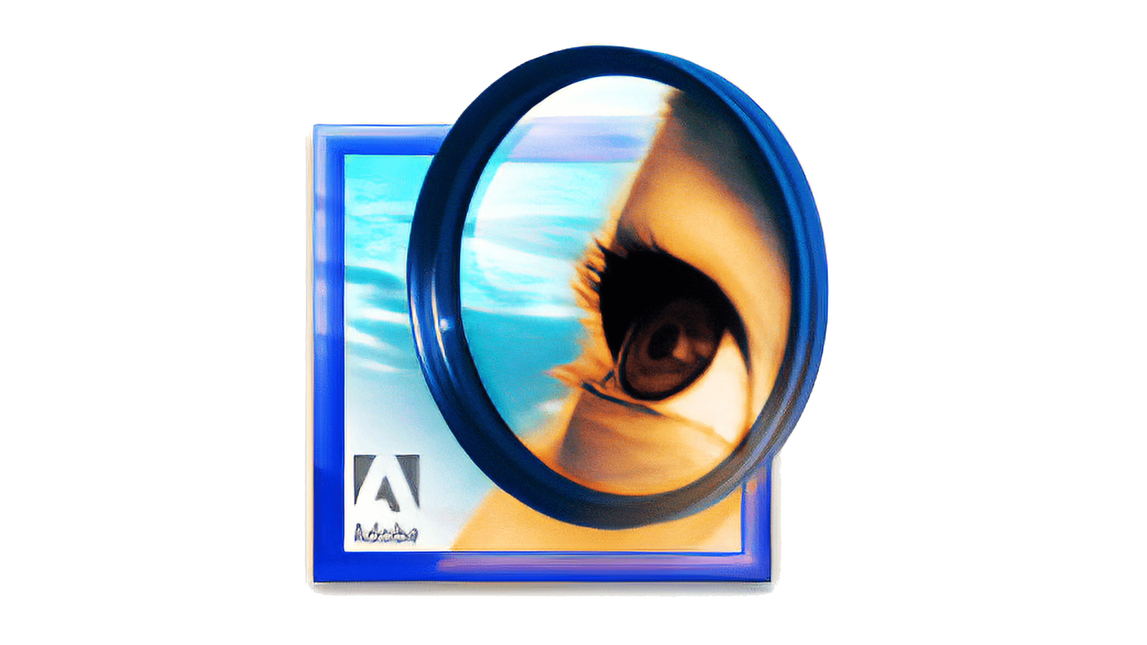
And Photoshop once had a logo that communicated what it did.[1]
As a brand becomes more established, it tends to be more abstract. Whereas Starbucks was once an elaborate siren (I interpreted it to be the siren call of espresso), details have been simplified over the years.[2] This is similar to the Photoshop magnifying glass logo becoming "Ps".
After the Apple I and Apple II, Apple sometimes used apple varieties (plus Lisa) to brand it's products (e.g. Macintosh, Newton). However, this largely stopped in the late 90s when Steve Jobs returned. Macintosh was shortened to Mac, and 'i' was prepended to various product names. Most new ones were descriptive e.g. iPod, iPhone, iPad, Apple Watch. The computers have retained "Mac" in the branding, along with "book" for notebooks (a convention predating Steve's return). The logos for all of these are just the names of the products typeset in its own San Francisco font; whenever Apple appears in a product name, the Apple logo is used instead.
So, yeah, I think it's reasonable to communicate what a product does or why a project exists with its logo. I didn't really see that w/ OctoSQL.
EDIT: I should also address Firefox & Chrome.
Firefox started as Phoenix (i.e. rising from the ashes of Netscape Navigator/Mozilla). Phoenix had a trademark conflict, so was renamed Firebird. This also had a conflict, and Firefox was chosen after. In the Zeitgeist of the early aughts, Phoenix made a ton of sense: instead of extremely bloated chrome around the page as had been prevalent in Navigator and Internet Explorer, Phoenix gave you a tab bar (truly revolutionary), the navigation bad and the bookmarks bar. It was simple and clean, like a reborn Phoenix.
Chrome is interesting because the name is not related to traveling or navigation. It's telling you it's just the container for what you care about. But the logo is a bit more like a sphincter or an all-seeing aperture. I've never gotten the logo for Chrome outside a spyware context, but it has become successful.
I agree. But I think the key thing is that deciding what phase to feed the system was still the key task. Creative people are unlikely to be out of a job anytime soon, even if they end up using something like Dalle to make quick prototypes.
> Most people don't know and don't care what makes good graphic design.
But isn't the logo created for most people? Does it matter that, you as a designer, think it's bad if most people don't? I see it like modern fashion shows. I look at them and think the clothes are insane and I would never wear them, but obviously other fashion designers think they look good (I'm guessing?).
I do agree that the logo isn't super practical though, it's too textured and won't scale. I would take it to /r/slavelabour or Fiverr and pay someone to vectorize it and see what they come up with.
Even things that are created for most people usually need a professional to make it actually good for regular folks. Just like most people can tell if a song is musically good or not, but would struggle to actually create that themselves. Or they know when a physical thing is easy to use, but they'll struggle to create things themselves that are easy to use.
But the point here is exactly that they don't need to create it, they just need to judge it. They make the AI create the logo and then decide if they like it.
I understand your argument but I don't think that's the problem - the problem is that even most users don't understand what a good logo looks like (even if they like them) the same as users don't know what they want. It's a known fact that you shouldn't ask users of a software how it should be designed because if you'd let them design a software they want it would be shit.
I work in the AI field, but not on image generation.
I don't think it would be technically hard to build a model with current technology which can generate logos with the attributes which you mentioned. You could simply fine-tune a Dalle-E style model specifically on a smaller dataset of logos. This would just take a small dedicated team of domain experts to work on the problem.
I've seen people screenshot logos at low res, save them as jpeg, share them with Whatsapp and put them in A0 posters. With SVG and EPS logos easily available. With detailed guidelines on how to use them. Point them out their fault and still not see anything wrong.
The thing you’re missing is AI generated content can be refined by AI. If Disney promised their meh looking movie would improve on its own over time, people would be line to it because it’s new, not just streamlined copy-pasted design we see all over media now
Painting the Titanic wasn’t the hard part. The hard part was organizing the process that produced its structure. That’s were AI content is now.
We’re generating the bulk structure pretty competently at this point. Refining the emotional touches will come faster.
I disagree with the analogy you draw (no pun intended). Good creative design is the edge case for a model like this and is naturally much less tractable than getting to this level of design (I’m not a fan).
> I bet in another 10-15 years, though, things might get a bit dicier for fellow graphic designers/ artists/ illustrators, though, as all this tech gets more advanced.
That's a long time. I expect within a decade or two, "AI" should be able to generate an entire animated movie given nothing but a script.
Unless the tech learns to reason, it will never be able to do anything other than recombine and remix prior art. (Which is maybe what many designers already do, but it won’t ever spit out a Paul Rand logo.)
Honestly logos are currently a very low entropy art form, much lower than graphic design which is already quite low compared to many forms of art (obviously my subjective opinion, but I'd like to think I have strong reasons). If anything, I think logo design is one of the first things ai can achieve human parity on. Obviously the style in this post was unorthodox for a logo, so I wouldn't even rule DALL-E out, with the right prompt engineering.
However, once you reach a certain budget, it's much more involved to *choose* a logo that "fits" how the company wants to present itself, than it is to generate candidate logos of sufficient quality. I can assure you that the "many-chefs problem" for a high budget design project is very real, and the major cost driver. You have a mix of "design by committee", internal politics, what designers wants on their portfolios, etc etc.
Those iterations suck. I'm not worried for my colleagues and I.
That being said! Many, MANY clients have questionable taste, and I can, indeed, see many who aren't sensitive to visuals to be more than happy with these Dall-E turd octopus logo iterations. Most people don't know and don't care what makes good graphic design.
For one thing, that final logo can't scale. For another, the colors lack nuance & harmony. The logo is more like a children's book illustration, and not something that is simple, bold, smart, and can be plastered on any and all mediums.
Just my 2 cents.
I bet in another 10-15 years, though, things might get a bit dicier for fellow graphic designers/ artists/ illustrators, though, as all this tech gets more advanced.