I think, bizarrely, the control pattern for mute "flows" the opposite way to the control for pause/play. If there's a play icon, and you click it, you expect it to play the video. If there's a pause button, you expect it to pause the video. Going against this pattern, if I see a speaker icon, and I click it, I expect it to transition to a crossed-speaker, and mute the video, and vise versa. That is: the current button state in play/pause reflects the action of the button, while the current button state in volume reflects the state of the button.
I think these conventions are easily solved for video, anyway, because it's obvious when the video is muted or not (hopefully).
> it's obvious when the video is muted or not (hopefully).
It isn’t always obvious to me. Sometimes I can’t tell if a video player is muted vs the system volume being low. There’s also the situation where a video is silent and I don’t know if I’m supposed to be hearing anything.
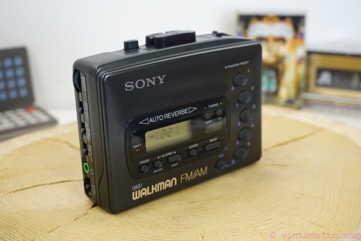
I think these conventions come from actual players like VHS and walkmans. The play, pause, stop,… where actual buttons and mute was an icon on the status display. Buttons are actions while icons are state. The rare case where there was a mute button, it was toggleable (or have a led on it) and these always reflect the state.
The correct pattern is to use the platform’s native video player because the user is already familiar with how it operates instead of reinventing the wheel with web jank.
It's actually a C++ app related to music visualization and the video player is one for a preview. I agree in principle though, if there were the equivalent of a <video /> tag in ImGui and OpenFrameworks I'd happily use that :)
They probably have a reason why their product is not just a video. They need integration. Going with what the platform thinks should happen, if it even offers such a control, will probably be a UI disaster in its own right.
If you have one button, I think it has to match what people are familiar with, and the major players all show the current state. If you have a volume slider or buttons, the mute button is adjacent to the silent end (bottom or left for me; I don't know whether RTL languages flip volume controls).
For muted audio I think a muted speaker icon on a button displayed in clicked/active state would be the most intuitive version.
Aside from that roughly 100% of applications I've been using use the "show current state" approach in this specific case. I don't think I've seen a media player which does it differently.
This solution is far from compact though, right? If you show it at all times, it takes space and adds clutter. If you hide it behind a menu, it adds extra clicks.
If this was meant (semi)ironically and mainly as a reference to the OP link, then sorry for the earnest response!
For a one-button option, I think I'd like something like a knob pointing to the current state (like a label saying ON), which when clicked would point to the other state (OFF). Both labels should be visible at all times. I think people may understand knobs. I'm an absolute fan of skeuomorphism but you may be able to design something more abstract (but that's a slippery slope so hopefully not).
Not as unambiguous as it sounds. My keyboard has an led that lights up when the speaker or microphone is muted. But the camera only lights up when it is on. Do we want to show when the function is active, or when the device being controlled is active? I would say the latter is generally better, since it indicates a potential vulnerability / exposure. But then we have to deal with security devices!
The LED should be on when the function is on. The function is whatever the icon depicts.
If the icon is a loudspeaker, then the LED should be on when the audio is on; but if the icon is a microphone with a bar across it, the LED should be on when the mic is off.
I have a button labelled "ASR OFF" in my car. Its LED is on when ASR is off and vice versa. I don't find it confusing.
Another example: my TV has a standby LED. It's off when the TV is on, and on when the TV is sleeping. Again, I find it correct.
Then we need to standardize how we name functions. For example, never talk about a mute function, but just sound on. All function names should indicating turning something on, and never off, or vice-versa.
I absolutely agree with this. Especially with buttons that toggle state, you need to be careful to use the right terminology. But I think we can say “Mute on” and be understood: TVs would often display text like “Mute on” while silencing the volume and the status would disappear when the mute button was pressed again. Likewise, adjusting the volume should turn off mute, and doing so would hide the “Mute on” text. It bothers me when a website tells me a video’s sound is off or “click the tiny mute button to unmute and listen to this,” I’d often instead prefer that the video start playing without sound to get my attention but then stop and wait for me to interact with it. And if I interact, just throw up a countdown timer that says “Video starting (with audio) in 10 seconds…” and toss in a cancel button. Alternatively, forget the unmute toggle and show a giant volume slider. Let me drag the volume to the level I want it to be at and I won’t be surprised if it’s suddenly unmuted and too loud. We really need to work on these conventions a bit more…
words take up precious real estate and makes the UI look congested/cluttered and is exactly the opposite of the desired clean look. if things are more ambiguous, it is just something for the user to come to terms with. --Jony Ive in some unwritten extract of thoughts
We've got a video playing and an icon button which controls whether the video is muted. We've got a "playing speaker" and a "muted speaker" icon.
What's the correct pattern? Should the icon reflect the current state, or the expected state after pressing the button?