It's always nice to see UI/UX people respond to user input and admit when they are wrong, rather than berate their users for not understanding the product. This sort of humbleness seems to be becoming increasingly rare.
In the past Microsoft has done well for themselves by listening to their business users and prioritizing their concerns about backwards compatibility. I hope this revert represents a natural continuation of that policy.
It undoubtedly helps that the key people behind the Windows 8 Ux have either left Microsoft or left the Windows org. So perhaps it's less 'we screwed up,' and more 'they screwed up.'
Except they've added all that metro crap to the already cluttered start menu. Their UI team is still a long way from acknowledging the failure of integrating metro with the desktop; and windows 8 will continue to be a mess until they do.
8.1 has the option to boot to desktop, they could enable that by default.
Personally I don't see Metro as a UI failure, my productivity actually increased with metro. I rarely need to use the mouse, which is great.
Also, hitting the windows key to switch screens is not a big deal, my grand parents complain about it a little, but the pains of having to explain finding stuff in the start menu to them and other older relatives has stopped happening.
Additionally with the docking capability of the task bar aka "pin program to task bar" had made the start menu quite redundant since win 7.
How so? What productivity enhancements exist in Win8 that do not in Win7?
This is a genuine question. I upgraded to and use Win8 daily for about 14 months now because I like running the latest stable software (from any vendor). But, with the exception of no longer being able to search without going full screen, it's exactly the same.
Edit
There is one fairly big enhancement I completely forgot about: the "power users menu" accessible via right-click in the bottom left corner or by pressing Windows-X. Of course this has nothing to do with "metro".
For one, there's two efficient axes of navigation along the Metro start menu, you can go left-right or up-down with your keyboard, which is SO much more amazing than the "hold down down key for 6 seconds. Awp go back up five. Now hit right four times. Enter" to launch an app that is actually "pinned" to your start menu. I can orient my Metro tiles how I want, and I know I can get to it within 5-6 arrow-key presses max. This is very nice and for the first time in 6 years I've actually used the Windows key to open the start menu for something other than shutting down (have been for the last 18 months of using Windows 8.x).
Going full screen really doesn't bother me one bit. I'm launching a new app, I'm losing context anyway. I find this similar to Apple's launchpad or whatever that OSX thing is that I never use because Spotlight and Terminal is all I need from that OS.
Vaguely related to improving productivity, Win8 has significantly better multi-monitor support out of the box, with all the flexibility I'd want, and with it better window management, than either of OSX or Win7.
Don't people on windows launch apps by hitting the windows key and then typing the first few letters of the program they want to run?
They changed this around windows 7 where you don't even need to hit "r" for run, It took me about two years to retrain myself on Windows 7 that when I wanted to start cmd, that I didn't have to type [WIN]+'r'+'cmd', and could just type [WIN]+'cmd'.
on Win7 I cannot remember the last time I actually navigated the start menu to launch a program. It's either on quicklaunch (pinned if you prefer) or win + search.
Every time I create a VM with 8 to try and use it, I last about a week and give up.
1. Dock/Pin primary apps to task bar (same as win 7)
2. Organized(Grouped)/stripped down metro for less-frequently used apps. Removed tiles for any apps that I do not use -> Reduces the number of apps I need to pin to the task bar -> Hit Win Key to quickly switch to Metro and select app
3. The first win 8.1 update (released 5-6 months ago) reduced the search to 25% of the screen. Hit "Win + S" for search under classic mode. Personally I just hit the Win Key and start typing, enters metro momentarily.
4. First win 8.1 release added a start button to the task bar. Hated it for 2 secs(for reducing my task-bar space). Right clicked start button and realized I could remove a couple of additional tiles/task bar pins. Keyboard shortcut is "Win + X".
4.1. Tip: Right clicking the start menu has a Quicker shutdown menu option. Tip 2: Additional shortcuts for the menu are only displayed if you use the keyboard shortcut to open the menu.
In practice, none of this comes close to compensating for the slower usage of the start screen vs. start menu, if only for the visually jarring effect it has. Additionally, normal document-oriented usage is considerably less practical since they removed the Recent files and the (implicit) recent/most used applications list from the start interface. Then there's the time lost due to unintended edge-pulls and hotcorners.
Interop between modern and classic is still terrible - no windowed modern apps (nor for that matter modern-docked classic apps), and start search is split by app type (as is so much of the UI).
The modern UI also suffers from not allowing renaming of apps, especially since so many apps+settings come in modern and classic flavors. Is that blaryscroo app in the search results the modern or classic variant? The icon looks plain, maybe that means it's modern? This is basically app-starting by trial-and error. If you try to rename the less-useful blaryscroo modern version to something like "blaryscroo (modern)"... well, you can't. Want to right-click the app for traditional options such as recently-opened files by that app - you can't do that either in the start screen.
All in all, for practical plain, boring, actually getting-things-done windows 8.1 simply hasn't made much of difference vs. windows 8, and it's made a rather negative difference vs. windows 7.
Don't get me wrong - I'm happier with boot-to-desktop than without it, but frankly, booting isn't where I spend most of my time, and then you're left with the fact that the start screen is really just a slightly larger, slower start menu - and the rest of the OS is a usability disaster for desktop usage. Despite the hype, windows 8.1 was virtually irrelevant for desktop usage.
I didn't downvote you, but I can only speak from personal experience that I haven't found the start screen to be any slower vs. the start menu.
None of the negatives you mention apply to my usecase (I don't typically rename shortcuts, nor did I ever use the recent files functionality etc.)
But what I do find is that the start screen is faster for opening the application I'm looking for: I'm either searching for a particular name as with the start menu, where the speed is about the same, or I'm browsing around looking for something whose name I can't remember, for which I find my groupings of smart tiles far easier to parse in a quick glance than I ever found navigating a directory structure in the start menu.
A directory tree to open applications still seems a bit like a holdover from the filesystem design, rather than an interface that's been designed for the purpose of finding the right application fastest.
not the downvoter, but my 2c:
> if only for the visually jarring effect it has
I don't find the effect jarring in the slightest, actually. there's a gentle fade into the background and then the tiles fade in, which I find quite easy on the eyes.
> since they removed the Recent files
I work with my apps pinned to taskbar. If I want to open my last VS solution, I right click on VS and click the top icon, which is the recent list? Maybe there was another recent list.
> Interop between modern and classic is still terrible
I agree here, in fact I would go as far as to say it's non existent, although I'm not 100% sure what sort of interaction I would expect between them. Allowing the metro apps access to more functionality would reduce the sandbox level in WinRT, so that's not going to happen. The only way I can see it happening is if MS give desktop apps access ti metro/modern app data, which is a privacy nightmare, so I don't know what the solution here is. I'd be interested in hearing one though.
> no windowed modern apps
Article says all MS universal apps will be windowed going forward, so I guess that means they're backing down on this.
> start search is split by app type
don't know what you mean here. If I type in "Evernote", I get
Evernote(desktop App)
Evernote(text file I have named evernote)
Evernote(Metro App)
> The modern UI also suffers from not allowing renaming of apps.
Rename the classic ones so?
> but frankly, booting isn't where I spend most of my time
Where do you spend most of your time? By the sounds of your criticisms, searching among the number of metro and classic apps you have installed, on the metro screen? I don't know about you, but 95% of my time is spent with FF, visual studio, spotify, sourcetree and 3DS max open, none of which are affected by the metro interface, so nothing has changed for me.
The only complaint people have is the start screen for Windows 8, which seems to more be a case of "I like the start menu", although as you state there is some missing functionality re: recent files. But what about the improvements?
My boot time was cut substantially, I'm on my desktop(including going via the start screen because I like booting to it and seeing the live update travel tile and looking forward to my next holdiay) in ~ 8 seconds.
Much better multiple monitor support, for backgrounds, multi-taskbars.
Built in reset and restore settings.
File History: this is awesome. Works like time machine for OSX and is a major upgrade over Backup and Restore.
I've also noticed my usage is snappier than it was on 7, and an increase in battery life on my MBP ( I run bootcamp).
Built in ISO mounting (bye bye wincdemu) is also cool. Overall, I'm happy, and won't be changing back.
Oh yeah, there are definitely technical advances, and they're not trivial. But they just don't compensate for the UI issues, and those are problematic.
e.g. on the interaction front, I'm not talking about technical interaction, but UI interaction - there's no reason metro apps can't run in a window nor classic apps can't run in fullscreen, even if their design won't be optimal for the non-normal UI. As is, you're forced to use two quite different UI's intermixed with one another. (Task-switching between classic+modern is problematic too).
I spend most of my time in and switching among the application I use to work/play in. I think the worst missing feature is the missing recent files/applications feature which means that ad-hoc workloads with various single-purpose tools are quite unhandy. It's not just recent files: the same thing counts for recent programs. Win7 provides taskbar (and start) pinning for your really common programs. Win8 provides start customization. But for the rest - the stuff you organically happen to use a lot for a particular task - Win8 has no alternative to the win7 recent programs.
Boot time: that's nice, but I really don't care very much - my old boot time was less than 30s, and now it's probably even less - but how often do you reboot?
I haven't noticed the multi-monitor support being better, what's the advantage?
In any case: there's no doubt that win8 has numerous technical advancements - and frankly, I like the modern interface. That makes it all the more aggravating that the UI is such a haphazard mess. The problem isn't modern - it's how they've done virtually no work in coordinating between the two UIs. If good integration is impossible, I'd even rather just have a mode-switch: render everything in classic mode, or everything in modern, regardless of what the app was really designed for.
Since 8.1, you can actually search without going fullscreen by pressing Win+S, which reveals a search sidebar on the right side without bringing up the start screen.
I have barely touched W8, but have they removed the Win+R run command? My go-to-prompt tends to be "Win+R c m d Enter" on XP and 7 (and "Cmd+Space t e r Enter" on Mac OS X).
I find the new task manager much more informative and it often saves me from starting the resource monitor. The new file transfer log is also very fancy and useful, although that doesn't really count as a productivity enhancement.
Then why not pin those to the start screen, as well, and have an even larger mouse target for getting started that isn't at the bottom of your screen? (Unless you're using Win+1-9, in which case, ignore me)
My mother recently got a new laptop and wanted that new "windows 8.1 thingy and a touch screen" I dont think she even noticed that the start menu was gone.
Metro itself wasn't the problem though, imo. It's the UX of going back and forth to do simple tasks that is the problem.
Example: how do you restart or shutdown your Windows 8.1 machine when you're on the desktop? Go to the start screen. Click your name, sign out, click the screen so it 'opens', click the power button, click restart or shutdown from the menu.
Or just go to the bottom right corner of the screen, wait for the charms bar to pop up, click the Preferences icon then shutdown. Which still doesn't make a lot of sense, but is simpler than what you described.
Yeah, and it's really f*cking annoying to try to do that on a remote desktop to a Win2012 server with the same horrible UI. On a desktop you can just drag your cursor to the bottom right.. in an RDP window, it isn't so easy.
Beyond that, Metro is horrible when you have more than one large monitor. The UI simple doesn't scale well in that environment. It looks like 8.1 update 1 will finally be much closer to how it should have been.
It reminds me of Vista, where half the control panel UI was updated, and half wasn't, and it was just a bad mix of old/new. I don't mind a new UI. For that matter, I'm really digging Ubuntu's Unity interface, ymmv on that.
I think that Windows 7 had a really nice UI, and that metro should have been an option on top of that from the beginning. Trying to make a unifying UX for interfaces from your phone to tablet to dual-monitor desktops just doesn't work that well. You really need two options, and making the UI work for those metro apps in the desktop context makes more sense.
Yeah, and it's really fcking annoying to try to do that on a remote desktop to a Win2012 server with the same horrible UI. On a desktop you can just drag your cursor to the bottom right.. in an RDP window, it isn't so easy.
And the Server 2012 R2 upgrade was not free unlike Win8.1. While at it, don't forget the lack of IE11 too.
That doesn't work if you're RDPing from another Win8 machine, the local OS swallows the keybind. What you actually need to press is Alt + Home or Alt + Delete (good luck figuring that out without doing a web search).
I'm actually really confused why this is, it seems to be such an important use case. I would not be surprised if they didn't even test WS2012.
Except that that gets you precisely one option, which isn't even normally the one I'm looking for. When pressing the power button somehow gives the the restart/sleep/shutdown option, then it will make sense.
This has been around forever, since at least Windows 2000. The power button signals the OS through ACPI to shut down correctly. It wasn't always reliable on all hardware and BIOSes, and didn't always default to that behavior until set in Control Panel - Power Options, but soft power-off is supposed to have been working for a long time and is hardly new.
> Or just press the power button, which actually does make a lot of sense.
No it doesn't. Pressing the power button implements what the PC maker wants to implement. In many cases (especially on laptops) it's for the computer to go to sleep.
I think I heard their justification once was that they thought it was a bit of an anachronism that we'd press a hardware button to turn a PC on, but would have to go through a software route in order to turn it off. Every other electrical device usually has a single on/off button, and in a world of ACPI it's entirely reasonable for that to be the same as a default "turn off" action on a PC. Initiating a manual restart or true shutdown then becomes more of a power-user thing that, yes, perhaps it does make sense as a Settings panel.
I actually had to Google "How to restart Windows 8?" - How can 'restart/shut down' be a setting. That's the most ridiculous thing I've seen about Windows in all these years.
Or even better, right-click the bottom left corner of the screen, go to Shutdown or Sign-out. Along with a ton of other stuff that power users want most of the time.
> Example: how do you restart or shutdown your Windows 8.1 machine when you're on the desktop?
I've been out of Windows for a long time, is this something that comes up much? Even with a laptop, I'd think you mostly be suspending it by closing the lid.
Can you still use the physical power button to bring up the shutdown menu?
It's something you hardly ever do. Even if there's been some kind of installation/update that requires a reboot, it tends to be able to trigger that itself (which can cause other pain, but that's for another day).
There are some people who like to shut down their machines, though. I think they haven't forgotten the days when a good reboot once a day was necessary to clear out cobwebs.
That's what I figured. I reboot my Mac when updates require it, and every once in a while if something weird is going on I might reboot it, but by and large my computer has uptime's in the weeks.
On OS X it's somewhat rare for an update for require a reboot. Often they don't actually reboot the machine but just log you out, perform the update, and then log you back in.
While these updates feel like a reboot since you lose your desktop environment state, you can tell the difference if you're paying close enough attention.
I do this all the time. Just right click the windows icon in the bottom LEFT corner. A context menu pops up with an option to shutdown, restart, log out, or sleep.
I don't see MS as humble here at all. They are backtracking because they are forced to backtrack as it is evident that their idea of an OS does not work. But do they backtrack in the right fashion? No. "As little as possible" seems to be the mission statement.
People want the old start menue back. They voice their opinions as "Where is the start button?" To anyone with half a brain it should be clear that they didn't just mean the UI element of that button but the functionality behind it. And as much as I hate Microsoft's shortcomings as of late, I doubt that they really believed "Well, if they just want that button, give them the button but once clicked it'll still do the same shift to metro it did before. That should give people what they want" I doubt anybody could be that dense.
And even this "return of the old start menue" is not what people want. As they still keep on with the Metro part of things.
A simple choice during install. Is all that is needed. "Do you want touch or desktop?" Touch meaning Metro and desktop meaning, well, desktop. Without any metro tile nonsense what-so-ever. Done. All of the issues with Win8 and I mean all of them would be gone. But that doesn't fit with Microsoft's vision of having tiles everywhere. So, by the way they are "fixing" win8 and refusing to acknowledge that metro needs to die, at least on the desktop, I really doubt that "Win9" would be any better.
We finally get off the "every other version of windows is usable" because now, every version of windows will be worse than its predecessor.
I don't know if I really mind the metro crap being there. Some of the "at a glance" stuff will be really useful (weather, mail, social, etc.) for quick views. In some ways that stuff already is useful, but having to roll out the big start menu that incompasses my entire screen to view was a bit silly, imo.
You are clearly too young to remember the rage people had back then.
WinXP was "Busy" compared to Win98. Those who wanted busier, more colorful schemes could always install a color pack or customize their windows as appropriately.
WinXP released with basically one colorpack, and removed the option of going back to the older "classier" gray look from Win98 / Win95.
I agree, however some user-loved UX paradigms hold you back from moving the product forward (Faster buggy problem) and listening to your users complain about nostalgia slowly makes you less competitive once some other company launches a better, newer UX.
That being said, nothing is an excuse for a bad or confusing UX pattern -- and Windows 8 had plenty of those on TOP of removing the start button, making people less forgiving of its removal.
makes me wonder,what kind of A/B testing they did before launching W8 at first place, or ModernUI was supposed to replce it, or was it just because some executive decided people did not need a start menu anymore.
Windows 7, Office 2010, etc. "phone home" by default, sending them usage patterns. But power user usually deactivate such intrusive annoyance.
Lessons learned the hard way: Don't rely completely on automatically gathered metrics. Do not piss off the community that develops applications for your platform.
Calling the data gathering intrusive is a bit of a stretch. Considerable efforts are made to ensure you're anonymized and personally identifiable information is not gathered. There are people to actively work to ensure you're not "tracked" in any way.
Off-Topic: I'd be interested to see the number of people who turn off the Microsoft CEIP (terrible abbreviation), yet still use a Google id and/or accept DoubleClick cookies.
As someone who has worked at Microsoft, I can tell you they spend thousands of hours on usability studies and the managers watch. Also there are countless readouts and documents summarizing the findings.
Microsoft spends an incredible amount of resources on usability studies.
Used to work at Microsoft too; the usability findings that agree with the existing strategy were kept, the ones that disagreed were ignored. They weren't taken seriously, and were slathered on after the product was 90% complete.
Those who decided whom to pay to do the studies received exactly what they wanted. The support for their managerial decisions and the proof how smart they are.
Oh, are we already jumping on the bash Microsoft band wagon so soon? You seriously think a company like Microsoft did no usability testing? That'd be quite shocking as Metro itself utilizes a ton of new research on UX and interaction design.
Oh, please. Stop denouncing all criticism as the "bash MS bandwagon." Removing the start menu was a terrible idea that anyone who cared could have predicted - MS screwed up somewhere. But this is no surprise. Their UI design has been consistently poor for decades. Sure maybe they did user studies but their dog ate them. Maybe their initial designs were all so poor that what they rolled out was the best of the bunch. Maybe they had the most amazing UI design but couldn't get it through the office politics. I don't know everything they failed at in their process but it doesn't matter. Whatever it is they are doing doesn't work.
This WAS predicted by many users and blogs prior to the release of Windows 8. Criticisms started a year prior to the official release of Windows 8, with the consumer preview version.
"This WAS predicted by many users and blogs prior to the release of Windows 8."
There will be people saying negative things about any change. Often they'll be right, whether for the right reasons or the wrong ones. I wasn't asserting that no one predicted it, I was trying to get at why the parent was asserting it was terrible.
I haven't watched the video, but at a skim the article raises quite a few points, most to all of which have nothing to do with the start menu in particular.
It's a core paradigm of windows for as long as I remember. If you removed the steering wheel from your car do you think drivers would be surprised? Upset? Confused? If you had any common sense and don't have a case of Microsoft stockholm syndrome you would.
Removing the steering wheel (which is used for continuous, delicate control) is much more akin to removing the mouse/keyboard than the Start Menu - and guess what? Lots of computing devices these days are doing that as well.
Removing the start menu is more like changing how the ignition works (hasn't stopped the sale of Priuses) or changing how you shift gears (also has happened plenty of times).
Familiarity is certainly a consideration, but it's not the only consideration, and when you elevate it too highly you get stuck unable to fix anything. Mind you, I'm not saying they didn't - in retrospect - underweight it. There is certainly evidence they did. Though I'm honestly not sure to just what degree the backlash is vocal-minority versus generally felt. In my own (few) experiences with modern Windows systems, I wasn't shocked by the lack of a Start Menu - but my computer hasn't had a start menu for the better part of a decade so I'm obviously highly unrepresentative.
> It's always nice to see UI/UX people respond to user input and admit when they are wrong, rather than berate their users for not understanding the product. This sort of humbleness seems to be becoming increasingly rare.
You must be kidding. In a big company like Microsoft I would have hoped they listen to user feedback BEFORE they release stuff, not just after. This is really the wrong way to design UI - they were clearly not humble in the first place when they pushed for the removal of the start button, but they still went on with it.
I agree, Metro on a small touch device is good, and being able to drop to the desktop to do "computer stuff" is awesome when you need it.
On a 27" desktop? Oh god, Metro is a nightmare. I've been using StartIsBack but I'm glad there'll be a properly sanctioned start menu soon. Hopefully it will lead to greater adoption of Win8, as besides that one major blunder, is not too bad at all!
The problem isn't the start menu. A fullscreen searchable start menu is something people have likely gotten used to - except for a vocal minority.
The problem is the context switching. Some apps full screen (even when they don't make sense or I want them part screen). Some control panel stuff in 'apps' (which requires full screen); some still in the old control panel. Some in both.
Somewhere along the way someone started thinking the whole 'single task at a time [or at most two]' was a Good Thing - but then someone else said that we can't do that, and what we got was the ugly bastard child of both.
I've stopped booting Windows, haven't done so even for gaming in a couple of months now. It's just too annoying at 8.x.
edit: before someone calls me on it, why no I did not read the article - I've since gone back and done so, and it sounds like they'll be offering windowed mode for metro apps as well.
So I take it back, this has the potential to make it far less annoying (if they consistently make it available for all metro apps).
Yeah, the "windowed metro apps" thing is way more interesting than the start-menu.
I stubbornly insist that the idea behind a unified tablet and desktop OS is sound, it's just that windows 8 screwed the implementation with its Classic/Metro schizophrenia instead of focusing on the nature of the user's screen real-estate instead of the nature of the applications.
On a desktop I have space, so use my space for an always-visible taskbar and windowed apps. On at tablet I don't have space, so make the apps always-maximized and auto-hide the taskbar. But that doesn't mean unifying the OS was a bad thing - I'd want that auto-hide always-fullscreen tablet-oriented OS on an 11" ultrabook, even if it was the "desktop" form of the OS. And likewise, give me windowing on some kind of monstrous 23" tablet thing.
It sounds ugly and wrong to have both IMHO. Yet I use both in Mac is every day. Coding = full screen zone mode, debugging = panel / window mode. Window mode I find pretty much useless these days Im not sure what has changed but I prefer full screen and panels windows just add an extra step and use case of organizing my windows which should be handled for me in this day and age.
Side note, anyone know of something like awesome for Mac?
The traditional windows UI is perfectly capable of accommodating all of your use cases. You want to code full screen? Put your editor into full screen mode and auto-hide all the panels. You want multiple windows? Just drag windows around and resize them to your heart's satisfaction. You want neat tiles? Use the snapping feature that virtually all modern desktop environments provide, or if you're really serious about tiles, use a tiling window manager.
All the alternatives I've seen so far, on the other hand, are excellent at one or two of these use cases but not all of them. So it's understandable that each and every one of them has a sizable group of vocal opponents (though not necessarily the same group of people) whose needs are being ignored.
It seems like the thinking at Microsoft has been that "Windows should be the same on every platform" That's why they had a terrible desktop-like experience in the mobile WinCE, and a terrible mobile-like experience in desktop Windows 8. (There were also rumors a while back that Ballmer wanted to put a Windows interface on the Xbox.)
Mobile and Desktop are very different use cases, and it seems like Microsoft is finally understanding that.
I mostly agree with your opinion about why Windows 8 was bad.
A full screen, searchable start menu isn't the worst thing - though it does mean I can't be read a webpage while looking for something (which is a slight loss on usability). This is just a special case of your point about only being able to do one (or two) things at a time, when on a desktop, I really want to be able to 4 or 5. It seems like an interface designed for a tablet stapled (badly) to a completely different interface.
Another problem is that they spread settings across 2 or 3 different places, hid things like shut down commands (because, you know, I'm never going to be shutting down my desktop!), and generally broke any consistency/sensibility to how the controls interface with the system.
> A full screen, searchable start menu isn't the worst thing
No, but it's a symptom of the worst thing. The worst thing is that Microsoft's UX team failed to realize that "The user's actually only interacting with this one thing right now" does not necessarily imply "This one thing is the only thing that deserves to even be visible right now."
My first experience with Win8 was trying to troubleshoot a legacy software issue where the relevant guide was in .pdf form... but the pdf viewer was fullscreen. It beggared belief that someone thought that you'd never want to see another part of the OS while working on a document, on a desktop system. How did they think that this would appeal to business users?
Yes, if I am using a word processor and want to pull up the calculator I don't want to lose sight of the document I am working on. Its nice that the old start menu didn't hide everything. Then when I get the calculator I want to see the number from my document -- don't want it taking up my entire 25 inch screen.
I think if Microsoft made more of an effort to encourage users to filter the start screen by typing then this would all be less of a sticking point for people. If I have a word processor open and I want to use the calculator I press the windows key and hit c-a-l-c-<enter>. The calculator is up on the screen alongside the word processor and the desktop has been obscured for less than a second.
Right. Winding up in front of a modern Windows computer for the first time, I was pleased to learn they'd moved things much closer to my workflow in ratpoison on Linux.
Speaking of the searchable start menu - I realized last week that hitting Win + S will open up just the search area over in a right sidebar. It's made me so much happier.
This is the first time I have heard of this and I am genuinely angry that this is the first I have heard of it. Maybe I should of read a short-cut doc.
I'm fascinated that they still keep the Building Windows 8 blog up these days. You can go back and read their justifications on why they made the major changes that are now being backed out of win 8, for example start menu: http://blogs.msdn.com/b/b8/archive/2011/10/11/reflecting-on-... and http://blogs.msdn.com/b/b8/archive/2011/10/03/evolving-the-s... I would love to see an analysis of how with so much data and insight they built something people didn't want. Was it all just confirmation bias causing them to see what they wanted in the data?
I actually read through one of those links, and wow, they really really went through great pains to explain every single decision with data and tracking. This really puts today's announcement into a new light. How DID they so blindly ignore the voices of users and trick themselves into believing the metro UI was better using all that data? There's so much of it that purportedly supports their old view.
I'm one who's never adapted to the new Windows 8, and prefer Windows 7 any time I have a choice. I actually feel that I use my laptop a lot less because it has Windows 8 on it.
From what I remember, they were pointing out an overwhelming majority of their users were only pressing the same 8 or so buttons at the bottom of the taskbar to start apps.
And I'm on board with that.
It's just that one needs the Start Menu to get those 8 or so buttons into the taskbar in the first place!!!!
I don't know really. Since Balmer kicked in, Microsoft's decision making process is a sort of a mystery. Can a company with so deep pockets, so well establish fail consequently?
There are still around people running Windows XP because they consider them superior. I never had issues with Vista or 7 (although never used them as a desktop), but Windows 8 are a new low...
“If I had asked people what they wanted, they would have said faster horses.” - Henry Ford
Casing user opinion is in my opinion a pretty terrible way to do UX. It's an interactive process not a committee one.
I imagine they ignored all the noise by filtering out all comments about issues they already addressed, then looked at how the ribbon ui went down and ended up a superb success.
I support end users. Most wouldn't go into 'all programs' unless directed. None know that panel as the "start menu" any more since they took the word 'start' off it.
It's just not that big of a deal to skip over every other cool thing in 8 to stick on 7.
Personally I want to see windowed metro apps, the start screen maybe the bottom half height/full width of my display (13" 1080p) and a transparent background.
That would be good I think. The corners are a nice idea although i never really use the left one.
Can we all use this effort to cry for a feature that would actually help like say, native virtual desktops in Windows? Wicked useful.
I have a Venue 8 pro that is my only Windows 8 device and I love it. I don't know that I would like this in a larger/more expensive device, but it pretty much kicks the shit out of a Nexus 7. The screen isn't as nice, and the UI isn't as smooth, but an x86 and the ability to install Windows apps makes up for it easily.
Your comment highlights the far more unsettling truth -- that a company with a great deal of resources, research and user-feedback still created something that the market rejected.
I deal with this fear by believing that users crave a personal vision. They can get into a product that is foreign to them as long as it represents a singular designed and cohesive flow. They reject 'design by committee' or data-driven designs because they represent the average of what all users want, not what any single user desires.
Someone else commented what I also suspected. It is not that MS didn't do any usability studies or analysis what is better. It is just that they suits had a pre established vision on how to do things and then they tossed the studies that didn't support that vision and kept the ones that did.
It is like wanting a nice feedback about Star Trek, so you go to a Star Trek convention and stay the hell away from any Star Wars Convention. There, you will have massive data that support your pre established notion that Trek is the best thing since sliced bread.
I'm familiar with the mentality that designed these interfaces -- just a stubbornness that everyone thinks the way you do, and hoping data can do the thinking for you. All that data, but no insight into how an everyday user would react.
I mentioned it below, but keyboard analytics show the z key is hardly used and should be removed, perhaps available to power users.
I imagine certain data was cherry-picked to tow the party line
There isn't any evidence of that. The far more interesting possibility is that the data suggested that they do what they did, but that the data was wrong. An examination of how and why that might be the case would be fascinating.
> The far more interesting possibility is that the data suggested that they do what they did, but that the data was wrong.
New Coke scored better than Pepsi in blind taste tests, yet New Coke was a sales disaster. Pepsi scored better than Coke Classic in blind taste tests, yet the Second Coming of Coca-Cola quickly came out on top.
What I find ironic is that the same people who did the Office Ribbon also came up with Metro. The Ribbon was all about exposing features that had previously been buried a couple of layers down in menus, because users will only use features that stare them in the face.
But Metro was all about burying features that had previously been staring users in the face!
New Coke was a disaster because Coca-Cola did not let its consumers choose between the two products and instead planned to stop making Coke Classic entirely. There is some similarity to Microsoft's decision to have Windows 8 boot into Metro by default.
Coca-Cola's pre-release focus groups told them that a minority of people would have a very hostile reaction to the elimination of Coke Classic, but they decided to ignore the data. You can see something similar if you read the comments of the Windows 8 development blog.
I believe they were tricked by the data. "Only 1.2% of users use this feature, so we got rid of it!" And they did that 100 times with 100 different features. And pissed everyone off.
Data didn't suggest, but the managers were able to find the support in the data. When you want to find something really hard, you will find it.
A lot of "poll questions" are designed to present the party who paid for them in the best light. Both the managers who request the poll and those who can give the bill to the managers for the poll have the same interests.
> The far more interesting possibility is that the data suggested that they do what they did, but that the data was wrong.
Agreed, you can even see good UI ideals behind several controversial decisions... large buttons on the start screen (just like enlarged buttons on the ribbon) suggest someone read Fitt's Law. Searching is a task that takes your focus while you type, it seems to deserve a little more screen real estate than the tiny eighth of a screen 7 offers.
Maybe MS designs are evaluated in usability studies by charitable or willing users, but are sort of foisted on the public once shipped, and evaluated much more critically.
Or maybe MS is lumping all of its users into one profile, when there are really so many Windows users, you almost have to break them into clusters of users.
I had a VM running Blue for a while. It was a jarring experience at first, I got used to it, but I didn't immediately run out and buy it. I mostly type to launch, so I never clicked on anything on the start page, but didn't really notice a dive in my workflow, since search was a little better. It was neither as good as its proponents claimed, nor as bad as its detractors made it out to be for me. But maybe that's just my workflow.
Windows is designed for so many audiences, they should really disaggregate their UI from their core. Something that makes Linux incredibly confusing might actually be really necessary for good UI design for this many people.
This seems like the wrong solution to the problem. Merging the start menu with the desktop as a full-screen launcher was a great idea - the start menu is effectively a modal interface so it only makes sense to make it fullscreen, and the old "icons on the desktop" thing in Windows has always been a misfeature.
My problem is its terrible integration with old Windows apps, drawing a hard line between "Metro" applications and "Windows Desktop" applications.
The other stuff is just mechanical problems with pretending that an 11" screen is the same as a desktop monitor. Give me an always-visible taskbar, one that uses words instead of pictograms. I've got 2 23" monitors - I've got the space to dedicate some of that room to a taskbar. Also showing multiple applications at a time.
Never understood the fixation with the start menu. You start up metro and you are greeted with all those tiles- that is the new Start Menu. Why is that so confusing?
Its not so much confusing as it is useless and annoying. It's just a really inefficient and wasteful design for a desktop OS. Basically, most windows users really liked the windows 7 start menu, and they replaced it with something that has no tangible upside and a lot of downsides.
Actually it's a terribly efficient design. The usability studies that involved eye-tracking showed that when the start menu is open, users gaze is purely focused on the start menu, not other objects on the desktop. If this is the case, then why not use the whole screen as your start menu? Now you can show many more apps, search results, and allow users to spatially group apps and folders to their liking.
The backlash came from the fact that it was a change from 20+ years of ingrained behavior, not that it was an inherently poor design. However, you could argue breaking the previous mental model of users will definitely create issues and therefore is a bad design.
Using the whole screen is one of those things that sounds more efficient in theory, but with large monitors there's a lot of scanning you have to do. With the menu I can scan top to bottom in an alphabetical way -- very quick to do. With tiles I have to scan in two dimensions, and there's no particular order to them so I can't just skim over any of them.
It's not the exact same thing, but it reminds me of the weird misadventure they made in Office 2000 where they would hide infrequently used menu items. It sounded good in theory, I mean, less menu items should mean less confusion right? But in practice the main response was "where the hell did that thing I was looking for go?" and "why does my menu keep changing?"
The users can dictate the ordering of apps and folders on the Metro Start Screen. Not only that, users can incorporate spatial organization to make apps even easier to scan and find quickly. You could argue that this is a better design. However, all designs have pros and cons and are not necessarily best for all use cases.
As to your second point, I think the question is how do you improve your UI without breaking previous mental models/behavior?
So with the old start menu, users were looking at the start menu when they opened it. That makes perfect sense -- why else would you open the start menu if you didn't want to look at it? However, it also took up a smaller section of the screen, so you could more readily find what you are looking at. With the Metro screen, I have to play Where's Waldo whenever I want to find an app (I have the same problem with Gnome 3 shell, trying to find an app icon in that massive wasteland).
But that's just me -- I also didn't like the sliding start menu design either (Windows 7, KDE 4), where submenus open in the same space as the folder icons -- I'd rather, when clicking on a submenu, have it open into new screen real estate like any of the traditional menus.
Yeah. By default, the Win7 start menu shows 10 most recent apps, then if you click "all programs" it shows a couple dozen little icons (about 1/3 of my menu) at once. If you have to scroll around to find little things, it takes longer than just looking at a single static page of larger icons.
If you don't remember the XP/Vista classic start menu, it's a linear list that expands to the height of the screen (and it takes multiple columns if the height isn't sufficient); no scrolling, no (or limited) two-dimensional scan. Even better, the list can be sorted for fast searching.
It's a good question because there are a handful of variables at play. Size of the window, density of objects, the layout of objects, the ordering of objects, etc.
Look at the window on the far left of your task bar, and tell me if you can read the system clock while looking at it. Now tell me if you can make out what the window directly next to it on the taskbar is while still looking at the first one. Peripheral vision is a limitation.
It's more like "try to find the needle in a pincushion" became "try to find the spear in the haystack", since icons/tiles can be much larger if you want.
Ok, so the larger icons make them easier to see out of the corner of your eye, but they are further away, making them harder. But I can see how it can go either way depending on your vision, and if you wear glasses, etc. But after looking at this screen, I'm a bit lost. The icon on the left column, third down -- I'm not sure what that one does (looks like maybe Skype? And the 4 additional boxes embedded in it, are linked to those contacts pictured?) -- same with the icon next to it wit hthe guy's picture . And the one toward the top with the two squirrels looking at each other?
I'm really hoping that this all makes sense once you start using it, as I'm going to have to make a decision on what to upgrade my parents' computer to (Win 7 or Win 8) -- I don't want to confuse them.
The one in the left column is your Contacts. The individual photos are just photos - they all go the the same place when you click anywhere on the button. The guy's photo says "Photos" on it. It just goes to your photos list when you click it, not to that particular photo. And the squirrels open the Bing app. Bing makes a big deal about their daily photo, I guess the app icon updates each day to match.
Edit: I agree it looks crazy, but at least it behaves consistently!
Ah, my bad -- the picture was scaled down, and I didn't click to make it full size. I see label text now. Although part of the word "photos" is washed out against the background. If anyone from Microsoft is reading this, it might be helpful to use a font with a contrasting outline color around it to prevent this washout effect.
So your problem isn't with the small-start screen vs big screen, but with the density of information? With the Metro Start Screen you can customize apps, folders, and their sizes to your liking, or just type what application you want and hit enter to launch it.
It's also about poor consideration of the varying circumstances of real world use. Ideas about a full screen start menu that work well in small form factors can't just be assumed to work on a desktop display. I think the new start menu is great on a small touchscreen device like a tablet, but my workstation has a pair of 30'' monitors and it's ridiculous.
Where I'm looking and what I'm thinking are different things. I used to use the start menu out of muscle memory like a zombie, it was subconscious. A full screen experience is jarring
20 years ago people were still using Program Manager instead of a start menu to launch applications... which was typically maximised to full screen, with spatially grouped apps in child windows.
I think this concern could be addressed. Simply scale down the tiles, which is the greatest unused aspect of metro. Those tiles can be big and touchable in a touch device and small and efficient on a non-touch device.
It's still full-screen and lacks any of the visual context of the desktop. Something like GNOME3's fullscreen Activities screen is better; when you open it up, it has little mini-screenshots of all your open windows, and you're not losing things like the taskbar (because it doesn't have one). You still have the top bar, which ties it into the system.
Opening the Windows 8 Start screen loses all the visual context - your taskbar disappears, your windows disappear, there's nothing to tie it into the desktop, it feels like an entirely different system from the one you were using a second ago. And that's before the fact that how you interact with it is entirely different from how you interact with a desktop app, which is the final wedge.
Sure, but they can't drop support for everything built over the past couple of decades just to have a new interface, so it is the fault of introducing Metro into Windows 8. To get around the problem, they could've had plenty of integration from the start - having the taskbar throughout Metro would be a brilliant start, and something familiar.
Luckily, they're integrating Metro into the desktop properly now, so the entire system will be usable.
My father-in-law resorted to navigating to Program Files to launch programs. Clearly there are some serious usability to discoverability problems if a normal user can figure that out but can't figure out the start menu.
The main complaint I think is the context switch. You go from desktop-world to metro-land and back again.
I think the new update will go a LONG way to reduce (or eliminate) these problems. The other major enhancement in my opinion is they made the taskbar accessible from metro apps.
I actually like "Metro Start Menu" better than "Start Menu" for the keyboard. Put simply, "Start Menu" is a tree. Lots of diving into nodes and scrolling up and down. Conceptually convenient and easy with a mouse, but the 2D grid in Metro is more convenient with just a keyboard.
The up/down (navigate vertically in a list) and left/right (enter/leave submenus) arrow keys (which worked on the tree going back to Win95) were hard? Conceptually grouping applications/utilities (sometimes across different task groups) is easier in a 2D tiled environment? Searching obviates discoverability? Sorry, but I don't buy any of it. It was not difficult to drive with the keyboard before and it's no easier now - but a lot has been lost in the transition.
I never used the word "hard". I know that the arrow keys can be used to navigate the start menu (how else would I navigate the start menu using the keyboard? Which is clearly what I am talking about), but it has always been more keystrokes to get around the tree-menu than to get around Metro's homescreen.
Is 10 keystrokes instead of 5 keystrokes "hard"? Of course not. I'm not a paraplegic. Notice I used the word "convenient".
#2 has been my biggest issue with Win8 since beta. One of the first things I noticed was how weird it felt constantly switching between the two UIs. I could probably adapt to a metro-only UI (Lord knows I'd throw a fit along the way and it would take forever), but there is ZERO incentive to use it when the classic UI is there.
For me, there's no sense of order to the tiles - it's like walking into a cluttered room. Sure - you'd get used to where things were, but the initial reaction for me was of shock.
And I'll add that it drove me nuts to see random, popcorn-like activity amongst the tiles.
I kept trying to find "control panel" to add a second monitor, for example, but one of those tiles spontaneously showed me a video of an fscking carnival in Rio!
Then, another flashed a bikini babe in Miami.
Then, another flashed a severe weather warning on another continent...
It was like being in the control room of a news station! Pretty like a Christmas tree or fireworks, but *first I have to help my girlfriend set up her computer to write her dissertation."
I actually like this. By removing the tree structure of the traditional menu, you allow the machine to do it's best to populate the screen with tiles it predicts are useful. Instead of forcing everything into a specific box, let the OS conform to the users history.
Personally, I feel overloaded with the full screen start menu. Many times I have gone to the start menu and then just reflexively hit Win + D immediately. Some times I completely forget what I wanted and have to return to context to figure out what I wanted.
Fortunately, I don't use Windows that much so I just cope with it when I do but I always dread booting it. I don't use it because I want it. And I swear I gave it more than an honest chance. For months, I told myself that it wasn't bad and I just needed to get used to it. I wanted to like it because it was an exciting new interface, but it couldn't be done.
Also very annoying to be thrown out of your app when you just want to run a calculator or something small. Even more annoying when that calculator has to run full screen (or you have to waste time snapping it to some side).
I haven't actually used Windows 8 because I've heard it's so terrible. What I don't understand is this:
> In the future, all of Microsoft’s Universal Windows apps will also run in a window.
What does this mean? Are you telling me that every program I run in Windows 8 is full screen? That's the dumbest thing I've ever heard. The OS is called WINDOWS.
Even easier: use the url bar as a calculator. Google has handled math as a seach for a while now, and it's pretty good [1]. No need to leave the browser.
True, while metro is really quite nice on a tablet, it is downright terrible with a mouse. I think this could be relieved by scaling down all the tiles on a mouse-and-keyboard setup.
But to me, thats an entirely different concern. It's frustrating that most users, of any platform, will simply scream and give up whenever there's a change in their routine.
People like the start menu over a tile based system full screen solution. Apple tried to do the same thing with launchpad, i have yet to see anyone use it.
I agree. There's no lost functionality with the new screen, except not being able to see your desktop while you're in the Start screen. Let's think about what you can do in the traditional start menu:
- search for and browse for applications and settings (you can do this in the start screen)
- have quick access to favorite programs (this is what tiles are for)
- have quick access to settings shortcuts, like "Devices and Printers" (you can search for these)
- shut down/standby/power commands (these have been moved to a charm, but will return in 8.1 Update 1)
The only thing that has been changed, that people might not like, is the design, the layout, and possibly the change in UX getting from the start screen to a given action. But as far as I can see, every action you'd want to do on the start screen is just as accessible as it was in Windows 7.
To me, pressing the Start key on my keyboard and typing the first few letters of literally anything I want to do on my system is the most important UX component of Windows 8 & 8.1. Windows Vista introduced it, Windows 7 improved it, and now 8 and 8.1 made it shinier and faster. It's amazing to me how many people I see trying to use their computers without taking advantage of this functionality.
Of course, I might have just forgotten something. But it seems like people are mostly just complaining because it's different, regardless of whether it's actually worse.
> To me, pressing the Start key on my keyboard and typing the first few letters of literally anything I want to do on my system is the most important UX component of Windows 8 & 8.1.
Agreed. It's something Spotlight has been incredibly successful at on OS X, and I'm surprised more Mac users don't hit Cmd + Space.
But then again, I'm also not surprised. It seems to me that the vast majority of users prefer a mouse or finger to typing on a keyboard, and when a search bar is not the main feature of an application, it goes unused. I know people who search for "gmail" on the Google homepage rather than clicking the header bar link, because the search bar is so prominently the focus.
Traversing the start screen menus without being able to see a webpage is a major downside for trying to figure out how to deal with their stupid settings layout, which is itself a second major downside to Windows 8.
Had they not spread settings between 2-3 different places, or left the menus being intuitive to make adjustments to the system, it might have been fine. But there's been several times I've had to resort to the internet to disable "helpful" features (like "power saving" by toggling my wifi on the desktop), and constantly toggling between the menu screen and the webbrowser because the menu ran full screen was rather annoying.
Not a good way to convince me you've made a good menu layout change.
> To me, pressing the Start key on my keyboard and typing the first few letters of literally anything I want to do on my system is the most important UX component of Windows 8 & 8.1. Windows Vista introduced it, Windows 7 improved it, and now 8 and 8.1 made it shinier and faster. It's amazing to me how many people I see trying to use their computers without taking advantage of this functionality.
This is a great feature. I think it actually was introduced by quicksilver on mac, though - and has been around for a long time in various linux environments also. Gnome 3 and Unity (much reviled in the 'nix world) suffered similar criticism to Windows 8 in part because they got rid of the traditional start menu.
I'm in the same group with you, I've gotten past those early Windows 8 woes, and now I like the new Metro start. Although my use is fairly narrow to just hitting the Windows key and typing the first few letters of the app I'm trying to launch, other than that it stays out of my way and if I need to look for something, its just as easy as launch pad on OSX.
The start menu should never have been removed. Microsoft lost their way temporarily with Windows 8, in their minds everyone was using Windows 8 on Surface tablets and Windows Phone's, not on the desktop where 95% of their market probably is using Windows with a keyboard and mouse.
My first purchase after buying Windows 8 was Stardock's Star8 which gave you back the start menu in Windows 8 and it only cost like $5. The fact I had to buy a separate application to bring back crucial functionality did irk we for a while, but it's good to see it's coming back eventually in its original form.
Don't get me start on the atrocious context switching. There is nothing more annoying then downloading a video, double clicking to play it only to have it load in the full-screen Metro Windows Media Player, then once you're done to be dumped back at the Metro tile interface again where you have to click on the Desktop tile to get back to point A.
I hope Windows 9 doesn't try and force new conventions that don't work on non-touch-screen devices again. Something tells me after the less than ideal Windows 8 sales figures, they won't make that same mistake twice.
When making such a major change its hard to know if people don't like it simply because "its not like it used to be" or if it really isn't good. Only way to distinguish between those two is to wait.
I still see people today who configure windows explorer to show the menu bar, this was removed (default to hidden) in windows vista and there's basically nothing on that menu that can't be done in fewer mouse clicks elsewhere. These people don't even use the menu themselves, they are just used to seeing it there.
And every single piece of that news started under Ballmer's tenure. The new guy has been there < 60 days. The stuff they're announcing now was started months if not years ago.
Microsoft has nearly 100,000 employees. The company moves at a glacial pace, so changes like this that might seem small to you, will actually take quite some time.
I'd hope they take more influence from the write-up, however. I like that they'll allow Windowed apps, but their current implementation now looks like they crammed together Metro and Windows 7 without any polish. The write-up, however, has a nice cohesive experience. Of course, Microsoft's startup menu is probably early alpha, so it's a moot point.
This is definitely better. One subtle thing that it takes into account that's different from the Microsoft screenshot is that the current Microsoft version has two shortcuts for the Start Menu - the pinned start items separated by a line and the live tiles.
Jay put the live tiles where the items are currently separated by the line to make that cohesive experience. I really hope they move forward with that design for the next update.
I don't really think adding in the start menu is the answer. I've been using Win 8 since release candidate and, although I was annoyed at first, I soon grew to enjoy the new UX.
When I use Win 7 now, the thing that annoys me the most is that damn start menu. It's clunky and feels like a chore to navigate through. In Win 8, you can switch over to the metro screen with the Win key, start typing and BAM. OR you can win+q and start typing while you're in desktop mode.
I never use metro, so I can't really talk about that. I'm not on a touch device for my desktop, though.
I think MS just has a reputation for being "slow" and "clunky," despite the reality that it's a blazing fast OS and, once you adjust to the new UX, a really nice workflow.
What is there "to navigate through"? In Win7, press start and type. At least the whole screen doesn't puke on you when you do it. I don't think I've clicked that 'All Programs' button in years.
But more realistically, all the apps I want to run are always already running. There's nothing for me to "Start". If not for installing security updates, my system uptime would be several years.
What I actually want is major improvements to Alt-Tab. The most frustrating thing is how it frequently screws up the z-order when I'm switching back and forth between multiple apps. It seems to forget where I came from, and a single Alt-Tab sends me to the wrong place. The window 'latching' and Win-<arrow> shortcuts they adding in Win7 does help a bit with this, but doesn't obviate the need for much better Alt-Tab.
I think the second major flaw is, just because I happen to have 10 different excel sheets, 10 PPTs, 10 notepads "open", does not mean each one needs its own blank square in the Alt-Tab view. They figured out how to stack properly in the taskbar, but it didn't translate to the Alt-Tab view?
The concepts of "open" and "running" seem quite outdated to me. Assume everything is "open", everything is "running", and I don't need to "Start" anything. But I do need good tools to context switch and organize multiple windows across multiple screens. A full screen of identical looking icons is NOT the best solution, IMO.
I don't think metro itself is very good, and, like I said, I don't use it.
I use Win+Q for searching (much like I use CMD+space on mac) and never even open the metro interface. I agree with you that the start menu and the idea of running/open are outdated.
Do people not realize you can "hit win key and start typing" in windows 7 too? I haven't clicked on "all programs" in months.
It does seem they made the type-to-search faster/more comprehensive in win 8. But there's no need for that to be full screen. A win 7 style start menu with win 8 style search is the best of both worlds.
Indeed, whereas in the start menu you could just search and press enter if the only result was a file to open it, with the start screen you will get a metro app showing results when you do do the same.
I hate the full screen switch, I have 2 monitors and at least 2 apps visible on both, I don't want something to go full screen and hide everything I'm working with. I'm using classicshell and I'll probably keep using it after this update.
Also sidenote: could they bring aero back as an option at least? I have a desktop with a mid-end graphics card, I really would like my desktop to not look worse than windows 95 did...
TBH I still find it very ugly, but then again I've disliked flat design since the first moment I've seen it.
I know I'm pretty much a caveman (and a minority) in this sense, but I really like the old, classic, sober windows 9x look and feel, so much that I doubt I'd use a new version of Windows that wouldn't allow me to use it. I'd rather do away completely with Modern UI in the desktop, but it seems some people like it; the more config options given, the better, at least for power users.
Metro in itself isn't a terrible idea. Especially the idea of having a reduced runtime that can work across mobile/tablet/desktop. The poor idea was forcing full-screen on the desktop. Now that they're going back on that idea, by implementing the Start menu, allowing Metro apps to run in windows, and more properly integrating Metro with the desktop, it might actually be usable.
Before W8 was released, Metro may have just been something Microsoft was pushing. Now, however, developers have released third-party Metro apps, and people have these apps installed. Do you think Microsoft would unceremoniously disable access to every Metro-only app?
There is a difference between "supporting third-party metro apps if necessary" and "putting links to metro apps that have desktop-style equivalents all over the start menu"
I doubt you'll be able to disable it, but presumably you could just remove all the tiles if you really don't want them.
Personally I think it might be a good idea. It seems like a reboot of what Microsoft was going for with the Windows Sidebar (or the Start screen, obviously) in a format that actually works with desktop Windows's overall UI paradigm.
I remember when people were switching from Windows Vista to Windows 7. Want to know what they missed the most? The sidebar widgets. There were all sorts of guides on how to get sidebar.exe running in W7.
The basic premise of W8, if you ignore all the window-management stuff, is that they put your sidebar widgets inside your start menu, and made that your desktop (thus also obviating desktop shortcuts.) They may have implemented it horribly, but if the W8 start screen was the desktop--if your taskbar and windows displayed on top of it--I think it'd be the perfect UX for a desktop.
It's easy to add features but removing features will usually piss of consumers.
I understand that they wanted a unified tablet and desktop OS but the way to do it would be to always use the tablet interface on tablets and offer the start menu and other traditional features as optional on first boot.
Optional and advanced features are always welcome, but don't replace things I use daily without offering a way to use the old version.
Maybe the new start menu / metro is better, but I don't have time TODAY to come to that conclusion myself. So I avoided Windows 8, because Windows 7 works and the time spent learning new things just didn't seem worth the new features.
Good job Microsoft, thank you for fixing this.
Windows 9 will be an important one. I personally think that they should look at what made Windows 2000, XP, and 7 so popular and focus on those features first. Look at what made Vista, ME, and 8 unpopular and avoid doing those things. That seems easy, good luck!
It's good that the "metro" apps now run in window-mode too next to Win32 apps.
Though, I wonder if Metro apps will be around in Win9. They could shut it down like Silverlight and the Vista/7 desktop gadgets. Instead of metro apps, saving websites to desktop (links) like in Win7 and FirefoxOS would make a lot more sense (IMHO).
Completely OT, but I just realized how pleasant Nadella was at BUILD, and how much he stressed the importance of MS' relevance in the coming years. It's so refreshing seeing Microsoft establish a really solid brand identity; they've now got an in-house phone development program, and apart from that terrible Scroogled thing, their branding and marketing is fantastic.
It's an aura I never got from Ballmer, who verged on either hostility or outright silliness. I'm extremely excited for the future of Microsoft, and backtracking on the Start Menu helps prove that they know what they're doing.
But forcing a touchscreen UI on everybody that doesn't have one is dumb. I don't see why they are trying to combine the two. Simply detect the form-factor, default to either the Metro or Win7 UI based on that and given people the option to switch.
I reckon, and I'm sure Microsoft and Apple do too, that screens without touch input will die out pretty quickly. Certainly within the lifespan of Win8 touch will be the norm.
And the Windows desktop in its current form is awful for touch screens, so it too will die out. Expect similar updates from Apple soon.
And we'll be expected to stretch our arms up to touch ever-larger-growing screens all day long?
At the moment I'm sitting in front of a pair of 27" monitors. Trying to use a touchscreen that big for extended periods of time is just going to be fatiguing.
I'm not saying it's going to replace mouse and keyboard but a screen that doesn't support touch at all will soon feel archaic. Even now I often find myself absent-mindedly trying to close windows with my finger on my dual-screen setup.
Remember that the ergonomics of a traditional workstation are driven by decades of mouse and keyboard input. As touch becomes more popular the layout will change to support that.
Dunno how any self-respecting nerd can accept Windows 8 knowing the direction that MS is taking the OS.
No matter how many band-aids they slap on it, IMO the 'new direction' (or metro, or tablet UI or whatever you wanna call it) is and will always be Microsoft's way of controlling the UX on Windows to maximize the efficiency of their app store sales funnel. The end goal is obvious, a commission on every software transaction on the Windows platform ala Mac app store.
If Microsoft was instead focused on the strengths of their OS rather than clamping down and being an Apple copy-cat I would have no problems continuing my support for Windows, a platform I've used since 3.1
Clearly though, they are going the other way. This sentiment is shared by Gabe Newell and it's no secret that Windows 8 was the catalyst for Valve's decision to shift efforts to Linux. I hope anyone else with Windows software will do the same.
When I tried the public preview, my heart sank when I saw that "Store" icon in the start screen.
The new UI I can deal with or customise - I've been developing since DOS, I'm sure I can get used to it. But please don't remove the very reason Windows became so popular: a relatively open ecosystem.
As a result of that (and the destruction of VS), my personal projects are no longer under Windows, and my career is also shifting away from it.
I'm not anti-MS - I was once their biggest cheerleader. I just don't like their direction.
If having a store inside windows that becomes popular enough, there would be potential for windows to become free to install/use.. (hey pigs could fly) Would that alleviate concerns about it?
The Verge link doesn't mention Windows 9 anymore. And the screenshot actually contains the "Windows 8.1 Enterprise Build 9600" string (check the right corner).
Who still uses Windows!?! Linux at work, OSX in my bag. I couldn't bring myself to use Windows after all these years. 3.1 was great, since then it got worse every year. I gave up on Windows years ago.
I'm all for flat design should the context call for it. I don't feel like Windows 8 calls for it. I feel like that start menu looks infantile and cluttered.
Yes Microsoft, we get it, you invented metro. Stop trying to push it on us on the desktop.
Microsoft just needs to copy Apple here. Have a desktop, but let Metro apps run in either a window or full screen in another desktop. Voila: integration of Metro and the desktop in a way that doesn't suck.
I don't agree. Metro doesn't make sense if you have a desktop with apps on it. It's redundant. I have no access to the numbers but in my office no one uses the Apps except weather. Trying to create a ubiquitous system for tablets/phones/desktop ignores how people use each device.
I can't stand the desktop with all the window management that is involved, so I generally prefer to just swipe between full screen apps. Sometimes you need to have multiple windows on screen, however, and so the desktop has a purpose, but as Windows moves forward it should be relegated to a secondary role.
I upgraded to 8.1 from Win7 last week. My first experience trying to compare a PDF document with text file in another editor was quite unpleasant (Metro essentially makes apps modal, which is nuts).
This is the biggest issue with window management on all new/mobile platforms, they can run multiple apps simultaneously but they can not run multiple instances of the same app! Compare the weather in two cities using the weather app, forget it. Compare two PDF documents with the office app, forget it. Compare two bus routes with your local public transport app, forget it. Why are we creating systems that are worse than what we already have.
Windows 8.1 can run multiple instances/windows of the same app, although the app needs to opt-in to implement support (which the built-in PDF reader, IE and mail client all do).
That's where the grandparent's idea of being able to run Don't-Call-it-Metro apps in a windowed mode comes into play.
Doesn't seem like it should be hard for Microsoft to accomplish. Metro's already supposed to be resolution-independent, so all that's really accomplished by forcing them to be fullscreen on desktop monitors is keeping ease of task switching and information density to an absolute minimum.
I actually really like how full-screen works in OS X, in principle, and on one monitor. It's nice, isolated, you can navigate quickly via keyboard (ctrl+left/right, alt-tab) or 3 finger swipe. But it all falls apart on multiple monitors. It's better on Mavericks, but still isn't quite right.
I do love the keyboard extensions brought into play with Windows 7 for positioning windows, windows+left/right to align to exactly half of the current window, keeping hitting right or left over and over again to keep moving across monitors. Windows+up toggle maximize. It's ridiculously quick and simple and you can go from a bunch of maximized apps to comparing two things side by side without ever leaving the keyboard.
I can do this on my mac as well, but I have to install a flaky extension of some sort to make it happen.
Until they fix the retarded search I'm not interested. We've got powerful computers...wtf do you mean it can't search applications, control panel and docs in one go? It could under Win7...
I think this is a great move, but why not enhance the run dialog so it works like Spotlight does on OSX: minimal, you type and it automatically searches. I like the start menu because its smaller than the start screen, but I prefer my launcher to be as tiny and powerful as possible without fullscreen flashing. Also, it lets me use the launcher to type in things that I can see from other windows, eg: calculations, paths, etc...
This will probably get buried, but I've been saying for months: I want Metro to be the default wallpaper on my desktop!
(Anyone wish to turn Conky into a Metro app?)
Add the usual wishlist item of allowing Metro apps to open in their own windows (perhaps only when you're in desktop mode), and that's as close to perfect integration as it gets between the two UI paradigms.
I've written about this[1] some time ago. When I used windows 8, was the first time that I had to read a tutorial online on how to perform every day tasks after ... maybe 10 years.
I mean it's hilarious how bad the user experience of windows 8 in laptops with no touch screen is.
The Microsoft conundrum: Every UI, interaction, and functionality must always stay the exact same and never change or be iterated upon/refined, but why aren't they trying anything to meet X demand or Y new thing.
There's plenty of new non-Metro-related functionality in Windows 8 that nobody ever complains about. Especially on the management side of things. Of course, people who'd actually use that functionality don't use Windows 8 because of Metro.
8 years ago I left behind .NET development and gaming PCs as a hobby for Ruby development on a Mac.
I got into crypto-currency mining last year. As that became less profitable I decided to sell most of my mining hardware, keep one R290, and build a gaming rig.
"Metro" (aside from forced full-screen) is the clean break Windows needed IMO. There were/are definitely usability issues with it, but mostly on the feature/app level IMO (it's difficult to know how to find the tool you're looking for in the new "Control Panel", it should not take minutes to figure out how to turn the computer off, etc).
The biggest problem with it was that it was inconsistent. Steam is a "Desktop" app. For no reason besides MS apparently didn't force developers to go Metro. That results in a really awful experience for users.
So this... bowing to the same crowd that said they'd never leave DOS for Windows '95. Or '95 for XP, or XP for Vista, and on and on... this is a huge mistake IMO. MS recommitting to a UX that's never really worked all that well, and at this point extremely dated.
> MS recommitting to a UX that's never really worked all that well, and at this point extremely dated.
At least a billion people have used and are experienced with the UX you claim as not working.
I'd say that is probably the best metric of a working UX. And the lack of Windows 8 adoption is another testament to that.
It doesn't matter if you think your next generation UI is an improvement, because there is one thing you can guarantee - if you are making radical UX changes, your userbase will not think it is an improvement. Change pisses people off, especially when they perceive it as unnecessary, and the Windows 8 UI mess came off to the vast majority of their userbase as unnecessary breakage of a 15 year UX their users came to expect.
More people have used and experienced CRTs. That doesn't make them superior. Just the state of the art for their time.
You're right. It doesn't matter that I think that. It matters that OSX can get people to convert because Windows is stale and it's desktop doesn't work well.
I didn't say "doesn't work". I said "well". Which is pretty subjective I guess, but I did qualify that it was an opinion so...
OSX has made changes. Some successes, some failures. The only real constant is that it does tend to change (at least to a greater degree than Windows IME).
Sure, MS may have the GM of operating systems on their hands. And there are a lot of GM fans with little Calvin & Hobbes stickers on their vehicles.
That doesn't mean there isn't room for improvement, and I'd be a lot happier as a PC user who only uses it for gaming if I never had to see the Windows Desktop experience again.
But I guess I'll be waiting for SteamOS for that to happen.
I mean, how many Xbox users want their much more Metro-like experience replaced with a standard Windows desktop?
I never argued it wasn't disruptive to goto Metro. As someone who uses BSD (OpenBSD load balancers), Unix (SmartOS VM hosts), OSX, Ubuntu (VMs) and Windows routinely, I just place good, intuitive UX above familiarity. It's the reason why Ubuntu is one of my least favorite distros with their alternative user-space tools and /etc design, and why the Windows Desktop is easily my least favorite GUI environment.
I'm seeing an increasing gap between what I need and what most people need. I haven't used a start menu for months since switching to i3wm and its dmenu, which is also making the mouse seem redundant for most tasks.
I still think that a lot of the fuss is because people don't realise you can just hit the windows key and start typing to search in Win8. It's much quicker than using a menu.
Be nice also to have an intuitive way to close a metro app you've accidently opened when in the desktop. I end up using task manager to get rid of them, escape maybe?
Metro should have been device-aware (and still, toggleable) from the very beginning.
You can't impose a touch interface on desktop devices any more than you can impose a desktop interface on touch devices. Microsoft tried that, too, with Windows CE. It didn't work so well.
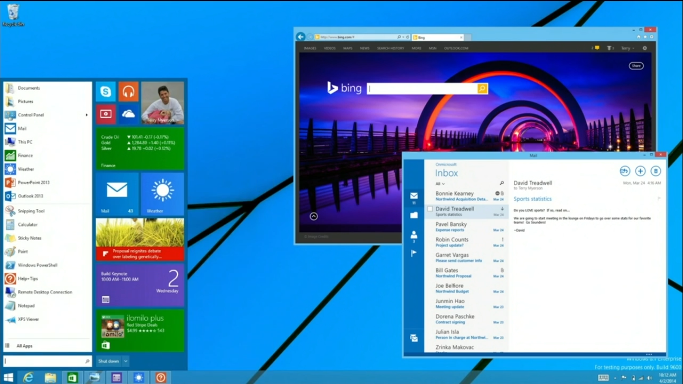
In the past Microsoft has done well for themselves by listening to their business users and prioritizing their concerns about backwards compatibility. I hope this revert represents a natural continuation of that policy.