The problem with vector icons is that they don't really scale as well as people seem to think.
Just because you can rasterise it at any size, doesn't mean that the resulting icon makes sense at that size. When icons are really small you usually want a simpler version of the same icon for it to remain recognisable.
To properly handle this you'd need either multiple versions or a vector format that can scale the amount of detail with the size. In either case you'd need to ensure that the rendering has pixel-perfect results at small sizes so it doesn't become a blurry-mess, kind of defeating the purpose of using a vector format.
Vector images work great for large icons, but for small ones they fall short.
Someone else has mentioned that HVIF supports level-of-detail hinting.
This is renderer-dependent (as it's a relatively new feature), but SVG alsp supports altering the vector by scale via CSS media-queries. Oversimplified example:
HVIF does have level-of-detail hinting, and I believe it also explicitly defines the pixel exact correct rendering although given the small audience I won't swear they didn't miss anything.
So you can add a shape which just isn't rendered at all in lower resolutions. For example suppose the icon for your app is a stylised steam locomotive and you want to add your company logo on the side of the tank, this detail will look cool at 512x512 and maybe if the logo is simple at 128x128 but it will just be a blotch on the 16x16 icon - so HVIF lets you specify that the logo isn't added at all below say 128x128.
I agree with the principle of what you're saying. A striking example from Windows XP is that is that folder icons are at a jaunty angle at 32x32 and higher but flat on at 16x16.
But what if you're looking at 48x48 icon on a screen with triple the pixel density in each direction? Surely you'd still want an image with with the same amount of detail as you'd normally get in a 16x16 icon, even those few details are rendered with a high pixel count – basically you're running into the resolution limit of your eyeball. And this is a very common situation now because of course phones have a far higher pixel density than most traditional monitors.
So there is potentially benefit in vector icons even though, as you say, you still need two or more versions with different levels of detail.
> For 32 px and above, vector images are a valid choice.
Well, that depends on your screen's density and how much you care that your design is aligned to the pixel grid. For a very long time most iOS icons were hand-aligned to the pixel grid, and when they switched to vector icons in iOS 13 they looked awful because they were aligned poorly.
Yeah, dedicated raster 16x16 and 32x32 versions and then a vector version if larger icons are required seems like the best approach.
I understand what they're trying to do with including the icon as metadata, but since they control the filesystem format as well, couldn't they just increase the storage available so they could store an extra kb or so? I'd expect that on modern hardware, reducing the number of reads by stuffing bytes into odd corners of each file's metadata is far less effective than just arranging a block of data to be read all at once.
At sizes like 32 px, you still want more control over line widths and details than a regular vector format grants you. For images that small, you still want to emphasise some things more than others.
The 'problem' with vector icons as well is pixel boundaries and anti aliasing producing blurry lines.
Say you have a 16x16 SVG, and have a single-unit ("pixel") line down the middle. Render that SVG at 16px, and you get a single nice crisp pixel. Render it as 20px and now your "1px" line is like 1.3 pixels, which isn't going to look good.
The problem is worked around with raster icons by just not providing the flexibility that a vector provides.
Rasterise your icons to fixed sizes that you’ll use in your application. Of course, this has its own set of compromises (namely the inflexibility) that may or may not be acceptable for your use case.
You can have a vector icon that doesn't have the smudge issue over a set of reasonably chosen rendering sizes (through specified pixel-exact rendering and alignment).
And said vector icon will still look a whole lot better scaled from supported/optimized 16x16 size -> less favored 20x20 size than a raster icon, even if it isn't absolutely perfect.
To rasterise your icons to fixed sizes, you need to scale the original source (possibly vector-based) image to that size. That scale operation, while one-off, has the same problem as the dynamic runtime scaling of vectors.
> The 'problem' with vector icons as well is pixel boundaries and anti aliasing producing blurry lines.
Level of details is also a major issue when scaling down. Nice features of an icon at large size become sub-pixel when scaled down and their rounding up or down messes with the icon and destroys its balance.
Just use the simple version at all sizes. Why does an icon need fine detail? Icons are abstract representations, like letters. Do you insist on adding ornamentation to your letters at large font sizes?
That's a great analogy. For scaled outline fonts to remain legible at low resolutions, they have a sophisticated hinting system (it even has a little virtual machine!).
I'm sure if someone developed a hinting VM framework for vector icons (that wasn't patent-encumbered like half of the font ones), it would do a lot to help convince people that special low-resolution bitmaps weren't necessary for tiny icons to look good.
Actually, fine font serifs are visible only in large sizes. Curves also can be more more finely rendered and gain a lot from bigger size/better resolution.
People do recommend switching between serif and sans serif typefaces, depending on the size of the text. Admittedly, it often goes the other way—-sans serif at bigger sizes—-but the idea is the same: some things look better at a particular size.
Indeed. The best icons are caricatures, designed to fit the resolution they are being displayed at. "About Those Vector Icons" is a good read that shows why "hinting" just isn't enough.
Both of those 16x16 icons look like blurry messes to me. If they weren't sitting next to 6 other larger pictures of a tape recorder, drawn in the same style, there's no way I'd have any clue what it was.
the Adwaita icon theme uses vectors for their icons[0], but they create multiple different SVGs at different sizes for the different sized icons (if that makes sense). For example, here’s one[1] icon.
You are right, there are some cases where vector graphics are not as good as traditional bitmap graphics (especially when the vector graphics weren't build for the size they are being rendered at).
But as soon as you don't know the pixel density of the target screen, vector graphics produce much better results compared to the time you would have to invest in perfect bitmap graphics.
So if you are designing a website (potentially viewed on devices with different pixel densities), vector graphics are likely to outperform bitmap graphics.
I wonder if it would be possible to create a vector image format that could identify the shapes and paths that are critical for legibility, and then write a scaling algorithm that is able to produce crisp results at 16x16 from the vector source.
On the outset that feels like a really hard problem.
The starting point would be to look at font rendering, especially hinting. I'm not sure if any of the popular font formats allow for adding more strokes when rendering at larger sizes, so they may not have much ability to scale image complexity, but they definitely have what you need to optimize for legibility at small sizes.
At risk of sounding like the guy who throws the machine learning hammer at everything, I actually wonder if a tiny CNN would not be a great solution to this. If you have a bunch of example icons tuned for low resolutions, as well as the vector art, you could potentially train a network to do a better downscaling job specifically tailored for icons. The point would be that the CNN weights could be common to all icons and not necessary to store in each file. Since the "domain" of icon design is quite restricted in terms of dimensionality and colour space, I bet a pretty small CNN would do a great job.
Another problem is that vector icons cannot capture every type of icon. For example, icons that were generated using a ray-tracer.
So instead of using a vector format, we should probably use an executable format instead to obtain full generality. Postscript does something like this.
The original truetype font was vector based but had to be legible at small font sizes. Apple created hinting in the late 1980s that worked well on macs. I believe Microsoft added better rasterization about a decade later.
The "small font problem" was practically unsolved until Adobe invented and patented declarative hinting in Type 1. Before, bitmap fonts were used. The bytecode stack machine for hinting used in TrueType, designed by MS/Apple, was specifically designed to not infringe on Adobe's patents.
Only when hinting became an option did vector font representation become viable at all for printing. Digital vector font display was accomplished much later.
While you are correct about Adobe Type 1 fonts, you are incorrect on display fonts. Apple System 7 had vector display fonts. There were issues on windows which is why Microsoft (and likely Adobe) improved TrueType. Adobe later responded with Adobe Font Manager which is likely what you are referencing.
With modern retina displays it's not really an issue. 16x16 icon on iPhone 8 display will have a size of 1,2 mm. 10mm icon will have 128x128 resolution with enough pixels to provide every detail.
Except high density displays are not really that common outside smartphones and the Apple world. It's probably safe to say most people still work on regular 1080p monitors at 90-100 dpi or at best on 1440p with slightly higher dpi. So an SVG with design resolution of 512×512 will look like a blurry mess when scaled down to 16×16. We'll get there eventually but optimising for low-density displays is still a very valid and reasonable thing to consider.
Even smartphones sometimes have lower-resolution displays. 720p resolution is still rather common at the low end, and that's something where a 'pixel perfect' 16x16 icon can still make some sense.
In that case, the problem seems a bit exacerbated by using a renderer that is very bad at rendering at small size. I'm sure you could render that to be a bit less of a jaggy and blurry mess.
IMO this is only an issue insofar as low resolution (~96 PPI) displays go. Of course you can just about always make better use of pixels by hand, but its not about making the absolute best possible use, just getting the job done and looking nice. How often do we even have 16x16 pixel icons in modern UIs?
or don't use low resolution displays. 5K displays are currently run of the mill. 8K displays are on their way and may be the end of the road for the resolution race. Printers went to what 1200DPI?
How many pixels is a 0.5CM icon at 8K? A dell 8K display at 31.5" has a PPI of 279. at 27" it'd be 326. Does vector scaling work at 326PPI?
If so any effort is wasted handcrafting icons. Simply wait 3-4 years.
Sorry you're right. 4K Is run of the mill now. 5K is not quite. But the point still stands, technology improves. It only needs to improve to a certain level before it goes beyond human perception. That will happen in a few years.
Any efforts trying to adapt to the limitations of current technology are wasted.
> The goal of the Haiku Vector Icon Format (HVIF) is to make vector icon files as small as possible. This allows Haiku to display icons as several sizes while still keeping the files small enough to fit into an inode (i.e., inside a file’s metadata). The goal of keeping the icons in the metadata is to reduce the disk reads needed to display a folder – it allows each file to only require one disk read to display.
This is a great goal, a very cool file format, and a very nice article!
That said, my main worry with this approach is that it might not be comparing or addressing the most common production workflows, which typically pack many icons into a single compressed file, and only unpack them in memory. When you pack multiple icons, you amortize all of the file reads into a single one. It’s extremely common in games, web, and even desktop apps, to also pack the images or other assets that icons represent into compressed files.
If you do pack your assets into zip files on disk, then it’s possible to lose disk space by converting to a binary icon format that might be less compressible, with no real gain in terms of disk reads or disk seeks -- and if you separate files instead of packing them so that you get icons in your inodes, you might be increasing the number of disk seeks & reads considerably.
Storing the icons in inode attributes is just one use of icons on Haiku; plenty of applications embed them as resources (i.e. in a data section of the binary), which is more or less what you are describing here.
Sure, I understand you aren't forced to store them in inodes, just pointing out (since it's part of the sales pitch here) that doing so might have unintended consequences since people don't usually load small icons from many separate files or web requests. It seems like a savings if you assume using single separate files, but if you store your assets in a zip file, then switching to keeping them in inodes might actually slow down the app. All the production games and web apps I've ever seen and/or worked on personally store many assets packed into single file.
It is worth thinking carefully about the tradeoff here. You are taking a functionality hit compared to SVG, and adding a new indirection and more tool dependencies to your pipeline in order to use HVF files. Ideally the payoff should be worth the effort, but if you zip all your SVG icons, how often is the compressed data averaging considerably more than 500 bytes per file? I just checked Google, and the first hit for free SVG sets is Feather, a 132kb zip file containing 282 icons, which clocks in at 480 bytes per icon on average.
Regarding storing icons in the data section of the binary, that is certainly one way to pack assets, but not one I would use or recommend personally. That locks you into shipping a binary if you want to update assets, it doesn't apply to web dev, or scripting languages, and it's pretty OS/platform specific. Typically what I've seen in production really is some kind of zip-like container file that is compressed and loaded separately from the application.
Vector images optimize for file size and flexibility. This is good for non-standard displays and network.
The network advantage is hard to disprove. But which has lower total computation cost?
A bitmap is created once, and the idea is very basic - you have a grid of pixels. The good part is that it's simple to use it. A vector image is a recipe for making an image. More calculations have to be done client-side, times the number of clients. Clients have to do the work the server didn't want to. You could say a bitmap is a compiled vector.
I think an ideal solution might be treating vectors as a source code. A web server would receive a request, including display size. Then it would "compile" the vector image into a bitmap and send the bitmap of the right size. And cache the image, so if another user with the same display size asks for the image, it's ready. Few people resize the browser window often. For the same reason, I think code highlighters shouldn't use Javascript on client side, unless the code might change (like, an in-browser REPL or pastebin).
Am I being misinformed? Pedantic? I like vector images, but would like to learn if my affection is justified.
They may not resize the browser window often, but when they do, it fires a lot of events with a lot of resolutions depending on how exactly they move the mouse to the desired position. Try opening your browser console, paste the code below, then resize a few times and see how many events you get.
You could do various techniques like detecting the start of resizing and waiting for it to settle down before requesting the new image, but still, I think you may be underestimating how many resolutions there are out in the wild :)
Haiku is full of little interesting design decisions like this. I would _love_ to have it running on a laptop (nearly there) or a Raspberry Pi (sadly, not likely to happen soon, because the initial ARM developments sort of shunned it and it's taken them a good while to re-focus).
Haiku's goal is being a full-fledged desktop/laptop OS, not a "mobile" OS; and most laptops and desktops right now are all x86, so that's what we primarily target.
What's preventing you from running it on a laptop now?
The idea of storing the icon in the inode is interesting.
Conventionally, when displaying a folder, a file manager identifies the _type_ of each file, and then looks up the appropriate icon.
Does Haiku instead display whatever icon is in the inode? Could a wordprocessor document masquarade as a spreadsheet, and such?
I can't think of any security implications of this, nor think of any real mischief that a developer might cause, but I also can't think of any big advantage of it either. What use-case for having the whole icon in the inode instead of just a mime-type that is then used to look up the (already parsed, and shared) icon?
Even Windows has resources, including icons, inside the exe file. Obviously a bit different (it's not in metadata, it's in the actual executable) but the idea that a single file named PerfectlyHarmlessPhoto.jpg.exe could have an icon of a jpeg file turns your computer in a botnet client is not a novel one.
Afaik in contemporary Mac OS, you have a directory with certain files in it. I'm not sure if anything prevents you from naming the directory PerfectlyHarmlessPhoto.jpg.app and giving it a jpeg icon. You would need to get the user to extract an archive first, which may be more or less difficult.
I think the Linux practice of having a separately identified file provide the icon is relatively rare. (I just checked Nautilus and ROX-Filer, and ROX-Filer shows .desktop icon files and allows you to execute them directly. Nautilus treats them like any other configuration file. I guess it would be relatively difficult to trick a Nautilus user into executing a script they thought was an image.)
The article claims that reading from the disk is extremely slow and so this results in a significant speed up. It is pretty quick to parse the images compared to reading the files off disk.
If the security considerations are relevant, you could presumably write the operating system not to render the icon of non-installed software tools.
I was referring specifically to the limited case of executables. As I mentioned, executables in Windows have a resource that is the icon. There's probably no real security issues in having a photo show up with a Word document icon.
Windows File Manager (which was used till Windows 3.11 and Windows NT 3.51) doesn't show generated thumbnails, although Windows Explorer does.
I actually think HVIF is one of the few things Haiku has done that's good engineering and deserves to see more use in something actually popular but it's very niche.
Per-file icons is a nice way to get cheap previews, especially at higher resolutions. For 2D images a fairly naive previewing method is to just flatten the whole image and scale it. For a PDF it will often but not always be useful to render the first non-empty page, then as you get into video, 3D or sounds it all starts to trickier.
However of course HVIF doesn't benefit any of these use cases, it's at its best when an artist has spent some effort learning techniques specific to the format and then hand crafts each icon accordingly.
HVIF in practice mostly gives icons to application software, so this technique lets Haiku use the directory of binaries to get back a set of icons for the applications those binaries implement, without doing a small file read per application as would happen in say Windows. A small advantage.
> What use-case for having the whole icon in the inode
One that springs to mind is that you could put a thumbnail of the document into the icon (although I guess that's a bit tricky with only 500 byte SVG-alike icons.)
The use case is to get file specific icons, rather than just type specific. One thing is thumbnails, but a lot of applications and games on the Amiga for example have custom icons.
Of course that doesn't require it to be in the inode (it isn't for the Amiga - it's in <filename>.info).
On the Amiga the ".info" file can also contain additional information, such as startup instructions, as well as snapshotted location in the UI - the Amiga Workbench was close to a reasonably spatial file manager (and I really miss that..).
Security implications certainly would be different than they were at the time, in that you could trick people to start executables instead of loading the file into an application they trust, but that really is best handled by warning people on execution of "new"/downloaded files anyway.
You could do this on classic MacOS - you could copy an image and paste it into the icon box in a files' properties. So yes, you could disguise your video games / hacking tools / illicit images as perfectly respectable ClarisWorks documents.
Mainly just a fun prank to change the icons without breaking stuff.
The performance use case is most significant to me. But I’m not sure why the OS wouldn’t look up all the icons used in a folder and only read them once for reuse. So having a thousand Word documents would only need one read of the Word icon.
I think it’s a nice packaging feature to not need to distribute a separate icon file, rather just include the icon in the file directly.
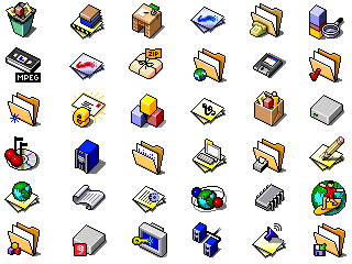
I have to say that I'm infatuated by 32x32 pixel art icons. There's something about the art style that screams early-2000s. I especially like the ones produced by someone named Masatoshi Ueji. He even drew BeOS icons.
Time for fun project stories: I once wrote a Java GUI program. That was 2007, Swing was still a thing, and "rich" frontend were still very basic (since there were no really good HTML engines for Swing/AWT).
So one day, I thought I would replace all bitmap icons in my application with SVG icons, because hell yes, vector, it must be better. And other projects did it alreay at that time, such as KDE/Gnome which used https://wiki.gnome.org/action/show/Projects/LibRsvg
So I added a Java library for rendering SVG to bitmaps. It brought several Megabytes of JAR dependencies. These libraries were much bigger then my whole application.
Conclusion? The whole program was much slower then before. Rendering time was really a thing. And this was not about thousands of icons or so, just a pretty standard GUI application with a few (less then ten) icons at a time.
Lession learned: Processing vector images to bitmap takes more time then just displaying bitmap. Especially on old slow computers.
Side note: I’m kind of shocked that they dropped the isomorphic style for the icons. That was a truly... iconic! aspect of the BeOS visual language. And quite modern in my opinion!
The pixel-perfectness of the UI was also iconic. If it were me, I’d go back to isomorphic and go deep on a rigorous system-wide grid. You can still do vector icons but be meticulous about the grid.
I think you mean isometric (that's where the X, Y, and Z axes all have the same scale, and are 120 degrees apart).
Fun fact: pixel art is usually not-quite isometric because they use a vertical line and then lines that have a slope of 2:1 which is about 7 degrees larger distance between the X and Y axis[1].
This makes perfect sense, and it seems that the article spends most of its time "selling" vector.
As a designer, I ALWAYS start with vector (usually an Illustrator file).
No need to sell it to me, but I'd gently suggest using existing vector formats, like SVG.
That said, most operating systems don't support the use case described. It would be nice if they did. That may be coming, but for now, we are stuck with BitMap. I'm glad that I don't need to use the damn .ico files anymore for Web sites.
I think some of the criticism to bitmap may no longer be valid. Such as Disk Space, Access Time with Modern SSD, along with added computation required for Vector Drawing instead of Bitmap. That is also assuming vector can do low level detail hinting as good as bitmap.
The devil in me wants to gather up a rag-tag group of designers and get them to start doing incremental improvements to the Haiku icon set. Then sit back and watch as the veteran devs begin discouraging that rapid development because it causes too many system-wide file writes.
How would it cause too many system-wide file writes...?
Most files on Haiku don't use custom icons, they just use the icon associated with the mimetype. Application binaries the primary consumer of the icons-in-attributes feature.
Random thought, but why the vector versions of both the folder and cassette reader use perspective projection while the bitmap versions are using parallel/isometric projection?
How does vector graphic compare to bitmap when it comes to cpu usage? It wouldn't make sense to save few bytes in memory only to spend more cpu resources later.
In general, compression works much better the more data it has to work with. When you're talking about one or two KiB files, the overheads are going to eat into a lot of your gains. It's definitely still worthwhile, but I can see how a custom packed binary format could easily outperform a compressed text format at these sizes.
The 7 KiB SVG is almost certainly too large for that image, but I guess it won't get much smaller than 1 or 2 KiB in that case. Not sure how SVG-specific brotli is. Wasn't the dictionary mostly HTML, which would save pretty much nothing for SVG?
Just because you can rasterise it at any size, doesn't mean that the resulting icon makes sense at that size. When icons are really small you usually want a simpler version of the same icon for it to remain recognisable.
You can see it clearly in the examples used in the article for the 16x16 icon. Compare the bitmap version (https://www.haiku-os.org/docs/userguide/images/apps-images/i...) to the vector version (https://www.haiku-os.org/docs/userguide/images/apps-images/i...) , the bitmap version is specifically made for the low resolution and is still very clear, the vector version is a blurry mess.
To properly handle this you'd need either multiple versions or a vector format that can scale the amount of detail with the size. In either case you'd need to ensure that the rendering has pixel-perfect results at small sizes so it doesn't become a blurry-mess, kind of defeating the purpose of using a vector format.
Vector images work great for large icons, but for small ones they fall short.